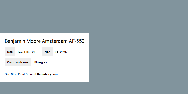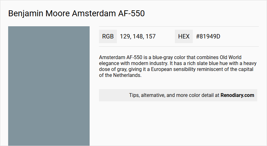
Benjamin Moore's Amsterdam AF-550 is a sophisticated hue that encapsulates the serene and understated qualities of blue-gray. The blend of RGB values—129, 148, and 157—contributes to its cool, calming presence, making it an excellent choice for creating restful and elegant environments. This versatile shade complements a variety of decor styles, seamlessly integrating with both contemporary and traditional design aesthetics.
Color Description
Amsterdam AF-550 is a blue-gray color that combines Old World elegance with modern industry. It has a rich slate blue hue with a heavy dose of gray, giving it a European sensibility reminiscent of the capital of the Netherlands.
Undertones
The color has significant gray undertones, which balance out the blue, creating a balanced and sophisticated tone.
Color Values
The Light Reflectance Value (LRV) of Amsterdam AF-550 is 29.21, indicating it is a relatively dark color that will absorb more light than it reflects.
Usage
This color is suitable for various rooms, including living rooms, dining rooms, bedrooms, kitchens, and bathrooms. It can also be used for exterior evaluations, though it is not meant to withstand sun and weather conditions.
Atmosphere
Amsterdam AF-550 creates a sophisticated and elegant atmosphere, blending traditional and modern elements. It captures the blue-hued beauty of Amsterdam, making it ideal for those seeking a refined and cultured aesthetic.
Benjamin Moore Amsterdam AF-550 Color Alternative
Benjamin Moore Amsterdam AF-550 offers a distinctive color identity that can also be represented by several notable alternatives. Designers and decorators considering variations may explore Dulux Smoke Grey 90BG 30/073, Little Greene James 108, and Farrow and Ball Stone Blue 86 as compelling options. Each of these alternatives brings its own character while maintaining a complementary aesthetic to the refined appeal of Amsterdam AF-550.
Bathroom
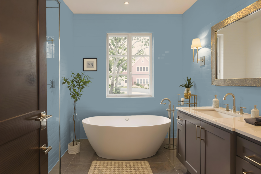
Bathroom color Amsterdam AF-550 is an excellent choice for bathroom paint due to its practical and aesthetic appeal. This well-curated hue belongs to a collection designed for color harmony, making it straightforward to pair with complementary shades to achieve a cohesive look. Its high-performance formula, tailored for high-humidity environments, offers mildew resistance that is especially useful in bathrooms and spas.
The paint is engineered for durability and ease of maintenance, washing clean in any sheen. For moist spaces, finishes such as pearl or satin are optimal since they form a smooth, less porous surface that effectively resists moisture and simplifies cleaning.
Bedroom
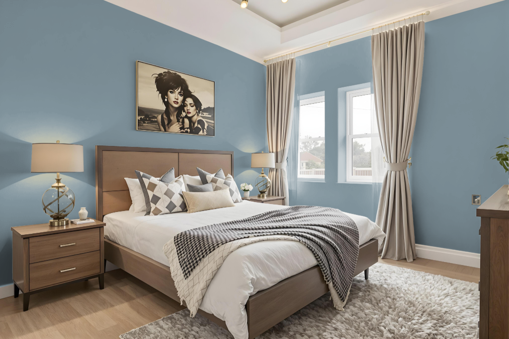
For a bedroom, Benjamin Moore's Amsterdam offers a soothing option that sets the tone for a cohesive and inviting retreat. Its rich character combines well with soft neutrals like off-white and light gray to create a calm and elegant setting, or with deep blues and greens for a dramatic, modern feel.
Amsterdam works wonderfully as an accent wall or primary shade, especially when paired with coordinating hues such as Solitude, Pike's Peak Gray, or Nimbus Gray for a seamless monochromatic look. Alternatively, incorporating complementary colors with red undertones—such as Quietly Violet or Desert Shadows—enhances the space with a vibrant and dynamic visual appeal.
Kitchen
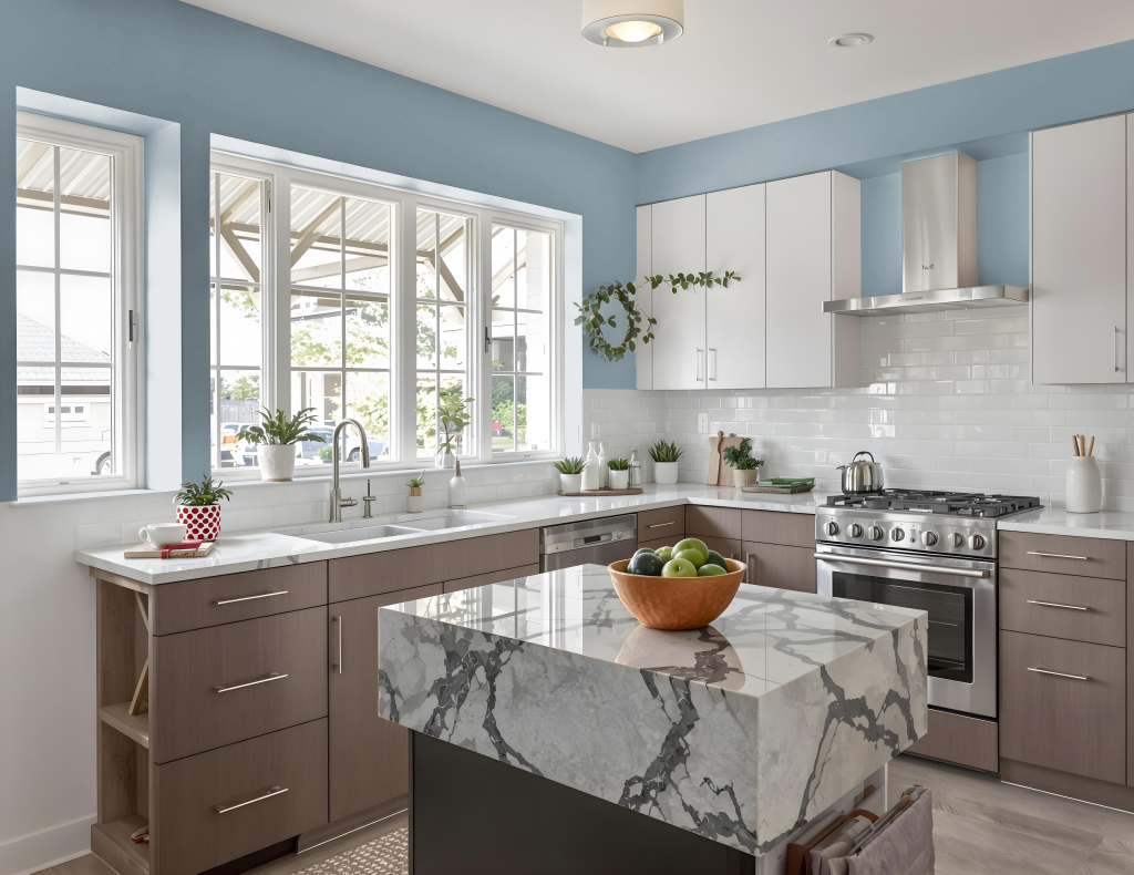
For a kitchen color scheme, Benjamin Moore’s Amsterdam AF-550 sets an inviting and distinctive tone. It pairs seamlessly with lighter shades like Solitude AF-545, Pike's Peak Gray 2127-50, or Nimbus Gray 2131-50, as well as with deeper hues such as Van Courtland Blue HC-145 or Chiswell Blue CW-660 in a monochromatic arrangement that encourages depth and balance.
Additionally, Amsterdam AF-550 can be harmonized with colors that have a red undertone—for instance, Quietly Violet or Desert Shadows—to inject a vibrant energy into the space. Using this hue as an accent on features like kitchen islands, cabinets, or walls brings warmth and interest to the overall design while the more neutral backdrop maintains a cohesive look.
Living Room
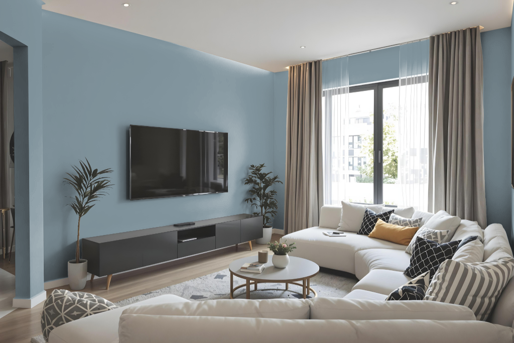
The living room color Benjamin Moore Amsterdam AF-550 creates a warm and inviting atmosphere, suitable for both traditional and contemporary design schemes. This hue adds depth and elegance to interior spaces, whether paired with soft neutrals for a calming effect or combined with deeper tones for a modern, dramatic look.
Thoughtfully chosen for its harmonious appeal, this shade enhances any setting by complementing a range of accent colors. Its availability in various finishes ensures practicality and tailored aesthetics for different areas of the home.
Outdoor
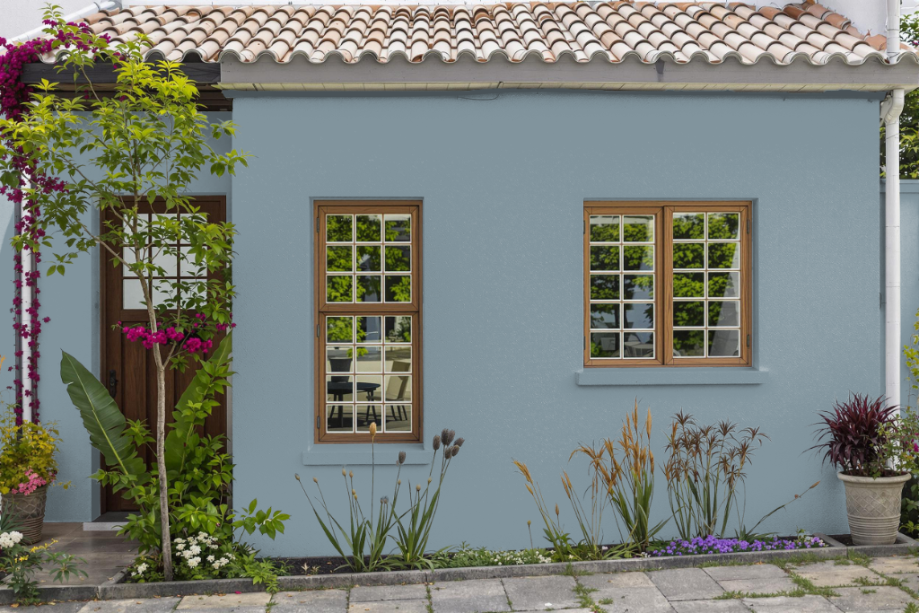
For home outdoor color featuring Benjamin Moore's Amsterdam AF-550, it's important to emphasize that while its aesthetic appeal can work well, the formulation is primarily intended for indoor use. Using it outdoors requires extra caution because the paint is not designed to withstand prolonged exposure to sun and weather conditions.
To successfully incorporate this hue outside, choose a product specifically engineered for exterior applications, such as Benjamin Moore's Aura or Regal Select exterior paints, which offer enhanced durability and resistance to weathering. Additionally, selecting a finish like semi-gloss or satin can help ensure easier cleaning and improved resistance against moisture and fading.