Benjamin Moore's Blue Note 2129-30, known for its rich and sophisticated hue, is often likened to the color of deep Outer Space. With its RGB composition of 64, 75, and 84, this shade evokes a sense of elegance and modernity, making it a popular choice for accent walls and bold decor statements. Its versatile undertones can complement both warm and cool color palettes, offering a timeless and stylish addition to any interior design scheme.
Color Description
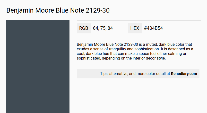
Benjamin Moore Blue Note 2129-30 is a muted, dark blue color that exudes a sense of tranquility and sophistication. It is described as a cool, dark blue hue that can make a space feel either calming or sophisticated, depending on the interior decor style.
Undertones
The undertone of Blue Note is predominantly blue, with no significant undertones of other colors mentioned. It is characterized purely as a blue hue.
Color Values
- HEX value: #404B54
- RGB code: 64, 75, 84
Usage
Blue Note is versatile and can be used in various rooms such as bedrooms, living rooms, and bathrooms. It pairs well with soft neutrals like warm whites, subtle grays, beiges, creams, and taupes. It can be used for accent walls, trim, kitchen cabinets, front doors, and other decorative elements to add a touch of sophistication.
Atmosphere
The color creates a harmonious and elegant atmosphere when paired with complementary colors. It can make a space feel calming or sophisticated, depending on the decor and accents used. When combined with shades of sand and taupe, it adds a unique and refined touch to any room.
Benjamin Moore Blue Note 2129-30 Color Alternative
Benjamin Moore Blue Note 2129-30 alternatives offer designers a unique opportunity to experiment with bold blue hues in a variety of settings. Farrow and Ball Hague Blue 30, Sherwin Williams Sea Serpent SW 7615, and Sherwin Williams Sea Mariner SW 9640 each bring distinct qualities and depth that can perfectly complement a wide range of interior design themes. These color alternatives maintain the creative spirit of Blue Note 2129-30 while providing fresh possibilities for achieving a vibrant and inviting atmosphere.
Bathroom
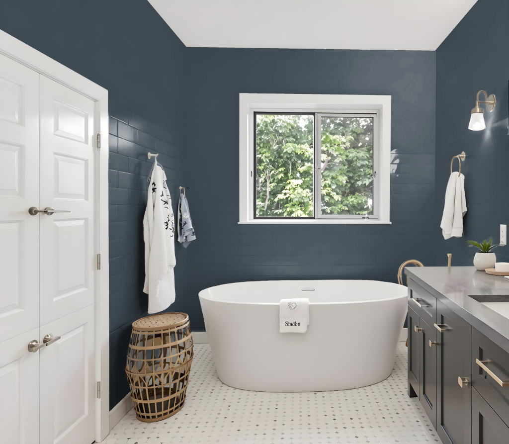
Benjamin Moore's Blue Note 2129-30 is an elegant choice for a bathroom, offering a refined backdrop that enhances the overall atmosphere. It harmonizes beautifully with soft neutrals like warm whites, subtle grays, and accents in shades of sand and taupe to create a balanced and inviting space.
Designed for high-humidity environments, this color is well-suited for bathrooms thanks to its resistance to mildew, ensuring a continuously fresh appearance. The recommended semi-gloss sheen further elevates its durability and ease of cleaning, making it a practical yet stylish option for spaces that require frequent maintenance.
Bedroom
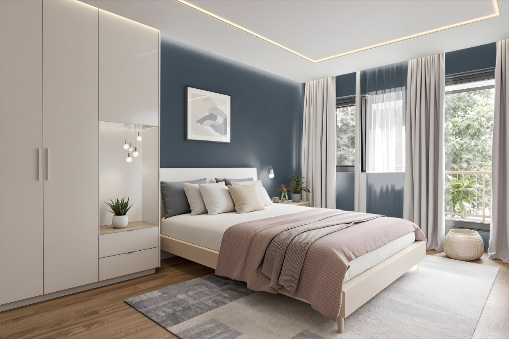
For a bedroom color scheme, Benjamin Moore's Blue Note 2129-30 sets a serene and sophisticated tone when integrated with a range of soft, complementary hues. It pairs beautifully with warm whites and subtle grays to create a harmonious environment, while accents in shades reminiscent of sand and taupe enhance the elegance of the space.
This color can serve as a statement wall or provide a refined backdrop for the entire room. Pairing Blue Note with lighter tones for contrast or richer, deeper shades for a layered, monochromatic design further deepens the ambience, establishing a balanced and calming retreat.
Kitchen
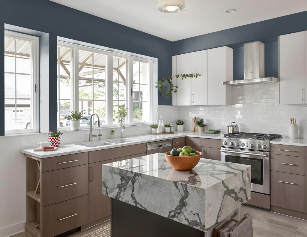
Benjamin Moore's Blue Note 2129-30 is a striking kitchen color that brings sophistication and drama to any space. It enhances design when used on islands, cabinets, or accent walls and pairs beautifully with neutral tones like beiges, creams, taupes, and off-whites to forge an elegant setting.
The deep and rich quality of Blue Note complements earthy hues such as sand and taupe, while lighter shades add meaningful depth and contrast. Adding red-inspired accents like Antique Pearl or Night Shade creates a dynamic counterpoint, resulting in a balanced yet visually compelling kitchen environment.
Living Room
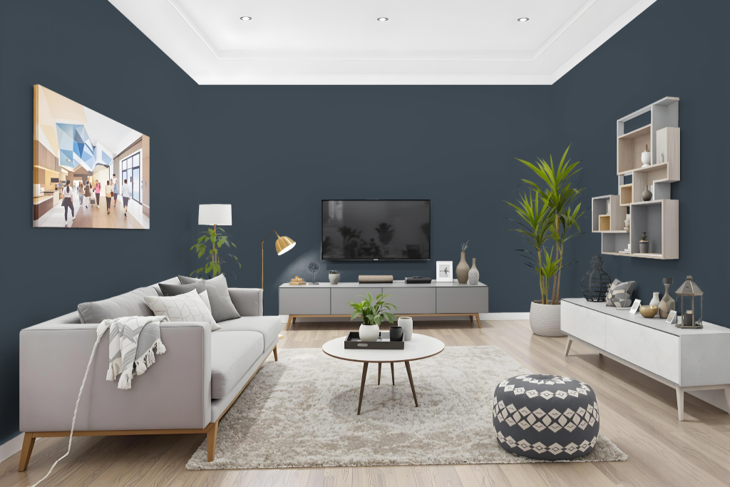
In the living room, Benjamin Moore Blue Note 2129-30 brings an impactful ambiance that sets the stage for an elegant environment. Its rich and deep tone pairs beautifully with soft neutrals, including warm whites, subtle grays, and earthy hues like sand and taupe, allowing it to serve as either a statement wall or an understated backdrop for the entire space.
This color effortlessly complements a range of decor styles, influencing the room to feel either tranquil or refined depending on the accompanying design elements. It also works seamlessly when coordinated with complementary shades such as Moonlight White, Brilliant White, and Cliffside Gray, ensuring a cohesive and stylish look throughout.
Outdoor
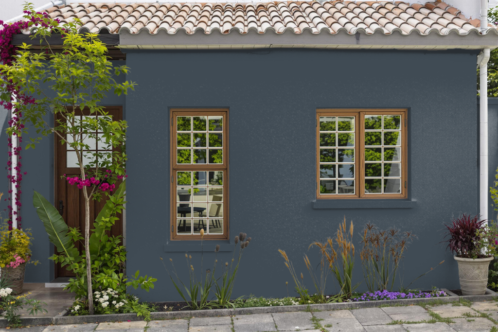
Blue Note is a home outdoor color from Benjamin Moore's collection that delivers reliable performance in exterior applications. It's designed to resist dirt, mildew, fading, cracking, and peeling, ensuring a durable finish that holds up well in challenging weather conditions, even when applied in lower temperatures.
The product features an advanced alkyd-fortified formula that adheres effectively to various surfaces such as PVC siding, chalky materials, and pitted masonry. Backed by industry-leading color technology from an extensive color palette, it offers a long-lasting solution for outdoor projects under demanding environmental conditions.