Benjamin Moore's Bruton White CW-710 is a sophisticated hue that blends the warmth of beige with the cool elegance of gray, creating a versatile color known as Greige. This balanced tone, represented by its RGB values of 213, 209, 199, provides a neutral backdrop that complements a wide array of interior designs, making it an ideal choice for modern and classical aesthetics alike. Its ability to adapt to various lighting conditions ensures that spaces feel inviting and harmonious throughout the day.
Color Description
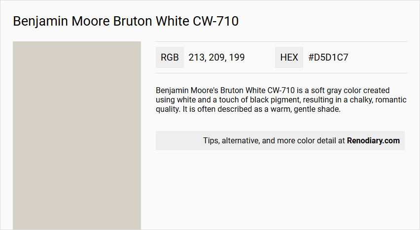
Benjamin Moore's Bruton White CW-710 is a soft gray color created using white and a touch of black pigment, resulting in a chalky, romantic quality. It is often described as a warm, gentle shade.
Undertones
The undertone of Bruton White CW-710 can be accurately described as having a red or warm hue, although it is primarily a soft gray.
Color Values
- HEX Code: #D6D0C6 (varies slightly as #D5D1C7 in some sources)
- RGB Decimal: 214, 208, 198
- RGB Float: 0.839, 0.816, 0.776
- CMYK Percentage: 0, 3, 7, 16
- LRV (Light Reflectance Value): 63.26
Usage
This color is suitable for creating a traditional and elegant atmosphere in various rooms. It is part of the Williamsburg® Paint Color Collection, suggesting its use in historical or classic interior designs.
Atmosphere
Bruton White CW-710 contributes to a warm, inviting, and romantic atmosphere, making it ideal for spaces where a soft, calming ambiance is desired. The chalky quality adds a subtle, vintage feel to the room.
Benjamin Moore Bruton White CW-710 Color Alternative
Benjamin Moore Bruton White CW-710 provides a balanced and adaptable canvas, making it a popular choice for modern interiors. Its color alternatives—including Tikkurila Mulberry H484, Tikkurila Batiste G487, and Tikkurila Median X486—offer comparable sophistication while allowing for subtle variations in ambiance. These selections empower designers to maintain the timeless appeal of Benjamin Moore Bruton White CW-710 while exploring distinct aesthetic expressions in their projects.
Bathroom
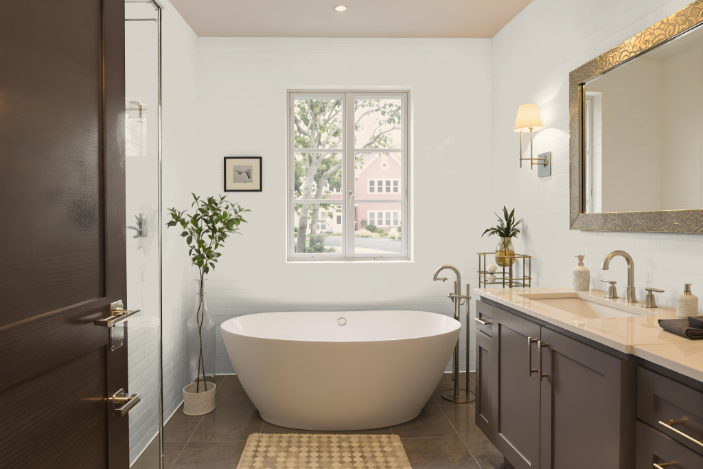
Benjamin Moore's Bruton White CW-710 is a refreshing bathroom color designed to excel in high-humidity settings while offering a practical solution for challenging environments. The ADVANCE Interior Paint in this tone provides a satin finish with excellent flow and leveling, mirroring the performance of traditional finishes while utilizing a waterborne formula.
Ideal for areas like bathrooms and spas, this paint includes mildew resistance to maintain a lasting fresh appearance. It also features low VOC emissions after tinting and cures to a hard, furniture-quality finish that withstands repeated cleaning, making it a reliable choice for spaces that demand both beauty and durability.
Bedroom
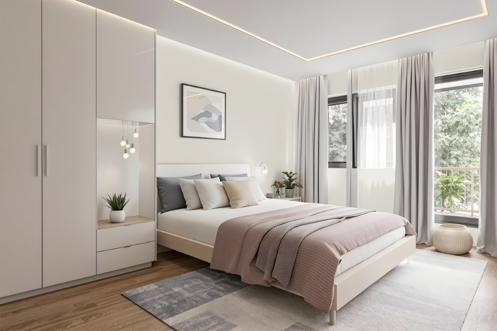
For a bedroom color scheme, Benjamin Moore Bruton White CW-710 sets the stage for a serene and inviting space. This crisp shade works beautifully alongside soft neutrals like taupe and greige, creating a balanced backdrop that enhances a range of styles from traditional to modern. Its inherent warmth makes it ideal for use on walls, trim, or furniture, lending a subtle, inviting glow to the room.
By pairing this color with muted pastels such as blush pink and pale blue, designers can achieve a calming, cohesive aesthetic. Complementing Bruton White with hues that lean towards blue, such as those found in Feather Gray or Bachelor Blue, introduces a dynamic visual contrast that enriches the overall ambiance.
Kitchen
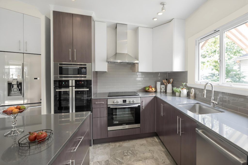
Benjamin Moore Bruton White CW-710 brings a warm, elegant touch to the kitchen, pairing seamlessly with neutral countertops, warm-toned backsplashes, and beige or greige wall colors. Its harmonious balance with softer hues such as taupe on walls or trim and muted pastels for accents creates a refined and inviting atmosphere.
Ideal for kitchen cabinetry, this color infuses a bright, airy feel—especially in light-filled spaces—while darker tones on elements like the kitchen island add thoughtful contrast. The overall effect enhances a harmonious look that suits both traditional and modern design aesthetics.
Living Room
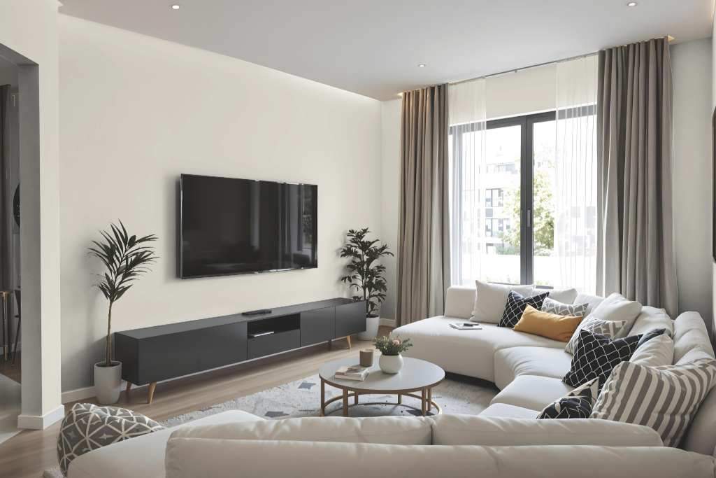
Benjamin Moore Bruton White CW-710 elevates the living room ambiance with its refined and inviting presence. It harmonizes beautifully with soft neutrals and muted pastels, making it an excellent choice for walls, trim, or furniture in both modern and traditional spaces.
Rooted in 18th-century tradition from the Williamsburg Paint Color Collection, this color introduces a touch of historical elegance while complementing diverse design schemes. It seamlessly integrates into both monochromatic layouts and contrasting color palettes, delivering a dynamic and cohesive visual statement.
Outdoor
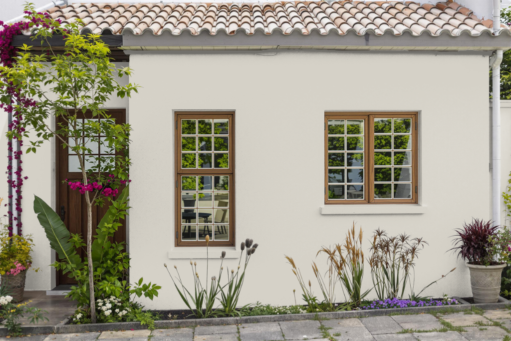
For home outdoor color, Benjamin Moore's Bruton White CW-710 adds a refined and inviting appeal to exterior facades. Its adaptable character makes it a fitting choice across a range of home styles—from classic traditional designs to sleek modern aesthetics—and it harmonizes gracefully with deeper hues such as rich blues, greens, and dark tones that serve as striking accents.
Depending on the available light, this shade subtly shifts its appearance: in shaded areas, it reveals a touch of green, while in the glow of afternoon light, it takes on a creamy, warm quality. Homeowners are encouraged to test this color in different lighting conditions to ensure it creates the desired ambiance for their specific exterior environment.