Benjamin Moore's Burnt Ember CSP-120, characterized by its subtly muted hue, closely resembles a sophisticated and timeless Dove Gray. This particular shade, with an RGB composition of (106,105,103), emanates a sense of warmth while maintaining a refined neutrality, making it a versatile choice for various design themes. Its understated elegance enhances interiors with a touch of modernity, creating a serene yet sophisticated ambiance.
Color Description
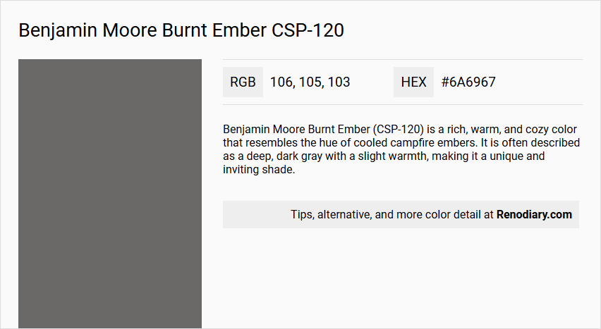
Benjamin Moore Burnt Ember (CSP-120) is a rich, warm, and cozy color that resembles the hue of cooled campfire embers. It is often described as a deep, dark gray with a slight warmth, making it a unique and inviting shade.
Undertones
The undertone of Burnt Ember can be accurately described as a red hue, although it is predominantly gray. This red undertone adds a depth and warmth to the color.
Color Values
- HEX: #6A6967
- RGB: 106, 105, 103
- CMYK: 0.0%, 0.9%, 2.8%, 58.4%
- LRV (Light Reflectance Value): 15.5
Usage
Burnt Ember is suitable for interior use and is not recommended for exterior painting. It works well in low to moderate traffic areas and can be used in various rooms, including bedrooms, to create a cozy and intimate atmosphere. The color is versatile and can be paired with soft cream tones, dark olive, or muted terracotta for a harmonious color scheme.
Atmosphere
Burnt Ember adds depth and warmth to a room, creating a cozy and intimate atmosphere. It is ideal for spaces where a rich, vibrant color is desired without being overly bright. The color helps to balance bright and lighter tones, making it a great choice for rooms that need a warm and inviting feel.
Benjamin Moore Burnt Ember CSP-120 Color Alternative
When exploring color alternatives for Benjamin Moore Burnt Ember CSP-120, designers may turn to options that offer distinct character without sacrificing impact. Tikkurila Basalt N499, Tikkurila V497, and Dulux Grey Tabby 00NN 16/000 each provide a unique twist that respects the original hue's dynamic qualities. These alternatives allow for creative expression in diverse settings, ensuring that the final choice meets both aesthetic and functional needs.
Bathroom
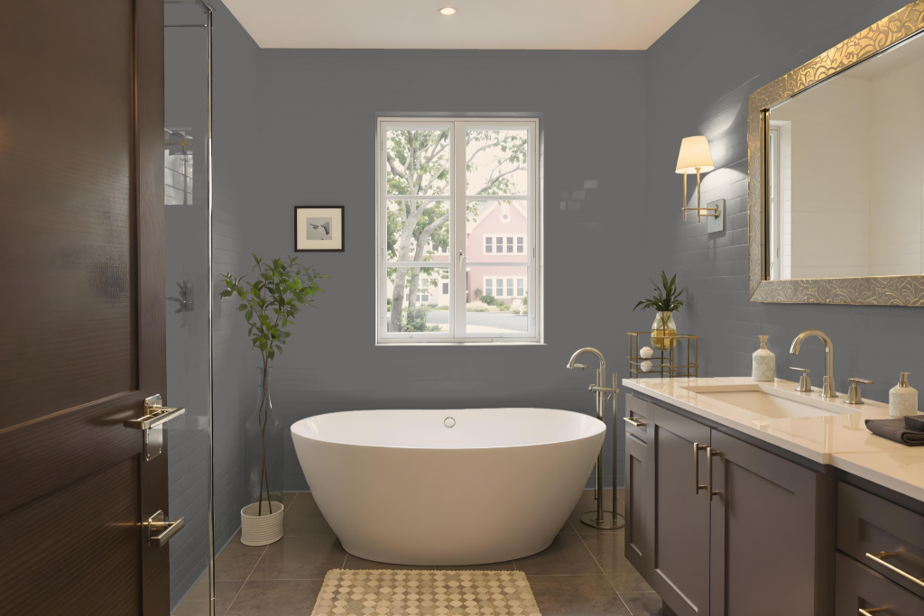
Benjamin Moore's Burnt Ember CSP-120 is an engaging bathroom color celebrated for its performance and durability. Its formulation offers mildew resistance, making it a smart choice for high-humidity spaces like bathrooms and spas.
This paint is designed to hold true over time with excellent hide, fade, and color rub-off resistance while remaining easily cleanable in any sheen. Its compatibility with various surfaces allows it to seamlessly integrate with other design elements, such as bathroom cabinetry, to create a modern and cohesive look.
Bedroom
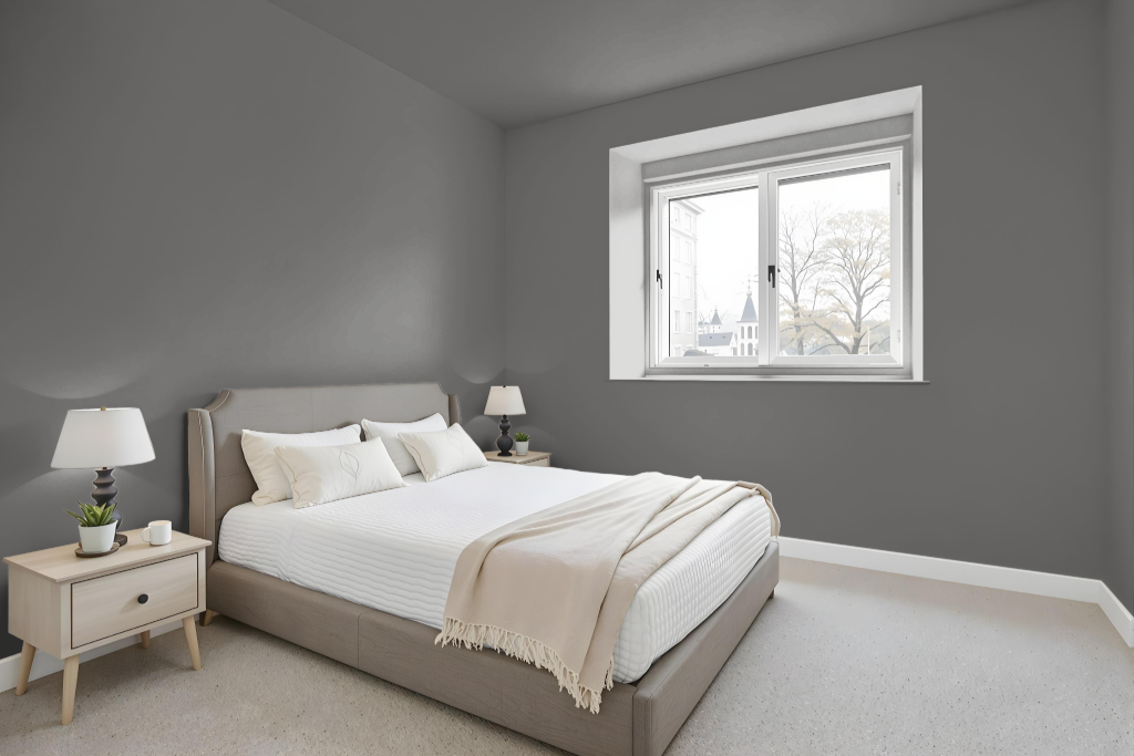
Benjamin Moore Burnt Ember is an excellent bedroom color, offering warmth and an inviting atmosphere when paired with soft cream tones for a sophisticated, cozy feel. Complementary accents in dark olive or muted terracotta add depth and harmony, while hints of cool shades through furniture, art, or decor introduce a refreshing balance.
This hue adapts gracefully within either a monochromatic or complementary color scheme, accommodating a range of design styles from classic to modern. Light accents in creamy tones further brighten the space, enhancing both contrast and visual appeal.
Kitchen
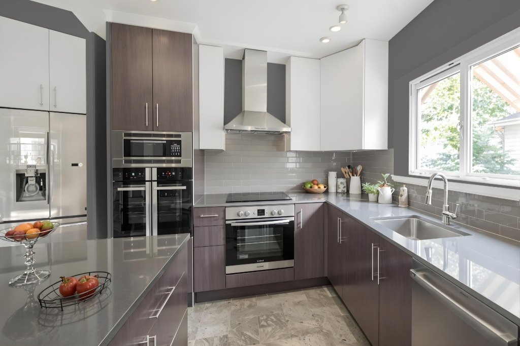
For a kitchen color scheme, Benjamin Moore's Burnt Ember creates a warm and engaging backdrop that pairs elegantly with soft cream tones on cabinets or countertops. This approach establishes a sophisticated atmosphere while adding depth through accents of dark olive or muted terracotta and lighter variants on walls contrasted by richer hues on islands or accent areas.
Integrating complementary shades with subtle blue undertones in elements like backsplashes or kitchen accessories further enhances the dynamic visual effect of the space. The overall composition offers a balanced interplay of warm and cool elements, resulting in an inviting and stylish kitchen environment.
Living Room
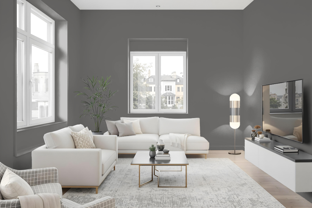
Benjamin Moore’s Burnt Ember brings a warm, inviting ambiance to living rooms with its rich, dynamic hue. This choice paint delivers exceptional durability, boasting impressive hide, fade, and color rub-off resistance, while the eggshell finish creates a softly polished glow on an easy-to-clean surface ideal for low to moderate traffic areas.
Part of the Aura Color Stories Collection, Burnt Ember remains consistently vibrant over time. It pairs harmoniously with coordinating colors such as soft cream tones, dark olive, or muted terracotta, allowing the creation of a balanced and welcoming space.
Outdoor
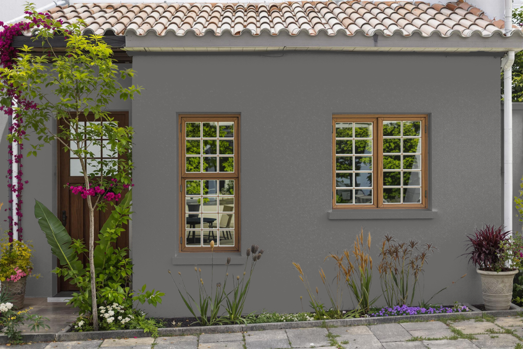
For home exteriors, Benjamin Moore Burnt Ember offers an enticing warm hue that might seem appealing at first glance. However, this color has been specifically engineered for interior environments rather than outdoor applications.
Designed to provide rich color vitality, exceptional coverage, and resistance to fading and color rub-off, this formulation excels indoors and may fall short when exposed to external weather conditions. Choosing a paint developed for outdoor durability ensures long-lasting performance against the challenges posed by the elements.