Benjamin Moore's Chatsworth Cream 225, described by its RGB values of (237,229,206), is a delicate and subtle shade that is often classified under the broader category of beige. This warm, neutral hue exudes a sense of calm and tranquility, making it a popular choice for interior spaces seeking a cozy ambiance. The understated elegance of Chatsworth Cream enables it to complement a variety of design styles, from traditional to modern, by seamlessly blending with diverse color palettes.
Color Description
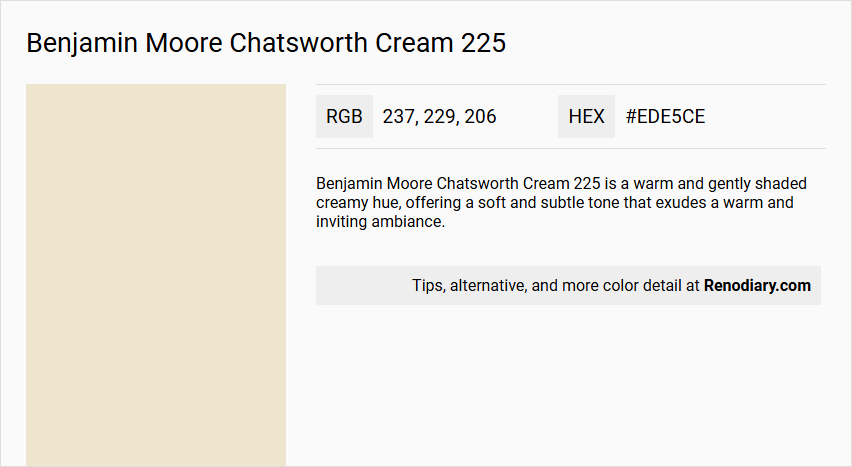
Benjamin Moore Chatsworth Cream 225 is a warm and gently shaded creamy hue, offering a soft and subtle tone that exudes a warm and inviting ambiance.
Undertones
The undertone of Chatsworth Cream is primarily a Yellow hue, although some sources also mention a slight tint of Green, which adds a cool, complex intensity to the color.
Color Values
- LRV (Light Reflectance Value): 76.35
- HEX Value: #EDE5CE
- RGB Code: 237, 229, 206
Usage
Chatsworth Cream harmonizes beautifully with rich earth tones such as olive green and terracotta. It can be complemented with accents in deep navy blue or charcoal gray to add a sophisticated touch. Pairing it with metallic finishes like brass or copper enhances its elegance and creates a timeless aesthetic in any room.
Atmosphere
This color creates an elegant and sophisticated atmosphere, making it suitable for various interior designs. It adds warmth and a classic touch to the space, making it ideal for rooms where a clean, classic look is desired.
Benjamin Moore Chatsworth Cream 225 Color Alternative
Benjamin Moore Chatsworth Cream 225 can be complemented by several appealing alternatives in the market. Tikkurila Parchment F466 and Tikkurila Tofu Y462 offer refined options that maintain a soft and inviting aesthetic comparable to Benjamin Moore Chatsworth Cream 225. Additionally, Dulux Natural Calico 37YY 79/084 presents a unique variation that promises to harmonize seamlessly with a wide range of design schemes while preserving the distinct charm of Benjamin Moore Chatsworth Cream 225.
Bathroom
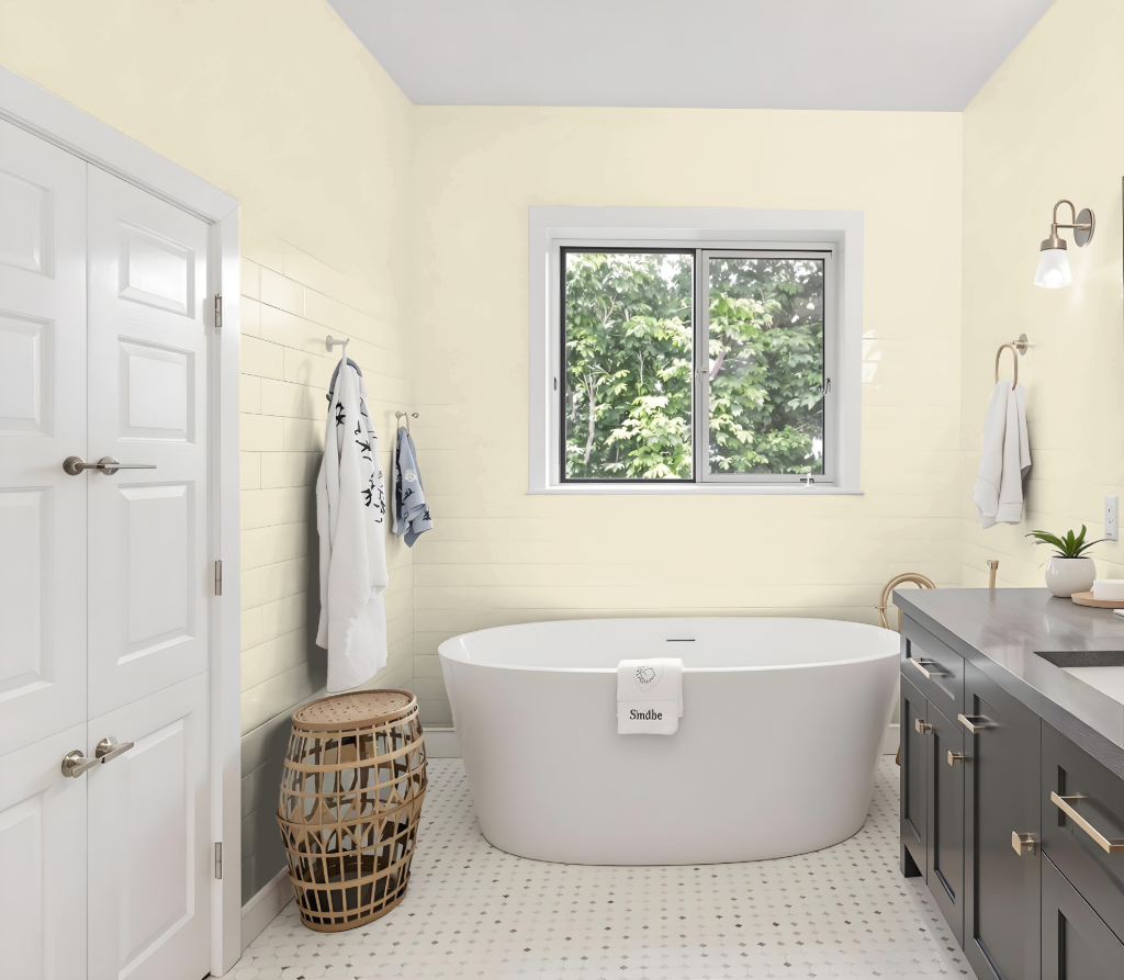
Benjamin Moore's Chatsworth Cream 225 provides an inviting hue well-suited for a bathroom, setting a warm, attractive tone for the space. For surfaces in high-traffic, humid areas, opting for finishes like Pearl, Satin, or Semi-gloss creates a smooth, moisture-resistant surface that is easier to clean and maintain.
For enhanced durability, use Pearl or Satin on the main walls and switch to Semi-gloss for trim, doors, and window frames. This approach not only boosts the bathroom's functionality but also allows for design flexibility when paired with contrasting deep hues or metallic accents to add sophistication.
Bedroom
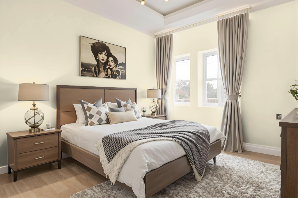
Benjamin Moore's Chatsworth Cream 225 is a sophisticated choice for a bedroom color scheme that creates an inviting and well-lit space. Its high light-reflecting quality enhances the room's brightness and spacious feel, resulting in a balanced and welcoming atmosphere.
This shade harmonizes beautifully with complementary tones for trim, furniture, or accent walls, contributing to a unified design. It consistently maintains a warm, inviting tone in both natural and artificial lighting, making it ideal for a refined and cozy bedroom environment.
Kitchen
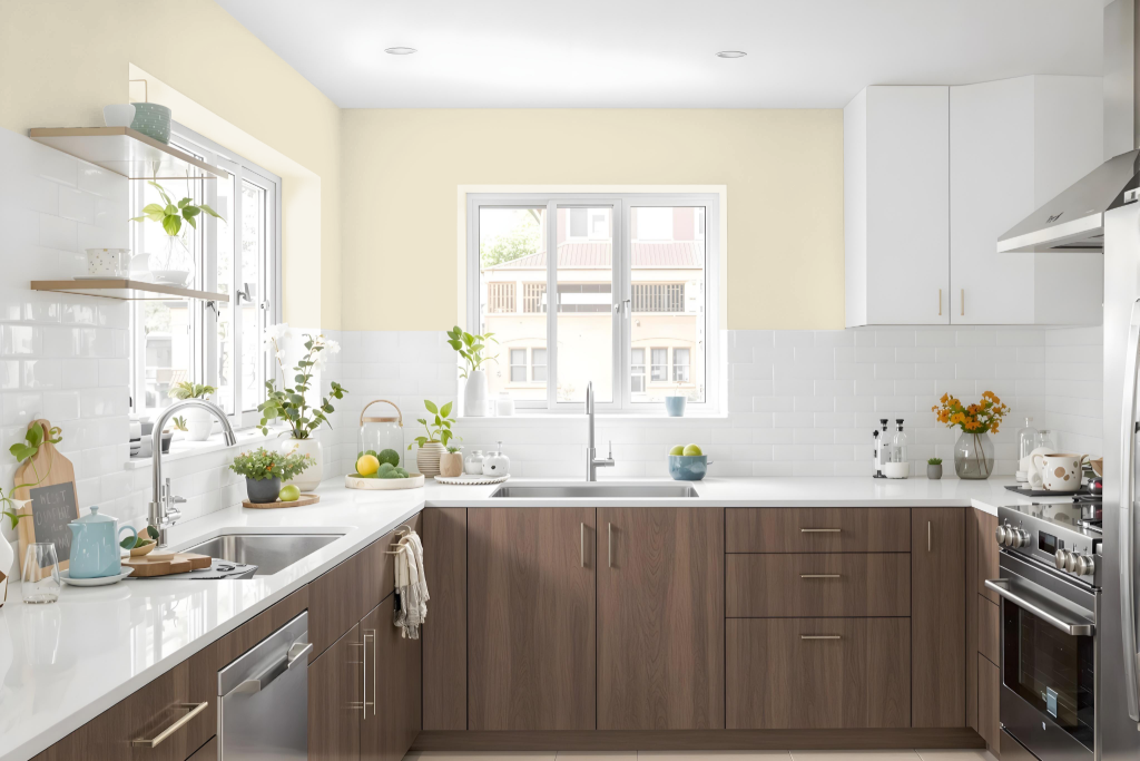
For a kitchen color scheme, Benjamin Moore's Chatsworth Cream sets a classic and inviting tone. This hue harmonizes seamlessly with both traditional and modern decor, working brilliantly with rich earth tones like olive green and terracotta to create a warm ambiance. Deep navy blue or charcoal gray accents can add a layer of sophistication, while metallic finishes such as brass or copper elevate its elegance.
To complete the design, consider pairing Chatsworth Cream with complementary hues that enhance cohesion throughout the space. Coordinated shades – including a soft khaki, a crisp white, a warm caramel, and an earthy brown – can be applied to elements like trim, cabinets, or adjacent rooms, ensuring a balanced and thoughtfully curated kitchen environment.
Living Room
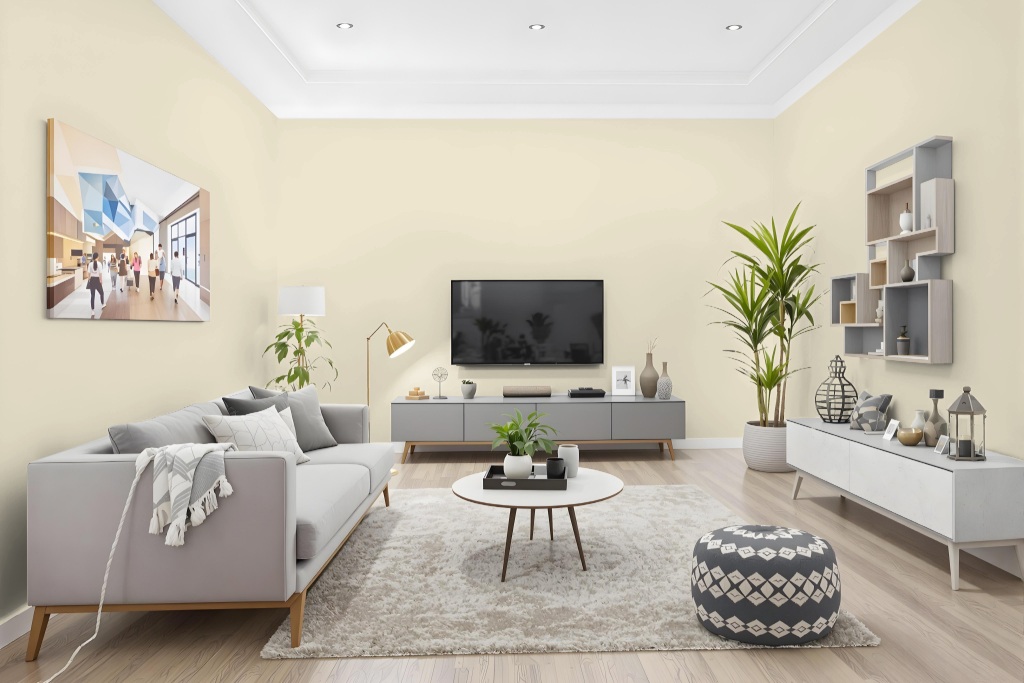
Benjamin Moore Chatsworth Cream 225 offers a warm living room color that brings a sense of refined elegance to various spaces, including bedrooms and hallways. It pairs beautifully with traditional or modern decor, complementing rich earth tones like olive and terracotta, while deep navy blue or charcoal gray adds a sophisticated accent. Accented by metallic finishes such as brass or copper, this paint creates an inviting and graceful atmosphere.
This neutral tone also works well in creating both subtle monochromatic schemes with lighter shades and more dynamic color arrangements with deeper accents. Its reflective quality ensures adaptability under varying lighting conditions, making it an excellent choice for enhancing the overall ambiance of any room.
Outdoor
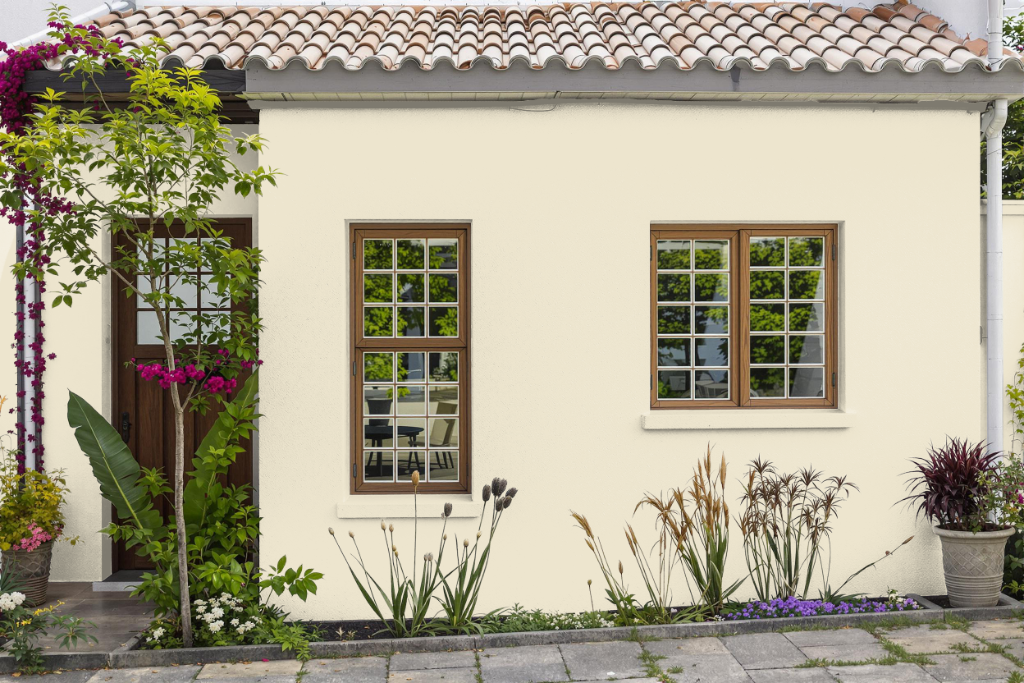
For home outdoor color, Benjamin Moore's Chatsworth Cream 225 offers a warm, inviting touch, although it is primarily an interior paint. Applying this shade outside means considering that its formulation may not withstand the elements as effectively as products specifically engineered for exterior surfaces.
To achieve optimal performance outdoors, it is recommended to use exterior paint lines that are enhanced with advanced weather-resistant technologies. Following the manufacturer's guidelines for surface preparation and application will help maintain the color's integrity and protect against environmental challenges such as staining and fading.