Benjamin Moore's Cliffside Gray HC-180 is a sophisticated shade with a subtle blend that creates a tranquil ambiance in any space. Its composition of RGB values 204, 208, 202 reflects a light gray that harmoniously balances warmth and coolness, making it versatile for various interior styles. This shade is perfect for creating a serene environment, offering an understated elegance that enhances both modern and classic decor.
Color Description
Cliffside Gray HC-180 is described as a "breezy wash of gray that conjures pale driftwood," giving it a light, airy feel.
Undertones
This color has a neutral gray tone without strong undertones, making it versatile for various design schemes.
Color Values
- LRV (Light Reflectance Value): 60.56 (moderately light)
- RGB: 204, 208, 202
Usage
Cliffside Gray HC-180 can be used both for interior and exterior applications. It is suitable for various surfaces including walls, ceilings, cabinets, and bookshelves. The color is also available in different stain opacities such as semi-transparent, semi-solid, solid, and ultra flat solid for exterior wood staining.
Atmosphere
This color creates a refined and elegant atmosphere, suitable for both traditional and contemporary spaces. It is part of Benjamin Moore's Historical Collection, inspired by America's historic landmarks and offering a timeless, classic look.
Benjamin Moore Cliffside Gray HC-180 Color Alternative
Benjamin Moore Cliffside Gray HC-180 inspires designers seeking a refined and neutral backdrop, and its alternatives offer dependable choices for those with a modern aesthetic. Tikkurila Median X486 and Tikkurila Sea Smoke X447 share a similar sophistication, making them ideal substitutes that maintain the original charm while introducing subtle nuances. Meanwhile, Tikkurila Gorgonzola G444 provides a distinctive yet complementary twist, further enriching the palette available to creative spaces.
Bathroom
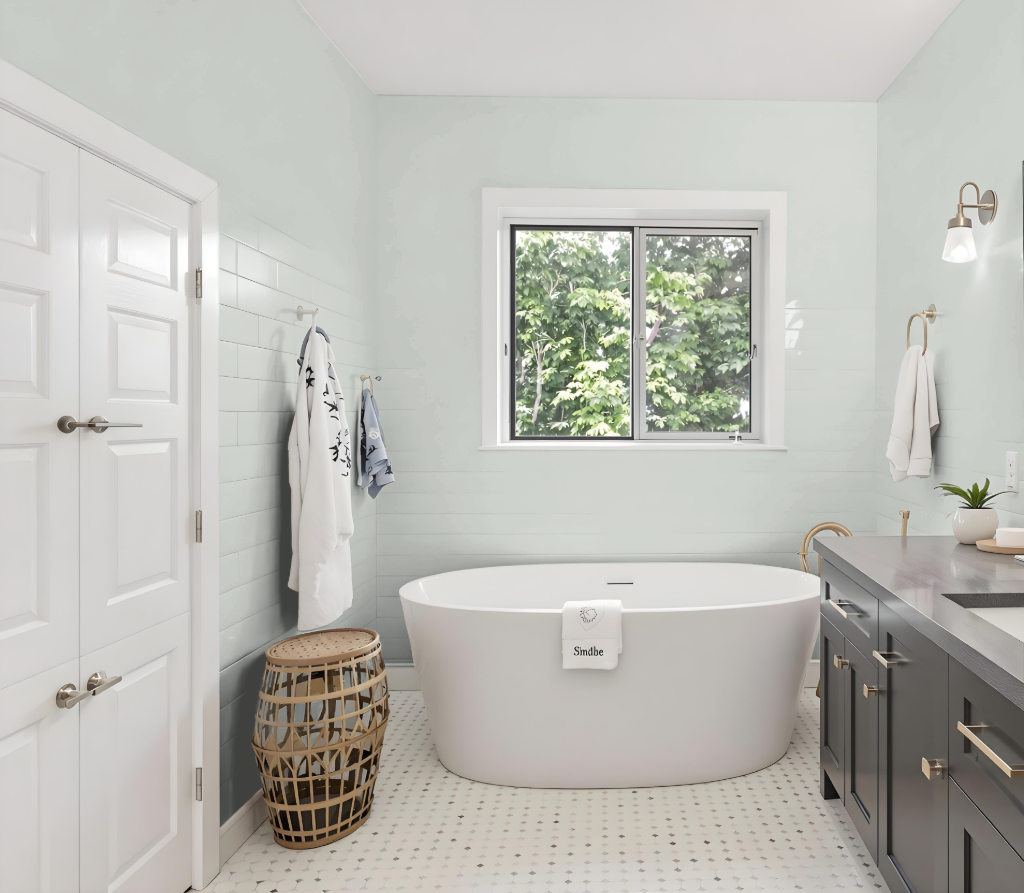
Benjamin Moore Cliffside Gray HC-180 offers an elegant bathroom color that brightens the space with its high light-reflecting quality, creating an inviting and open atmosphere. The refreshing shade uplifts the room by reflecting ample light, making it feel more spacious and airy—a perfect backdrop to showcase stylish fixtures and complementary decor.
This refined color complements both soft neutrals and darker tones, allowing for a range of design expressions from a calming ambiance to a modern, sophisticated look. Its slight green undertone harmonizes beautifully with natural materials, enhancing traditional or contemporary designs while adding a subtle touch of complexity and charm.
Bedroom
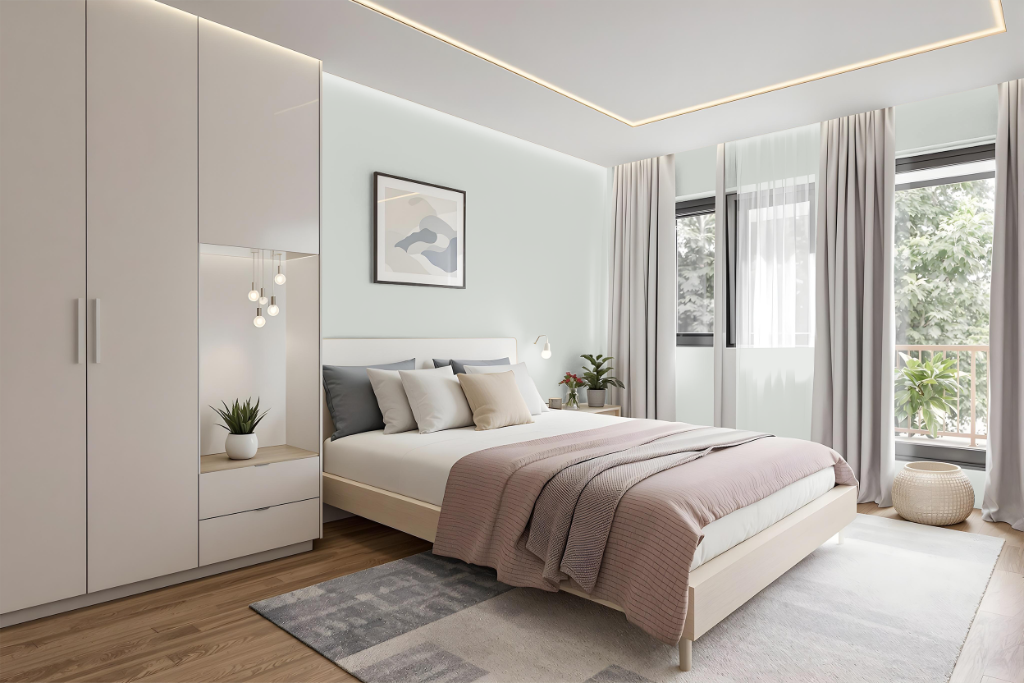
For a bedroom color scheme, Benjamin Moore Cliffside Gray HC-180 creates a calming foundation that pairs beautifully with soft neutrals such as ivory and taupe, resulting in an elegant and serene atmosphere. The hue also works well with crisp light neutrals to uplift the room’s brightness and provide an open, airy feel.
Deep, rich accents like navy or charcoal and even pops of purple add contrast and depth to the overall design. Additionally, building a monochromatic look with varying shades of gray maintains a cohesive environment, while incorporating complementary hues introduces a dynamic visual effect.
Kitchen
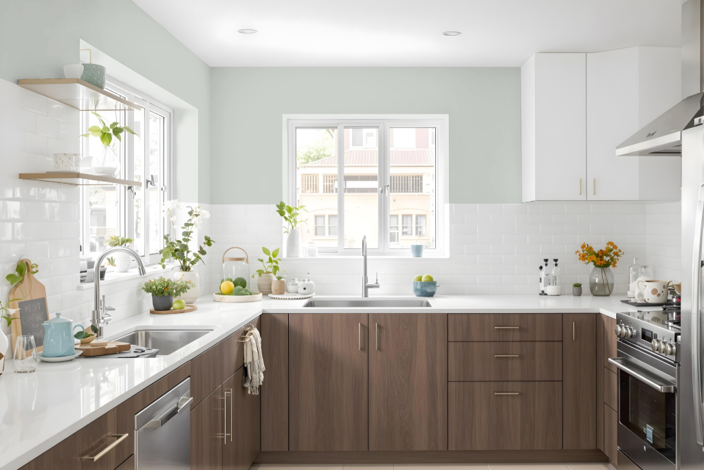
For a kitchen color scheme, Benjamin Moore Cliffside Gray HC-180 offers an elegant option that serves as the perfect backdrop for a blend of soft neutrals and dramatic accent tones. Its subtle warmth harmonizes with shades like ivory and taupe to create a calm and serene atmosphere, providing a refined setting for both traditional and contemporary kitchens.
Pairing this color with deeper hues such as navy or charcoal introduces a modern contrast that enhances depth and richness within the space. The balanced interplay of these shades, along with the use of varied finishes like satin or semi-gloss on cabinets and walls, contributes to an inviting environment that highlights thoughtful design and craftsmanship.
Living Room
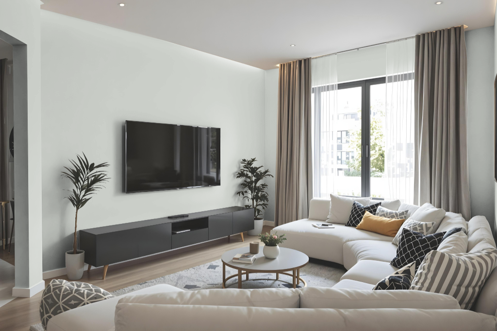
In living rooms, Benjamin Moore Cliffside Gray HC-180 creates a calming and serene atmosphere, pairing beautifully with soft neutrals such as ivory and taupe while offering a dramatic counterpoint when accented by deep navy or charcoal tones. Its soothing appearance makes it an ideal choice for establishing a refined setting that balances subtle warmth and contemporary edge.
Part of a collection inspired by America's historic landmarks, this hue honors time-tested design traditions while complementing modern interiors with its classic charm. Whether featured as a main wall color or as a thoughtful accent, it effortlessly enriches any decor scheme with a timeless and chic appeal.
Outdoor
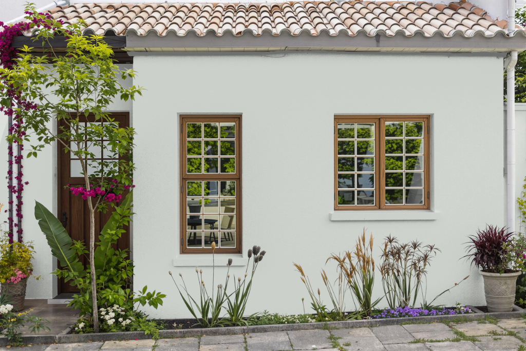
Benjamin Moore Cliffside Gray HC-180 makes a captivating home outdoor color choice, ideal for enhancing exterior spaces with style and resilience. Its formulation is engineered to adhere reliably to challenging surfaces, ensuring a smooth application even on areas that may be chalky or difficult to coat.
This exterior finish provides excellent flow, leveling, and durability against natural elements such as sun and rain. The paint also features technology that boosts color consistency and longevity, ultimately delivering impressive coverage and a polished appearance for any outdoor project.