Benjamin Moore's English Ochre CW-290, with its RGB composition of 189, 125, 72, radiates a warm, earthy tone that evokes the rich allure of natural copper. This hue balances both the warmth and depth of the seasoned metal, making it a versatile choice for creating inviting and sophisticated spaces. Its robust and timeless appeal adds a touch of classic elegance and is particularly suited for accents that aim to bring warmth and cohesion to interior designs.
Color Description
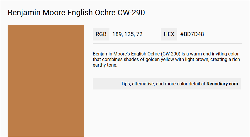
Benjamin Moore's English Ochre (CW-290) is a warm and inviting color that combines shades of golden yellow with light brown, creating a rich earthy tone.
Undertones
The undertone of English Ochre can be accurately described as a Red hue, which is evident from its color space.
Color Values
- HEX value: #BD7D48
- RGB code: 189, 125, 72
Usage
English Ochre pairs beautifully with creamy off-whites, muted greens, and soft blues to create a harmonious balance in a room. It can be used as a wall color or in accent pieces and works well with natural wood finishes or metallic accents to enhance its warmth.
Atmosphere
This color adds a touch of sophistication and creates a cozy and elegant atmosphere, making it suitable for various interior design schemes, particularly in living rooms.
Benjamin Moore English Ochre CW-290 Color Alternative
Benjamin Moore English Ochre CW-290 is celebrated for its warm, inviting hue that has inspired many designers to seek similar tones for their projects. Sherwin Williams Tassel SW 6369 offers a comparable richness, Sherwin Williams Butterscotch SW 6377 brings a soft yet distinctive golden touch, and Benjamin Moore Turmeric 2160-20 adds a modern twist with its vibrant character. These alternatives provide versatile options that maintain the spirit of Benjamin Moore English Ochre CW-290 while adapting to various stylistic needs.
Bathroom
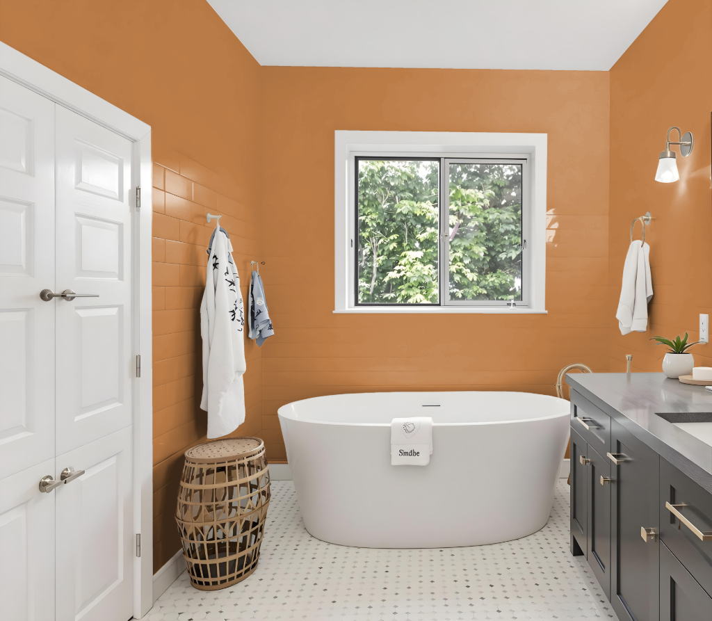
For a bathroom, Benjamin Moore’s English Ochre CW-290 provides a unique and warm atmosphere, making it a distinctive option despite its unconventional nature. Pairing this earthy tone with greens such as Nimbus Gray or Providence Blue creates a dynamic and balanced look, while using it on accent walls or decorative elements prevents the space from feeling overwhelmed.
Enhance the rich warmth of the color by incorporating natural wood finishes or metallic accents, which add depth and sophistication. In high-humidity bathroom environments, selecting a paint formulated for resistance to mildew will help maintain both the appearance and durability of this eye-catching hue.
Bedroom
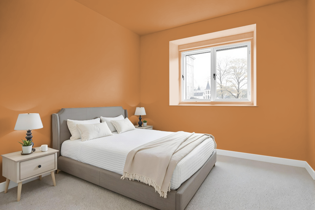
For a bedroom color scheme, Benjamin Moore's English Ochre CW-290 introduces warmth and character, making it an inviting choice for a restful yet refreshing space. This rich tone pairs well with light grey to maintain equilibrium between liveliness and tranquility, creating an atmosphere where both calm and subtly energetic accents work in harmony. Layering the ochre with muted greens or soft blues adds depth, while blush pink hints and natural wood finishes further enhance the space with a gentle elegance.
Combining complementary shades such as Parish White, Sugar Cookie, Oklahoma Wheat, and Cornice Tan for trim, furnishings, or accessories ties the look together seamlessly. Thoughtfully incorporating accent pieces ensures that English Ochre remains a focal point, contributing to an overall design that is both refined and balanced—a perfect backdrop for a bedroom that aims to inspire peace and gentle sophistication.
Kitchen
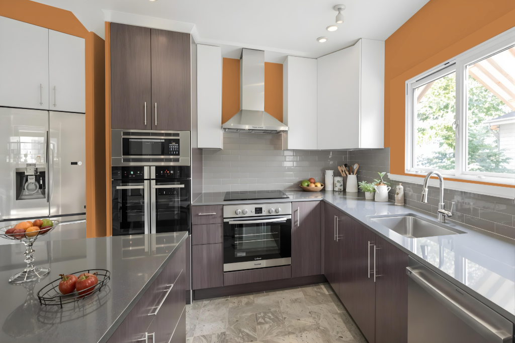
For a kitchen color scheme, English Ochre sets a warm and inviting tone that creates a distinct and cozy ambiance. This color pairs beautifully with creamy off-white shades for a refined look, and its warm undertones are balanced by lighter, golden-inspired hues on accent walls or cabinetry. Complementary accents in green and soft blue can add a dynamic contrast, enhancing the overall visual appeal.
Incorporating natural wood finishes or metallic details further enriches the design, reinforcing the warmth and sophistication of the space. Additional touches with delicate dusty pink or gentle blue accents introduce a fresh, modern twist, ensuring that the kitchen remains both vibrant and comforting.
Living Room
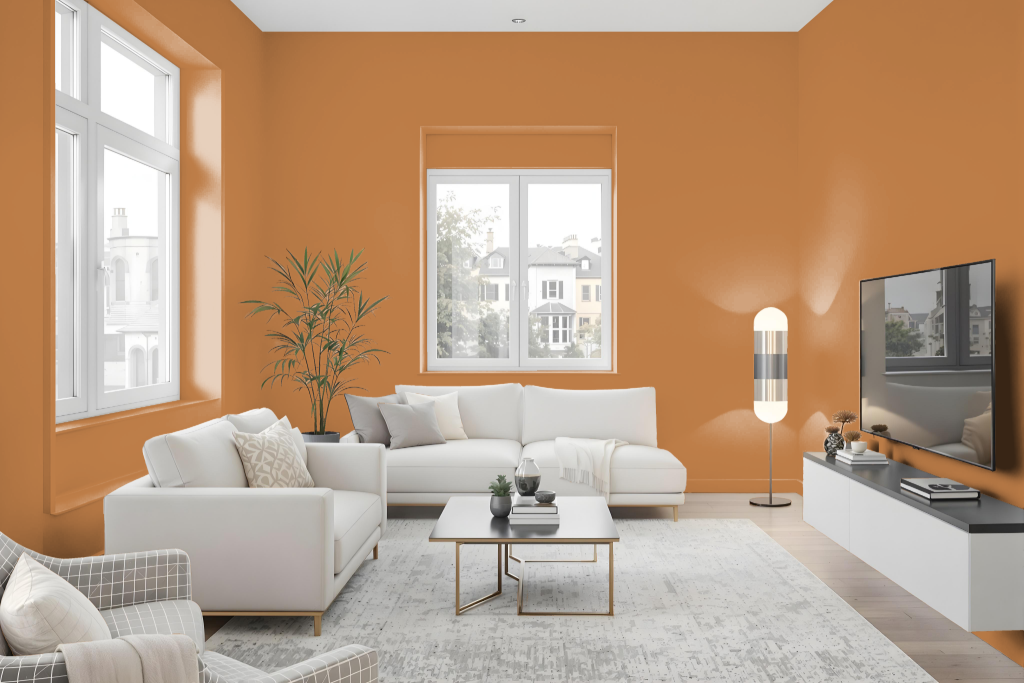
Benjamin Moore's English Ochre adds warmth and character to a living room, creating a cozy and elegant atmosphere. This inviting hue harmonizes beautifully with a range of complementary tones, including creamy off-whites, muted greens, and soft blues. To accentuate its richness, consider integrating natural wood finishes or metallic accents. For a unified look, lighter variations such as Golden Retriever, Fire Glow, Butterscotch Sundae, Roxbury Caramel, and Acorn Yellow offer a balanced monochromatic scheme, while deeper shades bring additional dimension.
Complementary choices like Nimbus Gray and Providence Blue further enhance the visual appeal, introducing a dynamic and captivating contrast. Available in finishes that cater to both low and moderate traffic areas, this sophisticated color maintains an easy-to-clean surface, blending aesthetic elegance with practical functionality.
Outdoor
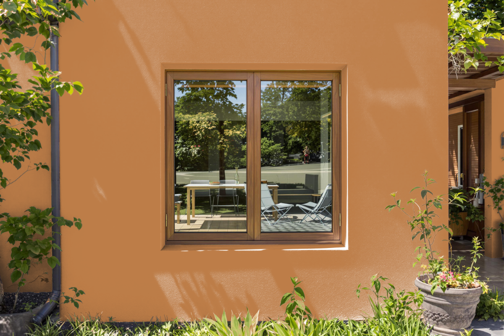
For home outdoor color, Benjamin Moore's English Ochre offers a warm and inviting hue that brings a classic appeal to exterior settings. Although originally formulated for interiors, it can be used outside if an exterior-specific finish is applied to provide the necessary durability against sun and weather. Testing the color in various lighting conditions and on different surfaces is essential to confirm it maintains the desired look over time.
When planning an outdoor project with this color, consider its interaction with complementary shades such as Nimbus Gray or Providence Blue, which can introduce dynamic contrast against natural surroundings. Such careful planning ensures that the overall palette remains attractive and responsive to changing light throughout the day.