Benjamin Moore's French Press AF-170 boasts a deep, rich hue reminiscent of freshly brewed coffee, perfectly captured by its RGB composition of 95,77,67. This earthy, warm shade is ideal for creating a cozy and inviting atmosphere in any room, exuding a sense of elegance and comfort. Whether used as an accent wall or a main color scheme, French Press brings a touch of sophistication and homeliness to interior spaces.
Color Description
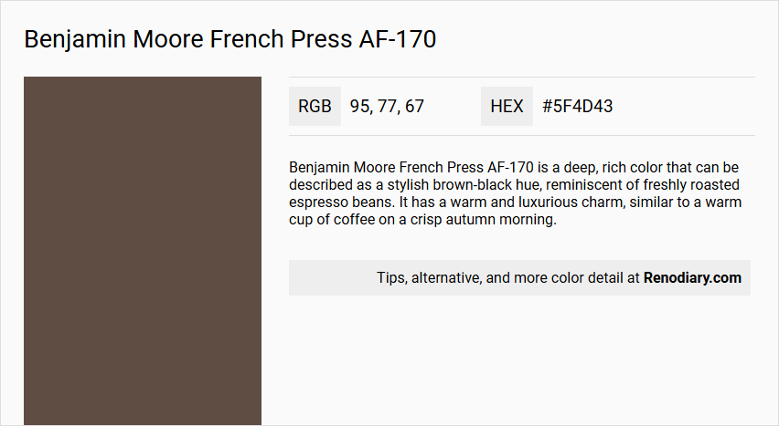
Benjamin Moore French Press AF-170 is a deep, rich color that can be described as a stylish brown-black hue, reminiscent of freshly roasted espresso beans. It has a warm and luxurious charm, similar to a warm cup of coffee on a crisp autumn morning.
Undertones
The undertone of French Press AF-170 is a red hue. This red undertone is evident when isolating the pure hue and eliminating any tints, tones, and shades.
Color Values
- HEX value: #5F4D43
- RGB code: 95, 77, 67
- LRV (Light Reflectance Value): 9.89
Usage
French Press AF-170 is versatile and can be used in both traditional and modern interiors. It pairs beautifully with soft neutrals like White Dove (OC-17) for a cozy ambiance, or with bold accent colors like Hale Navy (HC-154) for a more dramatic contrast. This color is suitable for various rooms, including living rooms, and can create a unique and inviting space.
Atmosphere
The color French Press AF-170 adds a touch of elegance and warmth to any room. It creates a cozy and inviting atmosphere, making it ideal for spaces where a rich, sophisticated look is desired. The deep, dark hue can also add depth and character to the room, especially when paired with lighter or contrasting colors.
Benjamin Moore French Press AF-170 Color Alternative
Benjamin Moore French Press AF-170 has long been celebrated for its warmth and depth in various design applications. For those seeking a color alternative, Little Greene Attic II 144, Little Greene Scullery 318, and Sherwin Williams Muddled Basil SW 7745 offer distinct yet harmonious options that can complement a range of architectural styles. Each alternative retains the strong aesthetic characteristics of the original while providing fresh perspectives for evolving interior trends.
Bathroom
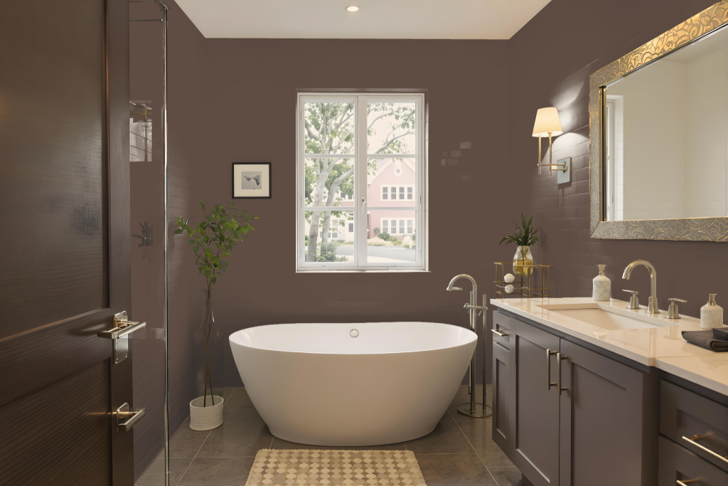
For a bathroom, Benjamin Moore's French Press AF-170 is an excellent choice, especially when paired with finishes that ensure durability in humid environments. Options like smooth finishes offer moisture resistance and ease of cleaning, while a specialized matte finish designed for high-humidity areas enhances longevity with mildew resistance and a consistently fresh look.
Complementary colors from coordinated collections can be used to achieve a harmonious aesthetic. Whether opting for bold accents or a refined monochromatic scheme that blends lighter and darker shades, the design can be tailored to create a balanced and appealing environment.
Bedroom
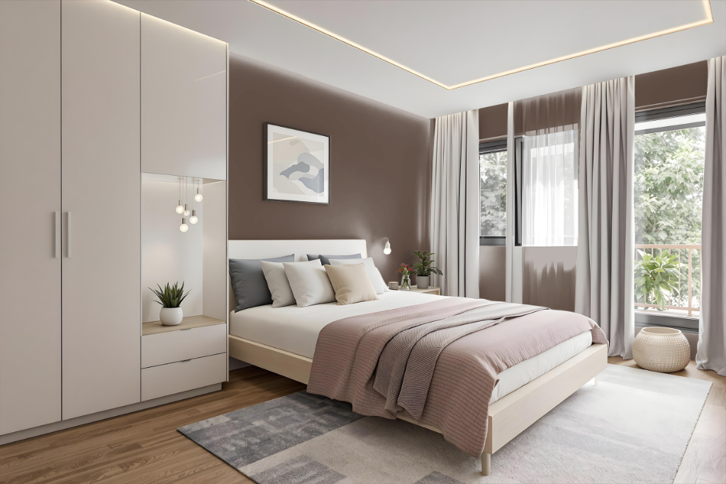
For a bedroom color scheme, French Press creates a cozy and inviting atmosphere that establishes an ideal backdrop for both calming neutrals and contrasting bold extras. Soft hues like White Dove work beautifully alongside it to maintain a serene ambiance, while a dramatic accent such as Hale Navy adds depth and character to the space.
Complement the rich tone of French Press with lighter shades used for trim and accent details, such as Ice Mist or Simply White, which enhance the overall balance of the room. Earthy tones similar to Hearthstone Brown or Van Buren Brown can be incorporated into furniture and decor to further elevate the elegant and harmonious setting.
Kitchen
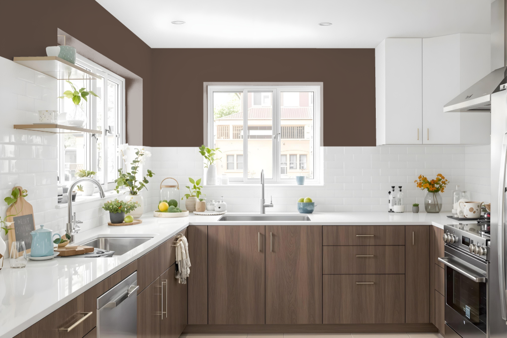
For a kitchen color scheme, Benjamin Moore French Press AF-170 sets an elegant foundation that can be paired with lighter neutrals for trim and accents to balance its deep, rich tone. Accents of a bold dark shade create dramatic contrast, while complementary hues with subtle green undertones introduce a vibrant, dynamic edge.
Additionally, a monochromatic approach using lighter and darker shades of similar browns maintains a cohesive and inviting ambiance. This thoughtfully layered palette provides plenty of ways to customize the space, whether you seek subtle sophistication or striking contrast.
Living Room
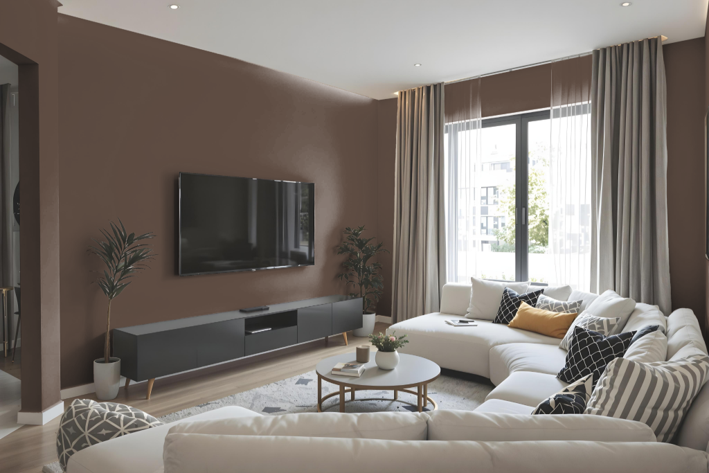
In the living room, Benjamin Moore French Press AF-170 creates a deep, inviting backdrop that pairs beautifully with soft neutrals to evoke a cozy, welcoming atmosphere. It works effortlessly with light, calming shades to soften its rich tone, while bolder accents can be introduced to add depth and character. The color is part of a curated collection designed to ensure harmony when combined with other thoughtfully selected hues.
With its rich appearance and low light reflectance, this shade is a perfect choice for spaces needing a sophisticated, dramatic edge. It can be integrated into a monochromatic scheme by coordinating with both lighter and darker tones, or it can be complemented with vibrant colors inspired by nature to enliven the overall design and create visual interest throughout the interior.
Outdoor
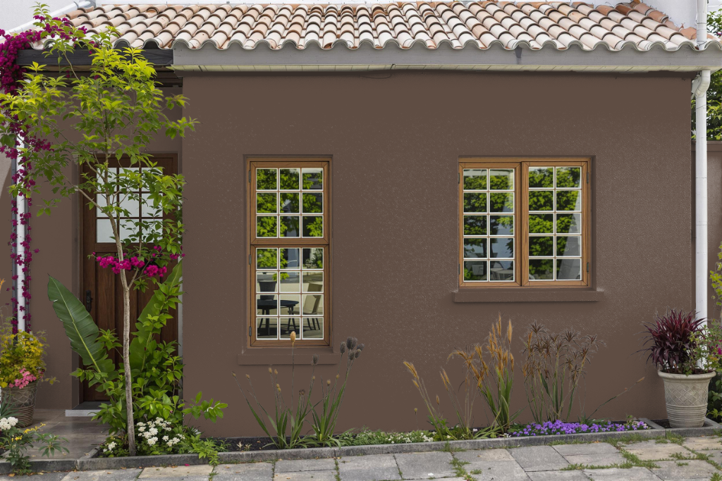
For home outdoor use, Benjamin Moore's French Press AF-170 serves as a quality color option that can extend your interior aesthetic to exterior spaces when the proper precautions are taken. Although it is primarily formulated for indoor applications, careful measures can be implemented to adapt this color for outdoor settings.
When using this paint outside, prepare the surface with an appropriate exterior primer and protect it with a clear sealant to guard against weathering and UV damage. Selecting a finish with a higher sheen—such as pearl, satin, or semi-gloss—will also contribute to greater durability and easier cleaning, ensuring that the finish withstands outdoor conditions effectively.