Benjamin Moore's Frostine AF-5 presents itself as a delicate, understated off-white, perfectly suited for creating a serene and airy atmosphere in any room. With its subtle blend of cool undertones reflected in its RGB composition of (238,241,235), it harmonizes effortlessly with both modern and classic decor styles. This versatile hue not only brightens spaces but also pairs seamlessly with a variety of accent colors, making it a prime choice for those seeking timeless elegance in their interior design.
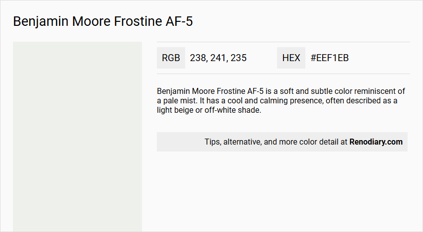
Benjamin Moore Frostine AF-5
Color Description
Benjamin Moore Frostine AF-5 is a soft and subtle color reminiscent of a pale mist. It has a cool and calming presence, often described as a light beige or off-white shade.
Undertones
The undertone of Frostine AF-5 can be accurately described as a Green hue. This green undertone is evident when isolating the pure hue and eliminating any tints, tones, and shades.
Color Values
- HEX value: #EEF1EB or #EFF1EA (slightly varying sources)
- RGB values: 238, 241, 235 or 239, 241, 234
- LRV (Light Reflectance Value): 86.93
Usage
Frostine AF-5 is versatile and can be used as a main wall color or as an accent color. It pairs well with muted shades like warm taupe or delicate peach, and it can also create a striking contrast when combined with rich navy blue or deep emerald green. It is suitable for various rooms, including bedrooms, where it can add a touch of soothing sophistication.
Atmosphere
The color Frostine AF-5 creates a sophisticated and elegant atmosphere. It adds a calming presence to any room, making it ideal for spaces where a serene and peaceful environment is desired. When used in bedrooms, it can enhance the room's tranquility.
Benjamin Moore Frostine AF-5 Color Alternative
Benjamin Moore Frostine AF-5 can be complemented by several striking alternatives. Tikkurila Calla G503, Tikkurila Paper F497, and Tikkurila Winter V503 each offer a distinct yet harmonious appeal that aligns with the modern aesthetic of Frostine AF-5. Designers and architects can confidently use these alternatives to create visually coherent and stylish spaces.
Bathroom
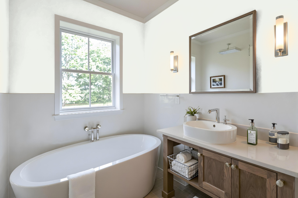
For a bathroom, Benjamin Moore's Frostine AF-5 is a notable color option when paired with a paint formulated for high-moisture environments. Utilizing a dedicated bathroom paint that resists mold and mildew while accommodating areas subjected to frequent cleaning and high humidity is essential for achieving a quality finish.
Enhancing adhesion and durability on various bathroom surfaces is also crucial, and using an appropriate primer helps ensure these benefits. By combining Frostine AF-5 with specialized bathroom formulations and a robust primer, you can attain a long-lasting, maintenance-friendly result ideal for challenging wet conditions.
Bedroom
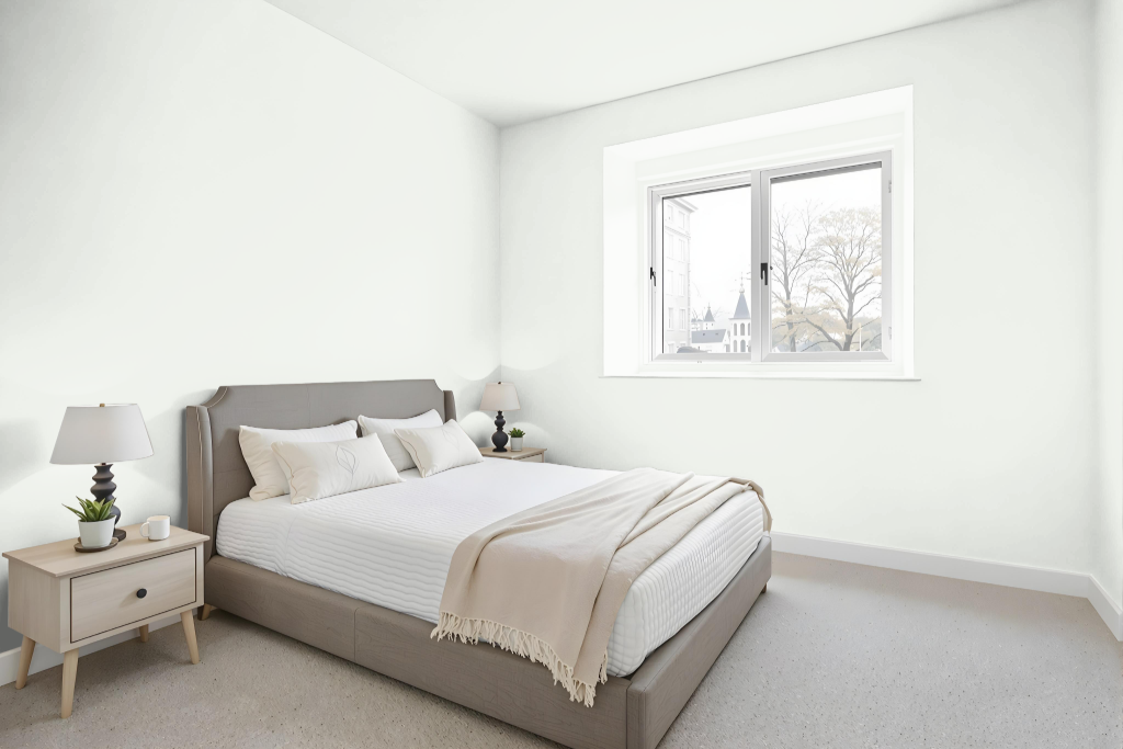
For a bedroom, Benjamin Moore's Frostine AF-5 provides a bright, airy backdrop that enhances the space with its light-enhancing qualities. Its finish options, including eggshell and satin, offer a softly polished glow while matte or flat finishes are ideal for disguising surface imperfections.
Pair Frostine AF-5 with harmonizing hues such as Eternity AF-695, Healing Aloe 1562, or Seattle Mist 1535 to achieve a cohesive and tranquil aesthetic that perfectly complements the overall decor.
Kitchen
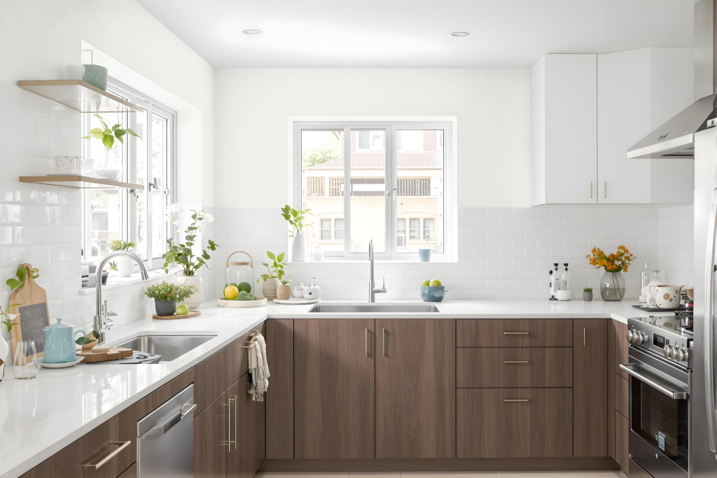
Benjamin Moore Frostine AF-5 offers a cool and calming presence ideal for kitchen spaces. Its refined undertones make it a popular choice for accent areas like trim and ceilings, enhancing a cool color palette and creating an inviting backdrop. Pairing this shade with deep navy blue or rich emerald green introduces striking contrast, while combinations with muted hues such as warm taupe or delicate peach foster an atmosphere of sophistication and elegance.
In addition to its aesthetic appeal, its high light reflectance contributes to a brighter, more spacious feel in the kitchen, adding depth and interest to the overall design. This adaptability allows homeowners to explore various styling options, from monochromatic themes to complementary color pairings, ensuring a harmonious and inviting environment.
Living Room
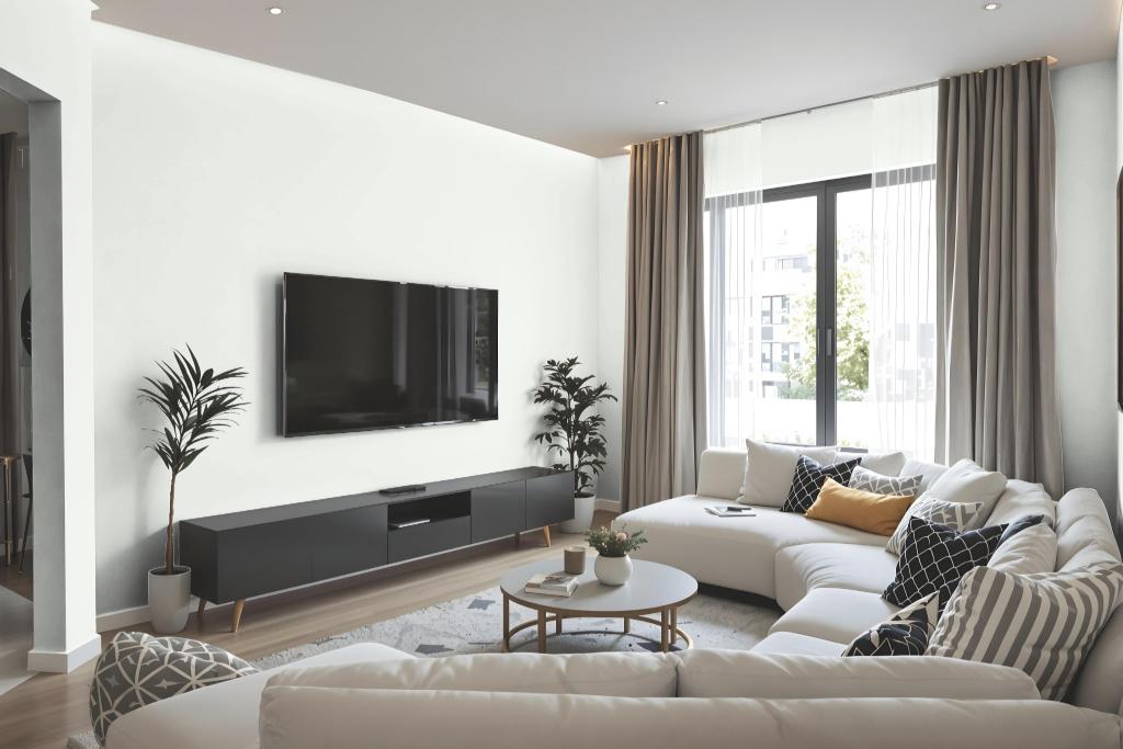
Benjamin Moore Frostine AF-5 enhances a living room with a bright, airy feel and adds an elegant touch to the overall ambiance. This sophisticated color blends seamlessly with muted shades such as warm taupe or delicate peach, creating a refined and inviting environment.
For a bolder impact, it pairs beautifully with deeper hues like rich navy blue or deep emerald green to introduce dramatic depth and interest. Ideal for use as an accent or on trim and ceilings, this color ensures that spaces remain open and engaging while providing a fresh, balanced backdrop.
Outdoor
Benjamin Moore Frostine AF-5 offers an attractive home outdoor color option that blends aesthetic appeal with robust performance. Although often used indoors, this hue can work well on exterior surfaces when applied with formulations crafted for outdoor endurance.
For exterior applications, selecting a product designed to withstand environmental challenges—such as those that incorporate cutting-edge technologies for color retention, fade resistance, and mildew protection—is essential. These paints deliver excellent coverage with fewer coats and easy cleaning, provided that surfaces are properly prepped and the finish is carefully chosen to optimize longevity and performance.