Benjamin Moore's Hudson Bay 1680 is a distinctive shade that elegantly blends blue with subtle gray undertones. Its RGB composition of 63, 82, 102 captures a deep yet soft hue, reminiscent of serene coastal waters. This versatile color can evoke a calming ambiance, making it an ideal choice for both contemporary and classic interior designs.
Color Description
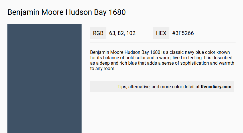
Benjamin Moore Hudson Bay 1680 is a classic navy blue color known for its balance of bold color and a warm, lived-in feeling. It is described as a deep and rich blue that adds a sense of sophistication and warmth to any room.
Undertones
The undertone of Hudson Bay 1680 is accurately described as a pure blue hue, without any significant tints, tones, or shades that would alter its primary blue character.
Color Values
- HEX Value: #3F5266
- RGB Code: 63, 82, 102
- Light Reflectance Value (LRV): 9.77 (reflects a relatively low percentage of light)
Usage
Hudson Bay 1680 can be used on walls or as an accent color. It pairs well with neutrals like White Dove OC-17 or soft greys such as Stonington Gray HC-170 to create a modern and inviting palette. It is versatile and can complement both traditional and modern decor.
Atmosphere
This color brings a timeless elegance and sophistication to any room. It enhances the luxurious feel when paired with metallic accents in gold or bronze. The warm and lived-in feeling it provides makes it suitable for creating a cozy and inviting atmosphere in living rooms, hallways, and other spaces.
Benjamin Moore Hudson Bay 1680 Color Alternative
Benjamin Moore Hudson Bay 1680 is a distinctive hue that brings depth and character to any space. Color alternative for Benjamin Moore Hudson Bay 1680 are: Tikkurila N431, Dulux Midnight Teal 90BG 11/101, Dulux Breton Blue 30BB 10/112, each offering a unique twist on this captivating tone. These options allow designers to explore complementary atmospheres while maintaining the timeless appeal inherent in Benjamin Moore Hudson Bay 1680.
Bathroom
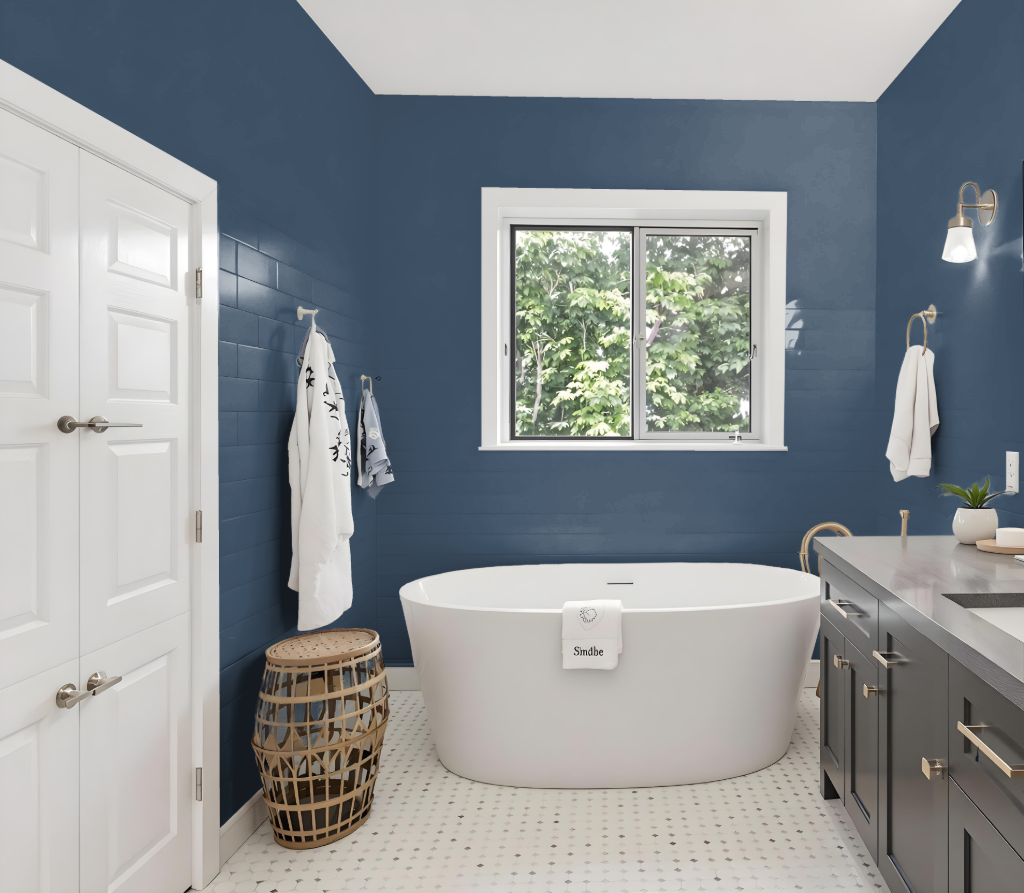
For a bathroom, Benjamin Moore's Hudson Bay 1680 creates a fresh, inviting ambiance as part of the Classic Collection. Paired with finishes like Aura Bath & Spa, this color is specially formulated for high-humidity environments such as bathrooms and spas, ensuring durability with its mildew-resistant properties.
The paint is available in diverse sheens, offering a washable solution for practical bathroom upkeep. Moreover, Hudson Bay 1680 can be gracefully harmonized with neutral tones or complementary shades to enhance and personalize your bathroom decor.
Bedroom
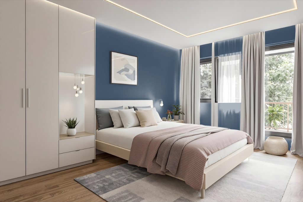
For a bedroom color scheme, incorporating Benjamin Moore's Hudson Bay 1680 as the dominant tone creates a bold and sophisticated backdrop that serves as a foundation for both contrast and harmony. Pairing this deep hue with neutral shades like White Dove or soft greys such as Stonington Gray creates an inviting atmosphere, while refined metallic accents in gold or bronze add an extra layer of luxury.
Introducing complementary colors with warm undertones, like those found in options such as Night Shade or Woodcliff Lake, infuses the space with dynamic energy and visual interest. Utilizing lighter shades for trim or accents, such as Muslin or Seashell, effectively contrasts with the deeper tone, ensuring a balanced and engaging design throughout the room.
Kitchen
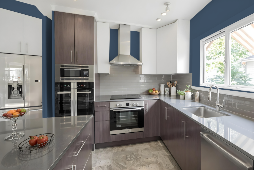
For a kitchen color scheme, Benjamin Moore’s Hudson Bay 1680 offers a bold and sophisticated backdrop that can be elevated by pairing it with lighter neutrals and soft greys. The contrast between the deep hue and airy lighter shades builds a modern yet inviting space, perfect for creating visual interest without overwhelming the room.
Application ideas include using Hudson Bay on kitchen cabinets or as a statement wall, complemented by metallic accents in gold or bronze for a touch of luxury. To add depth, consider integrating complementary colors with an orange hue, creating a dynamic balance that enhances the overall ambiance of the kitchen.
Living Room
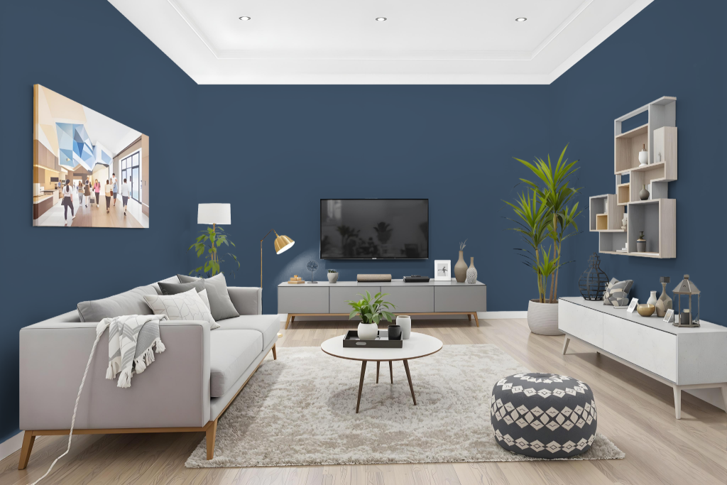
Benjamin Moore's Hudson Bay 1680 makes a distinctive statement in a living room, setting the stage for a modern and inviting atmosphere. It creates an engaging backdrop when paired with soft, neutral tones like White Dove or gentle greys, laying the foundation for a refined interior design.
Enhance the space further with accents in gold or bronze to add a luxurious highlight, while complementary matching shades such as Seashell, Muslin, or Maple Syrup reinforce a unified look. This color harmonizes well within both subtle monochromatic arrangements and dynamic contrasting schemes, allowing for a balanced yet striking overall palette.
Outdoor
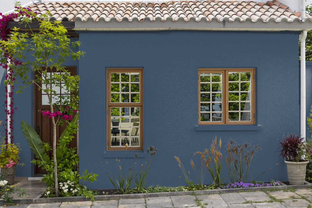
Home outdoor color Hudson Bay 1680 transforms exterior spaces with a rich, enduring appeal, offering a stylish option for those seeking an elegant finish. Hailing from a collection celebrated for its classic hues, this shade is backed by a reputation for excellent coverage and robust performance against changing weather conditions.
Enhanced by advanced technologies that ensure deep, lasting pigment and resistance to fading or rubbing off, this paint maintains its beauty over time while being easy to clean. Designed to withstand the challenges of outdoor environments, it delivers reliable durability and a finish that stands up to the test of time.