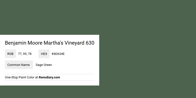
Benjamin Moore's Martha's Vineyard 630 boasts a sophisticated sage green hue, encapsulated by its RGB composition of 77, 99, 78. This shade exudes a calming and earthy ambiance, making it a popular choice for both contemporary and traditional interiors. Its versatility enables it to harmonize beautifully with a variety of accent colors, enhancing the overall aesthetic appeal of any space.
Color Description
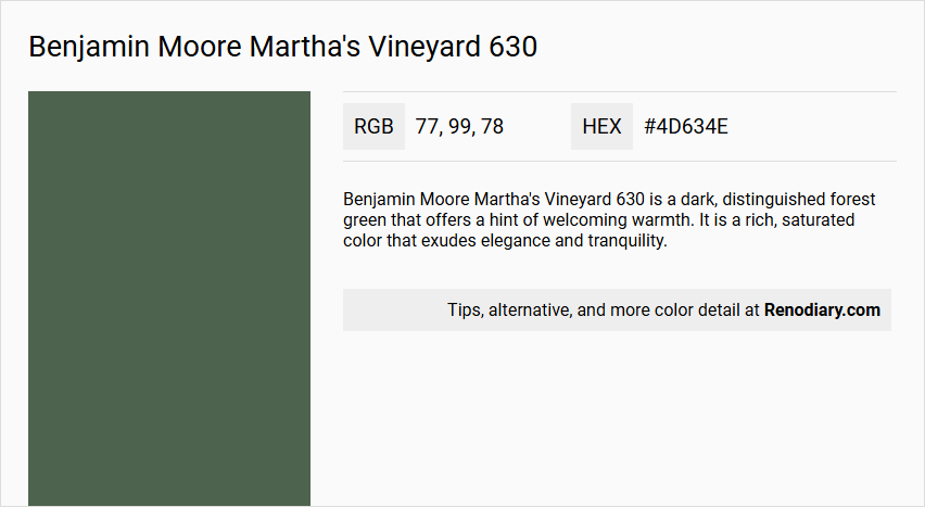
Benjamin Moore Martha's Vineyard 630 is a dark, distinguished forest green that offers a hint of welcoming warmth. It is a rich, saturated color that exudes elegance and tranquility.
Undertones
The undertone of Martha's Vineyard 630 is predominantly a green hue. This color does not have significant undertones of other colors, maintaining a pure green tone.
Color Values
- HEX Value: #4D634E
- RGB Code: 77, 99, 78
Usage
This color pairs beautifully with creamy off-whites, warm grays, and earthy greens to create a sophisticated yet inviting palette. It can be used as a bold statement on walls or in smaller doses through decor to add a touch of luxury and timeless charm to any room. Accents of gold or brass can enhance its luxurious feel.
Atmosphere
Martha's Vineyard 630 creates a unique and sophisticated space, lending a sense of elegance and tranquility. It can make a room feel luxurious and inviting, especially when complemented with the right accents and coordinating colors.
Benjamin Moore Martha's Vineyard 630 Color Alternative
Benjamin Moore Martha's Vineyard 630 is a renowned color that delivers a refreshing yet timeless appeal in any space. For those seeking an alternative, Farrow and Ball Beverly 310 provides a similarly elegant vibe with its rich undertones, while Benjamin Moore Lafayette Green HC-135 offers a slightly bolder yet complementary option. Additionally, Benjamin Moore Dakota Shadow 448 serves as another intriguing alternative, allowing for creative versatility while maintaining a harmonious connection to the original shade.
Bathroom
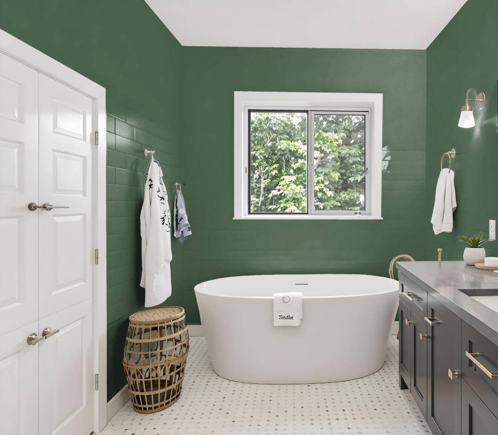
Benjamin Moore's Martha's Vineyard 630 makes an elegant and sophisticated choice for a bathroom, offering a dark, rich hue that sets a timeless tone. This hue, showcased in the Classic Color Collection, works beautifully when enhanced with lighter shades for trim and accents, creating a striking contrast that uplifts the overall space.
For a cohesive design, balance the depth of Martha's Vineyard 630 with neutral tones that foster a harmonious atmosphere. The inclusion of metallic accents adds a touch of luxury, ensuring the bathroom feels inviting and thoughtfully curated.
Bedroom
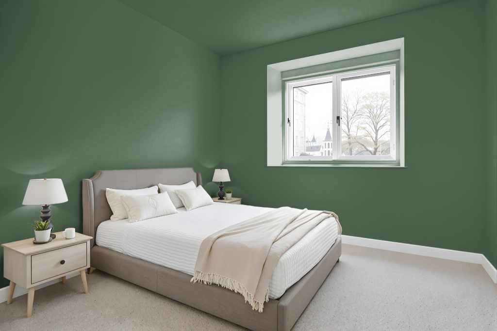
For a bedroom color scheme, Benjamin Moore's Martha's Vineyard 630 offers a deep and rich backdrop that exudes sophistication. Pair this bold hue with creamy off-whites, warm grays, and earthy greens to balance the intensity, with selective accents of gold or brass for an added touch of luxury. A monochromatic approach using lighter shades from the same family can also create depth without overwhelming the space.
Alternatively, introducing shades with a subtle purple undertone—reminiscent of options like Iris Bliss or Grappa—infuses vibrant energy and visual interest into the room. Coordinated options such as Cloud Nine and Horizon Gray can further enhance the overall aesthetic, ensuring a harmonious blend of warmth and drama throughout the space.
Kitchen
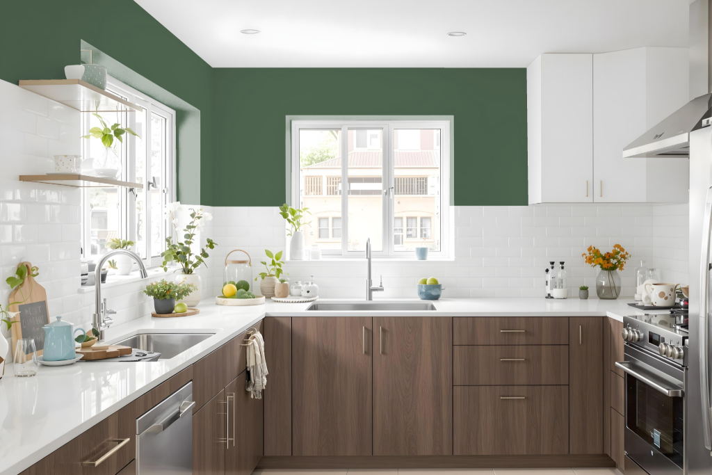
For a kitchen color scheme, Benjamin Moore's Martha's Vineyard 630 infuses the space with sophistication and depth. This enriched shade pairs beautifully with creamy off-whites, warm grays, and earthy greens, creating an inviting palette that can be used to make a bold statement on walls or as an accent on cabinets and islands to define different areas.
Accented with hints of gold or brass, the deep tone elevates its luxury feel and works seamlessly within designs that feature lighter, harmonious hues or complementary shades with purple undertones for a vibrant effect. Additionally, its darker surface proves practical, effectively concealing dirt and stains in high-traffic kitchen areas.
Living Room
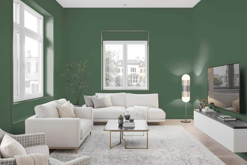
Benjamin Moore Martha's Vineyard 630 is a distinctive living room color that sets a cozy, inviting tone with its deep, rich presence. Designed for spaces with abundant natural light, this elegant shade remains resilient under strong sunlight and brings depth to any well-illuminated setting.
It pairs beautifully with creamy off-whites, warm grays, and earthy greens, while accents in gold or brass highlight its luxurious appeal. Used as an accent wall or in smaller decor elements, the hue adds a touch of timeless charm and sophistication to the overall design.
Outdoor
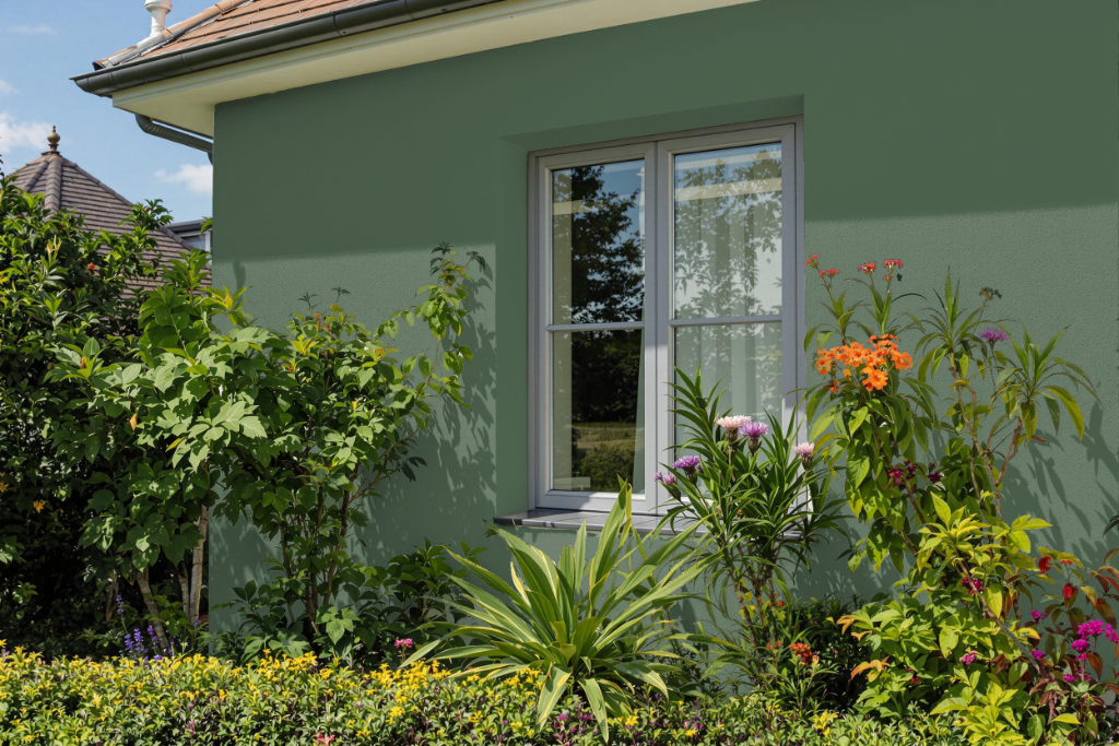
For home outdoor color, Martha’s Vineyard 630 by Benjamin Moore presents a distinctive option that withstands the challenges of exterior environments. This paint is formulated to resist stains and fading, ensuring that its warm, inviting hue remains consistent even when exposed to the elements.
Its advanced formulation delivers a robust layer that offers exceptional coverage and lasting performance. With enhanced durability, ease of cleaning, and protection against weather conditions, it serves as a reliable choice for updating outdoor surfaces and preserving curb appeal.