Benjamin Moore's Montpelier AF-555 is a sophisticated hue, commonly referred to as Slate Gray, which brings a subtle elegance to any interior space. With its balanced RGB composition of 113, 128, and 135, this distinctive shade provides a harmonious blend of cool undertones, making it a versatile choice for both contemporary and classic design schemes. Ideal for creating a calming atmosphere, Slate Gray offers a timeless quality that enhances natural and artificial lighting alike.
Color Description
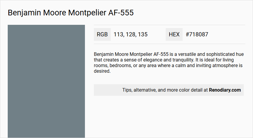
Benjamin Moore Montpelier AF-555 is a versatile and sophisticated hue that creates a sense of elegance and tranquility. It is ideal for living rooms, bedrooms, or any area where a calm and inviting atmosphere is desired.
Undertones
The undertone of Montpelier AF-555 can be accurately described as a Blue hue.
Color Values
- HEX value: #718087 or #708186 (slightly varying depending on the source).
- RGB values: 113, 128, 135 or 112, 129, 134 (slightly varying depending on the source).
- LRV (Light Reflectance Value): 20.86.
Usage
Montpelier AF-555 can be used as either an accent or main color. It pairs beautifully with warm neutrals like off-white and beige, and also complements light grey or soft pastels to enhance its timeless appeal.
Atmosphere
This color adds a touch of refined style to any interior scheme, creating a calm and inviting atmosphere. It is suitable for spaces where elegance and tranquility are desired.
Benjamin Moore Montpelier AF-555 Color Alternative
Benjamin Moore Montpelier AF-555 has inspired a range of striking alternatives that offer distinct vibes while retaining its sophisticated essence. For those considering a fresh approach, Tikkurila Surf S500 presents a bright interpretation, Sherwin Williams Blustery Sky SW 9140 introduces a cooler tonal balance, and Sherwin Williams Downing Slate SW 2819 offers a grounded, contemporary twist. Each alternative provides unique characteristics that expand creative opportunities when reimagining spaces without losing the foundational appeal of Benjamin Moore Montpelier AF-555.
Bathroom
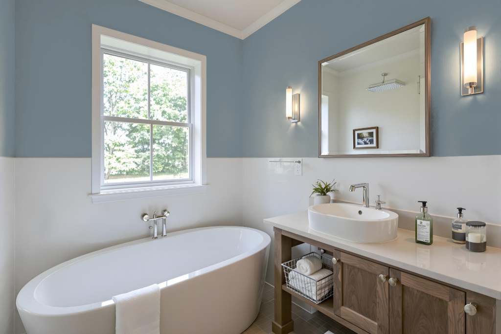
For a bathroom, Benjamin Moore's Montpelier AF-555 stands out as a strong choice due to its durability and maintenance-friendly qualities. This color, part of a well-curated collection designed for harmony and ease of selection, works well with finishes that create smooth, less porous surfaces, making cleaning simpler and handling moisture and high traffic much easier.
Complementing this selection, premium paint lines offer exceptional resistance to stains, dirt, and fading. Their formulations make them highly washable across various finishes, ensuring that the bathroom maintains its fresh look even in demanding conditions.
Bedroom
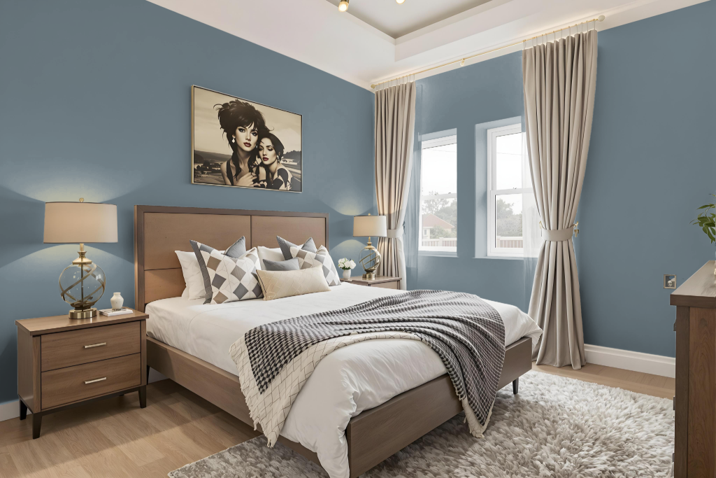
A bedroom adorned with Benjamin Moore's Montpelier AF-555 sets an intimate, cozy tone with its deep, sophisticated hue. This color, part of an exclusive collection designed to express bold yet refined visions, provides a strong foundation for creating a relaxing retreat.
Harmonious pairings with complementary hues enhance its rich character, allowing for thoughtful coordination in any space. Its formulation, optimized for indoor use with reduced emissions, contributes to creating a healthy and inviting environment.
Kitchen
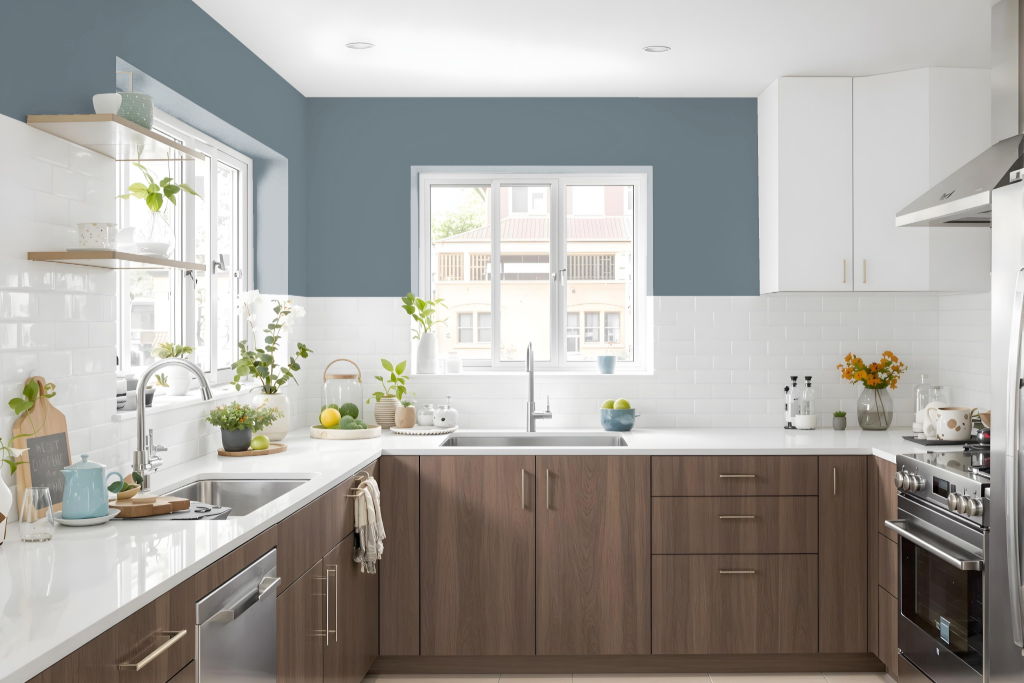
For a kitchen color scheme, Benjamin Moore’s Montpelier AF-555 brings a refined and harmonious feel to the space. It pairs effortlessly with adjacent hues in the Affinity Colour Collection, allowing for flexible integration with shades that create either a subtle monochromatic effect or an eye-catching contrast.
Montpelier AF-555 can serve as a standout choice for cabinetry or accent walls, seamlessly complementing other kitchen elements such as countertops, backsplashes, and fixtures. Whether combined with lighter tones for a soothing appeal, warmer neutrals for a traditional look, or soft pastels for a modern twist, this color contributes to an elegant and cohesive overall design.
Living Room
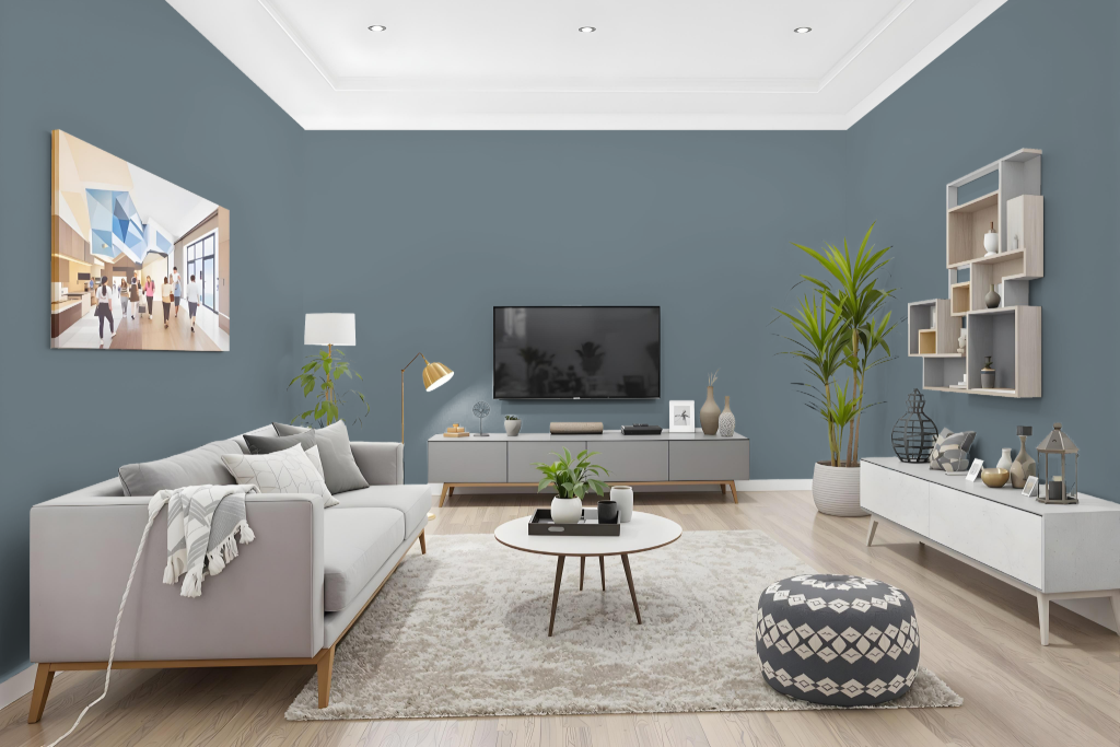
Benjamin Moore Montpelier AF-555 makes an excellent living room choice, creating a calm and inviting atmosphere. It pairs beautifully with warm neutrals like off-white and beige, as well as light grey and soft pastels that enhance its timeless appeal and add a subtle layer of modernity.
As part of the Affinity Colour Collection, Montpelier AF-555 works seamlessly with other colors in the palette to form harmonious schemes. Its varied finishes provide lasting performance with resistance to fading and scuffing, ensuring both aesthetic beauty and enduring durability.
Outdoor
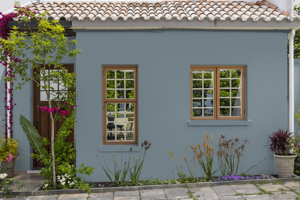
For home outdoor color, Benjamin Moore’s Montpelier AF-555 offers an attractive option for creating a seamless look between interior and exterior spaces. While this color works beautifully under indoor conditions, applying it to exterior surfaces requires careful consideration of paint durability.
To ensure lasting vibrancy and performance outdoors, it is advisable to select paint lines specifically formulated for exterior use. These products provide enhanced resistance to weathering, UV rays, and moisture while maintaining strong adhesion on outdoor surfaces. Checking with local retailers for VOC regulations and available options can help you make the best choice for enduring, outdoor application.