Benjamin Moore's Nelson Blue CW-635 exhibits a serene blend of hues that culminates in a soft light gray appearance, complemented by its RGB composition of 206, 214, and 208, which conveys a balanced and tranquil ambiance. This gentle shade harmoniously aligns with both contemporary and classic decor styles, serving as a versatile background that enhances any living space. Whether used in a living room or bedroom, its understated elegance invites a sense of calm and relaxation.
Color Description
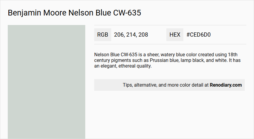
Nelson Blue CW-635 is a sheer, watery blue color created using 18th century pigments such as Prussian blue, lamp black, and white. It has an elegant, ethereal quality.
Undertones
The color features undertones of Prussian blue, which gives it a slightly cooler and more muted blue hue, balanced by the addition of lamp black and white.
Color Values
- LRV (Light Reflectance Value): 65.4, indicating a moderate light reflectance.
- RGB: 206, 214, 208.
Usage
This color is suitable for various interior spaces, including living rooms, hallways, and bedrooms. It can be paired with other colors like Harwood Putty, Distant Gray, Carter Gray, and Bermuda Blue for a cohesive look.
Atmosphere
Nelson Blue CW-635 creates a serene and elegant atmosphere, making it ideal for spaces where a calm and ethereal ambiance is desired. The color's sheer quality helps to reflect light softly, enhancing the overall aesthetic of the room.
Benjamin Moore Nelson Blue CW-635 Color Alternative
Benjamin Moore Nelson Blue CW-635 exhibits a timeless and calming character that makes it a favorite for both modern and traditional design schemes. As an alternative, Tikkurila Sea Smoke X447 offers a similarly composed yet subtly differentiated hue that can lend a fresh perspective to any space. Additionally, Tikkurila G488 and Tikkurila Tuft H495 provide designers with versatile options that maintain the sophisticated appeal of Benjamin Moore Nelson Blue CW-635 while introducing their unique tonal subtleties.
Bathroom
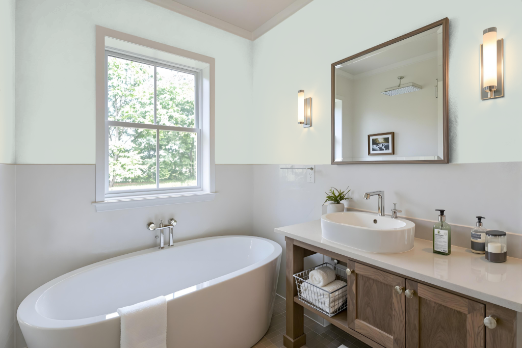
In a bathroom setting, Benjamin Moore's Nelson Blue creates an elegant and soothing ambiance. Drawing inspiration from America’s Colonial Period but refreshed with modern elements, this rich hue sets the stage for a classic yet contemporary look.
Pair Nelson Blue with crisp white tones for a striking contrast or warm neutrals for a cozier feel. Its compatibility with various finishes, including those ideal for high-humidity areas, further enhances the creation of a serene, spa-like environment perfect for relaxation.
Bedroom
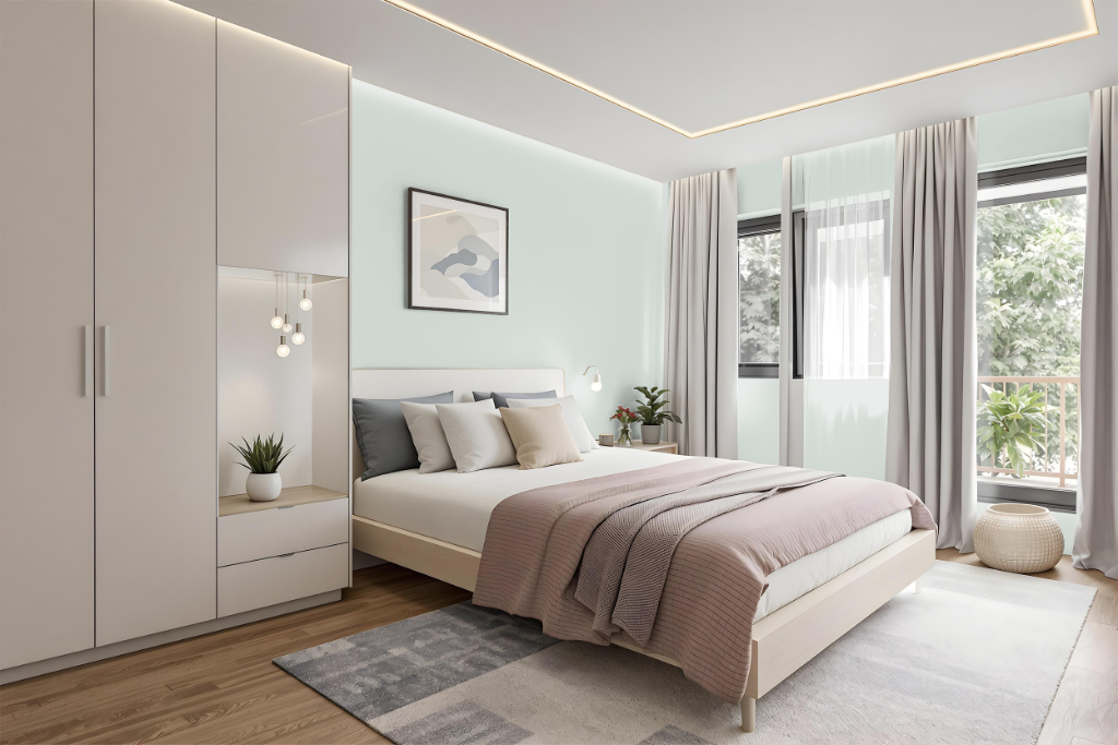
For a bedroom color scheme, Benjamin Moore's Nelson Blue CW-635 creates a serene and welcoming environment. Pair this soothing color with crisp white accents on trim or furniture to emphasize its calming nature, or mix in warm neutral tones like Tawny Daylily for a cozier feel. Metallic accents in fixtures and decor further elevate the elegance of the space.
For an additional layer of visual interest, consider using accents from a complementary palette with hints of purple undertones. Whether applied on walls, furniture, or decor elements, these well-chosen pairings help craft a unique and stylish bedroom retreat.
Kitchen
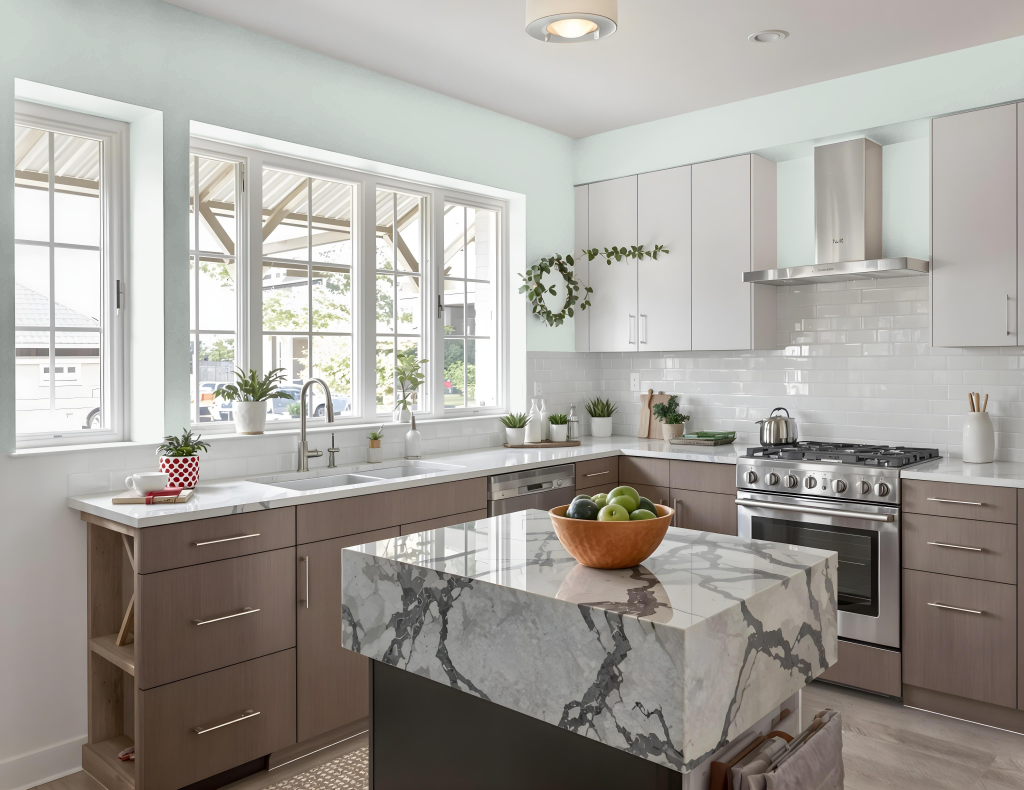
For a kitchen color scheme, Benjamin Moore Nelson Blue CW-635 exudes a classic charm that refreshes the space with a bright, airy feel. When paired with crisp white accents for trim, cabinets, and countertops, this cool hue creates a timeless backdrop that balances light and dark design elements. Warm neutrals, such as Tawny Daylily, further enhance the inviting atmosphere, while metallic fixtures add a touch of understated elegance.
Additional design details, like pairing this blue with slate or other natural materials, reinforce a cohesive look throughout the room. The strategic use of Nelson Blue on walls helps to unify the space, making even darker cabinetry appear integrated, and ensuring every accent complements the overall design scheme.
Living Room
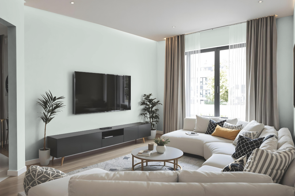
In living rooms, Benjamin Moore’s Nelson Blue CW-635 creates a captivating backdrop that transforms the space into an inviting retreat. It pairs gracefully with crisp white accents for a classic appeal or with warm neutrals for a snug and welcoming atmosphere.
For an engaging visual dynamic, complementing this hue with colors hinting at subtle purple tones can introduce depth and interest. Additionally, incorporating metallic finishes through fixtures or decor adds an element of refinement and chic elegance to the overall design.
Outdoor
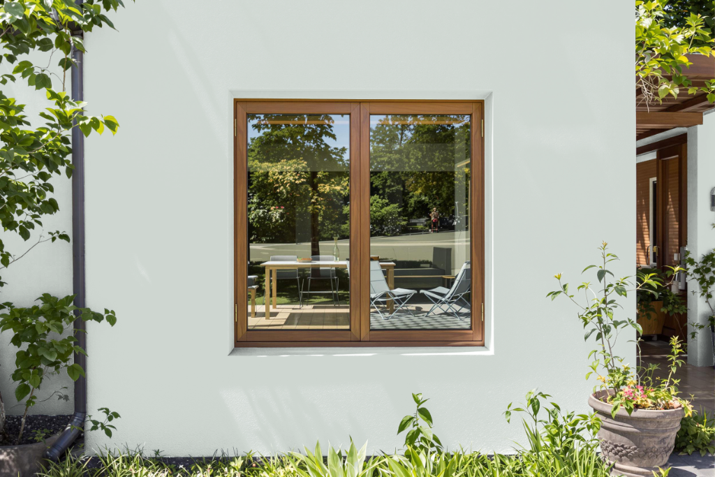
When considering a home outdoor color like Benjamin Moore Nelson Blue CW-635, it’s important to note that this shade isn’t formulated to withstand prolonged sun and weather exposure. While its sophisticated blue hue works beautifully indoors on walls, accents, or furniture to create a tranquil atmosphere, it does not offer the durability required for external surfaces.
For those looking to evaluate the appearance of Nelson Blue in natural light, experimenting with indoor samples can provide insight into how the color may shift under varying conditions. However, for exterior applications, selecting a product specifically engineered for outdoor use will ensure lasting performance against the elements.