Benjamin Moore Palace Ochre CW-425 is a rich, warm hue that embodies the essence of golden brown, with its RGB composition of 187, 153, 81 lending a deep, earthy tone to any space. This sophisticated color evokes a sense of timeless elegance and can enhance traditional interiors with its classic appeal. Whether used as an accent or a primary color, Palace Ochre adds a cozy and inviting atmosphere, making it a versatile choice for various design styles.
Color Description
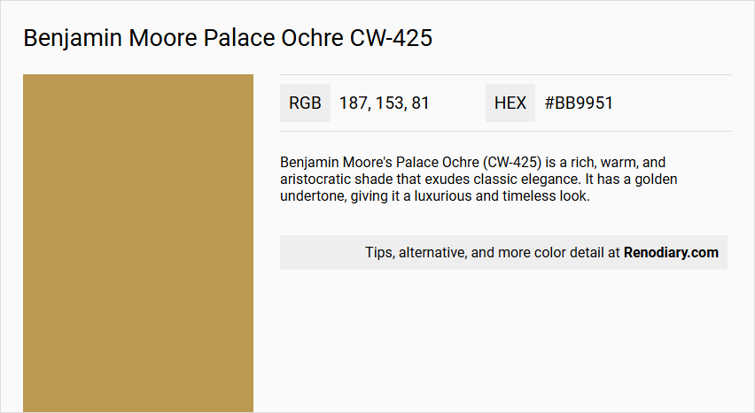
Benjamin Moore's Palace Ochre (CW-425) is a rich, warm, and aristocratic shade that exudes classic elegance. It has a golden undertone, giving it a luxurious and timeless look.
Undertones
The undertone of Palace Ochre is predominantly red, as evident from its color space. This red undertone is a key characteristic that distinguishes it from other ochre shades.
Color Values
- HEX value: #BB9951
- RGB code: 187, 153, 81
- LRV (Light Reflectance Value): 33.73, indicating it is a relatively dark color that can create a more intimate and cozy atmosphere.
Usage
Palace Ochre can be used as either an accent color or the main color in a room. It pairs well with deep emerald greens, navy blues, and burnt oranges to create a sophisticated and cozy atmosphere. It is suitable for various rooms, including living rooms, dining rooms, bedrooms, and kitchens.
Atmosphere
The color creates a harmonious blend of earthy tones, adding warmth and refinement to any decor scheme. It is ideal for creating a luxurious, classic, and inviting space that feels both elegant and cozy.
Benjamin Moore Palace Ochre CW-425 Color Alternative
Benjamin Moore Palace Ochre CW-425 is a warm and inviting hue that brings a touch of classic sophistication to any space. For those seeking a similar aesthetic appeal, Tikkurila Beeswax L396, Tikkurila N391, and Tikkurila Curry L395 serve as thoughtful color alternatives with their own distinct characteristics. Each of these alternatives mirrors the timeless charm of Benjamin Moore Palace Ochre CW-425 while offering versatility for both contemporary and traditional design schemes.
Bathroom
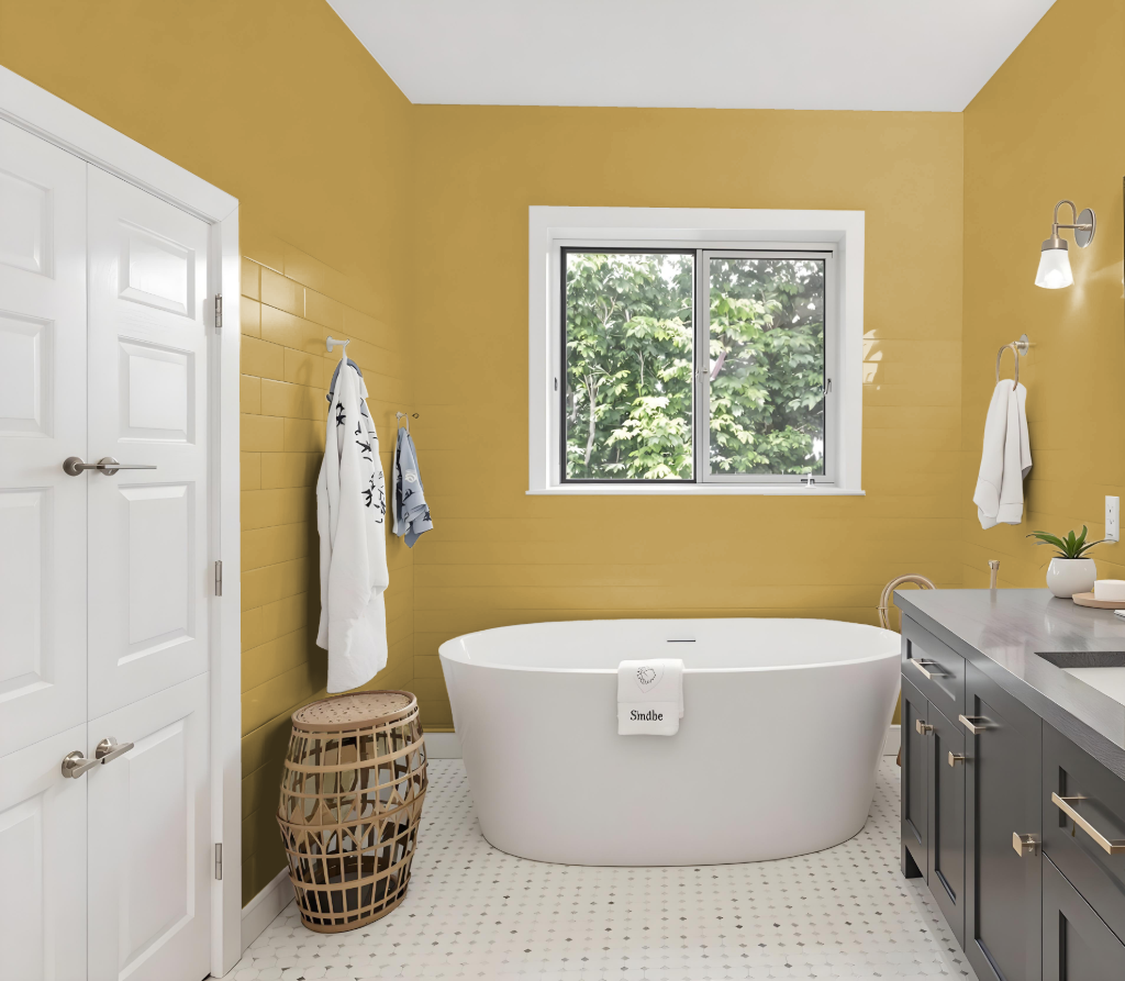
Benjamin Moore's Palace Ochre CW-425 is an excellent bathroom color choice, offering warm and inviting qualities that create a sophisticated, cozy, and timeless atmosphere. As part of the Williamsburg Paint Color Collection, it brings a sense of luxury to the space while harmonizing with deep emerald greens, navy blues, and burnt oranges.
This inviting hue pairs effectively with complementary shades such as Benjamin Moore Normandy and Feather Gray, resulting in a dynamic visual effect. It also integrates seamlessly with additional tones like Prentis Cream, Cloud White, Abingdon Putty, and Burwell Green to produce a cohesive and well-balanced decor scheme.
Bedroom
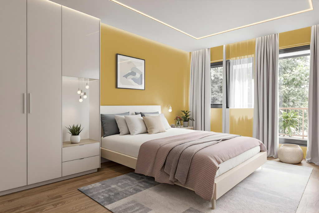
For a bedroom color scheme, Benjamin Moore's Palace Ochre CW-425 sets a warm, inviting foundation that pairs beautifully with deep tones such as emerald greens, navy blues, and burnt oranges. These richer shades enhance the room's cozy atmosphere, while lighter hues like Prentis Cream or Cloud White can be used for accents and trim to achieve a balanced, airy contrast.
In addition to complementary pairings, layering variations of this central color can impart depth and sophistication. By incorporating similar yet subtly distinct tones—ranging from softer to bolder intensities—the overall ambiance remains cohesive and luxurious, offering both drama and warmth.
Kitchen
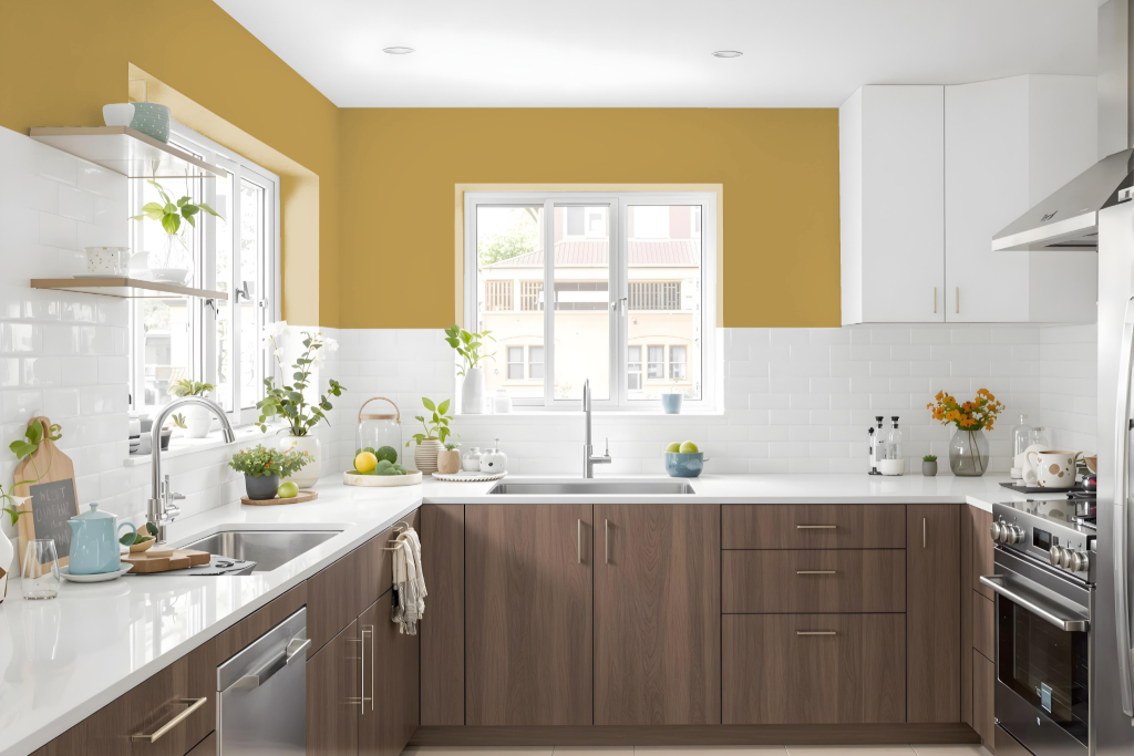
For a kitchen color scheme, Benjamin Moore's Palace Ochre CW-425 sets a warm and inviting tone that lends sophistication and depth. Employed as both a primary wall color or an accent, it creates a cozy atmosphere when paired with hues such as deep greens, navy hues, and burnt oranges.
Balancing the space further, a monochromatic approach with lighter shades like Mustard Olive or darker tones such as Golden Chalice and Tapestry Gold reinforces a unified look, while complementary accents like Normandy or Feather Gray inject vibrant contrast. Neutrals like Prentis Cream, Cloud White, or Abingdon Putty also help to maintain equilibrium and prevent the space from feeling overwhelming.
Living Room
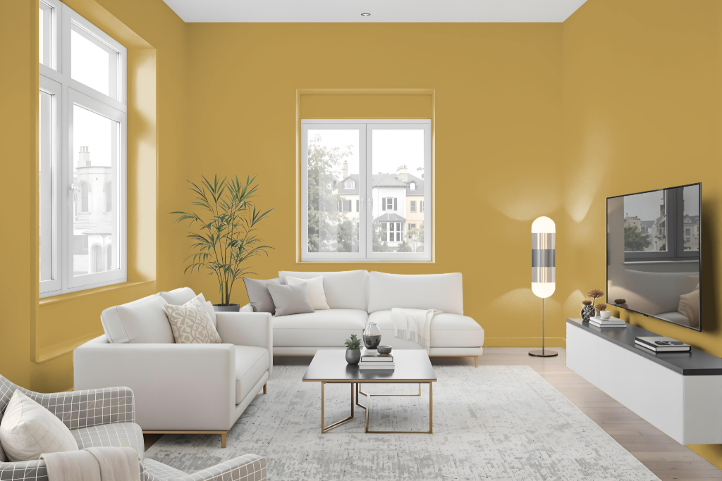
Benjamin Moore's Palace Ochre CW-425 is a distinguished choice for a living room color, infusing the space with a harmonious and inviting atmosphere. This hue pairs beautifully with elements like deep emerald greens, navy blues, and burnt oranges to create a sophisticated and cozy setting. For those seeking a monochromatic look, lighter tones such as Golden Chalice or darker hues like Tapestry Gold offer elegant variations.
Designers can also enhance the space with contrasting cool tones that bring a dynamic feel while balancing the overall look. Additionally, when combined with neutral shades like Prentis Cream, Cloud White, and Abingdon Putty, Palace Ochre creates a balanced, engaging environment perfect for both calm evenings and energetic gatherings.
Outdoor
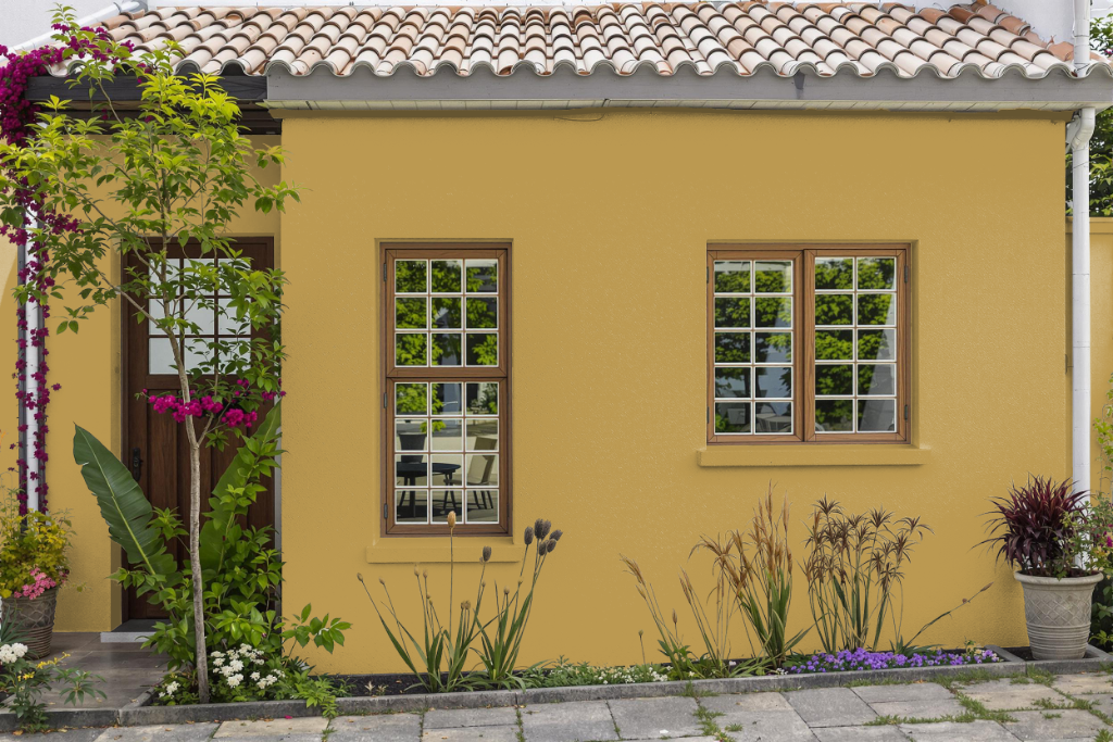
For home exteriors, Benjamin Moore Palace Ochre CW-425 offers a bold outdoor color choice that combines elegant design with advanced performance. This finish is available in high-performance lines engineered to maintain their vibrancy and resist fading and color rub-off. Proper planning for application is also essential, as accurate measurements ensure you have enough product to cover expansive areas effectively.
Choosing a higher sheen such as pearl, satin, or semi-gloss is advisable for areas subject to wear, as these finishes support easier cleaning and better long-term durability. Additionally, selecting a product that is compatible with the specific surface material—be it wood, stucco, or another substrate—helps achieve a smooth, lasting finish that stands up to the challenges of outdoor exposure.