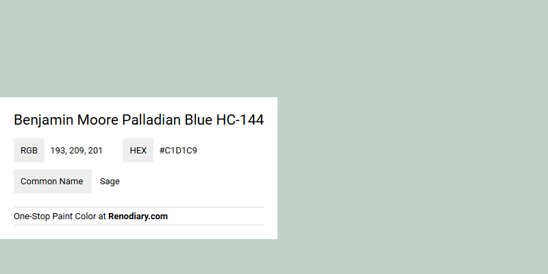
Benjamin Moore Palladian Blue HC-144 is often described as a soft, serene blue-green color that can evoke a sense of tranquility in any space. The RGB value of 193, 209, 201 confirms its blended hues, which lean more towards a muted blue with subtle green undertones, reminiscent of a soothing seascape. While some may mistakenly associate it with sage, Palladian Blue uniquely stands out with its balanced mix of cool tranquility and modern sophistication.
Color Description
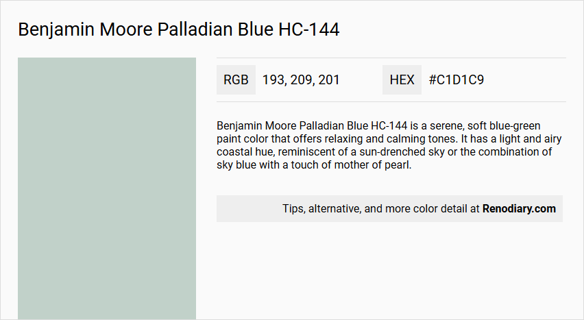
Benjamin Moore Palladian Blue HC-144 is a serene, soft blue-green paint color that offers relaxing and calming tones. It has a light and airy coastal hue, reminiscent of a sun-drenched sky or the combination of sky blue with a touch of mother of pearl.
Undertones
The undertones of Palladian Blue lean more towards green than blue, with hints of soft gray. This green undertone is more pronounced than the blue, making it distinct from other blue-green colors.
Color Values
- LRV: 60 (medium-range light reflectance value)
- HEX: #C1D1C9
- RGB: 193, 209, 201
This LRV indicates that the color will appear brighter in well-lit spaces and more subdued in areas with less natural light.
Usage
Palladian Blue is versatile and can be used in various rooms such as bedrooms, living rooms, bathrooms, and even laundry rooms. It pairs well with warm, beachy greiges and off-whites like Balboa Mist and Moonshine for a coastal look, or with soft white trim like White Dove for a cheerful scheme. It can also be contrasted with dark gray, pink, and jeweled blue-greens for a more metropolitan feel.
Atmosphere
Palladian Blue creates a serene and tranquil atmosphere, making it ideal for spaces where relaxation and rejuvenation are desired. It inspires calm and tranquility, especially when paired with light home decor and natural woods.
Benjamin Moore Palladian Blue HC-144 Color Alternative
Benjamin Moore Palladian Blue HC-144 has inspired a range of alternatives that offer distinctive yet harmonious vibes for modern interiors. Little Greene Salix 99, Little Greene Brighton 203, and Little Greene Aquamarine - Mid 284 each provide a unique twist on the serene foundation of Palladian Blue, allowing designers to play with variations in mood and intensity. These color alternatives encourage creative layering and nuanced contrasts, delivering both visual balance and character to any space.
Bathroom
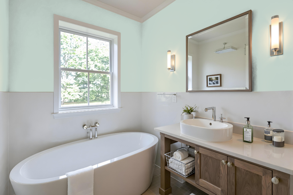
Benjamin Moore Palladian Blue HC-144 is an excellent bathroom color choice that creates a calming, spa-like atmosphere suitable for a range of lighting conditions. In the bathroom, it establishes a serene and clean setting when paired with light home decor and natural woods, enhancing the overall sense of tranquility.
The color works harmoniously with both lighter trim shades for a cheerful, breezy look or darker accents for a more contemporary, metropolitan vibe. It can also be extended to bathroom furniture or cabinetry, ensuring a cohesive design that blends both style and serenity.
Bedroom
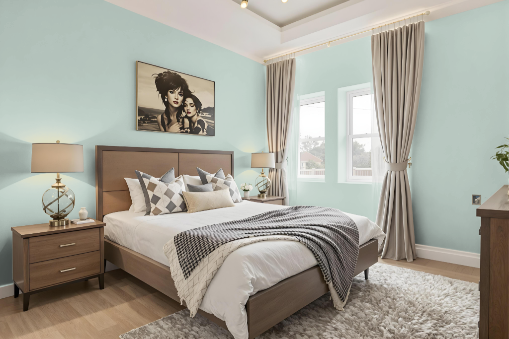
Benjamin Moore's Palladian Blue HC-144 is an excellent choice for a bedroom color that sets a peaceful and balanced tone. This serene hue adapts gracefully to varying lighting conditions, revealing more cool tones in bright, crisp light and soft, inviting touches in warmer settings.
Pairing Palladian Blue with light decor and natural wood elements fosters a calm retreat, while combining it with subtle off-whites and neutral tones can evoke a cozy, coastal ambiance. For those seeking a more daring contrast, deeper shades and jewel-inspired accents create an energizing metropolitan vibe, with clean white trim providing a refreshing counterpoint throughout the design.
Kitchen
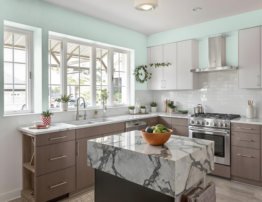
For a kitchen color scheme, Benjamin Moore’s Palladian Blue HC-144 establishes a serene and inviting backdrop. It pairs beautifully with light home decor and natural wood accents, enhancing the calm and tranquil feel of the space while bringing brightness to well-lit kitchens.
This color works harmoniously with white or light gray marble or quartz countertops, complemented by subway, patterned, or wooden backsplashes. Gold or brass hardware can add exquisite contrast, while incorporating warm, beachy greiges and off-white tones conjures a cozy, coastal cottage impression; alternatively, dark gray, pink, and deep blue-green accents inject a metropolitan edge into the design.
Living Room
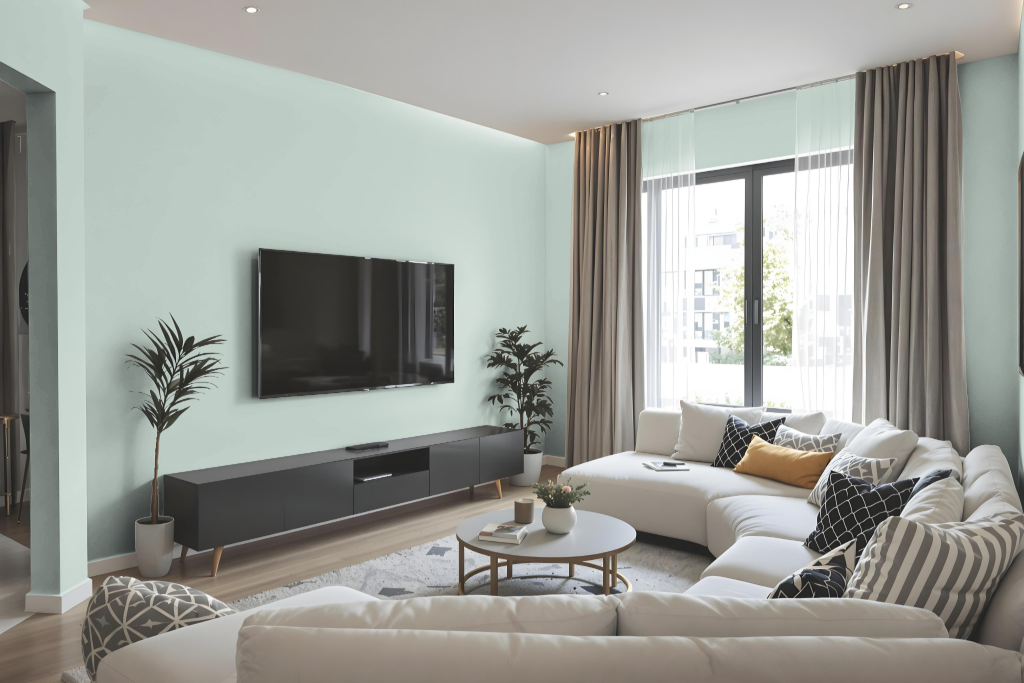
Benjamin Moore's Palladian Blue HC-144 lends a serene and calming touch to living rooms, making it an excellent choice for those seeking a tranquil atmosphere. This hue enhances traditional, transitional, coastal, and modern farmhouse environments, especially when paired with crisp white trim to create a striking contrast.
Complementing an array of other tones, this soft blue works seamlessly with whites, creams, grays, dark browns, and corals for an integrated look. When accented with richer shades, it gains additional depth and visual interest, transforming a space into a thoughtfully curated retreat.
Outdoor
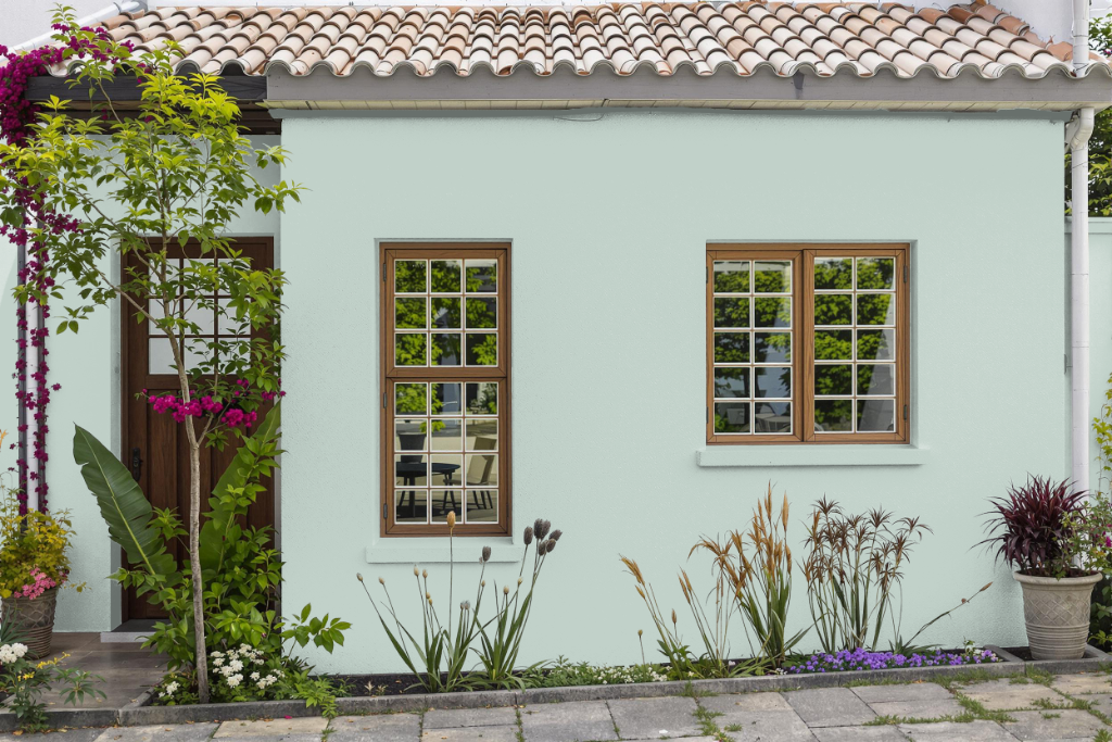
Benjamin Moore's Palladian Blue HC-144 offers a stunning home outdoor color option that brings a calming, serene quality to your exterior spaces. Its light, airy hue can create a peaceful retreat on covered patios, garden rooms, or other shaded areas where direct sunlight is minimized.
Keep in mind that this color might appear somewhat faint in areas with intense, direct sunlight due to its inherent brightness. It's important to ensure that the paint is designed for exterior use and to test it in your specific outdoor lighting to see how it evolves throughout the day.