Benjamin Moore's Palmer Green CW-475 is a rich, earthy hue that captures the essence of Olive with its balanced blend of deep greens and subtle browns. The RGB composition of 95, 93, 57 highlights its complexity, evoking natural landscapes and timeless elegance. This versatile shade is ideal for creating a warm, inviting atmosphere in both traditional and modern interiors.
Color Description
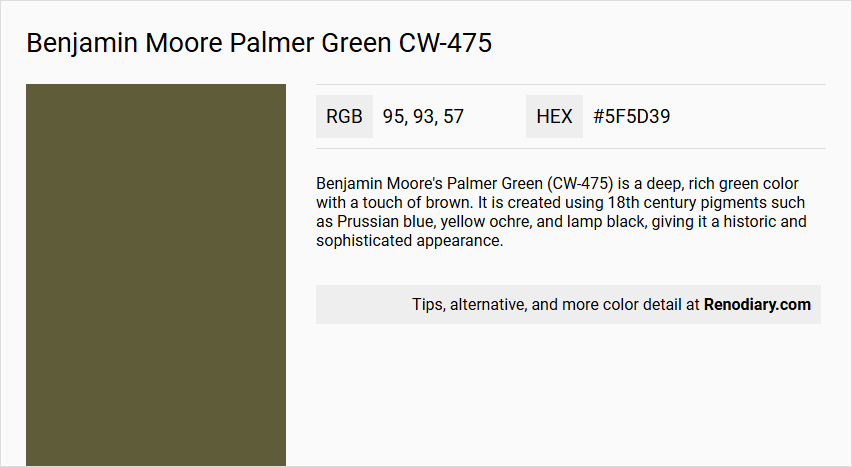
Benjamin Moore's Palmer Green (CW-475) is a deep, rich green color with a touch of brown. It is created using 18th century pigments such as Prussian blue, yellow ochre, and lamp black, giving it a historic and sophisticated appearance.
Undertones
The undertone of Palmer Green can be accurately described as a yellow hue. This is evident from the color space analysis, which isolates the pure hue and eliminates any tints, tones, and shades.
Color Values
- HEX Value: #5F5D39
- RGB Code: 95, 93, 57
- LRV (Light Reflectance Value): 12.09
Usage
- Pairs beautifully with crisp whites to create a clean and airy aesthetic.
- Complements warm neutrals for a cozy and inviting atmosphere.
- For a bolder look, it can be combined with deep blues or rich burgundies to add depth and drama to a room.
Atmosphere
This color evokes a sense of tranquility and sophistication. It can transform a room into a harmonious and stylish space, suitable for bedrooms, living rooms, and other areas where a natural and calming ambiance is desired.
Benjamin Moore Palmer Green CW-475 Color Alternative
Benjamin Moore Palmer Green CW-475 offers a vibrant, versatile backdrop that inspires creative design choices in any space. Sherwin Williams Inverness SW 6433 and Sherwin Williams Basque Green SW 6426 serve as tasteful alternatives with similar depth and character, providing options for those seeking subtle variations in tone. Benjamin Moore Bonsai CC-666 complements these choices by offering a nuanced twist on green, making it a refined alternative for those who appreciate the distinctive charm of Benjamin Moore Palmer Green CW-475.
Bathroom
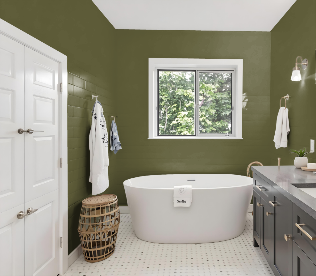
Benjamin Moore's Palmer Green CW-475 is not an ideal choice for bathroom use due to its insufficient resistance to moisture-related issues. Bathrooms require paints that can effectively handle high humidity without succumbing to mildew, mold, or stains.
For best results in a bathroom setting, opt for paints specifically formulated for such conditions, like Aura Bath & Spa or Regal Select. These alternatives are engineered to maintain a pristine appearance even in environments with high moisture levels.
Bedroom
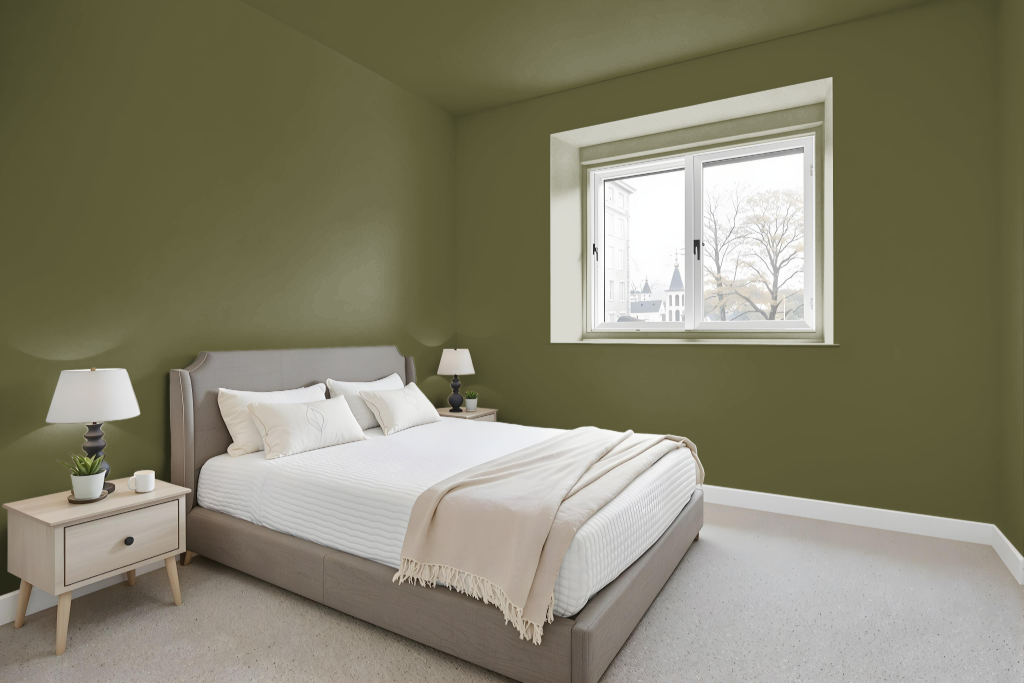
In a bedroom setting, Benjamin Moore's Palmer Green CW-475 makes a captivating statement, offering an earthy yet refined tone that transforms the space into a cozy retreat. Its distinctive hue harmonizes beautifully with neutral shades like cream or beige, creating an atmosphere that feels both sophisticated and grounded.
Its charm is further enhanced when paired with contrasting accents such as navy blue or subtle modern tones like gray, allowing for a range of moods from elegant to sleek. Additionally, combining it with other shades of green such as sage or moss emphasizes a natural, coherent look, while different finishes—whether a soft matte or a vibrant gloss—can tailor the room’s ambiance to suit a more organic or luxurious feel.
Kitchen
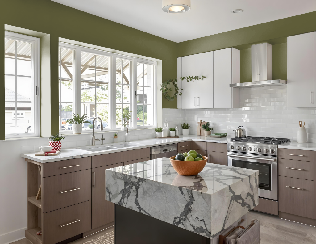
For a kitchen color, Benjamin Moore's Palmer Green CW-475 establishes a sophisticated aesthetic that bridges modern and traditional styles. It pairs beautifully with crisp whites and warm neutral shades—creating a clean, airy atmosphere—while also providing depth when combined with darker hues like deep blues or rich burgundies.
In addition to its visual appeal, Palmer Green is a practical choice for kitchen spaces; it conceals signs of everyday use, particularly when applied with premium finishes. This thoughtful color choice enhances the overall ambiance, making kitchens stylish, welcoming, and easy to maintain.
Living Room
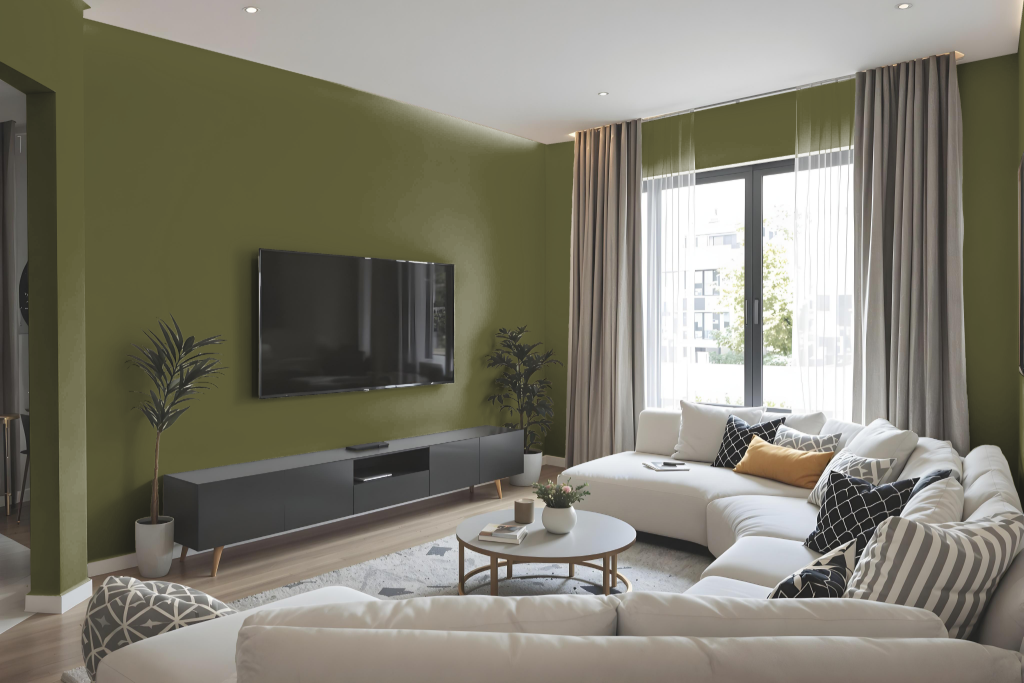
For a living room, Benjamin Moore’s Palmer Green CW-475 creates a sophisticated ambiance that pairs beautifully with crisp whites for a clean, airy feel or with warm neutrals for a cozy environment. This rich shade lends itself well to deeper dramatic accents when combined with deep blues or rich burgundies, establishing a space that feels both refined and inviting.
Inspired by Colonial Period aesthetics and part of the Williamsburg Color Collection, this hue brings depth and tranquility to any design. It harmonizes effortlessly with related tones such as Parish White, White Dove, Hancock Gray, and Pearl, resulting in an interior that is both stylish and balanced.
Outdoor
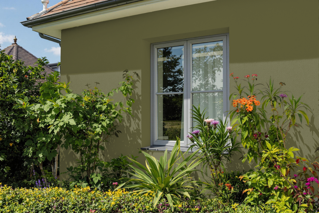
For a home outdoor space, Benjamin Moore’s Palmer Green CW-475 offers a refined, natural hue that complements the interaction of sunlight and shadows. This color works well alongside crisp white trims and accents to evoke a clean, airy feel while pairing with warm neutrals in siding for a cozy, inviting exterior.
Complementing deeper blues or rich burgundies for accent features further introduces depth and dramatic contrast. Its subtle yellow undertone creates a balanced effect, ensuring the overall design remains seamlessly integrated with the natural surroundings.