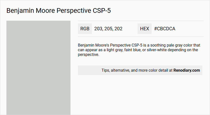
Benjamin Moore's Perspective CSP-5 is a sophisticated shade of light gray that embodies a sense of calm and understated elegance. Its balanced RGB composition of (203, 205, 202) results in a neutral tone that complements a wide array of interior designs while adding a subtle warmth to spaces. This versatile hue is perfect for creating serene environments, making it a popular choice for both modern and traditional home settings.
Color Description
Benjamin Moore's Perspective CSP-5 is a soothing pale gray color that can appear as a light gray, faint blue, or silver-white depending on the perspective.
Undertones
This color has subtle blue undertones, which contribute to its calming and versatile appearance.
Color Values
- RGB values: 204, 205, 201
- HEX code: #CCCDC9
- Light Reflectance Value (LRV): 60.72
Usage
Perspective CSP-5 is recommended for interior use and is not suitable for exterior painting. It is ideal for creating a harmonious atmosphere in modern interiors and can be paired with crisp whites and soft colors.
Atmosphere
This color creates a harmonious and calming atmosphere, making it perfect for modern interiors. It adds depth and a softly polished glow to the space, reflecting some light and enhancing the overall aesthetic.
Benjamin Moore Perspective CSP-5 Color Alternative
Benjamin Moore Perspective CSP-5 is known for its unique vibrancy and depth, making it a favorite choice for spaces that demand artistic flair. Its alternatives, Tikkurila Median X486, Tikkurila Sea Smoke X447, and Tikkurila Gorgonzola G444, offer distinctive yet harmonious nuances that allow for similar creative expressions. Selecting one of these options provides an opportunity to transform your environment with a dynamic and thoughtfully curated color scheme.
Bathroom
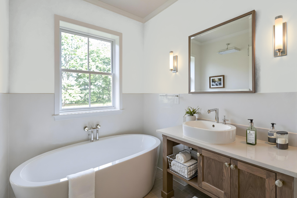
Benjamin Moore Perspective CSP-5 is an excellent bathroom color, part of a premium collection that delivers outstanding durability and washability in high-humidity spaces. Its formulation ensures impressive hide, fade, and color rub-off resistance, making it well-suited for environments that demand both beauty and strength.
Ideal finish options include pearl or satin sheens, which create a smooth, less porous surface that stands up well to frequent cleanings. This results in a practical and durable choice for bathroom walls and trim details, combining aesthetic appeal with long-lasting performance.
Bedroom
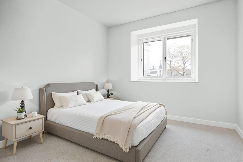
In a bedroom color scheme, Benjamin Moore’s Perspective CSP-5 sets a calming tone that enhances relaxation and comfort. It harmonizes beautifully with crisp whites and soft blues to create a fresh, airy ambiance, while pairing seamlessly with natural wood and gentle blush pinks to add a hint of cozy warmth.
This color supports a range of decorating approaches, whether employed in a monochromatic setting or highlighted with contrasting purple hues for a lively pop. Coordinated selections such as Stoneware, White Heron, and Seapearl—along with similar shades reminiscent of Whitestone and Pebble Beach—help enrich the overall design with depth and balance.
Kitchen
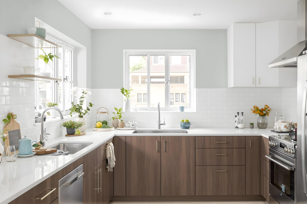
For a kitchen color scheme, Benjamin Moore's Perspective CSP-5 sets a refined foundation that pairs beautifully with crisp whites on cabinetry or countertops to evoke a fresh, airy ambiance. Natural wood elements and soft blush pink accents further enrich the space with added warmth and inviting charm.
To enhance the design, consider incorporating hues with a subtle purple tone, such as shades reminiscent of Iris Bliss or Grappa, to create a dynamic visual accent. Coordinating this centerpiece with neutral tones like Stoneware, White Heron, and Seapearl helps maintain a balanced and cohesive look throughout the kitchen.
Living Room
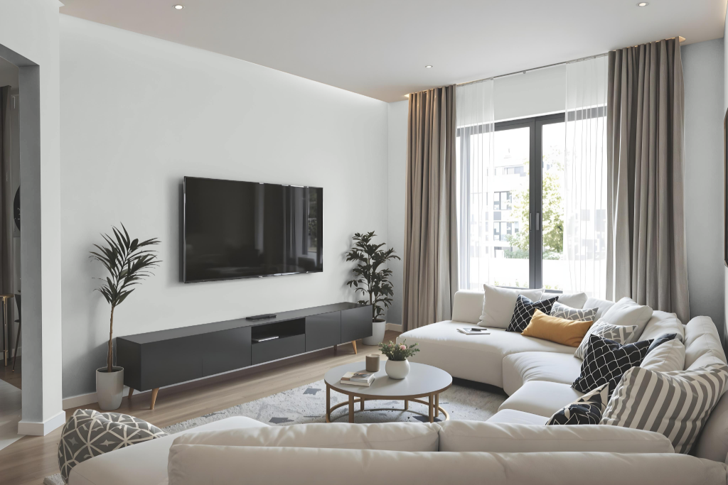
Benjamin Moore Perspective CSP-5 is a living room color that lends a balanced brightness to indoor spaces. This shade, part of the Color Stories collection, is ideal for interiors and reflects a moderate amount of light, ensuring rooms stay well-lit without becoming overwhelming.
The color is designed to harmonize with a range of coordinating shades, including complementary hues like Stoneware, White Heron, and Seapearl, as well as similar tones found in Whitestone, Pebble Beach, and Pelican Gray. It is available in finishes such as eggshell, pearl, satin, and semi-gloss, making it well-suited to various areas within the home based on different traffic and maintenance needs.
Outdoor
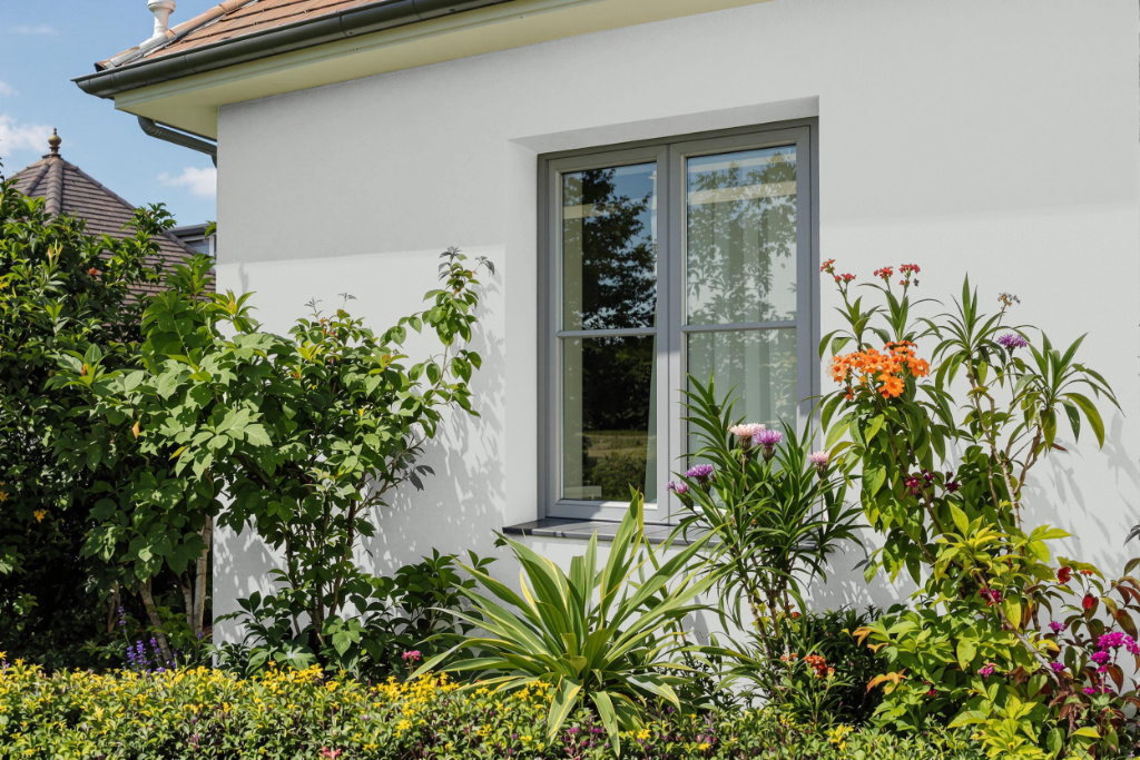
For home outdoor color applications, Benjamin Moore Perspective CSP-5 does not provide the necessary durability and is not recommended for exterior use. Instead, this color is designed as part of an interior collection to enhance living spaces with its vivid appeal and superior performance in carefully curated environments.
Intended for areas such as living rooms, hallways, and low-traffic bedrooms, this color is a testament to remarkable craftsmanship that delivers enduring color vitality. It is available in a range of finishes—each tailored to meet different aesthetic and practical requirements—ensuring a beautiful, quality look for interior settings.