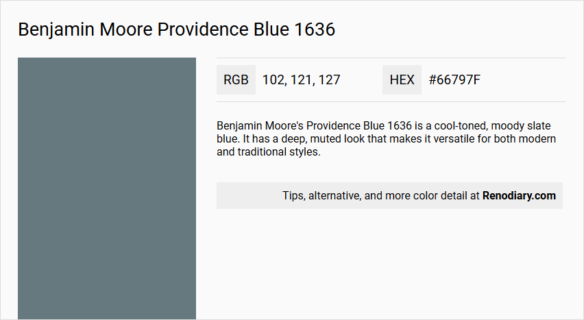
Benjamin Moore's Providence Blue 1636, with its RGB composition of (102, 121, 127), embodies a refined hue often likened to Slate Gray. This versatile color exudes a calming sophistication, making it an ideal choice for both modern and traditional interiors. The subdued undertones of blue contribute to its adaptability, effortlessly complementing various decor styles.
Color Description
Benjamin Moore's Providence Blue 1636 is a cool-toned, moody slate blue. It has a deep, muted look that makes it versatile for both modern and traditional styles.
Undertones
Providence Blue is characterized by dark gray undertones, which give it a sophisticated quality. It also has a slight touch of green, though not as pronounced as to make it a deep teal hue.
Color Values
The Light Reflectance Value (LRV) of Providence Blue is approximately 19.23, placing it in the medium-dark range. This indicates that it absorbs more light than it reflects.
Usage
- Statement walls
- Accent areas
- Kitchen cabinets
- Bathroom vanities
- Whole-room shades
- Moody offices
- Bedrooms
- Laundry rooms
- Small powder rooms
- Bold pop of color for home exteriors, doors, and shutters
Atmosphere
Providence Blue creates a bold, immersive atmosphere, making it suitable for spaces where a deep, rich color is desired. It is less suitable when paired with bright whites but works well with saturated shades or complex creams to maintain its rich vibe.
Benjamin Moore Providence Blue 1636 Color Alternative
Benjamin Moore Providence Blue 1636 is a distinctive hue that sets a serene and stylish tone in any space. For those exploring similar aesthetics, alternatives such as Dulux Steel Symphony 1 90BG 17/090, Little Greene Etruria 326, and Farrow and Ball De Nimes 299 offer varied nuanced options that retain the spirit of refined blue tones. Each choice provides a unique character while maintaining a cohesive look, enabling designers and homeowners to select the perfect complement for their decor.
Bathroom
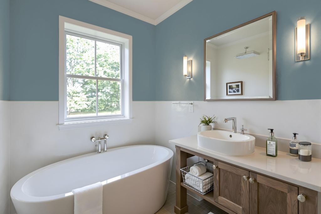
Benjamin Moore Providence Blue 1636 is an excellent choice for a bathroom, offering a sophisticated appeal that enhances both traditional and modern decor. It creates a welcoming ambiance when paired with crisp white trim for a classic look or softened by warm neutrals for a more contemporary feel.
Ideal for walls, cabinets, or vanities, this rich color lends a bold, immersive quality to any space, especially smaller bathrooms or powder rooms. To maintain a cohesive and elegant atmosphere, consider pairing it with a complex cream on ceilings or trim rather than bright whites, ensuring a refined and harmonious design.
Bedroom
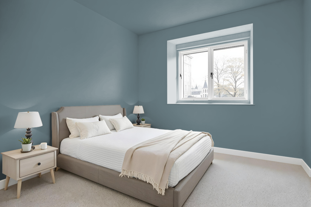
In the bedroom, Providence Blue 1636 creates a sophisticated and calming atmosphere perfect for any setting. Whether paired with crisp white trim for a classic look or softened neutrals for a modern touch, it adapts gracefully to various lighting conditions—revealing a pronounced blue hue in natural light and subtle gray undertones under artificial illumination.
Coordinating with complementary colors enhances its elegant appeal, as suggested by style guides. The color scheme can be thoughtfully layered with hues like Simply White or Barren Plain, resulting in a harmonious space that feels both refreshed and inviting.
Kitchen
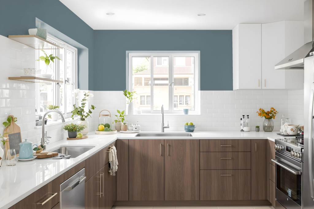
In kitchens, Benjamin Moore’s Providence Blue 1636 creates a sophisticated color scheme that suits both traditional and modern designs. Its balanced undertones work well with various materials such as wood, stone, and metal while shifting in appearance under different lighting conditions—revealing richer blue notes in natural light and softer gray nuances under artificial illumination.
Pairing this hue with neutral shades further enhances its elegance, making it an ideal choice for creating a harmonious atmosphere. Additionally, finishes like pearl or satin are recommended for busy areas to ensure ease of cleaning and maintenance without compromising on style.
Living Room
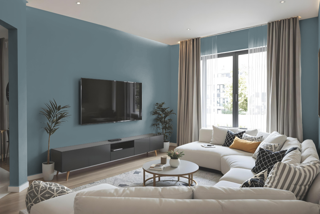
Benjamin Moore Providence Blue 1636 is an excellent living room color that exudes sophistication and welcome. It works well in both traditional and modern settings, creating a refined ambiance that can be enhanced with light neutrals for trims and ceilings or contrasted with warmer tones on walls and furniture.
In natural daylight the color appears richer and more dynamic, while in artificial lighting the subtle gray hues deliver a softer, moodier feel. Adding textural contrasts like natural wood, metallic finishes, or soft textiles further enriches the space, and using the color as an accent on a feature wall or select furnishings introduces a unique twist to the room.
Outdoor
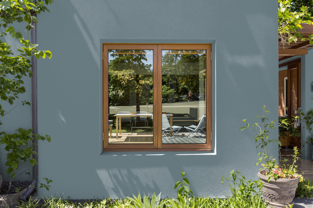
Benjamin Moore Providence Blue 1636 is an excellent home outdoor color that brings a pleasing depth to exterior spaces. Testing the color in different lighting conditions is essential, as it can shift in appearance between natural and artificial light. It complements light neutral accents such as whites and creams, and when paired with natural elements like wood or stone, it creates a balanced and inviting look.
For outdoor applications, incorporating metallic finishes or soft textiles in furniture and decor further enhances its appeal. However, due to its medium-deep tone, it is important to verify the durability and resistance to UV exposure, ensuring that the appearance remains consistent over time.