Benjamin Moore's Province Blue 2135-40 embodies a tranquil blend of subtle sophistication and modern elegance with its Blue-gray hue. The color, defined by an RGB composition of 130, 155, and 161, creates a serene and calming atmosphere, perfect for transforming any space into an oasis of peace. This versatile shade bridges traditional and contemporary design, making it an ideal choice for those seeking a timeless yet fresh ambiance in their homes.
Color Description
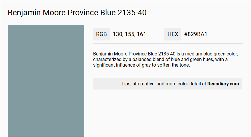
Benjamin Moore Province Blue 2135-40 is a medium blue-green color, characterized by a balanced blend of blue and green hues, with a significant influence of gray to soften the tone.
Undertones
The undertone of Province Blue is predominantly a blue hue, as evident from its color space. It does not have strong green or other undertones, making it a straightforward blue shade.
Color Values
- HEX Value: #829BA1 or #849BA1 (slight variation depending on the source)
- RGB Values: 130, 155, 161 or 132, 155, 161 (slight variation depending on the source)
- LRV (Light Reflectance Value): 31.57, indicating a moderate light reflectance
Usage
Province Blue is versatile and can be used in various interior design settings. It pairs well with warm neutrals like beige or cream for a cozy feel, or with crisp whites for a clean, contemporary look. It can also be combined with rich jewel tones like emerald green or sapphire blue for a pop of contrast.
Atmosphere
This color creates a serene and sophisticated atmosphere, making it suitable for both calming retreats and vibrant statement spaces. It adds a sense of elegance to any room, whether used in a living room, hallway, or other areas of the home.
Benjamin Moore Province Blue 2135-40 Color Alternative
Benjamin Moore Province Blue 2135-40 offers a refined and classic blue tone that serves as an ideal foundation for stylish interior designs. Several alternative hues, such as Tikkurila Tide L491, Dulux Celestial Cloud 2 50BG 32/114, and Dulux Pebble Drift 2 90BG 31/124, provide versatile options that mirror its sophisticated character while appealing to diverse aesthetic preferences. Each of these alternatives preserves the essential blue essence, ensuring that the timeless quality of the original is maintained throughout any creative project.
Bathroom
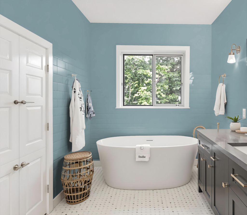
Benjamin Moore Province Blue 2135-40 is a sophisticated choice for a bathroom, ideal for creating either a cozy or contemporary atmosphere. The hue pairs beautifully with warm neutrals like beige and cream for a welcoming feel, or with crisp whites to highlight a clean look. For added design depth, consider accenting the space with rich jewel tones and exploring monochromatic or complementary schemes to emphasize its layered character.
This refined blue can also be enhanced with a specialty bath and spa finish that offers a luxurious matte aesthetic along with durability and mildew resistance, catering to the challenges of high-humidity environments. Such an application not only elevates the overall design but also ensures lasting performance in demanding bathroom settings.
Bedroom
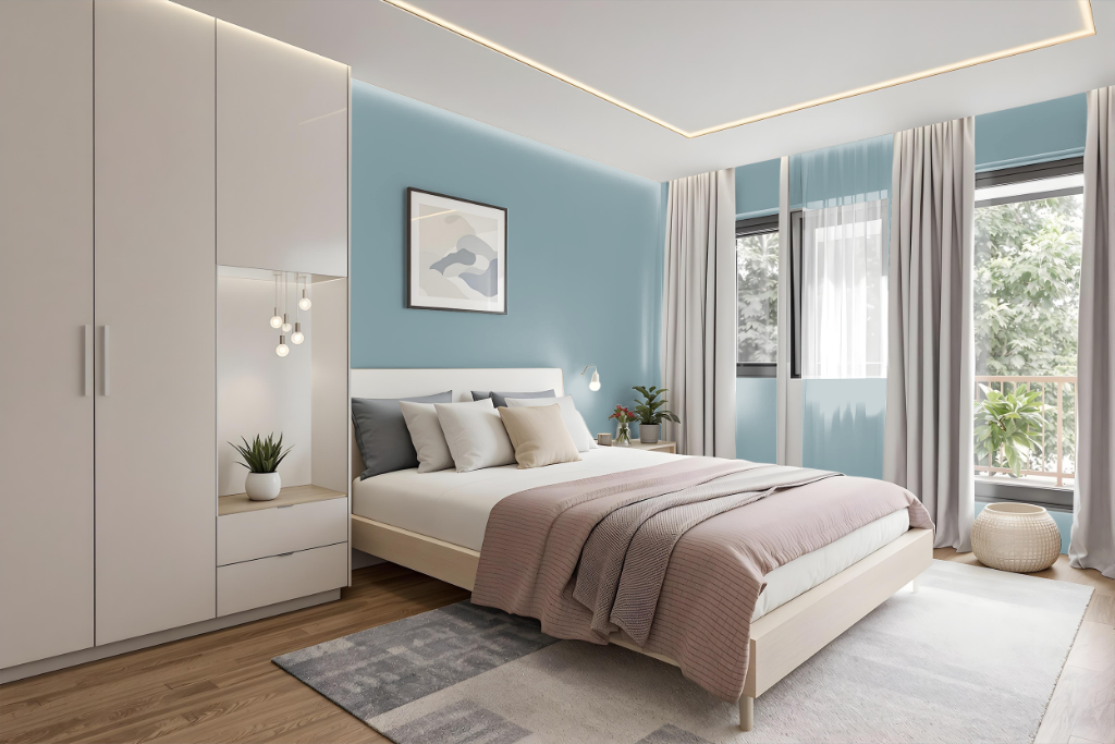
For a bedroom color scheme, Benjamin Moore's Province Blue sets a serene tone that can be enhanced with warm neutrals like beige or cream for a cozy, inviting feel, or contrasted with crisp whites for a modern effect. Jewel tones in shades reminiscent of emerald or sapphire infuse the space with additional depth and delightful accents.
Province Blue also works harmoniously within a single-color theme by pairing with lighter variations to brighten the area or deeper hues to add sophistication. Incorporating complementary shades with hints of red, such as Quietly Violet or Desert Shadows, further introduces dynamic visual interest that enlivens the overall design.
Kitchen
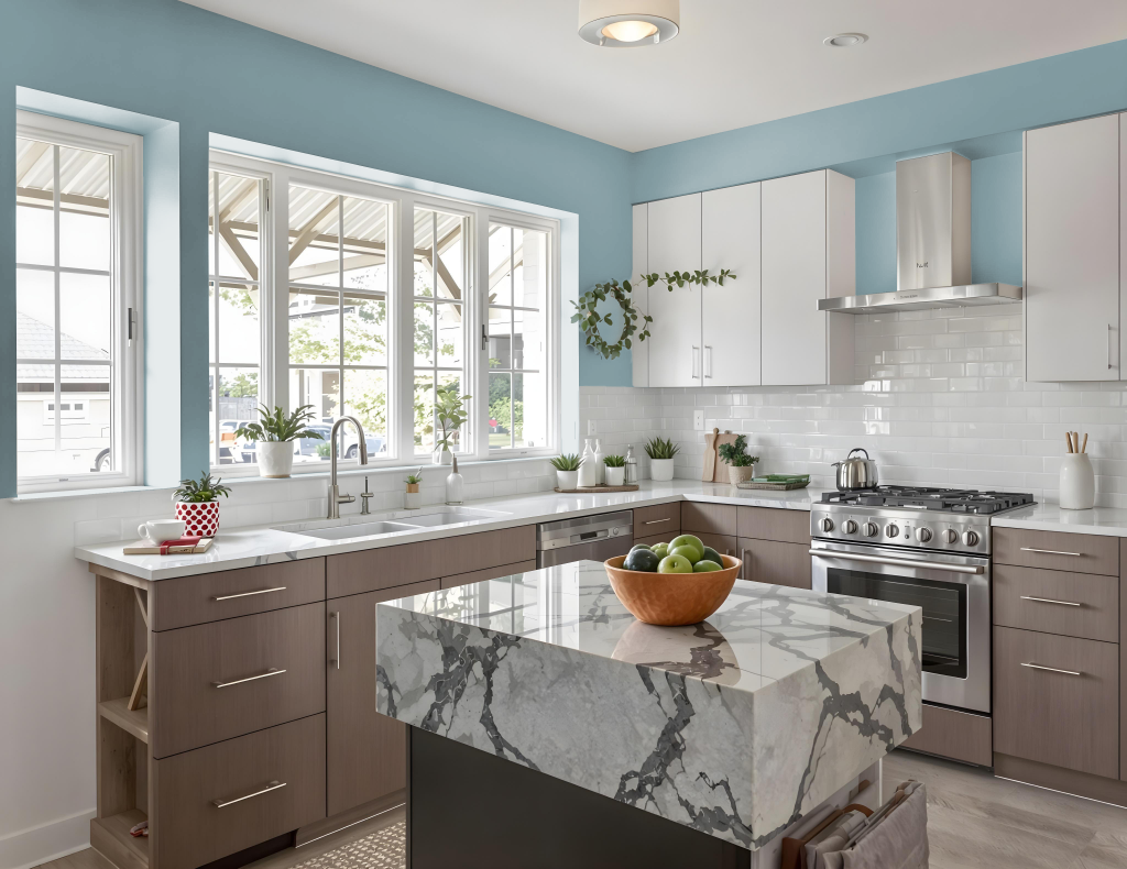
For a kitchen color scheme, Benjamin Moore Province Blue 2135-40 offers an elegant and inviting backdrop that pairs well with a range of complementary shades. This sophisticated hue works beautifully with understated neutrals for trim and cabinetry, creating a seamless and refined appearance throughout the space.
To enhance the overall design, consider a monochromatic approach by combining lighter and darker variants of the primary tone, adding depth and visual interest. Additionally, introducing contrasting accents—whether in soft complementary colors or with warm neutral tones—can create balance and a sense of comfort in the kitchen environment.
Living Room
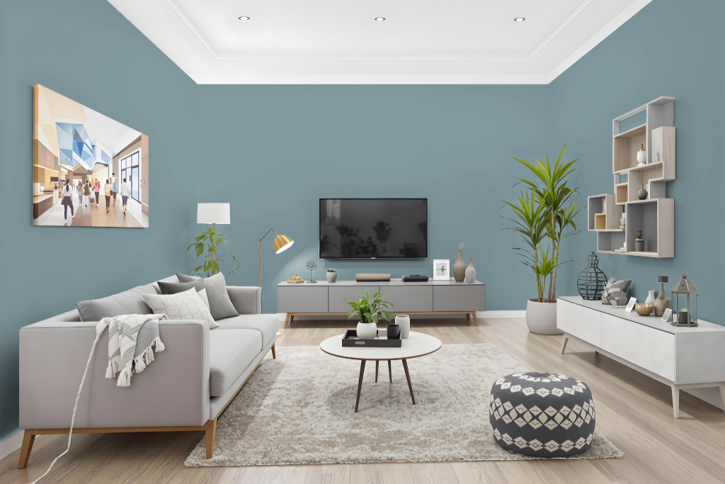
For the living room, Benjamin Moore Province Blue offers a stylish foundation when paired with warm neutrals like beige or cream for an inviting feel, or crisp whites for a modern look. Its deep, cool character also provides a striking backdrop for accent colors inspired by rich, vibrant jewel tones.
Part of the Colour Preview collection, Province Blue integrates seamlessly with complementary shades such as Ice Mist, Super White, and White Drifts, resulting in a harmonious overall design. Its balanced light reflection makes it a practical choice in spaces that require a carefully controlled spread of brightness.
Outdoor
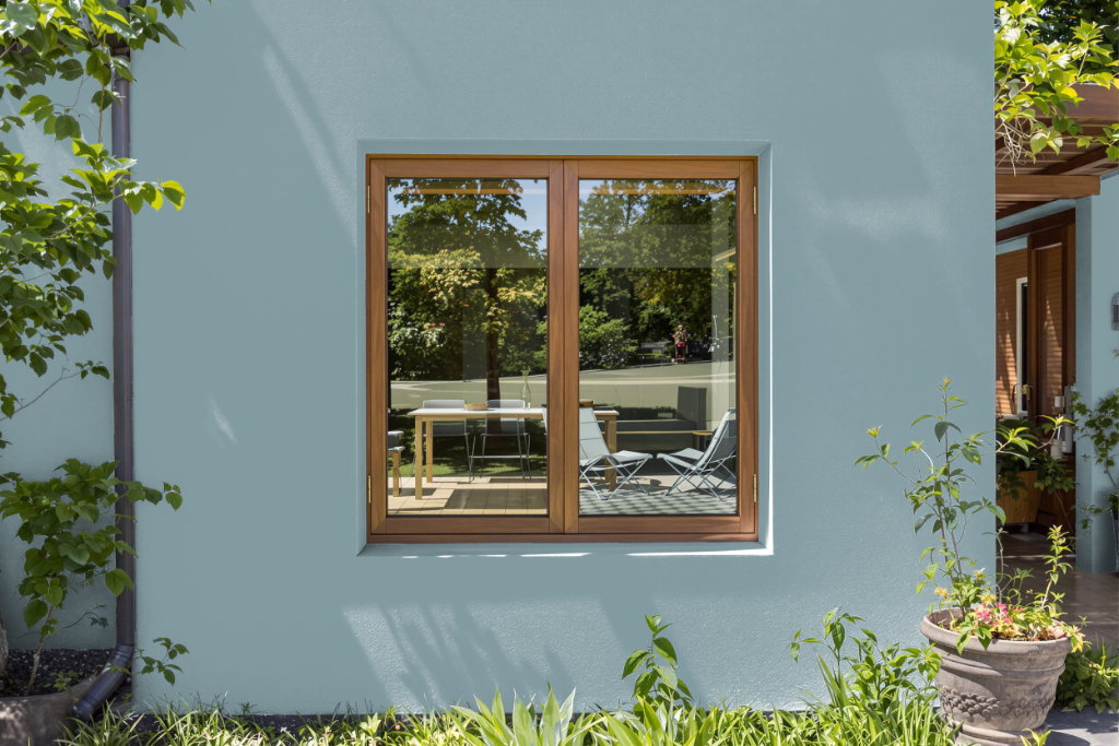
For outdoor home use, Benjamin Moore's Province Blue provides a sophisticated, enduring hue that enhances exteriors with a refined aesthetic. Formulated with advanced alkyd-fortified technology, this paint ensures superior adhesion on challenging surfaces, resisting cracking, peeling, and the effects of weathering and abrasion.
Applied with Regal Select Exterior paint, it offers excellent hide and coverage while maintaining a waterborne formulation that combats mildew and fading. Its soft gloss finish is ideal for trim work on windows, shutters, and doors, delivering a shiny, durable overlay that stands up to long-term exposure.