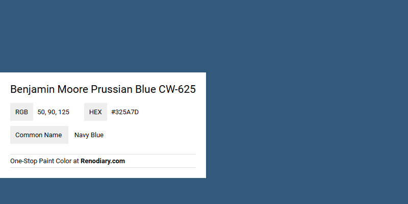
The Benjamin Moore paint color Prussian Blue CW-625 is distinct from the standard Navy Blue, offering a unique hue represented by the RGB values (50, 90, 125). This particular shade combines deep and muted blue tones, evoking a sense of sophistication and tranquility reminiscent of classical European design. While both Prussian Blue and Navy Blue are dark blues, the subtle differences in their undertones make Prussian Blue particularly suitable for creating elegant and timeless spaces.
Color Description
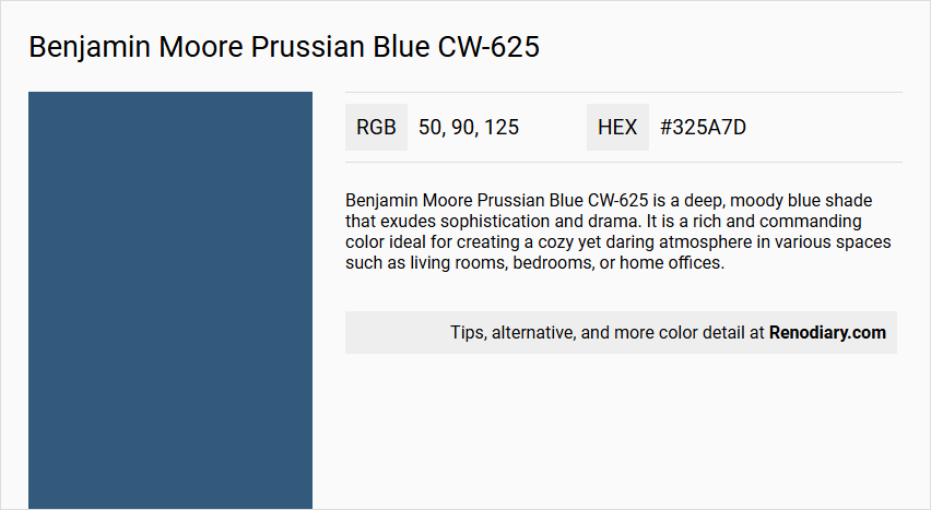
Benjamin Moore Prussian Blue CW-625 is a deep, moody blue shade that exudes sophistication and drama. It is a rich and commanding color ideal for creating a cozy yet daring atmosphere in various spaces such as living rooms, bedrooms, or home offices.
Undertones
The undertone of Prussian Blue CW-625 is predominantly blue, with no significant deviations into other color families. It maintains a pure blue hue without notable tints, tones, or shades of other colors.
Color Values
- HEX value: #325A7D
- RGB code: 50, 90, 125
Usage
This color is versatile and can be used in various interior spaces. It is suitable for walls, furniture, and even trim and cabinetry when using the Advance Interior Paint. It works well in monochromatic and complementary color schemes, and it can also be paired with other colors like those with a red hue for high contrast.
Atmosphere
Prussian Blue CW-625 creates a unique and elegant atmosphere, adding depth and luxury to any room. It is perfect for those seeking a bold and timeless look, making spaces feel cozy and sophisticated.
Benjamin Moore Prussian Blue CW-625 Color Alternative
Benjamin Moore Prussian Blue CW-625 stands out as a distinctive color, and enthusiasts often turn to comparable options that capture its depth and elegance. Tikkurila N434, Dulux Subzero Blue 50BB 08/257, and Little Greene Mazarine 256 offer nuanced variations that embody similar sophisticated characteristics. These alternatives allow designers and homeowners alike to maintain the striking impact of Benjamin Moore Prussian Blue CW-625 while exploring diverse aesthetic influences.
Bathroom
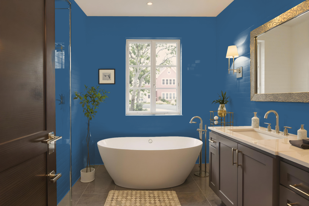
Benjamin Moore's Prussian Blue CW-625 is an excellent bathroom choice that makes a bold statement while creating a sophisticated backdrop in high-humidity environments. With options like Aura Bath & Spa available, homeowners can benefit from a luxurious matte finish specifically engineered to resist mildew and facilitate easy cleaning in moisture-rich settings.
Selecting the appropriate sheen is key for maintaining both style and function; pearl or satin finishes provide a smooth, durable surface ideal for busy spaces. Additionally, Benjamin Moore’s premium lines, such as Regal Select and Advance, provide advanced adhesion and exceptional flow, ensuring a long-lasting, high-quality finish that performs well in damp conditions.
Bedroom
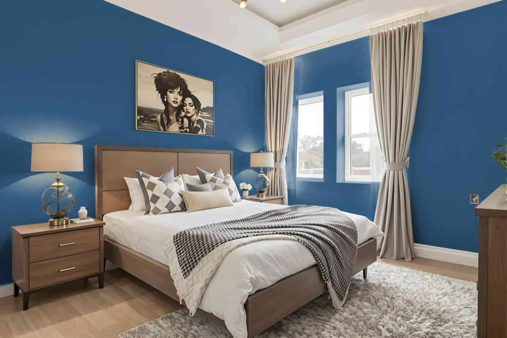
Benjamin Moore's Prussian Blue is an excellent choice for a bedroom, creating a cozy, daring ambiance that exudes both elegance and depth. It lends itself well to using a single hue in various shades and tones to build a harmonious, monochromatic scheme.
Alternatively, pairing this bold color with warmer hues that carry red undertones can energize the space with a dynamic visual contrast, while lighter tones bring balance and calm. Thoughtfully incorporating metallic accents further enhances the sophisticated feel of the room, making it a refined option for interior design.
Kitchen
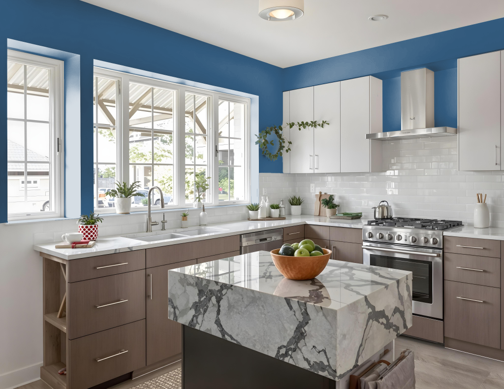
For a kitchen color scheme, Benjamin Moore's Prussian Blue CW-625 offers a dramatic and sophisticated touch. It seamlessly complements both traditional styles—paired with cream or white trim—and modern kitchens, where it contrasts sharply with lighter countertops and appliances to create a dynamic visual appeal.
This captivating hue enhances a variety of design elements, working well with materials such as metals, timber, and terrazzo. Prussian Blue brings depth and luxury to kitchen spaces, making it an excellent choice for cabinets, walls, or accent features.
Living Room
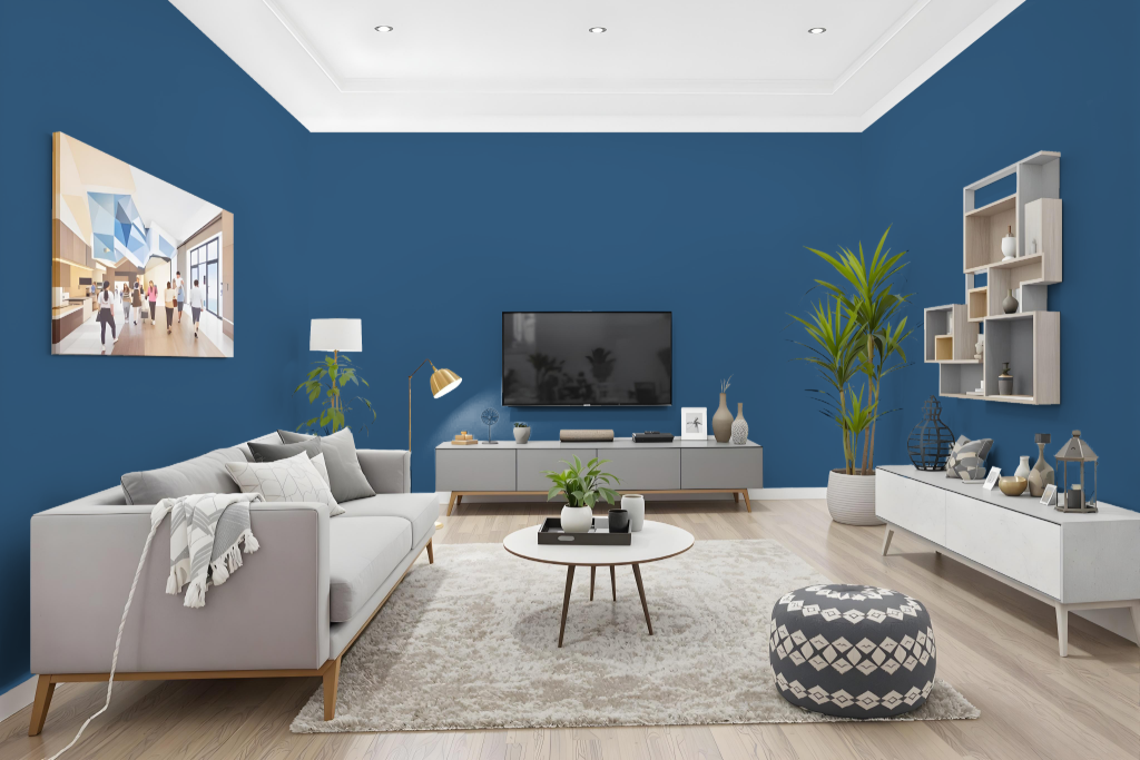
Prussian Blue CW-625 brings a cozy yet daring atmosphere to living rooms with its deep, bold blue hue. Inspired by timeless 18th century pigments and the refined aesthetics of blue-and-white Chinese export porcelain, this color sets an intriguing backdrop for any space, including bedrooms and home offices, while allowing for combination with shades ranging from lighter and darker blues to energetic red accents.
Available in a range of finishes—from flat and matte to eggshell, pearl, satin, and semi-gloss—this paint adapts to various needs, balancing aesthetic appeal with practicality for both calm areas and high-traffic zones. It also incorporates advanced color technology alongside environmentally friendly low VOC levels, ensuring lasting performance and ease of maintenance.
Outdoor
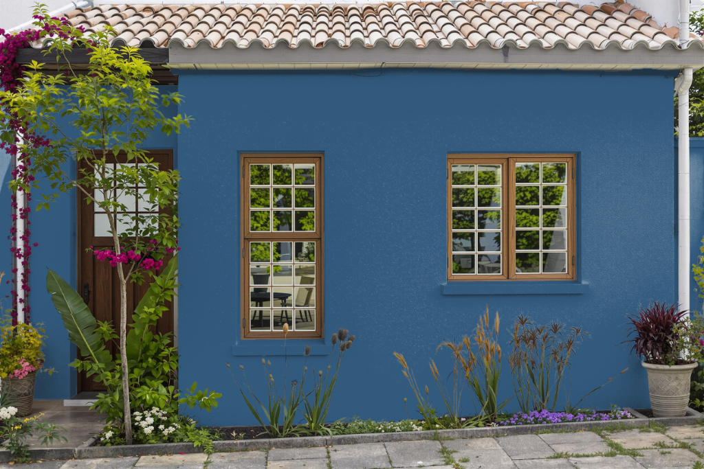
For home outdoor projects, Benjamin Moore Prussian Blue CW-625 is not recommended as it lacks the durability necessary to withstand sun and weather conditions. This color is ideally used in interior spaces to create a cohesive look on walls, ceilings, and other surfaces.
For exterior applications, it is best to choose a paint specifically designed for outdoor use to ensure long-term resistance to the elements. Although an 8 oz. sample may be used for evaluation outside, it should not be relied upon for lasting outdoor performance.