Benjamin Moore's Van Courtland Blue HC-145 is a sophisticated shade that elegantly blends elements of blue and gray, resulting in a calming, versatile hue often referred to as Blue Gray. The color's precise RGB value of (134, 152, 158) reflects its balanced mix of cool tones, making it an ideal choice for promoting a serene atmosphere in any space. This particular shade is highly favored by interior designers for its ability to complement a wide range of color palettes while maintaining an understated charm.
Color Description
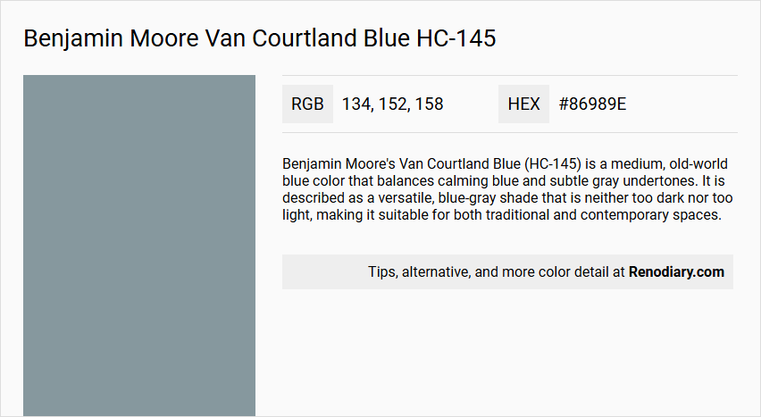
Benjamin Moore's Van Courtland Blue (HC-145) is a medium, old-world blue color that balances calming blue and subtle gray undertones. It is described as a versatile, blue-gray shade that is neither too dark nor too light, making it suitable for both traditional and contemporary spaces.
Undertones
Van Courtland Blue has no significant undertones of other colors, but it does exhibit a slight grayness, especially in dim lighting conditions. This lack of undertones makes it easier to pair with other hues.
Color Values
- HEX Code: #86989E or #879A9D
- RGB Decimal: 134, 152, 158 or 135, 154, 157
- Light Reflectance Value (LRV): 31.47% or 30.7%
Usage
This color is highly versatile and can be used in various rooms such as bedrooms, living rooms, and bathrooms. It works well with different decor styles and can be paired with crisp white accents, sandy beige, or soft blush for different looks.
Atmosphere
Van Courtland Blue creates a tranquil and serene atmosphere, making it ideal for spaces where relaxation is desired. The color's balance of blue and gray undertones contributes to a calming and elegant ambiance.
Benjamin Moore Van Courtland Blue HC-145 Color Alternative
Benjamin Moore Van Courtland Blue HC-145 is a striking color known for its captivating balance of depth and sophistication. An excellent alternative palette includes Tikkurila Tide L491, Tikkurila Agate N500, and Dulux Smoke Grey 90BG 30/073, each offering unique nuances that complement its bold character. These color options provide versatility for design enthusiasts looking to explore variations while maintaining a cohesive and refined aesthetic in their projects.
Bathroom
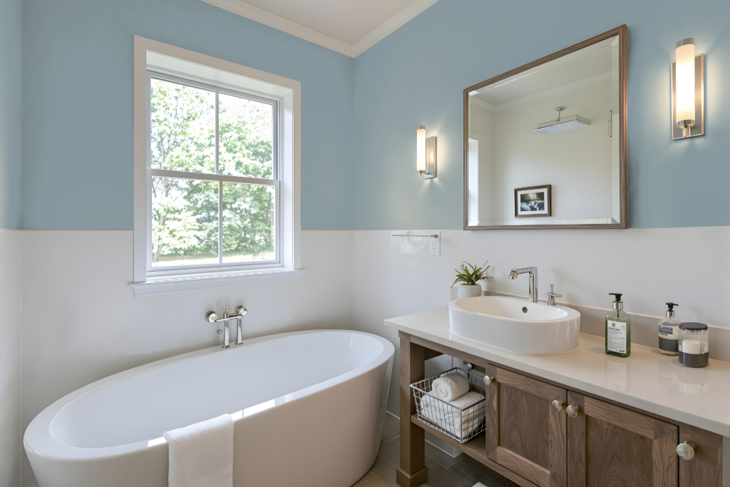
For a bathroom, Benjamin Moore's Van Courtland Blue HC-145 creates a sophisticated and tranquil atmosphere. Inspired by America's historic landmarks, this mid-tone hue from the Historical Collection pairs beautifully with crisp white accents for trim and doors, lending an elegant touch while harmonizing with both modern and traditional decor styles.
The paint works well with warmer shades like sandy beige or soft blush to add a cozy element, yet its appearance may shift under different lighting conditions, appearing cooler or exhibiting subtle green undertones at times. Additionally, its mildew-resistant formulation makes it an excellent choice for high-humidity environments.
Bedroom
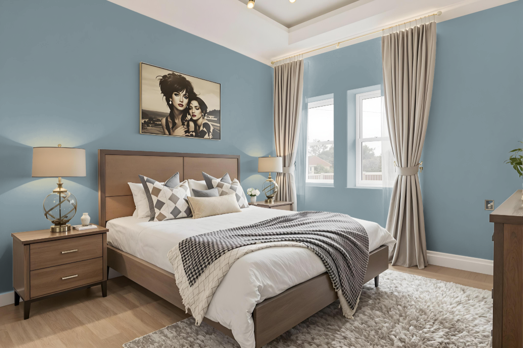
For a bedroom color scheme, Benjamin Moore’s Van Courtland Blue HC-145 creates a calming atmosphere with its soothing presence. The color pairs beautifully with crisp whites and can be enhanced with warm accents like sandy beige or soft blush to achieve a classic, refined look suitable for a modern or traditional setting.
To bring depth to the space, consider using lighter shades for a monochromatic design or introducing complementary hues with red undertones for added dynamism. The color also harmonizes well with trim options in off-white, crisp white, or various browns, offering an array of styling choices that highlight both subtle elegance and bold contrasts.
Kitchen
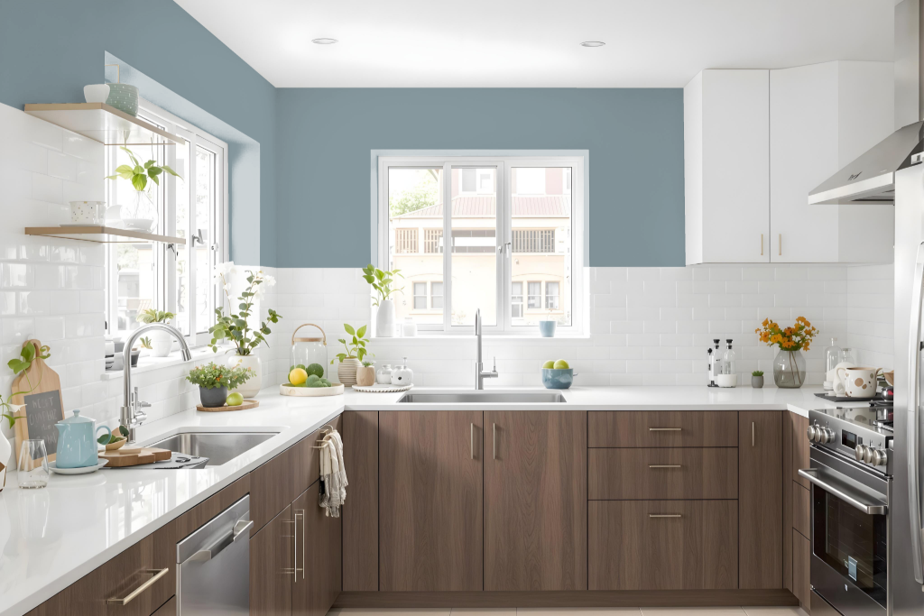
For a kitchen color scheme, Benjamin Moore's Van Courtland Blue HC-145 sets a sophisticated and inviting tone. This hue pairs beautifully with crisp white accents to create a classic ambiance, while warmer tones like sandy beige or soft blush introduce a cozy counterpoint.
Complementary colors such as Wedgewood Gray, Simply White, Milky Way, and Coronado Cream enhance the overall balance of the design. Testing the color in various lighting conditions is recommended, as Van Courtland Blue can appear different depending on the light; pairing it with lighter shades preserves a bright, airy feel, whereas mixing in richer tones heightens the space’s elegance.
Living Room
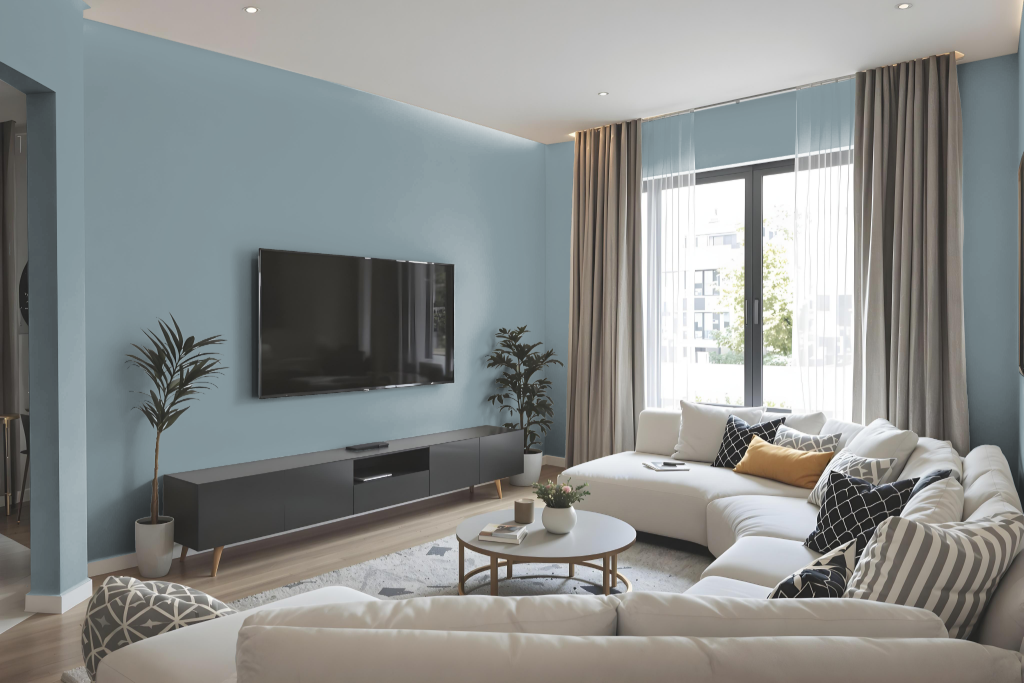
Benjamin Moore’s Van Courtland Blue HC-145 is a sophisticated living room color that creates an inviting backdrop for both traditional and contemporary spaces. Inspired by America’s historic landmarks, this tone brings a refined elegance to interiors through its balanced mix of cool and warm undertones.
Designed to enhance any living space, this shade pairs beautifully with trim accents in crisp white, off-white, or various shades of brown. Whether used in a monochromatic scheme with lighter and darker variations or contrasted with complementary hues featuring a red warmth, it helps establish a tranquil yet engaging atmosphere.
Outdoor
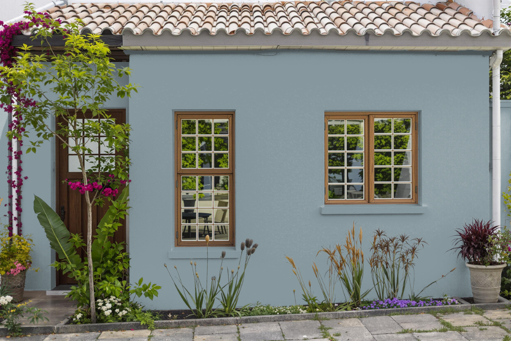
Benjamin Moore's Van Courtland Blue HC-145 is an excellent home outdoor color that enhances exterior walls, trim, and accents with style and lasting appeal. Part of the Historical Collection, this shade is designed to withstand the challenges of outdoor environments, incorporating high-performance resins in its finish to ensure exceptional fade and color rub-off resistance.
Its robust formulation, available in finishes such as pearl or satin, makes it well-suited for high-traffic and weather-exposed areas. When paired with complementary hues, Van Courtland Blue HC-145 helps create a cohesive exterior design that endures the test of time while maintaining a refined, classic look.