Benjamin Moore Wetherburn's Blue, designated as CW-580, offers a refined blend reminiscent of Slate Gray. Its RGB composition of (111, 132, 134) perfectly balances cool blue undertones with a warm, soothing hue, making it ideal for creating a sophisticated ambiance. This timeless shade effortlessly complements both contemporary and traditional interiors, enhancing any space with its subtle elegance.
Color Description
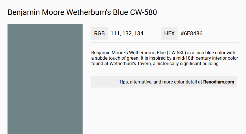
Benjamin Moore's Wetherburn's Blue (CW-580) is a lush blue color with a subtle touch of green. It is inspired by a mid-18th century interior color found at Wetherburn's Tavern, a historically significant building.
Undertones
The undertone of Wetherburn's Blue is primarily a blue hue, with no significant deviations into other color families. It maintains a consistent blue tone without strong influences from other colors.
Color Values
- HEX value: #6F8486
- RGB code: 111, 132, 134
Usage
This color is versatile and can be used in various rooms such as bedrooms, living rooms, and bathrooms. It pairs well with crisp white trims and natural wood accents, creating a timeless and elegant look.
Atmosphere
Wetherburn's Blue evokes a sense of calm and tranquility, making it ideal for creating a serene and soothing atmosphere. It adds a touch of sophistication to any space while maintaining a subtle and elegant charm.
Benjamin Moore Wetherburn's Blue CW-580 Color Alternative
Benjamin Moore Wetherburn's Blue CW-580 is well-regarded for its enduring appeal, yet many designers seek alternatives that convey similar depth and character. Sherwin Williams Blustery Sky SW 9140 and Sherwin Williams Downing Slate SW 2819 offer nuanced variations that embody both vibrancy and subtlety while maintaining the signature blue allure. For those desiring an even bolder statement, Sherwin Williams Portsmouth SW 9644 provides a dynamic twist that complements and reinterprets the classic essence of Benjamin Moore Wetherburn's Blue CW-580.
Bathroom
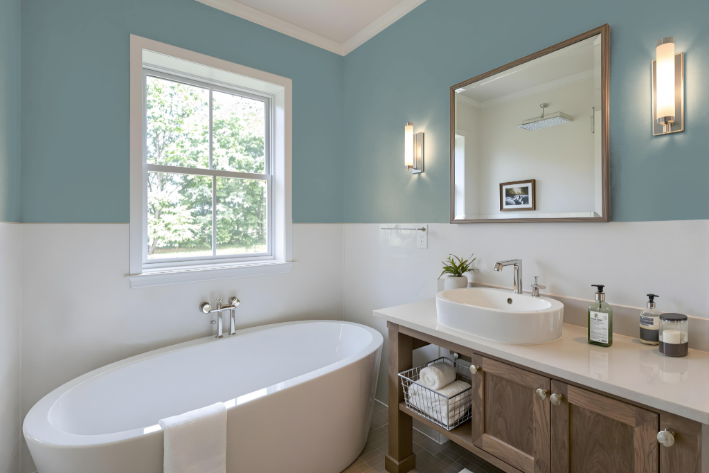
For a bathroom, Benjamin Moore's Wetherburn's Blue CW-580 is an excellent choice that imparts a calming and sophisticated vibe. Its deep, refined hue sets the stage for a serene retreat that harmoniously blends cool elegance with inviting warmth.
The color pairs beautifully with crisp white trims and natural wood accents, creating an atmosphere of enduring charm and tranquility. It adapts gracefully to varying lighting conditions, ensuring that the space remains a stylish and peaceful oasis whether illuminated brightly or softly lit.
Bedroom
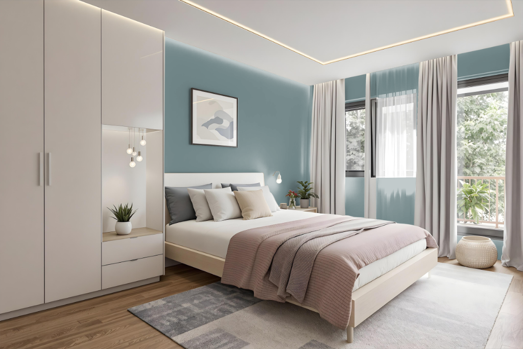
Benjamin Moore's Wetherburn's Blue is an excellent choice for a bedroom, delivering a calm and tranquil ambiance that enhances relaxation. It gracefully pairs with crisp white trims and natural wood accents to establish a timeless and sophisticated aesthetic. Employing different shades, tints, and tones of this blue allows for a harmonious monochromatic scheme that maintains a soothing atmosphere throughout the space.
For those seeking a more varied palette, introducing complementary hues with red undertones creates a vibrant dynamic that enlivens the room without overwhelming its serene quality. When combined with carefully selected furniture and decor, this color fosters an inviting sanctuary where style and serenity coexist seamlessly.
Kitchen
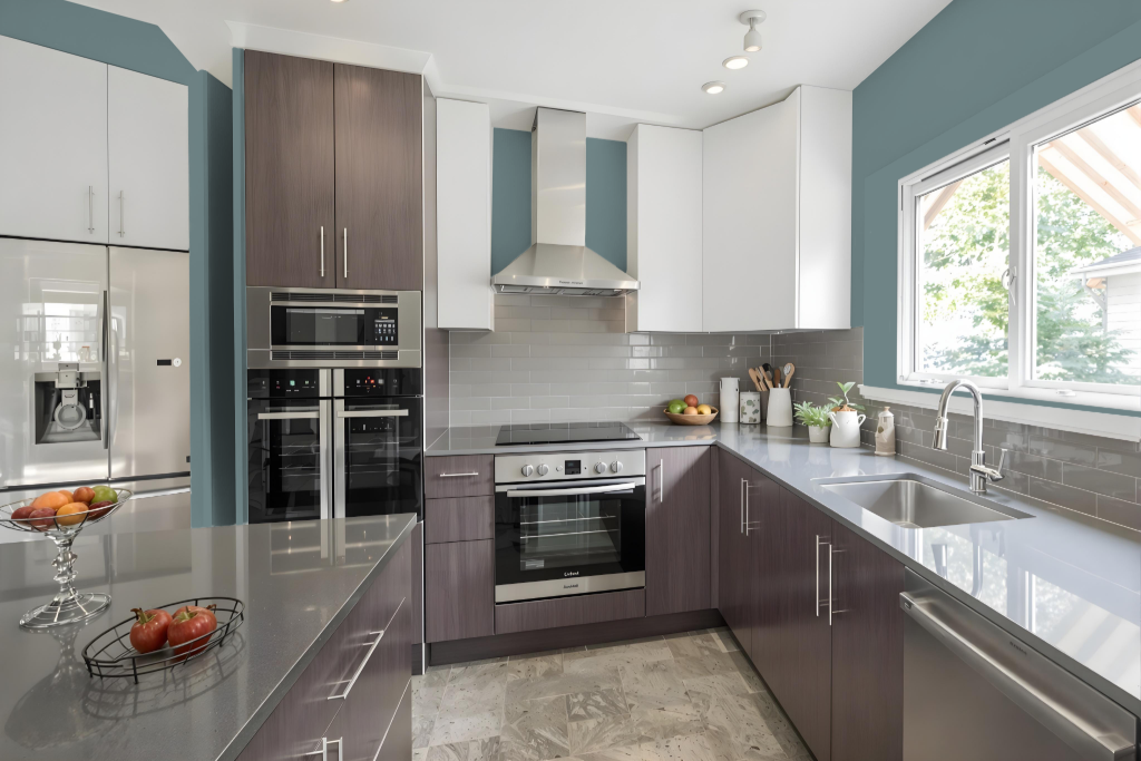
For a kitchen color scheme, Benjamin Moore's Wetherburn's Blue offers an elegant and soothing backdrop that enhances a space with crisp white trims and natural wood accents. The calming tone on walls sets a refined foundation, while using complementary white hues on trim and ceilings creates a unified, bright atmosphere.
Enhancing the overall design, this blue accommodates dynamic touches like accents in red-toned shades for areas adjacent to the kitchen, ensuring the space remains balanced and inviting. Opting for a pearl or satin finish increases the practicality of the walls by combining aesthetic appeal with ease of cleaning and durability.
Living Room
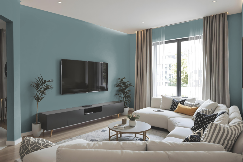
Benjamin Moore's Wetherburn's Blue CW-580 shines in the living room, pairing beautifully with crisp white trims and natural wood accents to create a timeless, elegant atmosphere. This sophisticated hue not only enhances living spaces but also adds a serene touch to other areas of the home like bedrooms and bathrooms.
For a cohesive overall look, it works harmoniously with complementary shades such as Capitol White, Super White, Barren Plain, and Raleigh Peach. Its balanced light reflectance makes this refined blue an excellent choice for spaces with varying lighting conditions, contributing to a sense of tranquility and classic style throughout.
Outdoor
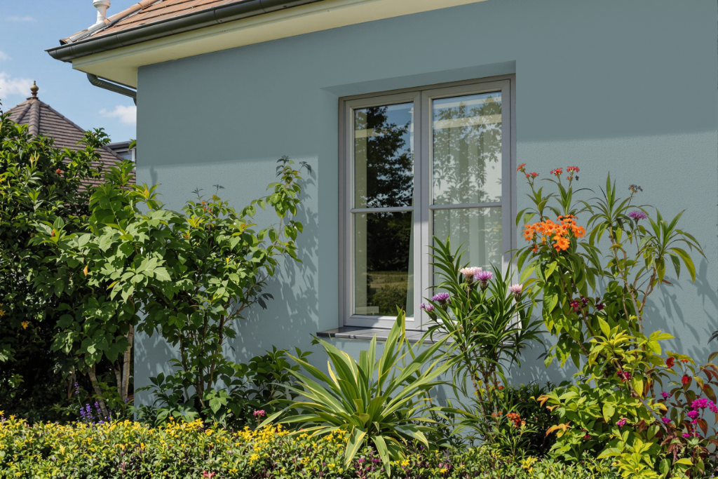
For your home's outdoor spaces, Benjamin Moore's Wetherburn's Blue offers an attractive aesthetic, yet it is not designed to weather the rigors of outdoor conditions. While its formulation includes low-VOC properties, excellent color longevity, and a resilient finish, the paint is specifically engineered for indoor applications.
For exterior projects, it is best to opt for products that are formulated to withstand sunlight and environmental challenges, ensuring enduring performance and reliable protection against the elements.