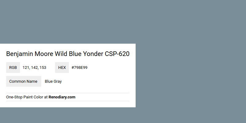
Benjamin Moore's Wild Blue Yonder CSP-620 exudes a calming and sophisticated aura, blending the serene tones of blue with the subtlety of gray. Its RGB composition of 121, 142, 153 creates a balanced hue that works harmoniously in both contemporary and traditional settings. This versatile color is perfect for adding a touch of elegance and tranquility to any living space.
Color Description
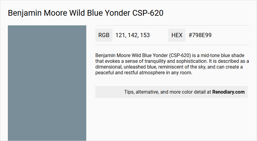
Benjamin Moore Wild Blue Yonder (CSP-620) is a mid-tone blue shade that evokes a sense of tranquility and sophistication. It is described as a dimensional, unleashed blue, reminiscent of the sky, and can create a peaceful and restful atmosphere in any room.
Undertones
The undertone of Wild Blue Yonder is accurately described as a pure blue hue. This blue undertone is evident when isolating the pure hue and eliminating any tints, tones, and shades.
Color Values
- HEX Value: #798E99 or #7B919B (slightly varying depending on the source).
- RGB Values: 121, 142, 153 or 123, 145, 155 (slightly varying depending on the source).
- LRV (Light Reflectance Value): 26.97.
Usage
Wild Blue Yonder is not recommended for exterior use. It is suitable for interior spaces such as bedrooms, living rooms, and studies, where it can enhance creativity and focus. It can be used in various color schemes, including monochromatic and complementary schemes.
Atmosphere
This color creates a serene and calming atmosphere, perfect for unwinding after a long day. It infuses any space with a sense of relaxation and introspection, making it ideal for rooms where tranquility is desired.
Benjamin Moore Wild Blue Yonder CSP-620 Color Alternative
Benjamin Moore Wild Blue Yonder CSP-620 is a striking blue hue that brings sophistication and a sense of calm to any space. For those who appreciate its unique tone, color alternatives such as Dulux Denim Drift 87BG 27/077, Farrow and Ball Selvedge 306, and Sherwin Williams Moody Blue SW 6221 provide comparable richness and visual appeal. Each option offers its own subtle interpretation of blue, ensuring a refined aesthetic that complements both contemporary interiors and classic exteriors.
Bathroom
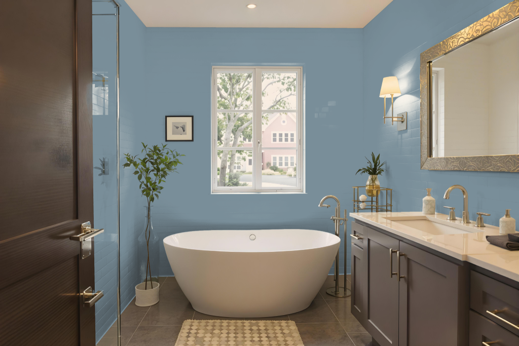
Bathroom color Benjamin Moore Wild Blue Yonder CSP-620 offers a deep, cool tone suitable for interior spaces if proper precautions are taken. Although it can be applied in bathrooms, it lacks the specialized moisture-resistant and mildew-resistant features found in formulations designed specifically for high-humidity environments.
For optimal performance in a bathroom, it is recommended to use a high-quality primer to improve adhesion and durability. The color’s relatively dark appearance may influence the room's brightness, so careful planning of lighting and complementary elements is essential for achieving the desired ambiance.
Bedroom
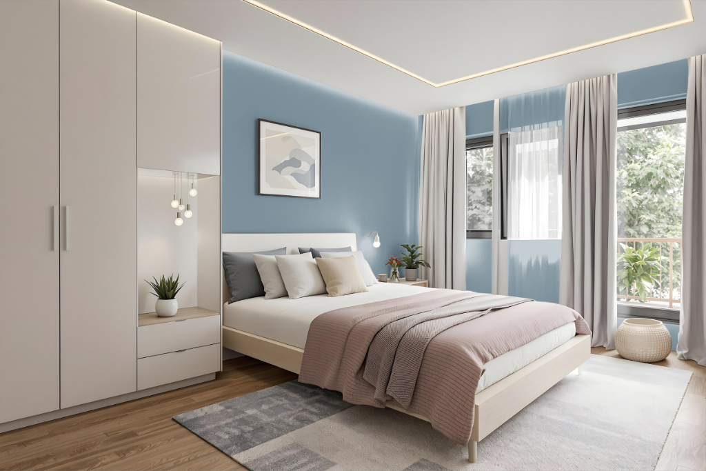
For a bedroom color scheme, Benjamin Moore's Wild Blue Yonder brings a calming mid-tone blue that sets an inviting foundation. It works well when used as the primary wall color while pairing with lighter shades for accents and trim, creating an atmosphere that feels both serene and thoughtfully composed.
To add visual interest, consider introducing hues with contrasting undertones to create a dynamic effect. Coordinating additional colors across bedding, furniture, and decorative elements helps reinforce the overall harmony of the room, ensuring every detail contributes to a balanced and engaging aesthetic.
Kitchen
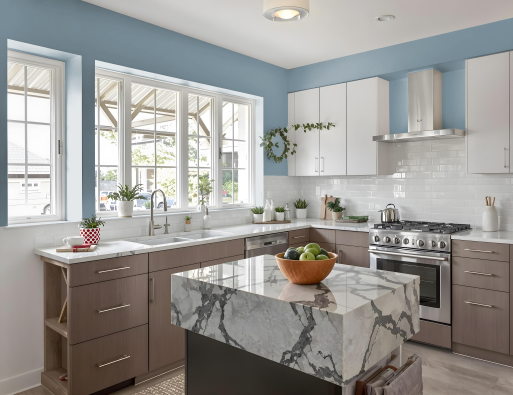
For a kitchen color scheme, Benjamin Moore's Wild Blue Yonder creates a distinctive backdrop that can set an engaging tone. Pair this blue with hues carrying a red undertone, such as Quietly Violet or Desert Shadows, for a striking complementary effect, or combine it with lighter and darker variations for a carefully layered monochromatic look.
Enhance the overall aesthetic with clean, durable finishes in select accent pieces and trim. Integrating neutral shades like White Dove or Edgecomb Gray for these features adds a polished touch while contributing to a balanced, inviting space that is both stylish and practical for everyday use.
Living Room
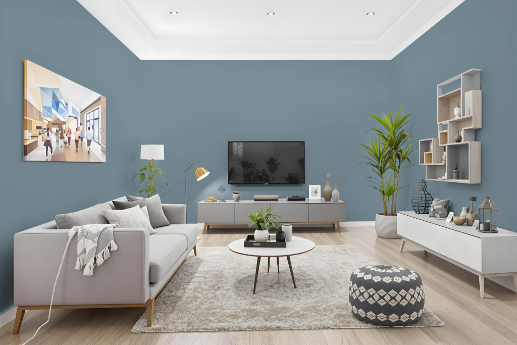
Benjamin Moore Wild Blue Yonder CSP-620 is an ideal choice for a living room, offering a calming effect that inspires creativity and focus while promoting relaxation and productivity. Its serene quality works well in many design contexts, making it suitable for spaces that require a soothing yet engaging atmosphere.
This color pairs seamlessly with coordinated shades for a monochromatic scheme or contrasting hues to create a complementary look. It is available in premium interior and bath and spa finishes that ensure excellent coverage, resistance to fading, and easy washability in any sheen.
Outdoor
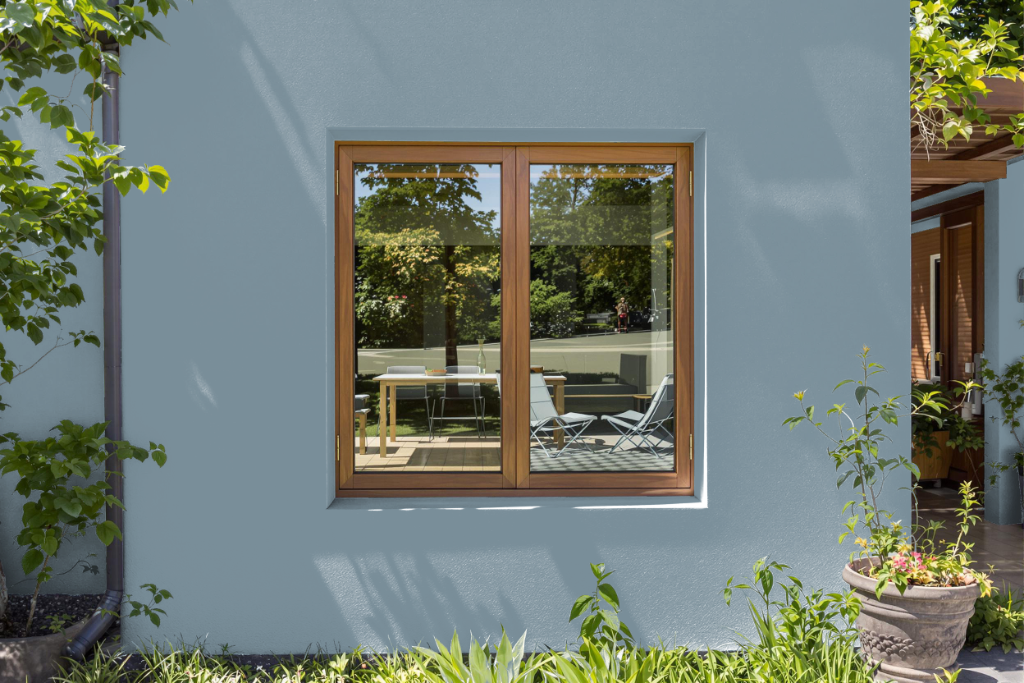
Home outdoor color Benjamin Moore Wild Blue Yonder CSP-620 might initially seem like an attractive option for enhancing exteriors, yet it is not recommended for outdoor applications. Designed as part of the Aura Color Stories Collection for interior spaces, this shade is optimized to uplift indoor environments rather than withstand the challenges of external weather conditions.
For homeowners seeking a reliable outdoor finish, it is best to choose colors specifically formulated for exterior use. These are engineered to provide lasting protection and maintain their appeal despite exposure to varying weather and environmental elements.