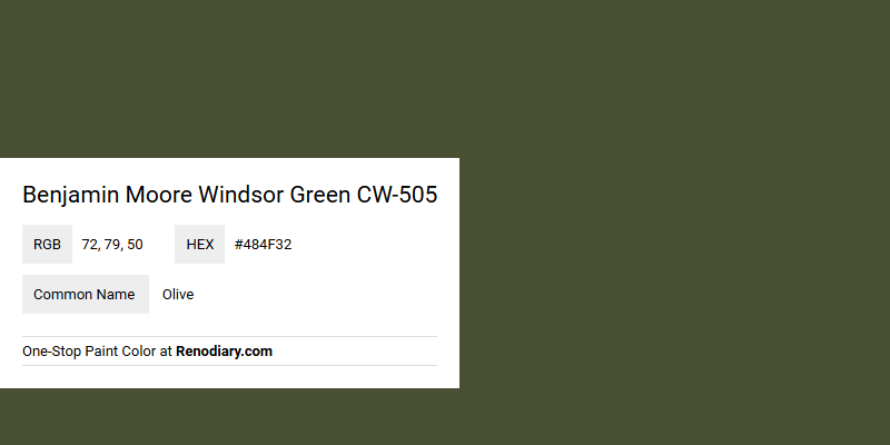
Benjamin Moore's Windsor Green CW-505 is a sophisticated shade with an earthy undertone, embodying the serene elements of a lush olive grove. Its RGB composition of 72, 79, 50 reinforces its deep, natural green, making it an ideal choice for spaces that seek to evoke tranquility and timeless elegance. This color's subtle depth can harmonize beautifully with neutral tones or serve as a standout feature wall, enhancing the overall ambiance of any room.
Color Description
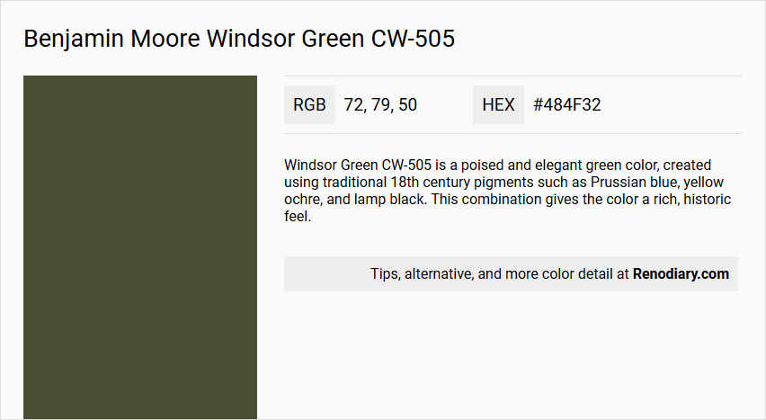
Windsor Green CW-505 is a poised and elegant green color, created using traditional 18th century pigments such as Prussian blue, yellow ochre, and lamp black. This combination gives the color a rich, historic feel.
Undertones
The color has undertones of blue and yellow, derived from the Prussian blue and yellow ochre used in its formulation. This blend contributes to its unique and balanced green hue.
Color Values
- LRV (Light Reflectance Value): 8.84
- RGB: 72, 79, 50
Usage
Windsor Green CW-505 is suitable for various applications, including walls, ceilings, cabinets, and bookshelves. It can be used to create a cohesive look in traditional, historic, or elegant settings.
Atmosphere
This color evokes a sense of classic elegance and sophistication, making it ideal for creating a refined and timeless atmosphere in any room. The dark, rich tone can add depth and character to the space.
Benjamin Moore Windsor Green CW-505 Color Alternative
Benjamin Moore Windsor Green CW-505 is a distinctive hue, and its alternatives offer similar depth and character. Tikkurila Ficus N378 and Dulux Olive Grove provide appealing variations for those seeking a unique twist while maintaining a comparable earthy, timeless appeal. Farrow and Ball Duck Green W55 stands out as another excellent alternative, offering versatility and a refined aesthetic similar to Benjamin Moore Windsor Green CW-505.
Bathroom
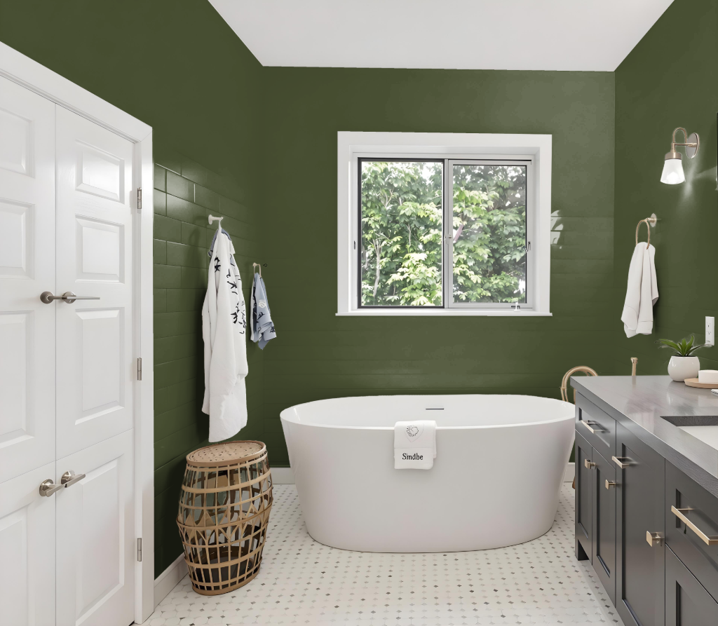
In a bathroom, Benjamin Moore's Windsor Green delivers an elegant and sophisticated backdrop. Drawing inspiration from 18th century pigments such as Prussian blue, yellow ochre, and lamp black, this deep shade from the Williamsburg® Paint Color Collection lends a historically rich appeal, while its lower light reflectance means additional lighting may be needed for optimal effect.
Windsor Green can be harmonized with shades that provide vibrant contrast like Approaching Storm or Iced Lavender, or balanced with neutral tones such as Harwood Putty, White Dove, and Cliffside Gray. Offered in finishes like eggshell and satin, this color is well-suited for bathrooms, ensuring both aesthetic charm and practical durability in spaces requiring frequent cleaning.
Bedroom
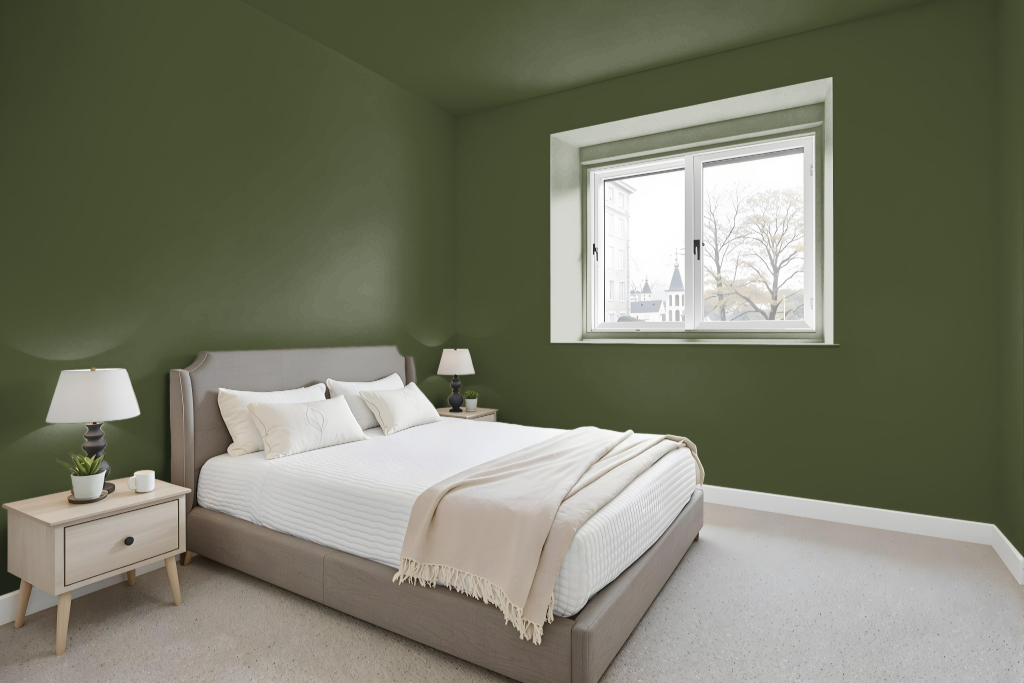
For a bedroom color scheme, Benjamin Moore Windsor Green CW-505 offers a bold, timeless option for creating an inviting space. Its deep, dark quality works well for accent walls or as the main color when paired with abundant natural light, establishing a dramatic backdrop that enriches the room's character.
To add visual interest and prevent monotony, this rich hue can be paired with lighter shades from the same family or contrasted with blue-inflected tones such as those found in Approaching Storm or Iced Lavender. The inclusion of traditional pigments lends an element of classic elegance that harmonizes beautifully with both modern and classic decor styles.
Kitchen
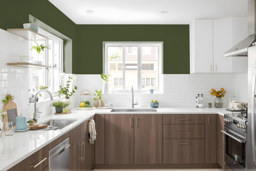
Benjamin Moore's Windsor Green CW-505 offers a unique and sophisticated choice for a kitchen color scheme. Its deep tone creates an elegant backdrop that works well in smaller spaces or as an accent wall, providing a rich contrast when paired with neutral shades like a classic white.
Employed on kitchen cabinets or decorative paneling, Windsor Green brings together modern and traditional design elements seamlessly. Pairing this color with warm neutrals or lighter shades helps create a balanced, cohesive, and inviting kitchen environment.
Living Room
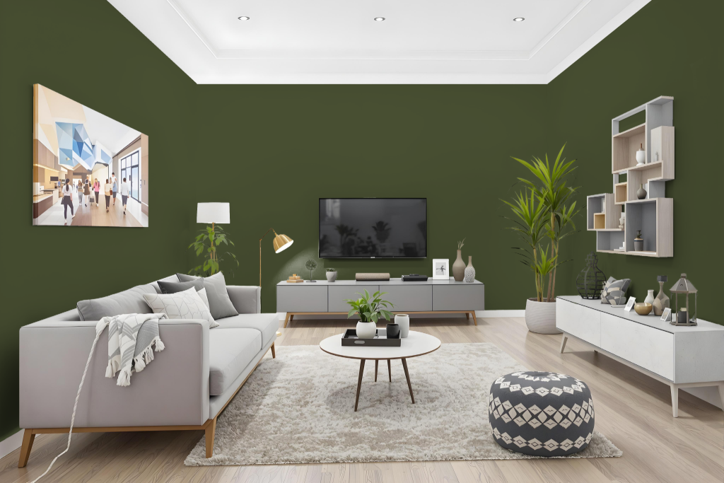
In the living room, Benjamin Moore Windsor Green CW-505 sets a cozy and elegant atmosphere with its dark, rich tone. Its deep hue, part of the Williamsburg® Paint Color Collection, lends an intimate feel to spaces like home offices and bedrooms, where a touch of sophistication is desired.
This refined shade pairs beautifully within monochromatic layouts or alongside complementary tones such as Approaching Storm and Iced Lavender. Coordinating colors like Harwood Putty, White Dove, Cliffside Gray, and Bruton White further enhance its character, making it an excellent choice for creating harmonious, stylish interiors.
Outdoor
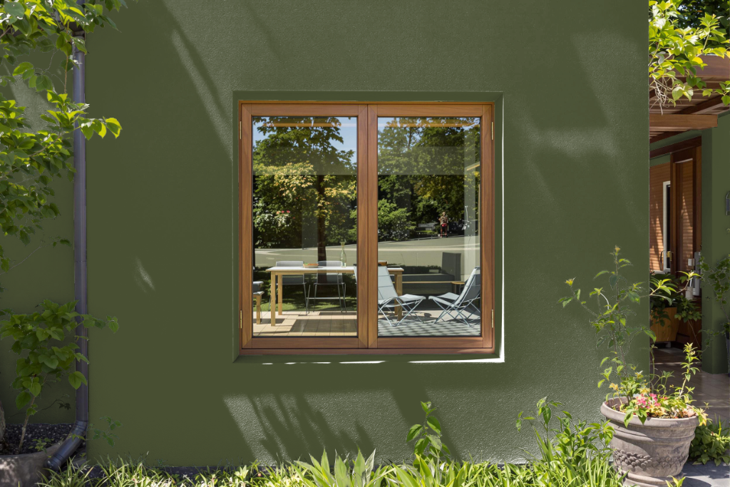
Benjamin Moore Windsor Green CW-505 is recognized as a home outdoor color option, even though it isn’t engineered to endure prolonged exposure to intense sunlight and adverse weather. Its rich, deep hue is best appreciated in interior environments where controlled lighting enhances its appeal in spaces like living rooms, home offices, or bedrooms.
For those keen on examining its effect in different settings, Benjamin Moore offers an 8 oz sample that can be applied to walls or foam boards, allowing you to observe how subtle shifts in light impact its appearance. For exterior projects, selecting a paint specifically formulated for prolonged outdoor use is essential to ensure durability and long-lasting performance.