Benjamin Moore's Winter Orchard 1555, with its RGB values of 221, 221, 211, offers a serene light gray hue that evokes a sense of calm and tranquility. This subtle shade is versatile, making it an excellent choice for creating airy, open spaces that can harmonize with a wide range of color palettes. Its understated elegance can enhance both modern and traditional interiors, adding a touch of sophistication without overwhelming other design elements.
Color Description
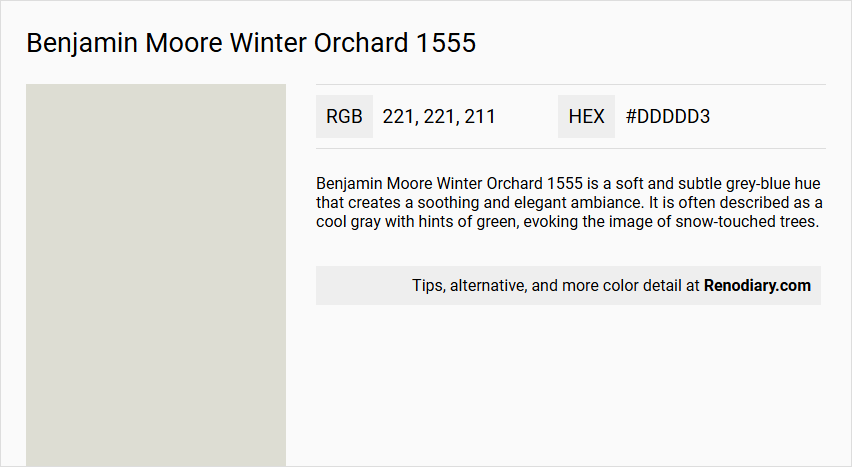
Benjamin Moore Winter Orchard 1555 is a soft and subtle grey-blue hue that creates a soothing and elegant ambiance. It is often described as a cool gray with hints of green, evoking the image of snow-touched trees.
Undertones
Despite its grey-blue appearance, the undertone of Winter Orchard can be accurately described as having a Yellow hue. This is determined by isolating the pure hue and eliminating any tints, tones, and shades.
Color Values
- LRV (Light Reflectance Value): 70.26 to 71.26
- RGB Values: 221, 221, 211 or 222, 220, 210
- HEX Code: #DDDDD3 or #DEDCD2
Usage
Winter Orchard 1555 is versatile and can be used on walls, furniture, or as an accent color. It pairs well with crisp whites like Benjamin Moore Chantilly Lace OC-65 for a fresh look, or with warm neutrals like Benjamin Moore Revere Pewter HC-172 and rich earth tones like Chelsea Gray HC-168 for a more sophisticated palette.
Atmosphere
This color adds a touch of tranquility and sophistication to any room. It creates a soothing and elegant ambiance, making it suitable for various spaces where a calm and refined atmosphere is desired.
Benjamin Moore Winter Orchard 1555 Color Alternative
Benjamin Moore Winter Orchard 1555 offers a distinct presence that can be matched by several carefully selected alternatives. Tikkurila Batiste G487 provides a crisp and inviting feel that aligns closely with the original tone of Benjamin Moore Winter Orchard 1555. In addition, Tikkurila Tailwind G486 and Tikkurila Talcum G484 are excellent choices for those seeking a similar aesthetic balance and visual warmth.
Bathroom
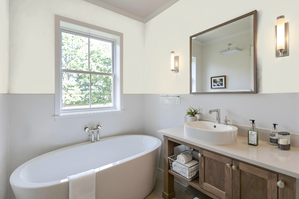
For a bathroom, Benjamin Moore's Winter Orchard 1555 creates a charming and refreshing atmosphere. For areas with low to moderate traffic, a matte or eggshell finish delivers a softly polished glow while providing an easy-to-clean surface.
For spaces prone to moisture such as near the shower or sink, a pearl or satin finish offers a smoother, less porous surface that can withstand frequent cleaning. Additionally, using a semi-gloss finish on trim and moldings enhances durability, making them well-suited for areas that require repeated cleanings.
Bedroom
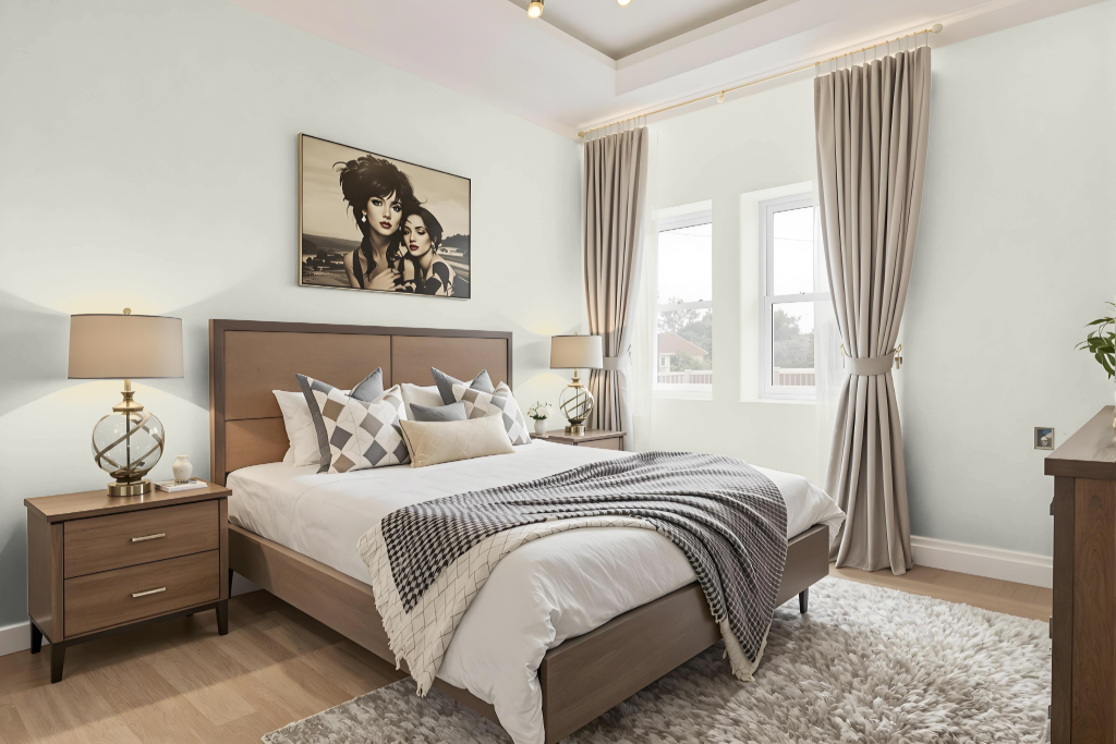
Benjamin Moore's Winter Orchard 1555 creates a calming and refined bedroom environment. This color elevates both traditional and modern settings while fostering a serene and inviting space that exudes elegance and relaxation. Its balanced hue pairs harmoniously with complementary tones such as White Dove, White Opulence, Boudoir, and Smokey Taupe.
The design palette is further enhanced by its ability to reflect a moderate amount of light, contributing to a room that feels both bright and tranquil. Whether embracing classic charm or contemporary sophistication, this warm and engaging color establishes a seamless foundation for an integrated and cohesive decorating scheme.
Kitchen
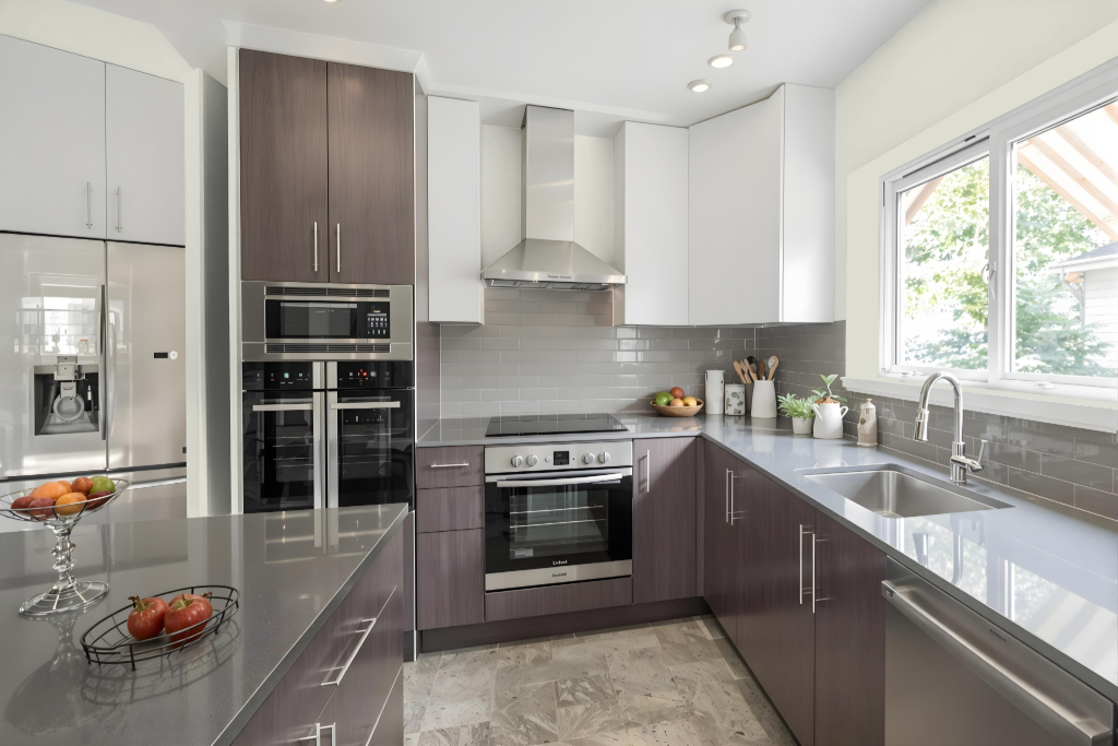
For a kitchen color scheme, Benjamin Moore Winter Orchard 1555 serves as an elegant foundation that pairs seamlessly with crisp whites like Chantilly Lace OC-65 for a clean and refreshing look. Integrating warm neutrals such as Revere Pewter HC-172 and rich earth tones like Chelsea Gray HC-168 further enhances sophistication while maintaining balance with cooler gray and green accents.
Utilizing varied shades and tints of Winter Orchard 1555 supports a well-defined monochromatic design. Complementary hues including White Dove OC-17, White Opulence OC-69, and Smokey Taupe 983 contribute to a harmonious palette, creating an inviting and refined kitchen atmosphere.
Living Room
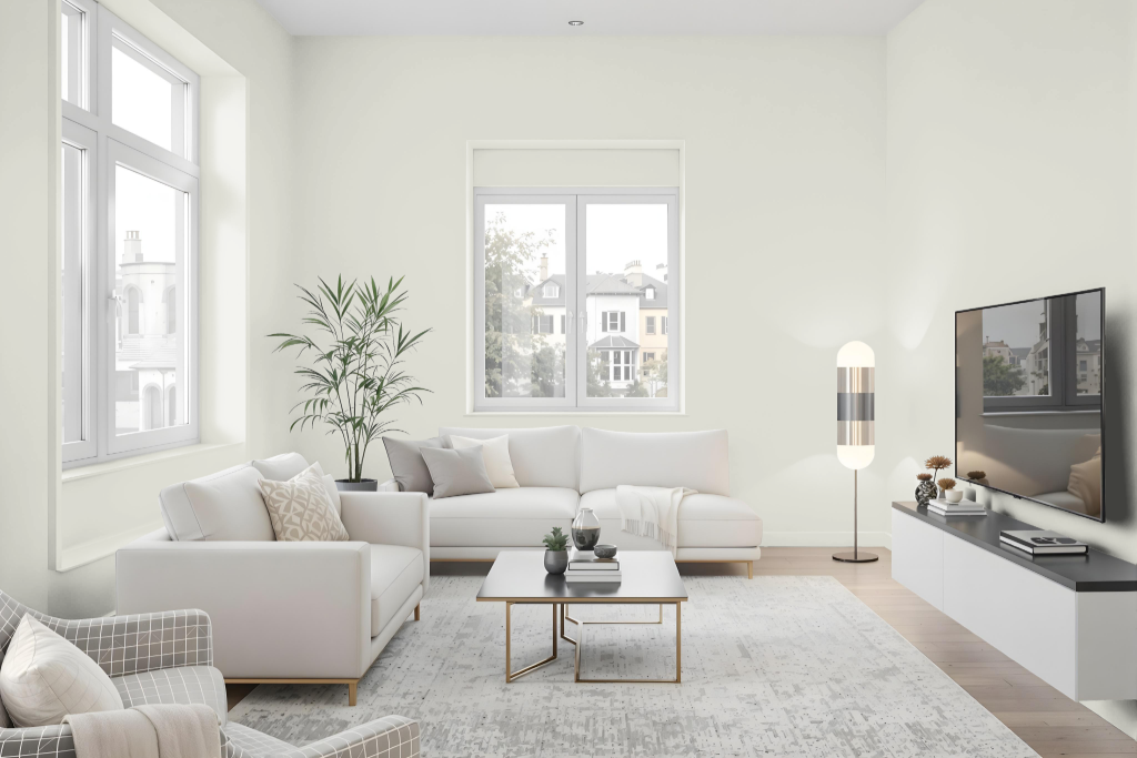
In a living room, Winter Orchard 1555 brings an inviting and elegant touch that immediately enhances the space. Its warm tones pair nicely with crisp white shades for a fresh, clean look or with warm neutrals and rich earth accents to achieve a sophisticated palette that adapts well to various decor styles.
Coordinate this refined hue with complementary shades like soft whites and muted taupes to create a dynamic visual effect. Whether applied in a monochromatic scheme or combined with contrasting colors, this classic choice from Benjamin Moore’s Classic Collection sets the stage for a timeless and personalized interior aesthetic.
Outdoor
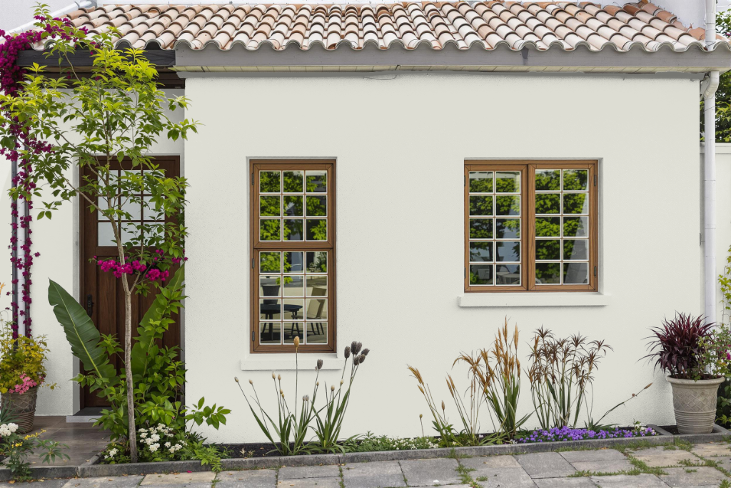
For home outdoor color, Benjamin Moore's Winter Orchard 1555 creates a subtle and soothing ambiance that lends a unique charm to exterior spaces even though it is often recommended for interiors. Its moderate light-reflecting quality ensures that the color maintains a balanced appearance outdoors.
When paired with crisp whites for accents and warm, rich tones for additional elements, Winter Orchard 1555 contributes to a cohesive and sophisticated exterior palette. The thoughtful combination of these hues helps to elevate the overall curb appeal and create a harmonious look around your home.