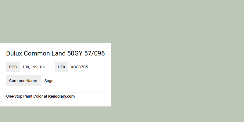
The color identified as Dulux Common Land 50GY 57/096 is recognized as a soothing shade of Sage, showcasing a harmonious blend of green and grey tones. Its RGB composition of 188, 199, and 181 reflects a gentle balance, creating an atmosphere of tranquility and refinement in any space it adorns. Often associated with calmness and nature, this hue is a popular choice for those seeking to incorporate a touch of serenity into interior design.
Color Description
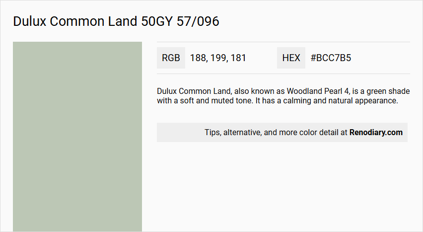
Dulux Common Land, also known as Woodland Pearl 4, is a green shade with a soft and muted tone. It has a calming and natural appearance.
Undertones
The undertone of Dulux Common Land is a green hue, which is evident from its color space. This green undertone gives the color its characteristic natural and earthy feel.
Color Values
- HEX Value: #bcc7b5
- RGB Code: 188, 199, 181
Usage
This color is versatile and can be used in various rooms such as living rooms, bathrooms, and bedrooms. It is suitable for walls, trims, and even exterior painting due to its calming and natural appearance.
Atmosphere
Dulux Common Land creates a serene and calming atmosphere, making it ideal for spaces where a peaceful and natural ambiance is desired. It can help in creating a unique and harmonious space that feels connected to nature.
Dulux Common Land 50GY 57/096 Color Alternative
Dulux Common Land 50GY 57/096 offers a refined base that can be complemented by alternative hues such as Tikkurila Flannel J446, Tikkurila K494, and Dulux Tranquil Dawn 45GY 55/052. These carefully selected color alternatives provide designers and homeowners with a range of options to tailor ambiance and visual impact in various spaces. By incorporating Tikkurila Flannel J446, Tikkurila K494, or Dulux Tranquil Dawn 45GY 55/052, creative projects can achieve a harmonious balance between traditional appeal and contemporary flair.
Bathroom
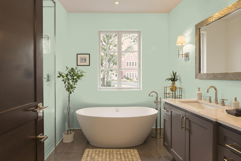
For a bathroom, Dulux Common Land offers an interesting and unique choice with its cool green undertones. Its natural hue can harmonize with earthy elements like stone or wood while requiring careful matching with bathroom fixtures to avoid possible clashes with warmer tones.
To achieve the best outcome, it's important to test the sample under natural lighting alongside other colors and materials in the space. Combining this paint with complementary purple shades can enhance the visual appeal, ensuring that the color's distinctive character is accentuated in a well-balanced setting.
Bedroom
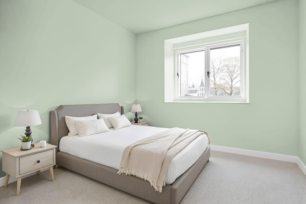
For a bedroom color scheme, Dulux Common Land creates a serene and calming atmosphere that can be used both as an accent feature and across the entire room for a tranquil vibe. Its muted tone lays the groundwork for a space that offers rest and relaxation.
Enhance the room by pairing this soft backdrop with complementary hues that introduce a dynamic contrast, or opt for a monochromatic approach with variations of the same shade to maintain cohesion. Incorporating layered textiles, natural materials, and minimal decor further elevates the elegance and reinforces the room's peaceful ambiance.
Kitchen
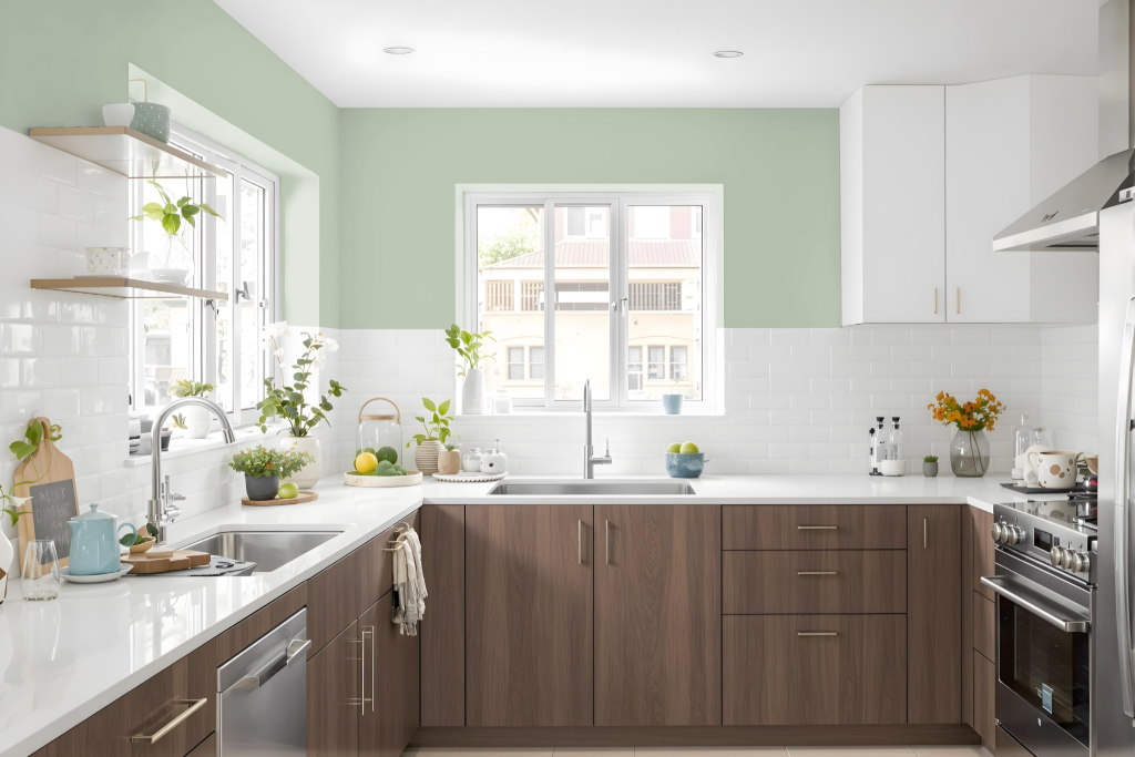
For a kitchen color scheme, Dulux Common Land creates a balanced, bright environment that serves as an excellent neutral backdrop. It works well with lighter shades for cabinetry and countertops, maintaining a light and open feel while supporting the introduction of bolder accent colors.
Complementary earthy hues such as warm beiges, soft grays, or muted greens enhance the natural elements like wooden features and flooring. Brighter tones through accessories or a feature wall can also be incorporated to establish an inviting and well-coordinated kitchen space.
Living Room
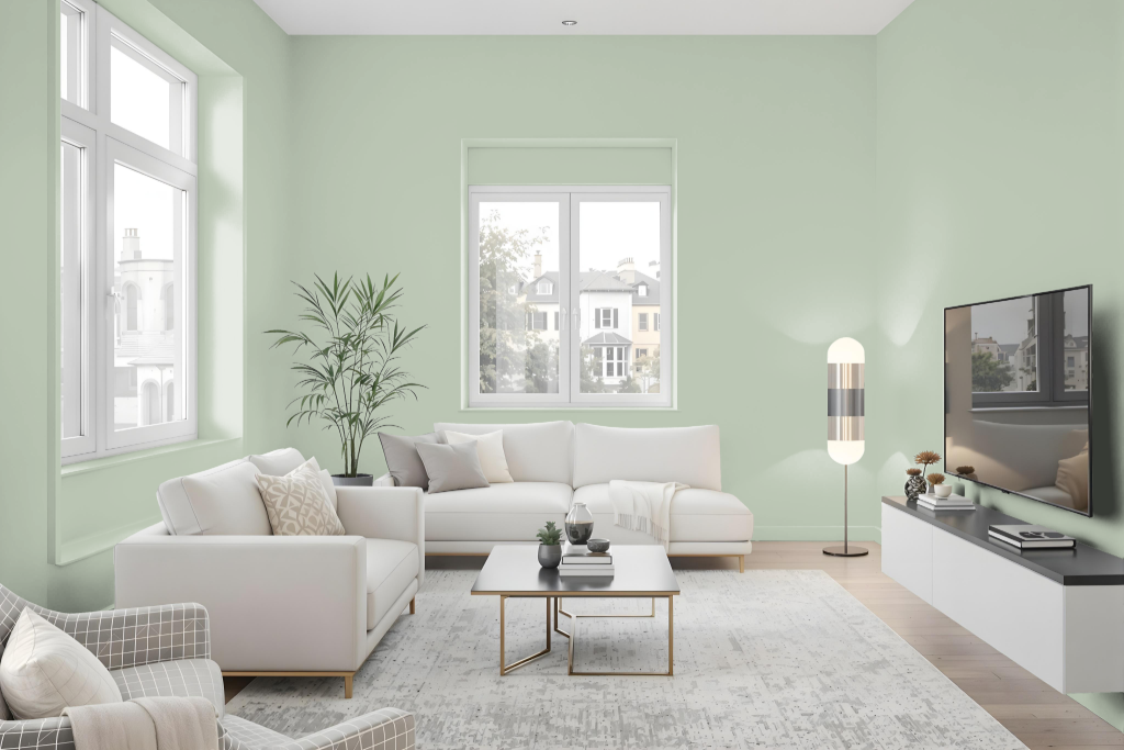
Living room design featuring Dulux Common Land creates a unique and harmonious space that brings a calm and serene atmosphere to walls and trims. This shade enhances the ambiance by serving as a perfect backdrop for various decorating schemes, including both monochromatic styles that employ lighter or darker variations of the same hue and vibrant combinations achieved by pairing with contrasting shades inspired by purple tones.
In addition, this color complements neutral tones, making it easy to tailor decor choices that reflect personal style and create a balanced visual effect. Its adaptability in different settings ensures that the living room remains a welcoming and thoughtfully curated environment.
Outdoor
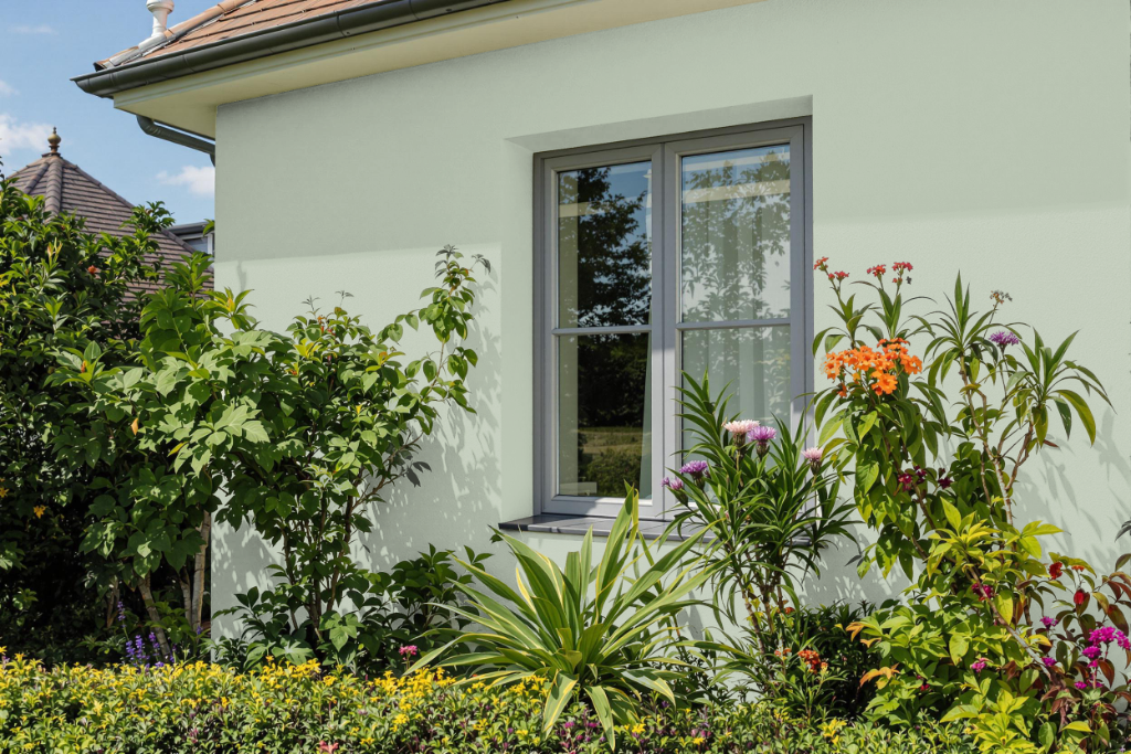
Dulux Common Land is an appealing home outdoor color characterized by a bright, balanced tone and subtle nuances that enrich exterior spaces. Its technical specifications indicate high lightness with carefully calibrated color coordinates that lend the hue an inviting air, making it a fitting choice for enhancing the appearance of outdoor elements.
With a light reflectance value around 57, this color has the capacity to brighten various surfaces, whether applied on textured walls or smoother finishes like exterior cabinetry. These detailed measurements support thoughtful application and ensure that the color maintains its intended aesthetic appeal across different environmental conditions.