Dulux Pretty Pink 69RB 70/114, with its RGB composition of (228, 210, 226), exudes a soft and inviting hue commonly known as Lilac. This gentle shade seamlessly blends subtle notes of pink and lavender, offering a vibrant yet serene aesthetic that can transform any space into a calming sanctuary. Whether used in living areas or bedrooms, the color Lilac embodies a sense of tranquility and elegance, making it a popular choice for those looking to create a soothing environment.
Color Description
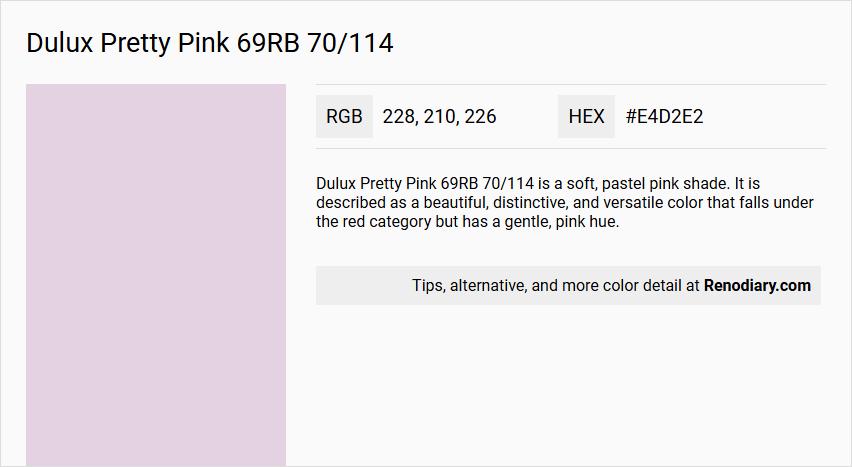
Dulux Pretty Pink 69RB 70/114 is a soft, pastel pink shade. It is described as a beautiful, distinctive, and versatile color that falls under the red category but has a gentle, pink hue.
Undertones
This color has subtle red undertones, which give it a warm and slightly vibrant appearance without being overly bold.
Color Values
The color code 69RB 70/114 indicates its position in the Dulux color system. In terms of digital color representation, it can be approximated by the hex code#e4d2e2, although the actual color may vary slightly depending on the medium and lighting.
Usage
- As a feature wall to add interest and impact.
- In bathrooms to create a calming atmosphere when paired with contrasting dark grey or white.
- For painting doors and wood trim to add a pop of color without committing to full walls.
- In kitchens to energize the space by painting cabinets or creating a feature wall.
- In bedrooms to create a cosy and inviting atmosphere, especially when combined with neutral or deep red and purple hues.
Atmosphere
This color evokes a sense of calmness and stillness, particularly in bathrooms and bedrooms. It can also bring a playful and cheerful vibe to other rooms like kitchens and living areas. The soft, subtle hue makes it ideal for creating a serene and modern feel.
Dulux Pretty Pink 69RB 70/114 Color Alternative
Dulux Pretty Pink 69RB 70/114 offers a vibrant and playful hue that makes any room feel full of energy and personality. For those looking for inspiring alternatives, Sherwin Williams Inspired Lilac SW 6820, Sherwin Williams Lite Lavender SW 6554, and Sherwin Williams Joyful Lilac SW 6972 provide refined and harmonious options that maintain the spirit of the original shade. Each of these alternatives brings its own unique character to the table, ensuring a perfect match for various design preferences while honoring the essence of Dulux Pretty Pink 69RB 70/114.
Bathroom
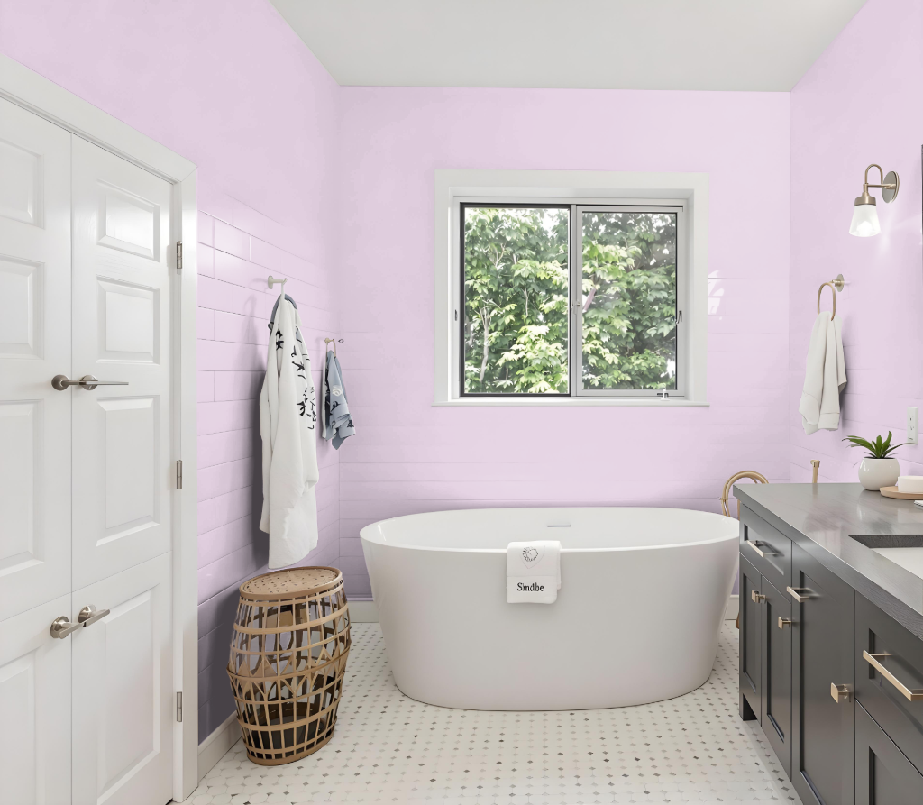
For a bathroom, Dulux Pretty Pink provides an inviting focal point when incorporated into the design. Complementing it with neutral or balancing tones, such as soft blues or subtle greys, creates an atmosphere that is both engaging and harmonious.
Employ this color on accent walls, skirting, or as dynamic touches on furniture and accessories. Thoughtful lighting and a dedicated bathroom paint resistant to mould and steam help ensure the finish remains fresh, elegant, and enduring over time.
Bedroom
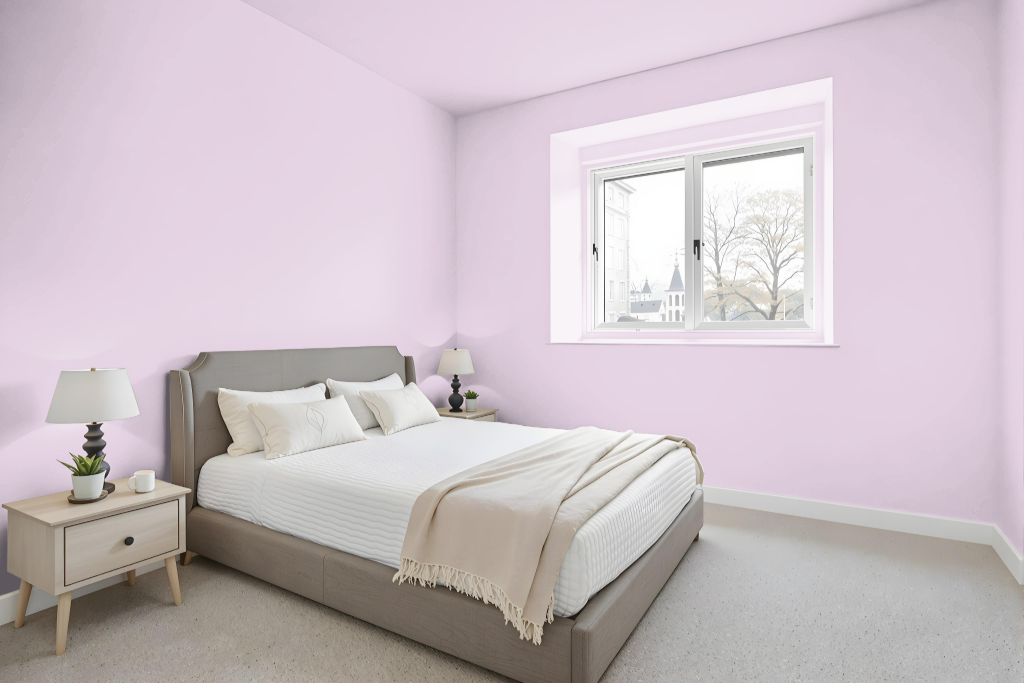
For a bedroom color scheme, Dulux Pretty Pink serves as a striking choice that can be applied to an accent wall or the entire space, adding a refined and inviting air. Its soft, elegant tone sets a sophisticated foundation that transforms the room into a welcoming haven.
Pairing Pretty Pink with hues that evoke warmth creates a dynamic visual appeal, while blending it with neutral shades establishes a balanced and calming atmosphere. Thoughtfully integrating contrasting accents, such as deeper or more subdued colors, further enhances the design, allowing the room to feel both energetic and harmoniously grounded.
Kitchen
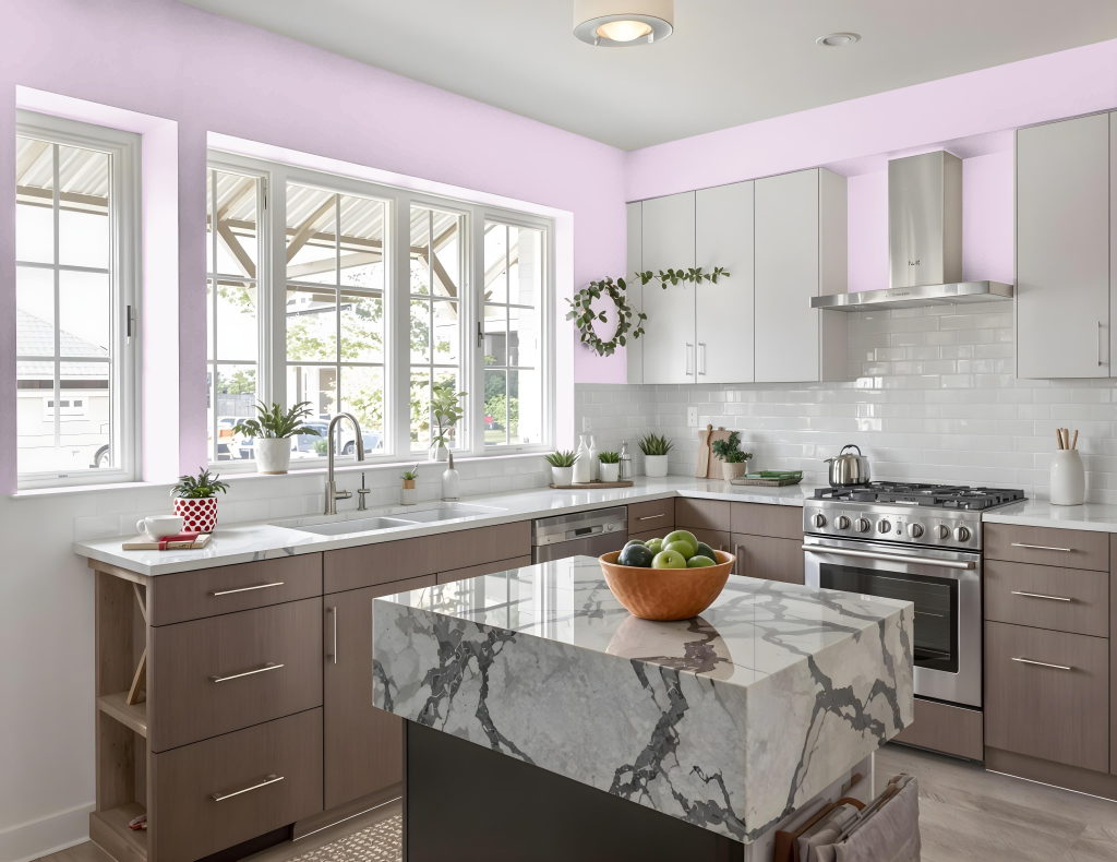
For a kitchen color scheme, Dulux Pretty Pink creates an inviting space that feels both playful and elegant. This captivating hue works exceptionally well on cabinets and backsplashes, while white accents like pendant lights and countertops help to illuminate and balance the overall look.
Incorporating this distinctive color on key features such as a kitchen island or standout appliances adds a bold touch to the space. Pairing it with complementary hues like warm yellow tones or a contrasting navy blue, as well as accentuating with pink utensils, curtains, or floral patterned wallpaper, further enhances the room’s cohesive and thoughtfully curated design.
Living Room
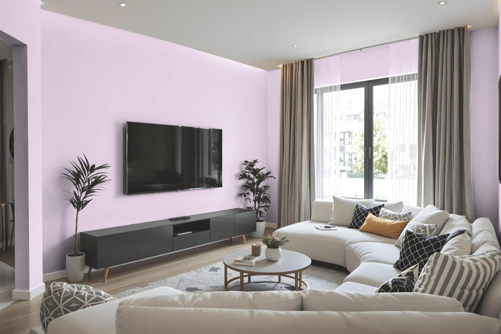
Living room color Dulux Pretty Pink transforms the space with a soft and inviting ambiance when applied to walls or trims. Its calming presence helps create a unique and soothing atmosphere that fosters a subtle yet distinctive character in the living room.
This hue effortlessly pairs with diverse decor schemes, whether using various shades of the same tone or contrasting complementary colors to achieve a vibrant visual balance. Neutral accents further enhance the look, ensuring an engaging and sophisticated environment adaptable to different lighting and surrounding elements.
Outdoor
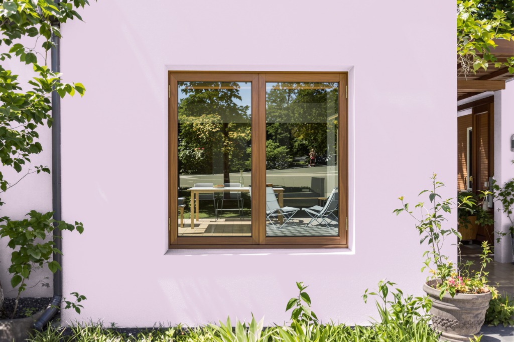
Dulux Pretty Pink is an attractive home outdoor color that, despite its charm, is not ideally suited for exterior surfaces due to its limited resistance against harsh weather conditions. Its formulation does not include the advanced protective properties necessary to effectively counter prolonged exposure to the elements.
For projects where durability and long-lasting performance are paramount, selecting a paint engineered with high-performance acrylic resin, mould-resistant biocides, and quick-drying waterproof capabilities ensures superior protection. This specialized alternative is designed to better withstand harsh environmental factors while maintaining a vibrant finish over time.