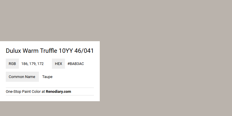
Dulux's Warm Truffle 10YY 46/041, often recognized by its RGB composition of (186,179,172), elegantly falls under the taupe color family. This shade offers a perfect balance between soft gray and brown tones, making it a versatile choice for creating a cozy and inviting atmosphere in any living space. Its subtle warmth and neutral undertones complement a wide range of interior styles, from modern minimalism to rustic charm.
Color Description
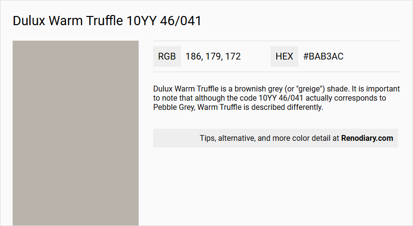
Dulux Warm Truffle is a brownish grey (or "greige") shade. It is important to note that although the code 10YY 46/041 actually corresponds to Pebble Grey, Warm Truffle is described differently.
Undertones
Warm Truffle features subtle undertones of warm yellow.
Color Values
For the actual 10YY 46/041 (Pebble Grey), which does not apply to Warm Truffle, the values are:
- Lab: L* 73.55, a* 1.27, b* 3.9
- RGB: sRGB 185; 180; 174
- LRV: Approximately 46
For Warm Truffle, specific color values are not provided in the sources. It is described as a lighter shade compared to Soft Truffle with less of a pink tint.
Usage
- Works well within a neutral palette or as part of a bold scheme.
- Suitable for both interior and exterior applications, including coating exterior walls with long-lasting color.
- Can be paired with soft pastels, creams, off-whites, or rich shades to create various looks.
Atmosphere
- Creates a clean and simple yet snug and intimate atmosphere in living rooms.
- Injects a touch of cosiness into a minimalist interior design.
- Contributes to a layered, luxurious feel when combined with darker tonal blends.
Dulux Warm Truffle 10YY 46/041 Color Alternative
Dulux Warm Truffle 10YY 46/041 offers a rich and inviting ambiance, making it a popular choice for sophisticated interiors. Its carefully selected alternatives, including Tikkurila Driftwood V484, Tikkurila Cloister V487, and Tikkurila Shantung V481, provide distinct yet harmonious variations that cater to different design preferences. Each of these colors has been chosen to complement the warm undertones of Dulux Warm Truffle 10YY 46/041, ensuring that every space can achieve a balanced and elegant feel.
Bathroom
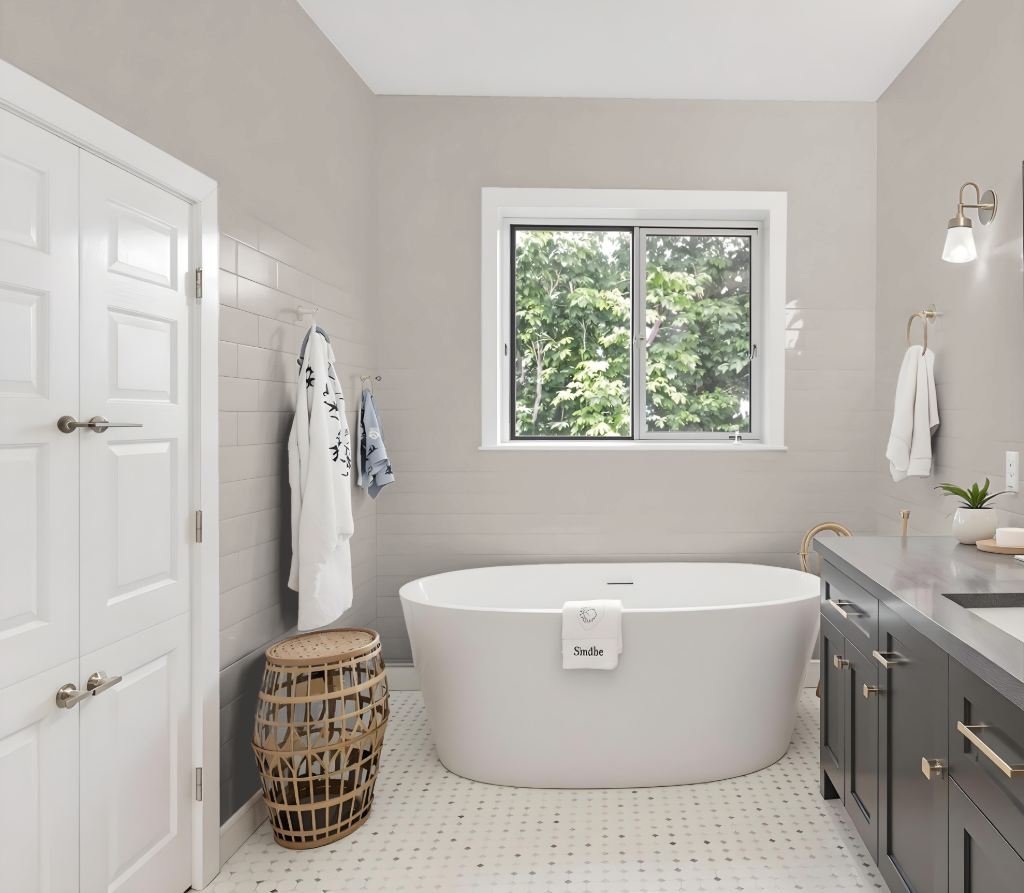
Dulux Warm Truffle is an excellent bathroom color celebrated for its calming properties and its ability to create a clean, simple look with a snug, intimate feel. It balances functionality with ambiance, offering a foundation that pairs well with soft pastels, creams, or off-whites for a lighter atmosphere, or with richer shades for a bolder, vibrant contrast.
Available in various finishes that cater to different levels of durability and ease of maintenance, this color adapts seamlessly to a range of design preferences. Its flexible nature ensures that bathroom walls can be both visually appealing and practically resilient.
Bedroom
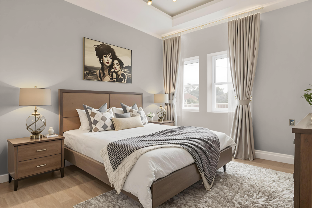
For a bedroom color scheme, Dulux Warm Truffle provides a cozy and inviting foundation that sets a warm tone for the space. It can serve as the anchor for a monochromatic design by incorporating lighter and darker variations of itself or be paired with cool blue-inspired tones to create a dynamic visual contrast.
The color also works harmoniously with soft, neutral shades—such as pastels, creams, and off-whites—to evoke a gentle, feminine ambiance, while integrating richer hues can introduce a bold, luxurious accent. This approach offers multiple pathways to tailor the overall mood and character of the room.
Kitchen
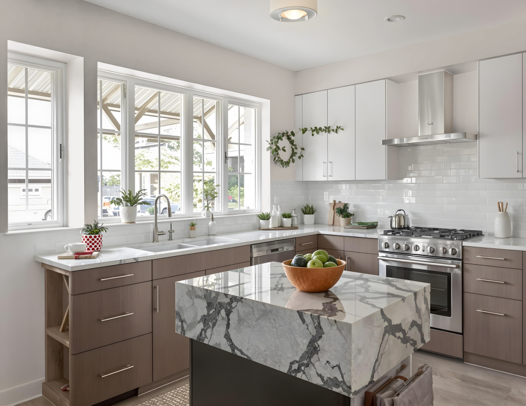
For a kitchen color scheme, Dulux Warm Truffle serves as an appealing choice that injects warmth and sophistication. It enhances cabinets, walls, and accent features when paired with soft pastels, creams, and off-whites like Dulux Sorbet, Dulux Candy Cream, or Dulux Barley White, creating a delicate and feminine ambience.
For a bolder twist, rich shades such as Dulux Sapphire Salute, Dulux Roasted Red, or Dulux Cranberry Crunch offer striking contrast, while deeper tones like Dulux Rich Praline and Dulux Praline Melt contribute a layered, luxurious depth. The high opacity formula guarantees a professional-quality finish that maintains its enduring color richness.
Living Room
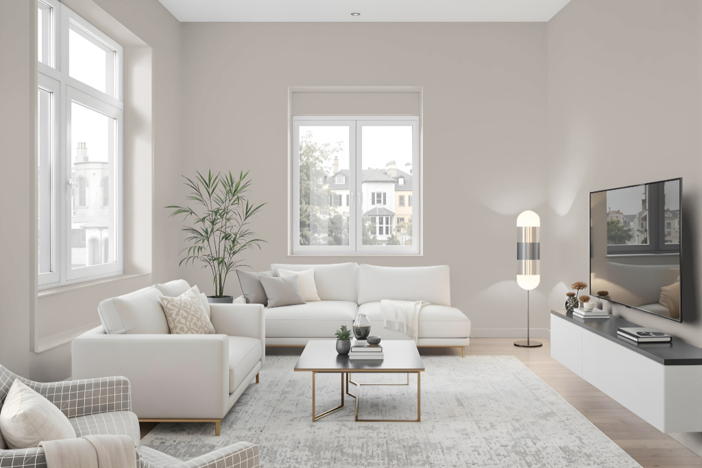
In a living room, Dulux Warm Truffle makes a bold statement with its earthy elegance, creating an inviting atmosphere that can feel both calm and intimate. This hue easily blends with a neutral base for a clean aesthetic or anchors a bold scheme with deeper, richer accents, allowing for a monochromatic approach or a mix of complementary colors that highlights both soft pastels and vibrant tones.
It can be paired with a range of shades—from lighter, delicate hues to darker, more dramatic ones—enabling various design moods that suit different lighting conditions. By harmonizing with a spectrum of complementary accents, the color adapts seamlessly to rooms with diverse orientations, ensuring a balanced yet striking visual impact.
Outdoor
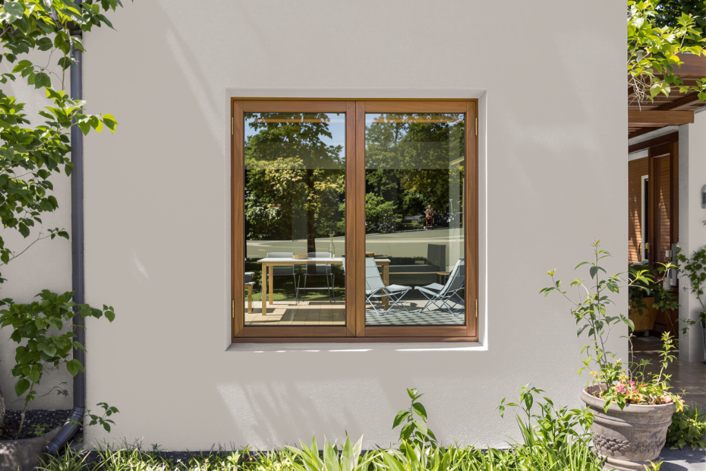
Dulux Warm Truffle offers a distinctive home outdoor color ideal for enhancing exterior walls with a long-lasting finish that significantly boosts curb appeal. It has been specifically developed for exterior surfaces to withstand various weather conditions while delivering a smooth, high-quality finish.
This exterior coating is designed to harmonize with a range of other hues, lending itself well to both neutral palettes and more dynamic color schemes. Its adaptability allows homeowners to pair it confidently with soft pastels or deeper shades to create a unique and memorable outdoor aesthetic.