Farrow and Ball's Peignoir 286, with its delicate RGB composition of 214, 200, 195, embodies a shade that harmoniously blends sophistication with warmth, often described as a subtle taupe. This hue, reminiscent of soft blush tones mixed with earthy grays, captures a timeless elegance perfect for creating serene and inviting spaces. The versatility of Peignoir allows it to complement a wide range of interior styles, making it a sought-after choice for both traditional and contemporary design enthusiasts.
Color Description
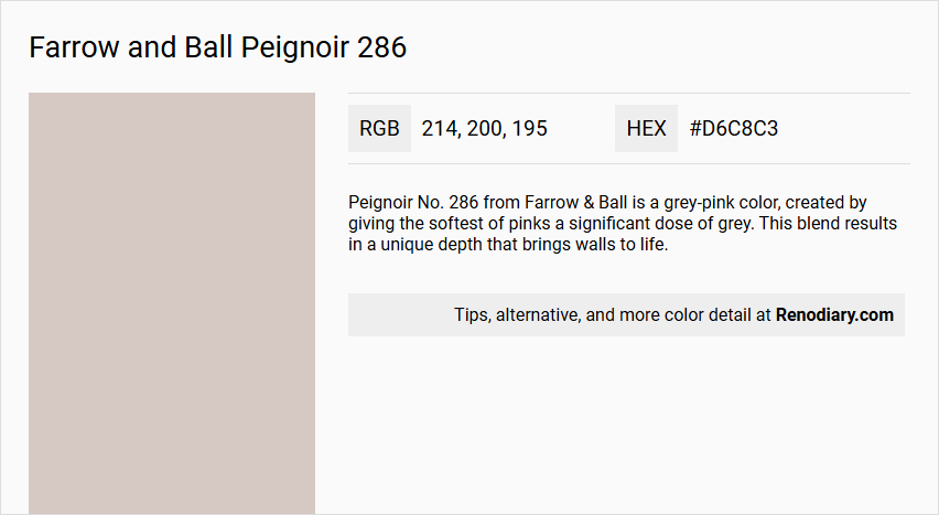
Peignoir No. 286 from Farrow & Ball is a grey-pink color, created by giving the softest of pinks a significant dose of grey. This blend results in a unique depth that brings walls to life.
Undertones
The color has prominent grey undertones, which contribute to its sophisticated and balanced appearance.
Color Values
The hex code for Peignoir No. 286 is #d6c8c3, indicating a light to medium grey-pink hue.
Usage
Peignoir No. 286 works perfectly in both old and new homes and can be paired with Farrow & Ball's Contemporary Neutrals, or with colors like Brassica and Pelt. It is suitable for various rooms, including bedrooms and living rooms, and is available in different finishes such as Estate Emulsion and Modern Emulsion.
Atmosphere
This color has a romantic feel, inspired by the 19th-century chiffon gowns worn by ladies while brushing their hair. It adds a touch of elegance and sophistication to any space, creating a warm and inviting atmosphere.
Farrow and Ball Peignoir 286 Color Alternative
Farrow and Ball Peignoir 286 is a distinctive color whose unique characteristics make it a popular choice for refined interiors. Tikkurila offers alternatives such as Tikkurila Median X486, which provides a similarly elegant tone, and Tikkurila Shawl Y467, which offers a gentle yet contemporary variation. For those seeking a deeper, more dramatic option, Tikkurila Mirage G481 serves as an excellent alternative without compromising on the sophistication inherent to the original shade.
Bathroom
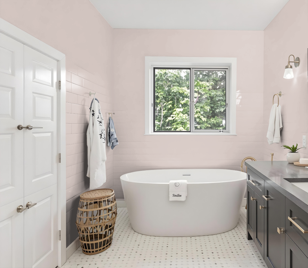
For a bathroom, Peignoir 286 sets a serene tone that complements the space's design. This color works exceptionally well when enhanced by a modern, water-based finish that is both washable and scuff-proof, ensuring the walls remain attractive despite everyday use.
The recommended finish also features a protective quality against moisture and mould, making it ideal for humid environments. Its durability and low-maintenance properties help keep the bathroom looking fresh and well-maintained over time.
Bedroom
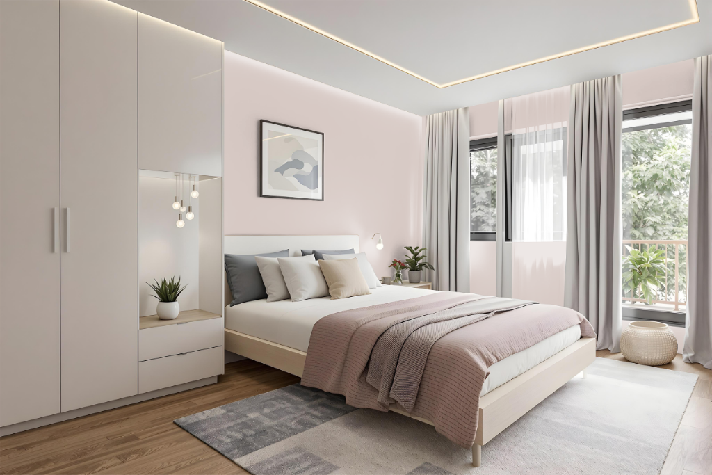
For a bedroom, Farrow & Ball's Peignoir 286 offers a warm, inviting hue that sets the stage for a cohesive design. This color harmonizes beautifully with gently tinted neutrals and, when paired with deeper grounding tones as accents, creates a balanced ambiance that echoes its subtle richness.
Building on this foundation, natural wood elements, macramé cotton cords, and woollen throws add tactile warmth and layered visual interest, enhancing the room’s cozy charm. Additional touches, such as coordinating skirting boards and window frames with the primary hue and integrating soft shades alongside bold accents, help maintain a unified yet dynamic atmosphere throughout the space.
Kitchen
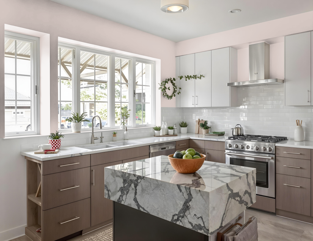
For a kitchen color scheme, Farrow and Ball's Peignoir 286 offers a sophisticated and cozy ambiance. It creates a harmonious backdrop when combined with gently tinted neutrals such as Wevet and Great White, and it is effective on walls as well as on accent elements to tie the space together.
The calming tone of Peignoir complements richer grounding hues used as accents, while pairing it with warm neutrals like Charleston Gray reinforces a cozy feel. This elegant choice adapts well to a range of kitchen styles, from traditional to modern, and pairs beautifully with accents in gold or soft grey.
Living Room
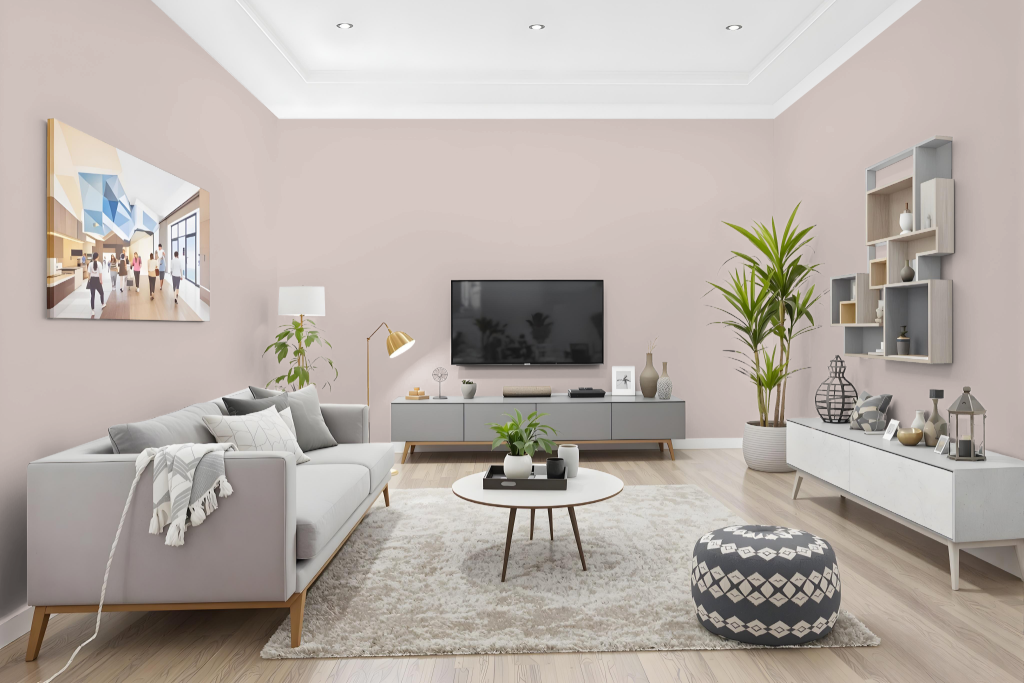
In a living room, Farrow & Ball’s Peignoir delivers a warm and pensive backdrop that encourages a cozy ambiance, especially when paired with gently tinted neutrals like Wevet and Great White. Its warm undertones offer a calming presence, and the use of stronger grounding accents or complementary combinations such as Charleston Gray and Cinder Rose can further enhance its inviting feel.
Beyond the living room, Peignoir works effectively in a range of rooms—from kitchens and bathrooms to bedrooms, nurseries, and garden spaces—providing a consistent and welcoming vibe throughout the home. Its compatibility with Modern Emulsion finishes also makes it a practical choice for areas that experience higher foot traffic.
Outdoor
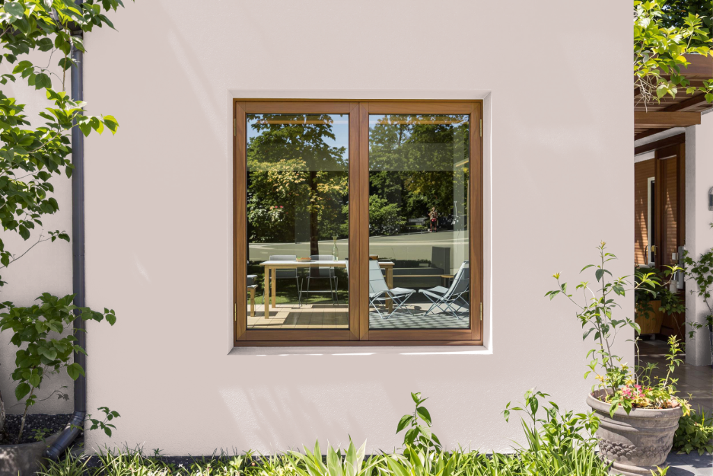
Farrow and Ball Peignoir 286 is a distinctive home outdoor color that carries an air of sophistication despite being engineered exclusively for interior living spaces. It is part of an emulsion range crafted to provide a chalky, deeply matte finish on walls and ceilings, and benefits from a water-based composition with low VOC levels that make it an environmentally conscious choice.
Designed for optimal application with a brush, roller, or spray, this finish enhances indoor aesthetics with its refined texture. For true outdoor environments, Farrow & Ball recommends selecting from their range of exterior-specific coatings that are tailored to withstand weather challenges while offering various levels of sheen.