Farrow and Ball's Preference Red 297 is a rich, deep hue that embodies sophistication and warmth, making it a popular choice for creating luxurious interiors. With its RGB composition of (109,66,71), this color reflects a balance of muted red and dark undertones, often perceived as akin to maroon. This shade is ideal for adding a timeless elegance to any space, effortlessly complementing both modern and traditional design styles.
Color Description
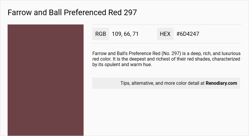
Farrow and Ball's Preference Red (No. 297) is a deep, rich, and luxurious red color. It is the deepest and richest of their red shades, characterized by its opulent and warm hue.
Undertones
The undertone of Preference Red can be accurately described as a pure red hue, without any significant deviations into other color undertones.
Color Values
- HEX: #6d4247
- RGB: rgb(109, 66, 71)
- CMYK: cmyk(0%, 39%, 35%, 57%)
- HSL: hsl(353, 25%, 34%)
Usage
This color is ideal for creating a focal point in rooms such as dining rooms and living rooms. It works well as an accent wall color, especially when paired with more neutral tones like Cornforth White or Ammonite. It can also be used effectively in bathrooms to create a warm and inviting atmosphere.
Atmosphere
Preference Red creates a warm and inviting atmosphere, adding a sense of intimacy and elegance to the space. It commands attention and can make a room feel more opulent and luxurious.
Farrow and Ball Preferenced Red 297 Color Alternative
Farrow and Ball Preferenced Red 297 lends a rich, sophisticated hue that can be excellently matched with several contemporary alternatives. Tikkurila Beetroot M425 offers a similar depth with a slightly infused vibrancy, making it a suitable option for spaces that require an energetic yet refined look. Meanwhile, Tikkurila Rooibos M476 and Tikkurila N470 further expand the palette, delivering elegant variations that maintain the character of the original color while adding their unique twists.
Bathroom
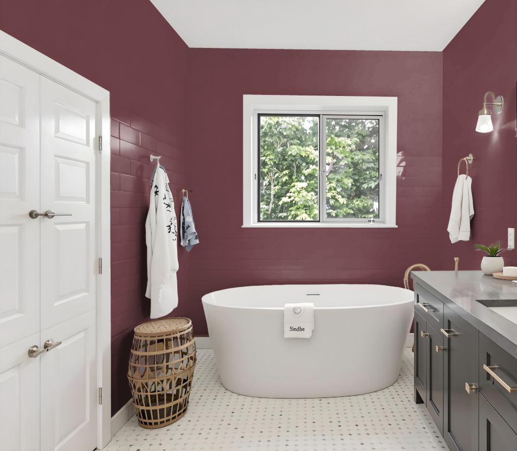
For bathroom color, Preferenced Red 297 offers a striking and deep hue that can create a bold statement, though its rich tone may not be the most practical choice for such spaces. Modern Emulsion is highly recommended for bathrooms due to its water-based formula, washable properties, scuff resistance, and a sheen that provides durability against moisture and condensation.
If one still opts for the striking tone of Preferenced Red 297 in a bathroom setting, it is available in the Modern Emulsion finish, ensuring the necessary protection and ease of maintenance while preserving its distinctive character.
Bedroom
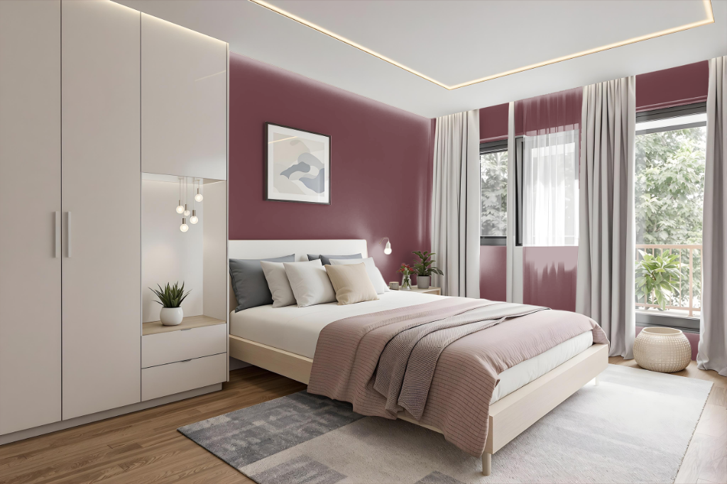
Farrow and Ball's Preferenced Red 297 is a striking bedroom color choice that sets the stage for a luxurious and intimate retreat. Its warm, enveloping tone creates a rich backdrop ideal for pairing with deep neutrals to form a "Cosy & Cocooning" atmosphere. Whether applied to an entire room or used on an accent wall, the hue brings depth and elegance, enhancing design elements like a painted headboard and creating a refined, comfortable space.
The use of Preferenced Red 297, when combined with soft lighting, transforms the bedroom into a sanctuary that feels both grounded and secure, perfect for unwinding after a long day. This carefully selected color helps generate a serene environment, making it an excellent option for those seeking a restful haven that exudes warmth and sophistication.
Kitchen
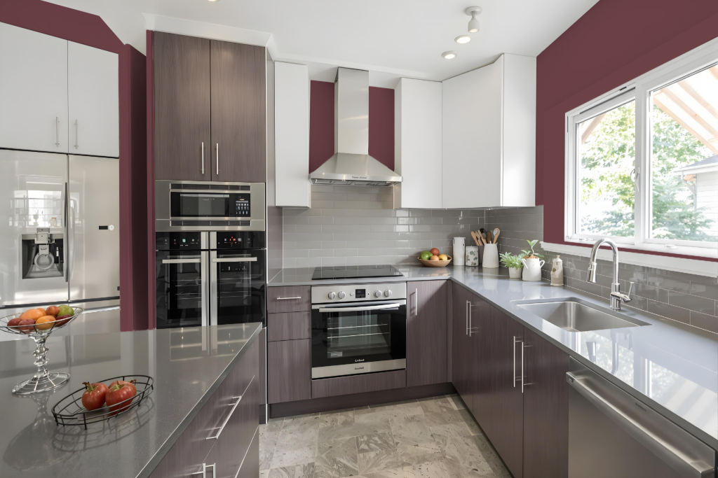
Farrow and Ball's Preferenced Red 297 transforms a kitchen with its deep, inviting intensity, making it an excellent accent hue for areas like a feature wall, kitchen island, or selective cabinetry. Its commanding presence adds elegance and warmth, drawing attention without overpowering the space when used thoughtfully.
Balancing this rich tone with lighter neutral shades creates a harmonious atmosphere. Pairing it with soft hues on surrounding walls or cabinetry ensures the bold character of the accent is both highlighted and complemented, resulting in a stylish and cohesive kitchen design.
Living Room
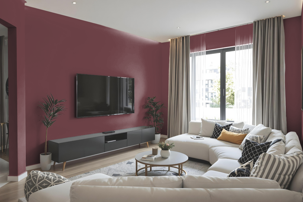
In the living room, Preferenced Red creates a warm and inviting atmosphere with its distinctive hue. It commands attention as a focal point while infusing the space with intimacy and elegance, making it an excellent choice for those looking to incorporate a deep, inviting tone into their décor.
When harmonized with more neutral options like Cornforth White or Ammonite, this rich shade elevates the overall aesthetic, rendering the room cozy and sophisticated. Its ability to establish a luxurious ambiance makes it ideal for areas where a sense of opulence and warmth is desired.
Outdoor
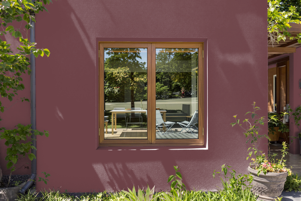
For home outdoor color, Preference Red presents a bold hue that might initially catch the eye, but it is primarily formulated for interiors rather than the rigors of external environments. When considering an exterior finish for brick, render, or concrete surfaces, a specially designed formulation offers a super-matt appearance, water resistance, high breathability, and protection against fungi and algae for long-lasting durability.
For wood and metal cladding, an alternative low-sheen coating has been developed to provide a flexible, weather-resistant finish. This product not only withstands outdoor conditions effectively but also ensures a reliable protective layer that endures over time.