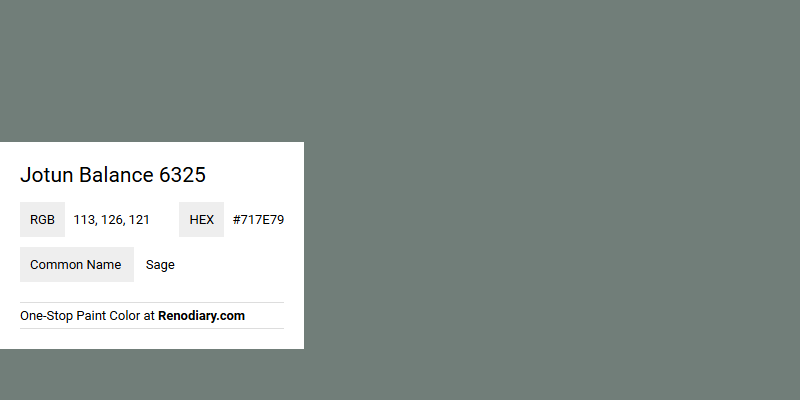
Jotun Balance 6325, known for its calming and serene appeal, embodies the essence of the color Sage with its balanced mix of muted green tones. The RGB composition of 113,126,121 reflects a soothing presence, making it an ideal choice for interior spaces seeking tranquility and elegance. This versatile hue complements various design styles, bringing a subtle yet sophisticated touch to any room.
Color Description
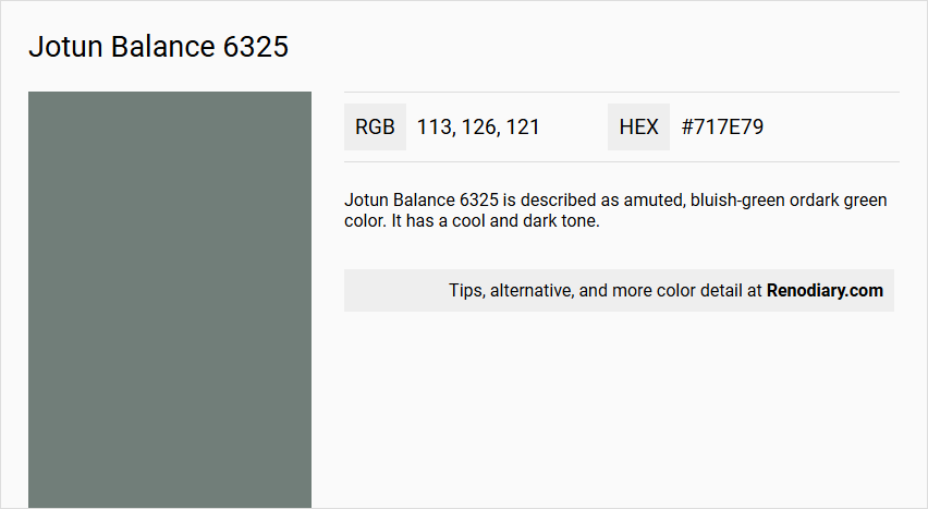
Jotun Balance 6325 is described as a muted, bluish-green or dark green color. It has a cool and dark tone.
Undertones
The undertone of Jotun Balance 6325 is predominantly green, with a hint of blue.
Color Values
- HEX value: #717E79
- RGB code: 113, 126, 121
- NCS Code: 5608-B78G
Usage
This color is versatile and can be used in various rooms such as bedrooms, living rooms, and bathrooms. It works well as a background color and can be combined with a wide range of color palettes.
Atmosphere
Jotun Balance 6325 creates a unique and dynamic visual effect, especially when used in a complementary color scheme. It adds a sense of authority and can work well with flashy or colourful decor, maintaining a classic and long-lasting appearance.
Jotun Balance 6325 Color Alternative
Jotun Balance 6325 has several color alternatives that offer a range of moods and styles, making it a versatile choice for any design project. Little Greene Ambleside 304, Little Greene Livid 263, and Farrow and Ball Green Smoke 47 each bring a distinct character to a space, allowing for tailored aesthetics based on unique lighting and layout contexts. These alternatives not only harmonize well with various decor themes but also provide creative flexibility for both modern and classic interior designs.
Bathroom
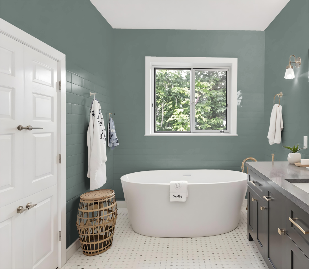
Jotun Balance 6325 is an excellent choice for a bathroom, creating a distinctive appearance that enhances both style and functionality. Its unique characteristics allow it to form a cohesive space, whether used alongside complementary hues or within a monochromatic scheme, lending an easy-to-maintain elegance to any bathroom setting.
In addition to its aesthetic appeal, this paint provides a luxurious smooth finish, is simple to clean, and emits minimal odor. Its antibacterial and antifungal qualities further ensure that the bathroom remains hygienic and easy to upkeep, making it a practical option for real-life applications as seen in curated examples from genuine bathroom designs.
Bedroom
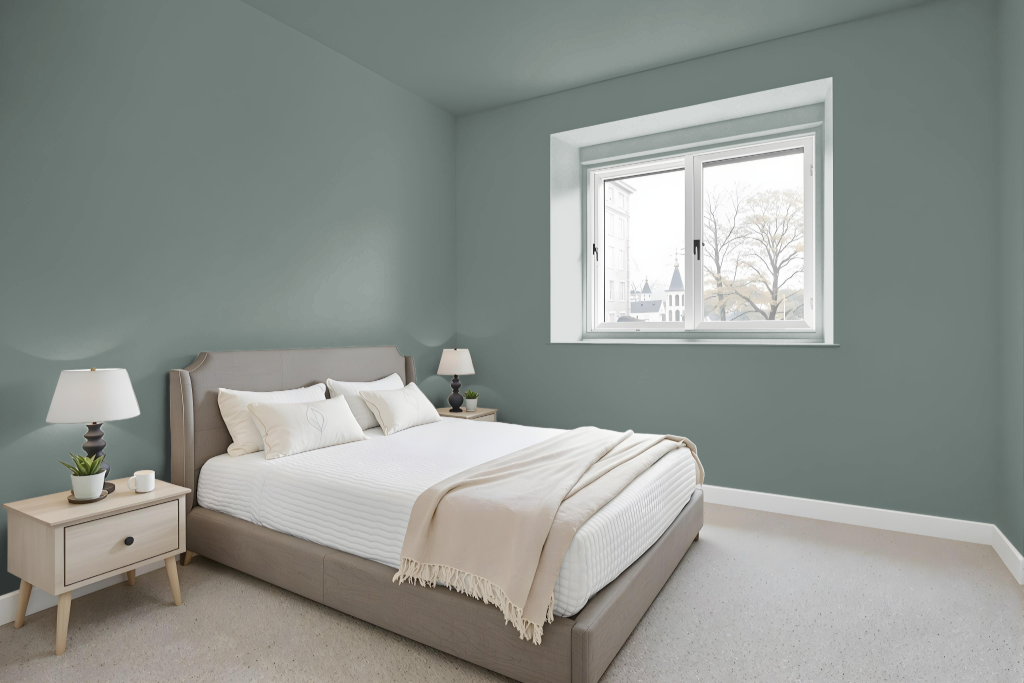
Jotun Balance 6325 creates a serene ambiance in bedroom settings, offering a soothing backdrop that complements a wide range of decor styles without overwhelming the space. Its inherent calmness enhances the room's atmosphere, making it an excellent choice for creating a balanced and refreshing retreat.
This color works harmoniously within a monochromatic scheme where varied shades, tints, and tones contribute to a unified look. When paired with complementary accent pieces suggested by Jotun, Balance 6325 adds depth and visual interest, ensuring the space feels both engaging and cohesive.
Kitchen
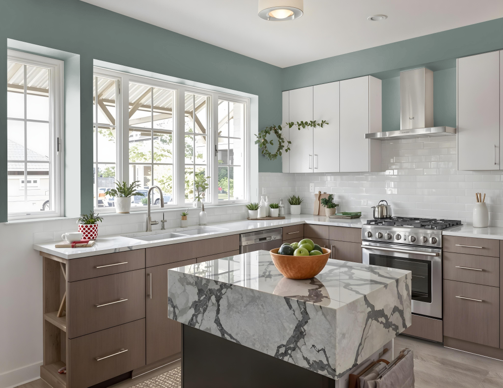
For a kitchen color scheme, Jotun Balance 6325 is a distinctive green hue that serves as an appealing foundation for design. When applied as a primary color, exploring a monochromatic approach by incorporating a range of shades, tints, and tones creates a commitment to harmony. A dynamic alternative introduces complementary accents with reds, drawing on similar hues from associated collections to enhance contrast and add visual excitement.
Pairing this robust hue with neutral tones works well for spaces such as cabinetry or wall finishes, while lighter hues can be featured on trim and ceilings to introduce depth and variety. Given that the appearance of the color may change based on surface texture, it is advisable to conduct tests on different materials to ensure the desired effect is achieved consistently throughout the space.
Living Room
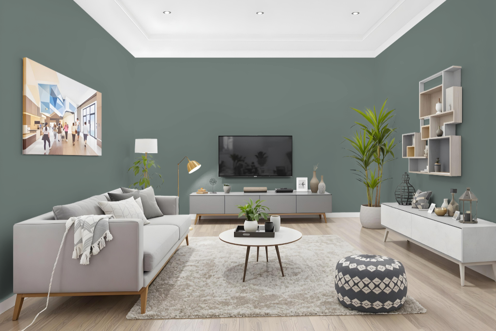
Jotun Balance 6325 defines a unique living room centerpiece that anchors the space with a dynamic and engaging ambiance. It sets the stage for a range of design approaches, from a monochromatic setup enhanced by carefully chosen accent decor to a high-contrast arrangement when paired with complementary shades that introduce warm, red-toned hues.
The color’s enduring appeal is bolstered by its consistent appearance across varying lighting conditions, ensuring a reliable look throughout the day. Its impressive coverage makes it not only an aesthetically striking option but also a practical choice for interior painting projects.
Outdoor
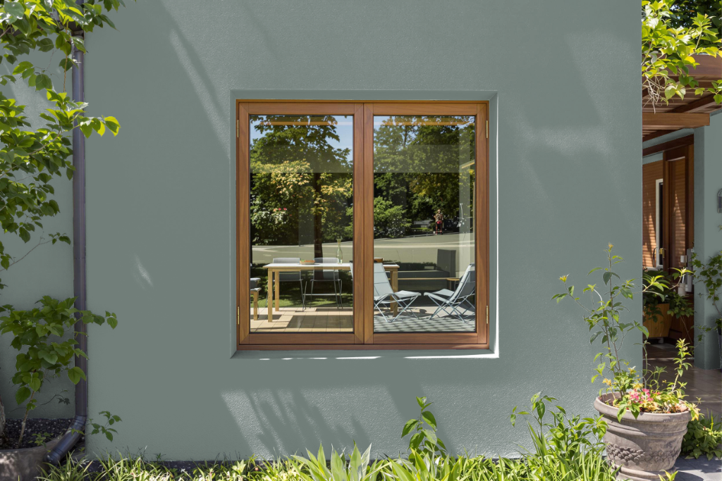
Home outdoor color options like Jotun Balance 6325 offer a distinctive tone that can enhance the appeal of a residence, though this specific shade is engineered for indoor applications. It is celebrated for its exceptional color accuracy, stability in a variety of lighting conditions, and its smooth matt finish, providing a refined aesthetic to spaces such as bedrooms, living rooms, and bathrooms while promoting improved indoor air quality and featuring easy-clean technology with no noticeable odor.
For exterior projects, it is recommended to select products specifically formulated for outdoor conditions to ensure optimal durability and weather resistance. This approach guarantees that the chosen finish will maintain its visual appeal and protective qualities even under changing environmental stresses.