Jotun Comfort Grey 12078, with its RGB composition of (190,185,175), closely resembles a sophisticated taupe hue. This neutral shade exudes a calming and versatile elegance, making it an ideal choice for both contemporary and classic interior designs. Its subtle blend of earthy tones provides a warm backdrop that complements a wide array of decor styles and accents.
Color Description
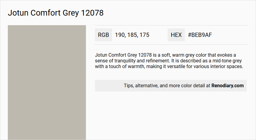
Jotun Comfort Grey 12078 is a soft, warm grey color that evokes a sense of tranquility and refinement. It is described as a mid-tone grey with a touch of warmth, making it versatile for various interior spaces.
Undertones
The undertone of Comfort Grey can be accurately described as a Red hue. This is evident from the color space analysis, which isolates the pure hue and eliminates any tints, tones, and shades to determine the undertone accurately.
Color Values
- HEX: #BEB9AF
- RGB: 190, 185, 175
Usage
Comfort Grey is suitable for various rooms, including living rooms, bedrooms, and home offices. It pairs well with crisp white trim for a timeless elegance, and it also complements deeper charcoals, muted blues, natural wood tones, and metallic accents. This color works harmoniously with contrasts such as red, darker green tones, and blue tones.
Atmosphere
When used, Comfort Grey creates a calming and refined atmosphere. It adds a touch of subtle sophistication to both modern and traditional interiors, making the space feel both calming and stylish.
Jotun Comfort Grey 12078 Color Alternative
Jotun Comfort Grey 12078 offers a refined and modern tone that enhances any space with its distinctive elegance. One can consider color alternatives such as Tikkurila Flannel J446, Tikkurila Cloister V487, and Tikkurila Fen V446, which provide a similar aesthetic appeal while introducing subtle variations. Designing with these options enables a seamless transition in style, maintaining the balanced sophistication originally inspired by Jotun Comfort Grey 12078.
Bathroom
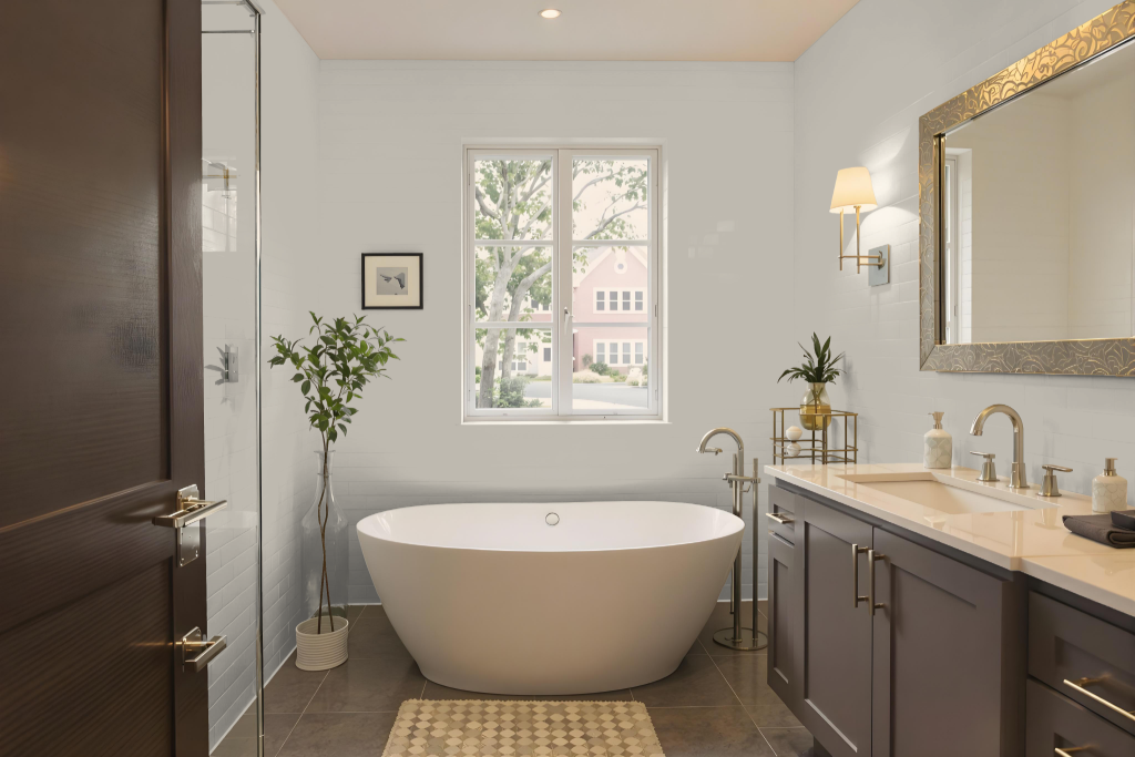
Jotun Comfort Grey 12078 offers a refined and calming bathroom color, setting a serene atmosphere that is both relaxing and inviting. Its warm mid-tone hue effortlessly complements natural materials like wood and stone while enhancing neutral accents such as crisp white fixtures and metallic detailing.
This thoughtful color pairs beautifully with deeper shades and muted blues to create a contemporary and stylish aesthetic while its subtle red undertones can be balanced with complementary hues for added visual appeal. The dynamic use of various shades ensures the space remains engaging and well-coordinated.
Bedroom
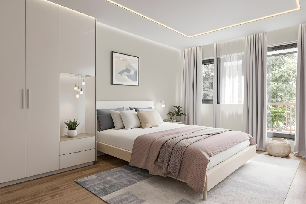
Jotun Comfort Grey 12078 enriches bedroom spaces by uniting contrasting hues into a balanced and appealing color scheme. It pairs effectively with deep reds, rich green tones, cool blues, and warm greys, creating a serene and well-coordinated environment.
This shade, a brighter interpretation of the well-loved 0394 Soft Grey, offers a unique aesthetic that can seamlessly integrate into various interior designs. Its careful curation in Jotun's Interior Colour Centre collection ensures that it harmonizes beautifully with multiple color accents throughout any living space.
Kitchen
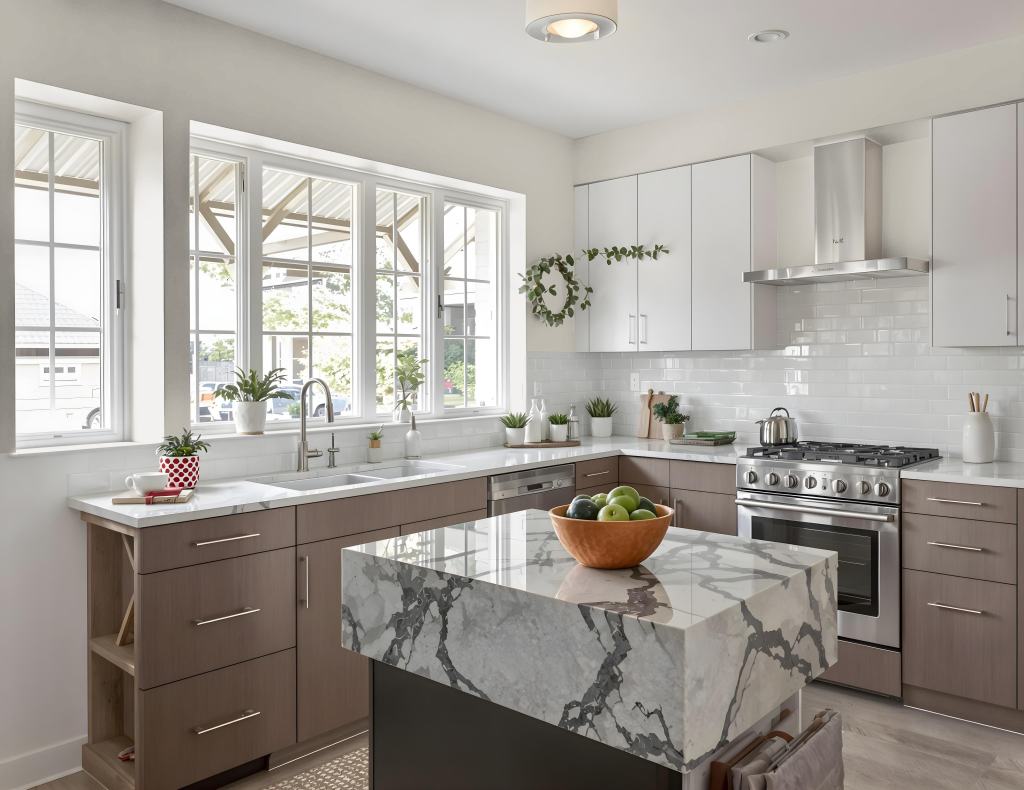
For a kitchen color scheme, Jotun Comfort Grey 12078 creates a calming and refined atmosphere. It pairs beautifully with crisp white trim to add timeless elegance and balances effortlessly with deeper charcoals and muted blues for a contemporary look.
This color complements natural wood tones and metallic accents, making it ideal for both modern and traditional kitchen designs. It can also be incorporated into a harmonious monochromatic or complementary scheme with blue hues for a vibrant and dynamic visual effect.
Living Room
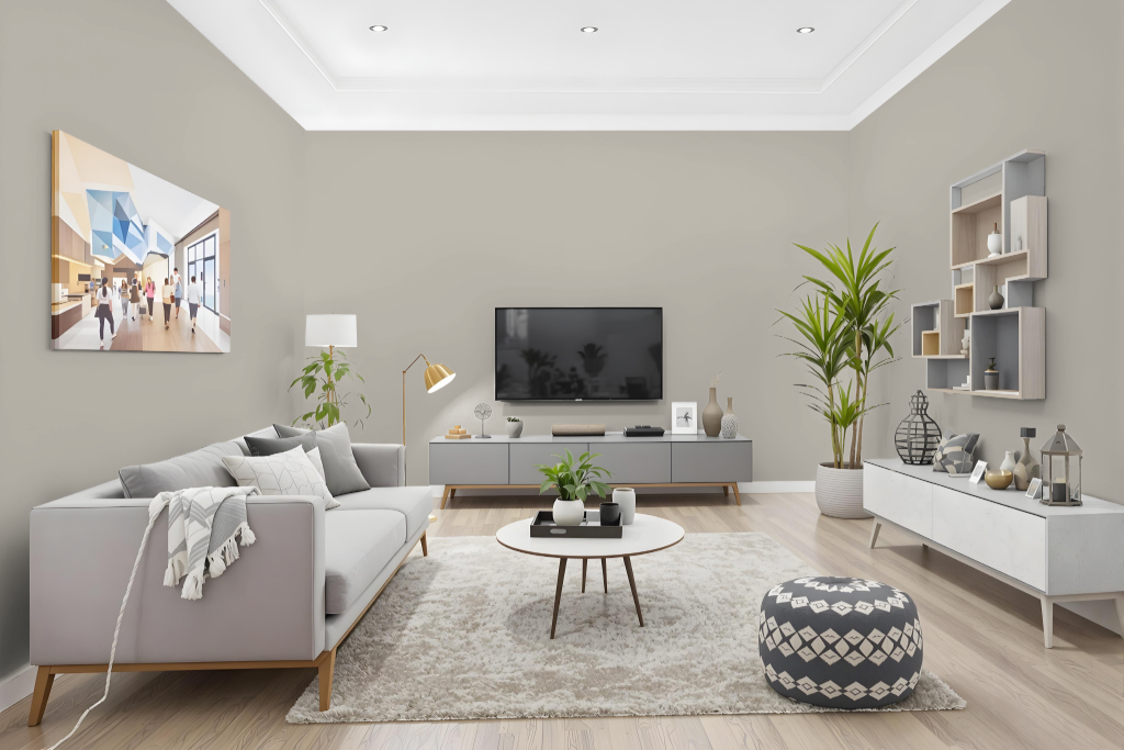
In a living room setting, Jotun Comfort Grey 12078 sets a refined tone that pairs beautifully with crisp white trim for a look of timeless elegance. The color also adapts well to more modern designs when combined with deeper shades and cool accents, creating a stylish and calming atmosphere.
This hue complements natural wood tones and metallic finishes, adding a layered sophistication to interior spaces. Its ability to create balance and serenity makes it an ideal choice for those aiming to foster a relaxed yet polished living environment.
Outdoor
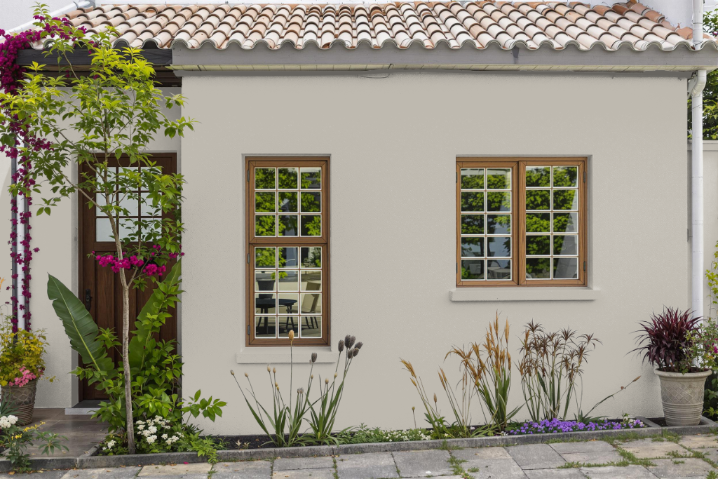
Jotun Comfort Grey 12078 is an ideal choice for home outdoor color application, offering consistent performance even under varying natural light conditions. Its reliable finish ensures that exterior surfaces maintain a smooth appearance with excellent coverage, enhancing the overall aesthetic of any home façade.
While it delivers a robust and even finish, the color's final look can vary based on the texture of the surface it is applied to. For example, rough walls may reflect the tone differently than smoother surfaces, highlighting the importance of considering underlying materials during application.