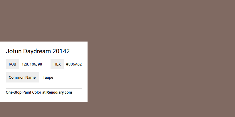
Jotun Daydream 20142 is a sophisticated shade featuring subtle undertones that manifest as a warm taupe in appearance. This balanced color, with its RGB configuration of (128,106,98), encapsulates a muted elegance that beautifully complements various interior styles. Such hues often evoke a sense of tranquility and comfort, making them ideal for creating inviting and harmonious living spaces.
Color Description
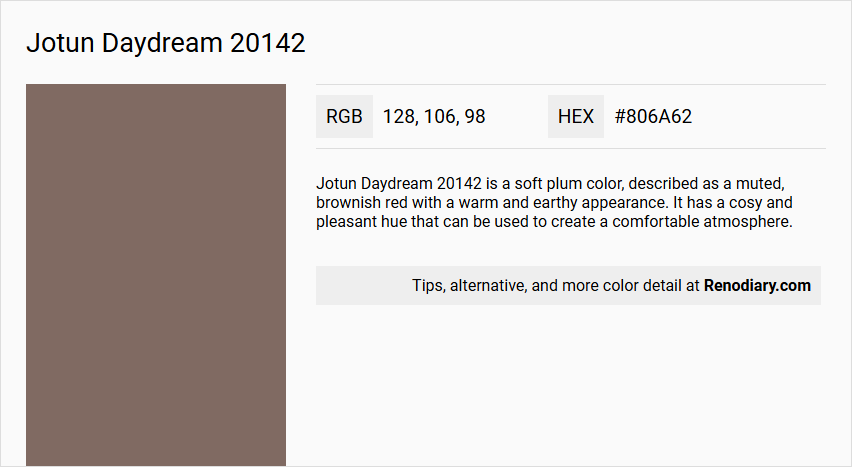
Jotun Daydream 20142 is a soft plum color, described as a muted, brownish red with a warm and earthy appearance. It has a cosy and pleasant hue that can be used to create a comfortable atmosphere.
Undertones
The color has golden and red undertones, with some descriptions also mentioning maroon and purple undertones, which contribute to its warm and earthy feel.
Color Values
- HEX value: #806A62
- RGB code: 128, 106, 98
- NCS Code: 6010-Y75R
Usage
This color can be used throughout an entire room to create a cohesive look or combined with bright tones or beautiful neutrals for a more varied aesthetic. It is suitable for various interior spaces, including living rooms, and can also be applied to furniture, storages, and other decorative elements.
Atmosphere
The color creates a warm, earthy, and cosy atmosphere, making the space feel elegant and comfortable. It is ideal for creating a welcoming and inviting environment.
Jotun Daydream 20142 Color Alternative
Jotun Daydream 20142 brings a balanced and inviting energy to any room, setting a harmonious tone that many find appealing. Farrow and Ball London Clay 244 and Sherwin Williams Library Pewter SW 0038 offer wonderful alternatives with their refined nuances and ability to complement contemporary as well as classic interiors. For an option that introduces a bold statement, Sherwin Williams Patchwork Plum SW 0022 provides a dynamic contrast that enchants with its depth and vibrancy.
Bathroom
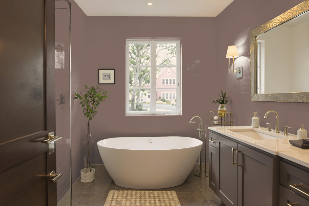
Jotun Daydream 20142 is a superb bathroom color, offering a warm and inviting presence that transforms the space into a cozy retreat. Its earthy character creates a comfortable atmosphere that enhances the elegant feel of the room, making it an excellent option whether used across the entire bathroom or combined with brighter tones and neutrals to achieve a distinctive play of light and contrast.
This rich color easily adapts to various decor styles, from the timeless to the contemporary, and enriches larger spaces by infusing them with a sense of intimacy and comfort. Its subtle undertones complement complementary hues for a dynamic visual effect, ensuring that your bathroom feels both stylish and welcoming.
Bedroom
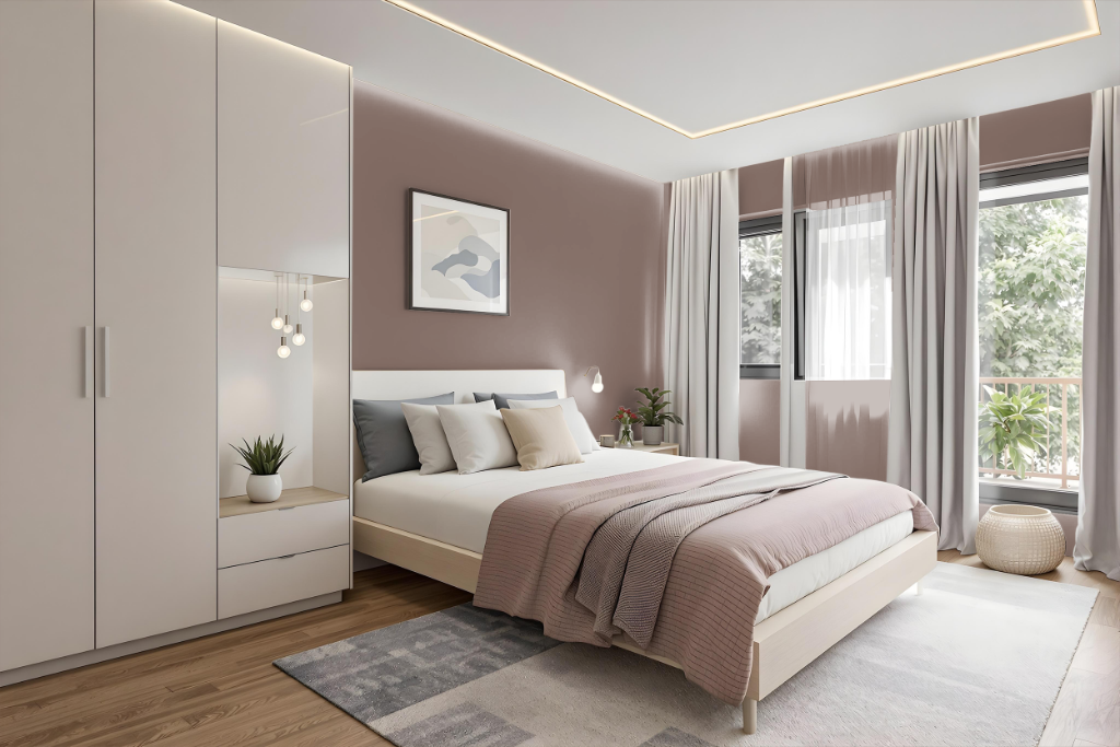
For a bedroom color scheme, Jotun Daydream 20142 creates a cozy and inviting atmosphere. This soothing shade harmonizes beautifully with warm neutrals and natural tones, while delicate textiles and soft surfaces enhance the homey, comfortable feel of the space. It can be enriched with golden and red accents, adding layers of warmth to the overall design.
Combining the base with earthy elements such as rustic furniture and nature-inspired fabrics further deepens the ambiance. Integrating contrasting accents like light green or shades of rust introduces subtle details that can elevate the room’s character, creating a balanced yet dynamic environment.
Kitchen
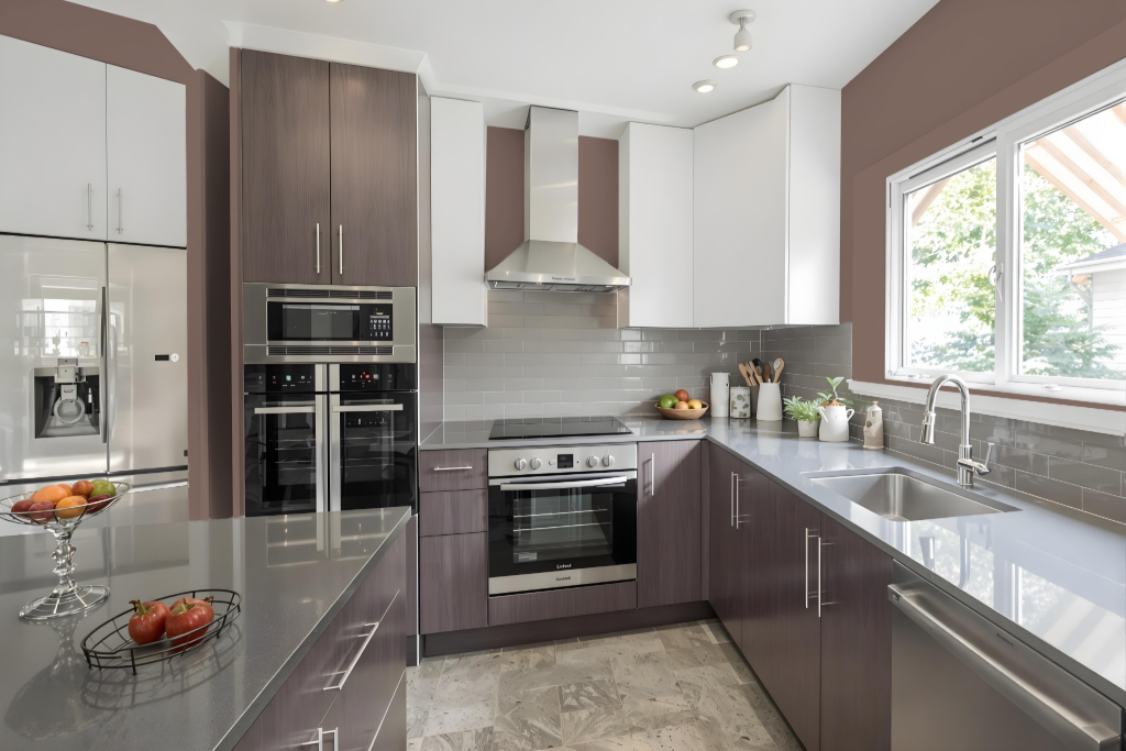
For a kitchen color scheme, Jotun Daydream 20142 sets the stage for a cohesive and inviting space. It works beautifully in a monochromatic approach by using lighter and darker shades to add subtle depth and prevent monotony, while also providing a warm and earthy foundation.
For a dynamic design, consider pairing Daydream 20142 with tones that bring greenish accents, such as those reminiscent of deep teal hues, to create striking contrasts and an energizing atmosphere. Integrating this color with a mix of bright accents and natural neutrals balances its warmth with vivid splashes of color, resulting in a harmonious look suited for both modern and traditional kitchens.
Living Room
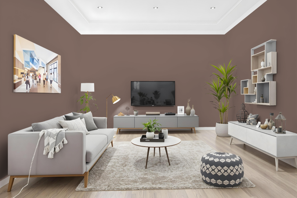
In the living room, Jotun Daydream 20142 creates a cozy and inviting atmosphere, making the space feel comfortable and welcoming. This color enhances the ambiance in various rooms, including bedrooms and hallways, by offering a subtle warmth that naturally draws people in.
Designed to harmonize with different design schemes, it can be applied uniformly throughout a room or combined with brighter accents to create contrast. When paired with lighter shades for a monochromatic effect or mixed with green-inspired tones for a dynamic visual appeal, the finish can vary depending on the type of surface, adding a unique depth to textured walls versus smooth cabinetry.
Outdoor
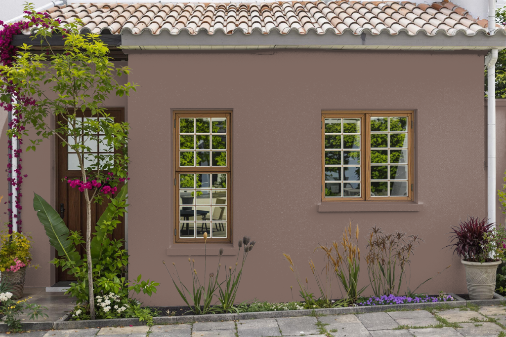
Jotun Daydream 20142 is a perfect home outdoor color, infusing exteriors with a warm, earthy feel that enhances the natural surroundings. Its appearance may vary depending on the texture and material of the surface, with rough and smooth finishes offering subtly different visual experiences.
When used on outdoor structures, this color creates a welcoming atmosphere that can be further elevated by pairing it with complementary green hues or balanced with bright tones and neutral shades. This thoughtful combination adds depth and character, resulting in a vibrant and dynamic outdoor space.