Jotun Pistachio 7386, with its RGB composition of 200, 205, and 175, embodies a gentle sage green hue that brings a sense of tranquility and balance to spaces. This muted green shade nestles perfectly into both modern and traditional interiors, effortlessly complementing natural aesthetics. Its soothing undertone makes it ideal for creating serene environments, be it in living rooms, bedrooms, or even home offices.
Jotun Pistachio 7386
Color Description
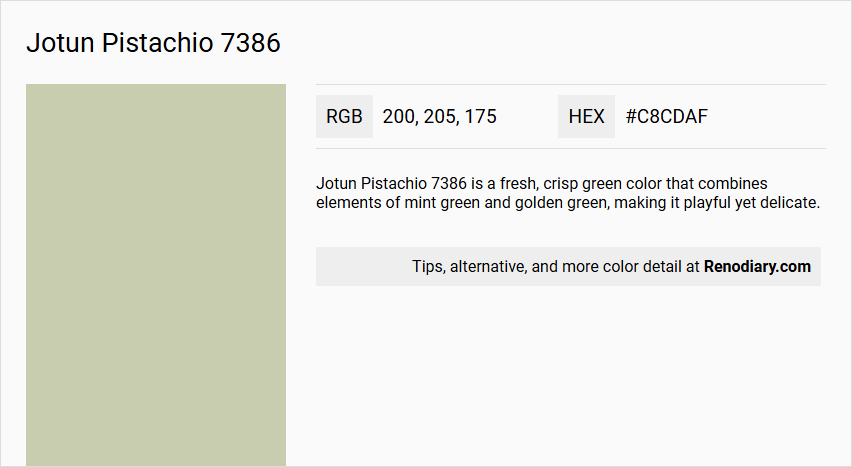
Jotun Pistachio 7386 is a fresh, crisp green color that combines elements of mint green and golden green, making it playful yet delicate.
Undertones
The undertone of Jotun Pistachio 7386 can be accurately described as having a Yellow hue, although the primary appearance is green.
Color Values
- HEX value: #C8CDAF
- RGB code: 200, 205, 175
- It is more saturated and darker compared to other similar shades like Jotun Timeless 1024.
Usage
This color is suitable for various interior spaces, including bedrooms, where it can create a warm and inviting atmosphere. It can also be used on furniture, storages, hallways, stairs, and ceilings.
Atmosphere
Jotun Pistachio 7386 creates a warm, light, and refreshing atmosphere, making it ideal for spaces where a playful yet delicate ambiance is desired.
Jotun Pistachio 7386 Color Alternative
Jotun Pistachio 7386 stands out with its distinctive character and depth, making it a popular choice for dynamic design projects. Tikkurila Monsoon X385, Sherwin Williams Acanthus SW 0029, and Sherwin Williams Bonsai Tint SW 6436 serve as excellent alternative color options that complement the original shade. These alternatives offer their own unique appeal and versatility, allowing designers to achieve a cohesive yet varied aesthetic across different spaces.
Bathroom
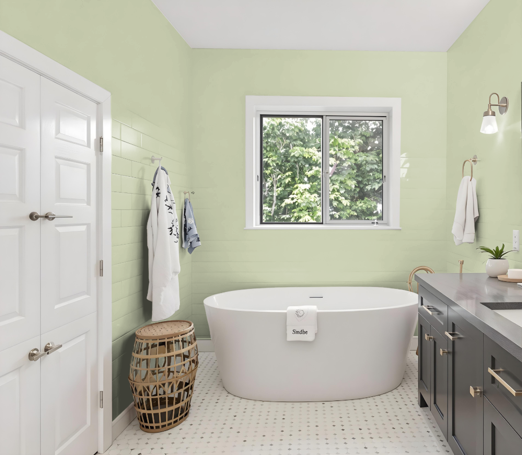
Jotun Pistachio 7386 is an inviting bathroom color that brings warmth and a cozy touch to the space. Its light, warm tone creates an intimate ambiance ideal for larger areas, while a subtle yellow undertone infuses the room with a gentle, uplifting brightness.
Beyond aesthetics, this paint is engineered to withstand the challenges of moisture and humidity, ensuring it remains attractive over time. Its enduring washability makes it a practical choice for bathrooms, where durability and ease of maintenance are essential.
Bedroom
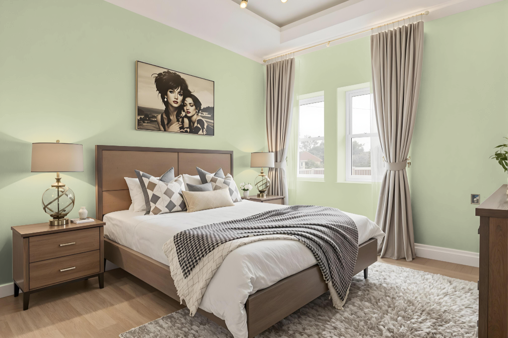
Jotun Pistachio 7386 is an excellent bedroom color choice that creates a calm, soothing environment ideal for rest and relaxation. Carefully selected by color experts, this hue introduces a peaceful ambiance that enhances the overall serenity of a bedroom space.
Designed to work harmoniously with a range of furnishings and decor, it offers flexible styling options while maintaining an aesthetically balanced look. Coordinating seamlessly with complementary shades from the broader palette, the color supports a unified and tranquil interior design.
Kitchen
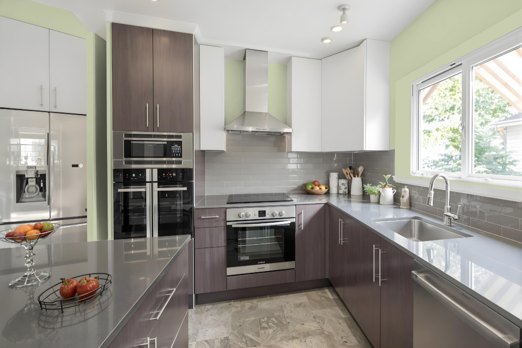
For a kitchen color scheme, Jotun Pistachio 7386 offers a warm tone that creates a welcoming culinary space. Its deeper, saturated nature contrasts with lighter shades, making it effective for establishing an intimate environment that encourages a cozy atmosphere.
This color pairs well with golden peaches, whites, greens, or greys to create a playful yet harmonious design. Combining it with earthy neutrals or softer muted hues further enhances balance and comfort, making it an excellent choice for kitchens where both function and ambiance are key.
Living Room
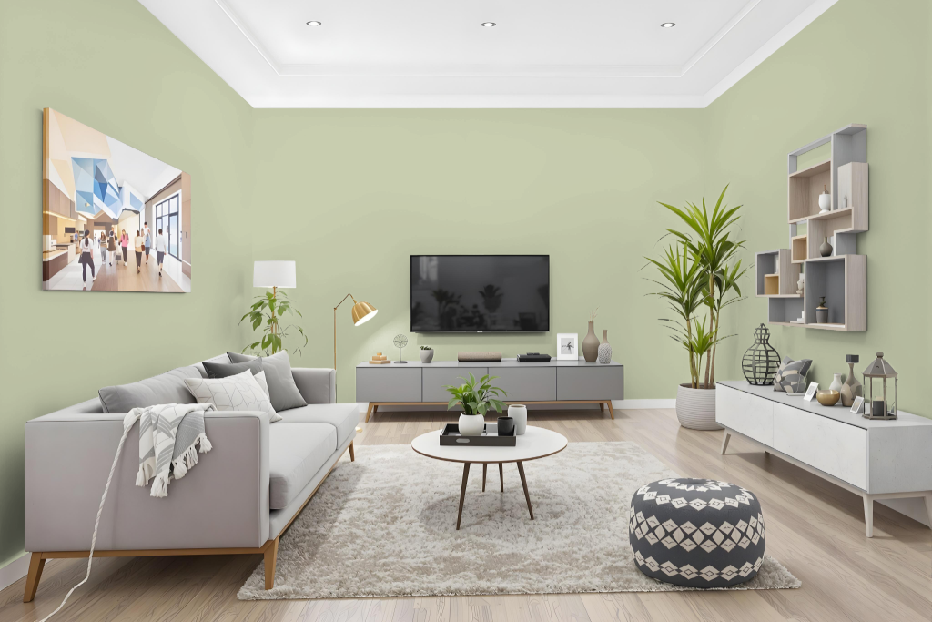
Jotun Pistachio 7386 is a standout living room color that brings a distinctive, deep warmth and character to any space. Its rich saturation and slightly darker tone create an inviting atmosphere while the subtle yellow undertone enhances the room's overall ambiance by complementing various furniture and decor styles.
When applied, the color’s appearance can shift based on surface texture, with differences evident between rough walls and smooth surfaces like cabinets. It’s important to view the color in person or through a sample, as external factors such as lighting and viewing conditions can influence its final look.
Outdoor
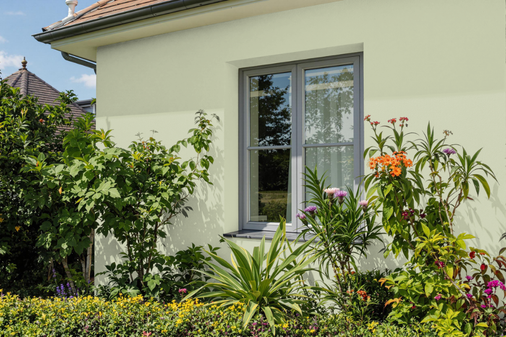
Jotun Pistachio 7386, while appealing as a home outdoor color option, is actually tailored for indoor use. Its formulation is specifically designed to enhance interior spaces such as bedrooms and hallways, where controlled environments help maintain its finish.
Using this shade on exterior surfaces is not advisable, as prolonged exposure to sunlight, rain, and fluctuating temperatures could compromise its durability. For projects requiring robust performance outdoors, selecting a paint engineered for external conditions is recommended to ensure lasting beauty and resistance.