Jotun Reflection 1622, with its soft RGB composition of 235, 233, and 225, presents a delicate off-white hue that exudes a sense of cleanliness and serenity. This subtle shade is versatile and timeless, making it an ideal choice for modern interiors seeking to evoke tranquility and openness. Whether used on walls or furniture, its understated elegance complements a wide range of accent colors, creating harmonious and inviting spaces.
Color Description
Jotun Reflection 1622 is a light grey shade with a subtle hue. It is often described as a light color that can create a unique and elegant space, particularly in living rooms.
Undertones
The undertone of Jotun Reflection 1622 is accurately described as a yellow hue. This is determined by isolating the pure hue and eliminating any tints, tones, and shades.
Color Values
- HEX value: #EBE9E1
- RGB code: 235, 233, 225
- NCS Code: 0801-Y25R
Usage
This paint is ideal for all indoor spaces due to its smooth matt finish and good washability. It is suitable for walls, furniture, storages, dressers, hallways, stairs, and ceilings.
Atmosphere
Jotun Reflection 1622 can create a calm and serene atmosphere, making it a good choice for living rooms and other interior spaces where a light and airy feel is desired. The color can be part of a monochromatic or complementary color scheme to achieve different visual effects.
Jotun Reflection 1622 Color Alternative
Jotun Reflection 1622 offers striking visual appeal, and its color alternative options such as Tikkurila Feather F487, Tikkurila Steam G497, and Tikkurila Cloud Y481 provide designers with versatile solutions for varied applications. Each alternative presents a unique character, allowing one to tailor the mood and atmosphere of a space while ensuring a harmonious design outcome. By choosing between these alternatives, both professionals and homeowners can achieve a refined aesthetic that complements modern interiors and exterior facades alike.
Bathroom
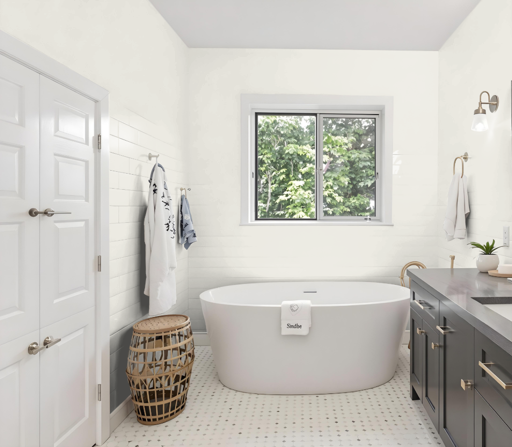
For a bathroom, Jotun Reflection 1622 is an excellent color choice that creates a calm, inviting atmosphere. Its light grey shade lends a sense of spaciousness and airiness even to smaller areas, while its subtle undertones introduce depth without overwhelming the space.
When paired with complementary hues featuring blue and violet tones, this color enhances a dynamic visual effect that brings balance between serenity and visual interest. The combination of these shades contributes to a unique and engaging bathroom ambiance ideal for modern settings.
Bedroom
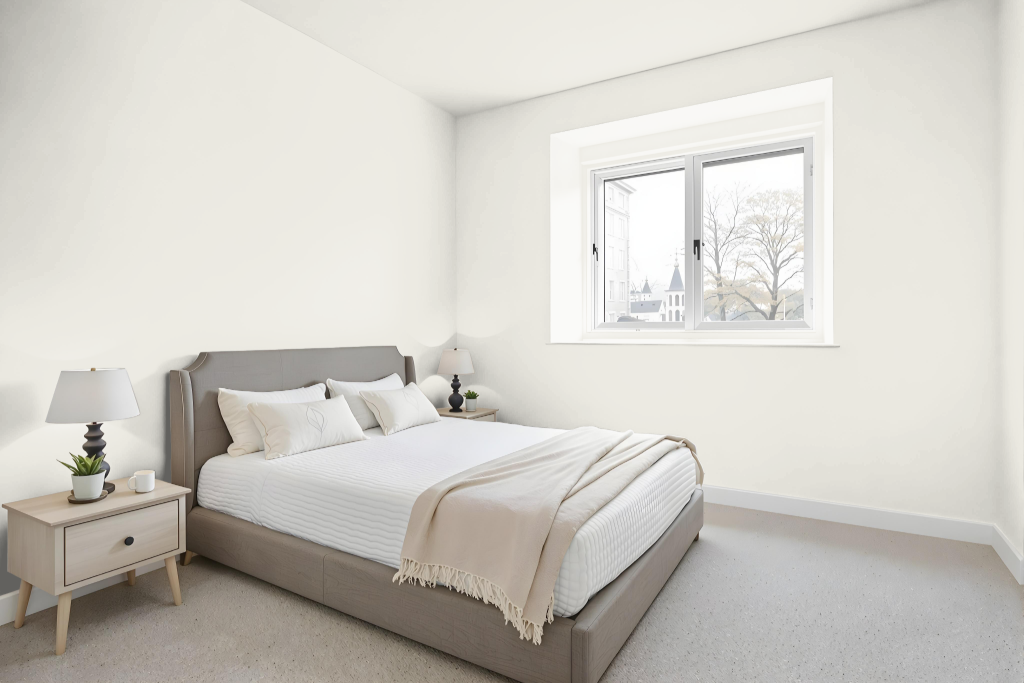
For a bedroom, Jotun Reflection 1622 sets a serene and calming tone, ideal for creating a peaceful retreat. This soothing color works harmoniously within a monochromatic scheme, where variations of shade and tone maintain a unified look, while incorporating accent pieces can enhance visual interest and avoid monotony.
Pairing this color with complementary hues that carry a blue tint, such as those from related collections, can introduce a dynamic contrast for a more engaging effect. Meanwhile, attention to surface textures is key, as the color’s depth may vary between rough walls and smooth furnishings, influencing the overall balance and ambiance of the space.
Kitchen
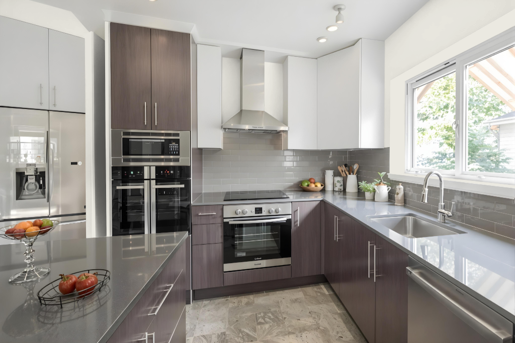
For a kitchen color scheme, Jotun Reflection 1622 creates a warm and inviting atmosphere that makes larger spaces feel more cozy and welcoming. This hue can be harmonized through a monochromatic approach—using various shades, tints, and tones of the same color—to achieve a unified look, or it can be paired with blue-inflected accents like Classic Blue or Heath Violet for a more vibrant impact.
The smooth matt finish of the associated rich interior paint enhances washability, a key feature for maintaining cleanliness in busy kitchen environments. This practical benefit combines with its aesthetic appeal, making the color a refined choice for kitchens where both style and ease of upkeep are paramount.
Living Room
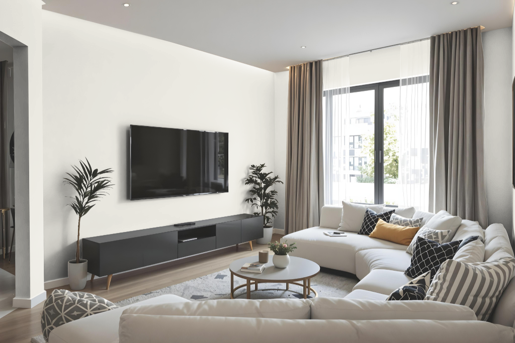
Jotun Reflection 1622 is an excellent choice for living rooms, known for its calming and inviting properties that make any space feel cozy and intimate. Its warm tone creates a welcoming atmosphere, making larger areas more comfortable and enhancing both the ambiance and functionality of the room.
When applied, it's important to consider the surface texture since the appearance may differ between rough finishes and smoother ones like cabinets. This color works harmoniously within a monochromatic scheme using lighter and darker shades, or paired with complementary hues to create an engaging, well-balanced look in various settings such as bathrooms and children's playrooms.
Outdoor
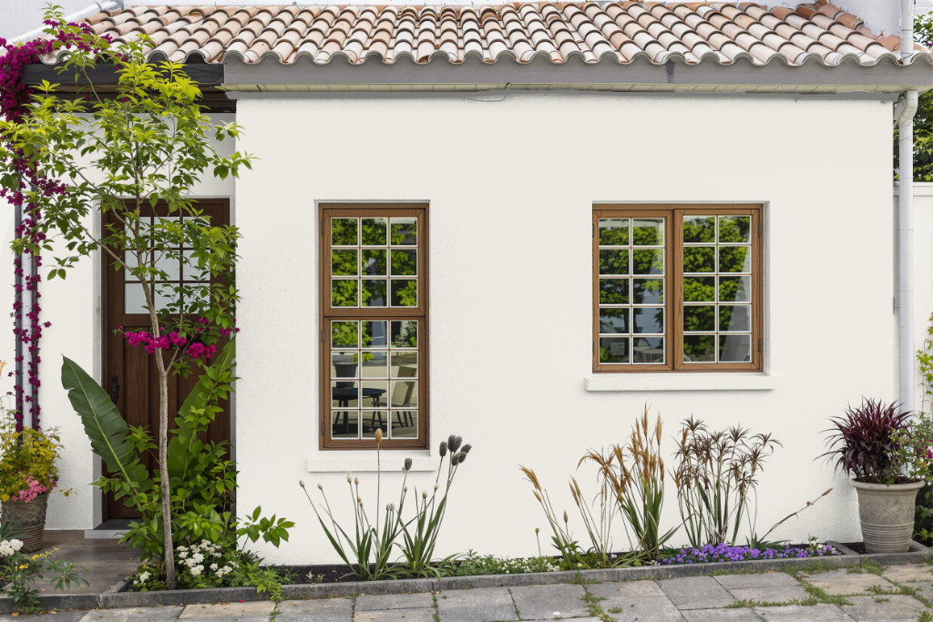
For home outdoor use, Jotun Reflection 1622 offers a light grey hue that is particularly well-suited for exteriors. This color’s high light reflectance makes it an attractive option for surfaces like vinyl siding, as it can help minimize heat absorption and reduce the risk of warping or other damage caused by excessive heat.
It is important, however, to ensure that the paint meets the specific requirements for light reflectance values set by the exterior materials in use, generally falling within a moderate range. By selecting a color that appropriately reflects light and sunlight, homeowners can enhance the durability of their exteriors while also benefiting from improved energy efficiency.