Jotun Slate Lavender 3377 is a distinct hue characterized by its rich amalgamation of understated sophistication and a calm allure. The RGB composition of 142,134,135 translates to a balanced blend that exudes the warmth typical of subtle grays while hinting at a gentle, muted lavender undertone. This unique convergence makes it an ideal choice for creating serene yet stylish interior spaces, offering both a modern and timeless appeal.
Color Description
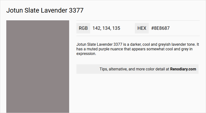
Jotun Slate Lavender 3377 is a darker, cool and greyish lavender tone. It has a muted purple nuance that appears somewhat cool and grey in expression.
Undertones
The undertone of Jotun Slate Lavender 3377 can be accurately described as a Red hue.
Color Values
- HEX value: #8E8687
- RGB code: 142, 134, 135
Usage
This color is suitable for various rooms, including bedrooms and living rooms. It can be used to create a unique and cohesive space, and it works well as an accent wall in modern and minimalist homes. It can be combined with colors like Sheer Grey or Klassisk Hvit for a light and calm look, or with Cityscape for a more dynamic effect.
Atmosphere
Jotun Slate Lavender 3377 creates a warm, dark, and unique atmosphere. In bedrooms, it can transform the space with its rich, dark hue. In living rooms, it contributes to a distinctive and dynamic visual effect, especially when used in a complementary color scheme.
Jotun Slate Lavender 3377 Color Alternative
Jotun Slate Lavender 3377 offers a distinctive hue that inspires design enthusiasts to explore its complementary alternatives. Little Greene Mid Lead Colour 114, Farrow and Ball Mole's Breath 276, and Farrow and Ball Brassica 271 each provide unique interpretations that maintain the sophisticated character of the original shade. These alternatives serve as versatile options that allow creativity to flourish while preserving the integrity and appeal of fine color design.
Bathroom
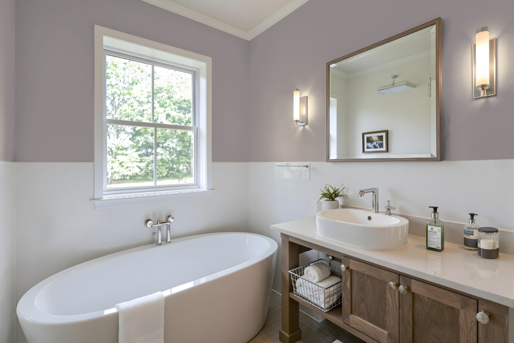
For a bathroom, Jotun Slate Lavender 3377 offers a unique and sophisticated ambiance that works well within both refined monochromatic setups and more dynamic complementary styles. Using varied degrees of the same hue can create a subtle, seamless look that emphasizes depth and cohesion, while incorporating contrasting tones can introduce visual interest and energy.
Lighting plays a crucial role in realizing the desired effect, as darker shades may make the space feel intimate in environments with limited natural light. Testing the color under different lighting conditions and balancing it with lighter accents can ensure that the bathroom remains inviting and well-proportioned.
Bedroom
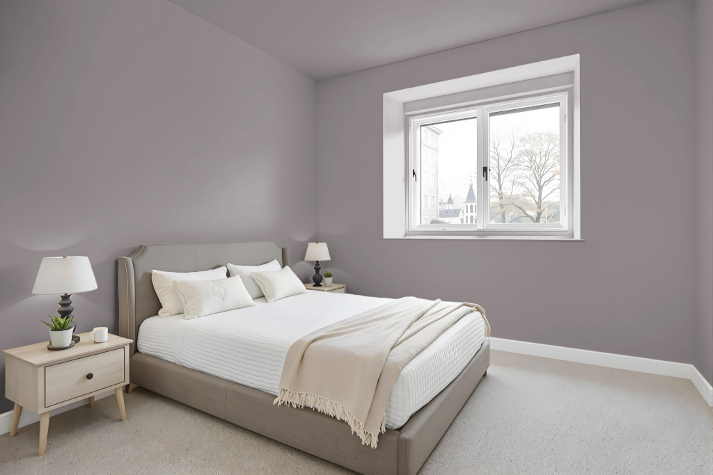
For a bedroom color scheme, Jotun Slate Lavender 3377 sets a soothing stage that can be paired with lighter hues to create a striking contrast. Light complements, such as Pale Linden and Classic White, help brighten the space and bring balance, while the central hue offers a gentle backdrop for furniture and decor.
Enhancing the serene atmosphere, neutral tones like Comfort Grey and Soothing Beige work seamlessly alongside the lavender, deepening the calm and inviting ambiance ideal for restful environments. The combination is particularly effective when inspired by Scandinavian design trends focused on calm and refined aesthetics, resulting in a harmonious and elegant space.
Kitchen
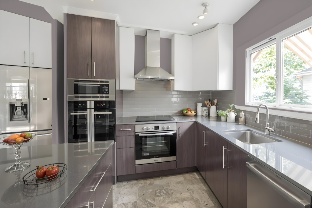
In a kitchen, Jotun Slate Lavender 3377 brings a distinct and inviting touch, making it an ideal option for both accentuating fixtures and creating a coherent color story. This shade can be applied in a monochromatic layout, using its different tones and tints to maintain visual interest without drifting into monotony.
For those seeking a more energetic atmosphere, pairing Slate Lavender with complementary hues like green offers a striking visual contrast. It also harmonizes well with lighter shades, such as soft neutrals or crisp white, to balance the overall ambience while adding thoughtful pops of color to key areas like an island or cabinetry.
Living Room
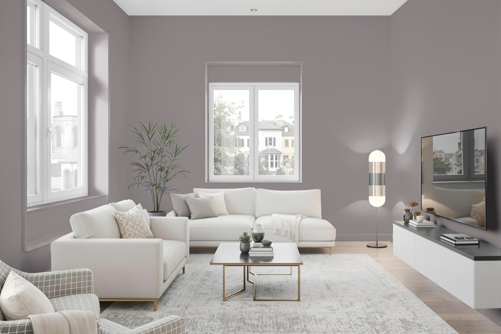
For a living room, Jotun Slate Lavender 3377 creates a distinctive ambiance when applied as the primary color. The unified space can be enhanced by employing a monochromatic strategy that explores various shades and tints of the same essence, or by adding green-toned accent colors such as a deep teal or a cool breeze hue to inject energy into the design.
When paired with lighter tones like a subtle pale linden or a classic white for trim and accents, this color heightens the overall aesthetic and balance of the room. Careful attention to different surfaces, from textured walls to smooth cabinetry, ensures that the color’s character adapts seamlessly across various elements, contributing to a well-integrated living space.
Outdoor
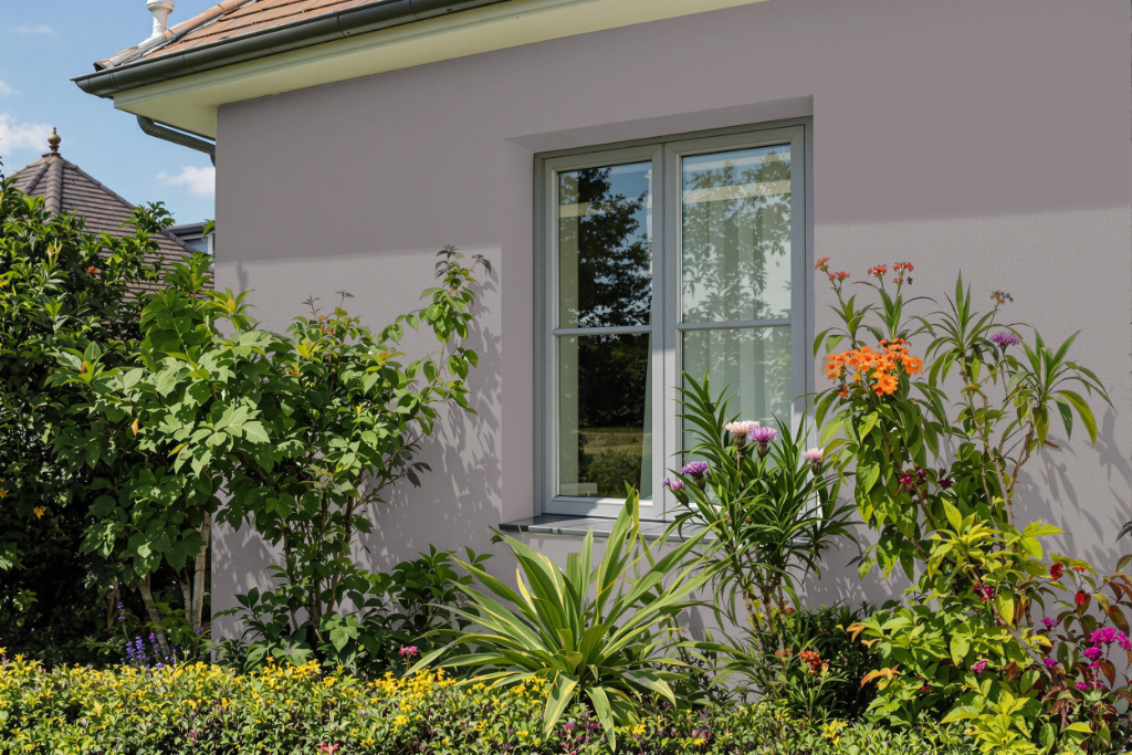
For home outdoor color use, Jotun Slate Lavender 3377 is an elegant choice that lends an air of luxury and mystery to a home's exterior. It imbues the space with a unique and sophisticated aesthetic that sets a distinguished tone.
This refined color harmonizes well with complementary shades bearing green hues, injecting vibrancy and dynamism, or with lighter tones and classic neutrals like pale linden and white for a balanced, harmonious appearance.