Jotun Subtle Green 7685 is a calming hue that brings a sense of tranquility to any space, reminiscent of the natural beauty found in a serene garden. With its RGB composition of 171, 175, 155, this soft shade aptly embodies the classic elegance associated with the color sage. Perfect for modern interiors, it effortlessly complements a variety of design aesthetics, enhancing environments with its understated sophistication.
Color Description
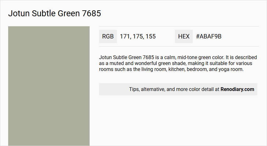
Jotun Subtle Green 7685 is a calm, mid-tone green color. It is described as a muted and wonderful green shade, making it suitable for various rooms such as the living room, kitchen, bedroom, and yoga room.
Undertones
The undertone of Jotun Subtle Green 7685 can be accurately described as a Yellow hue. This is determined by isolating the pure hue and eliminating any tints, tones, and shades.
Color Values
- HEX value: #ABAF9B
- RGB code: 171, 175, 155
- NCS Code: S3010-G40Y
Usage
This color is versatile and can be used in multiple areas of the home, including living rooms, kitchens, bedrooms, yoga rooms, as well as bathrooms and other spaces where a calm atmosphere is desired.
Atmosphere
Jotun Subtle Green 7685 creates a calm and peaceful atmosphere, making it ideal for spaces where one wants to unwind and find some peace and quiet in everyday life.
Jotun Subtle Green 7685 Color Alternative
Jotun Subtle Green 7685 offers a refined and earthy hue that brings an inviting character to any space. Tikkurila Serpentine V447 provides a harmonious variation, while Dulux Overtly Olive 70YY 43/113 and Dulux Arcadia House 50YY 43/103 deliver unique interpretations that complement diverse design perspectives. These color alternatives provide a practical and stylish solution for achieving a sophisticated, nature-inspired aesthetic without sacrificing the essence of Jotun Subtle Green 7685.
Bathroom
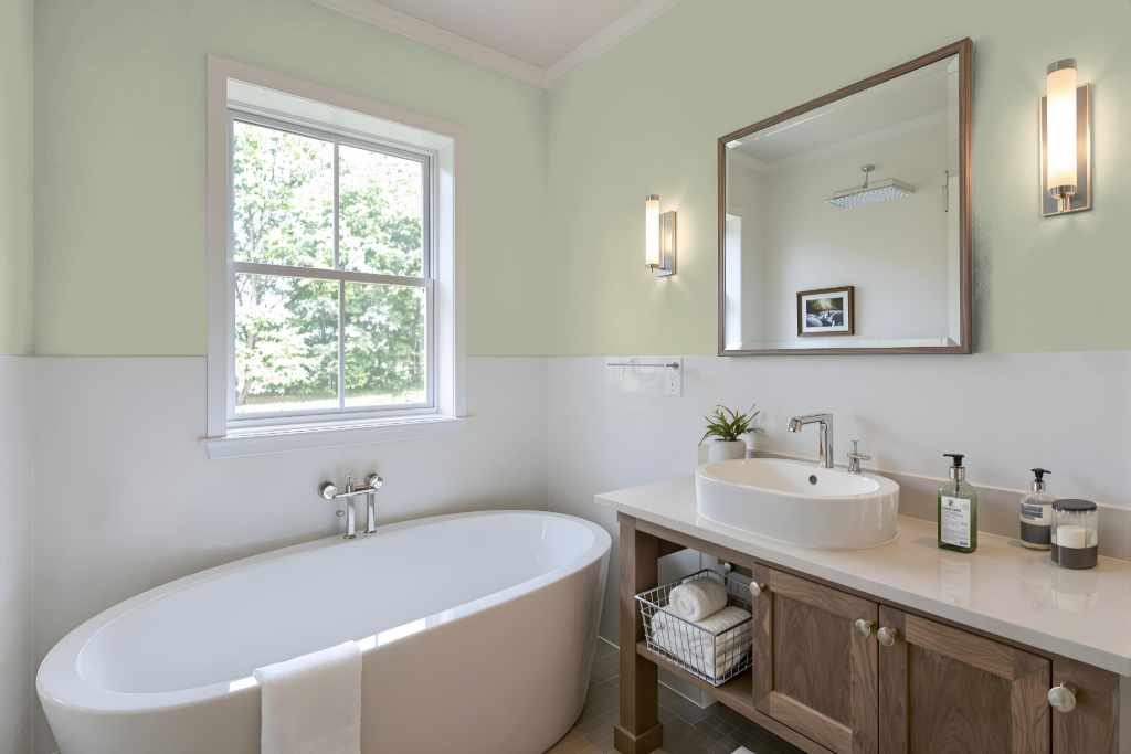
Jotun Subtle Green 7685 is an excellent bathroom color choice thanks to its calming, soothing properties. Its gentle hue creates a unique, peaceful atmosphere in a variety of settings—from contemporary to traditional—and harmonizes beautifully with a range of decor and fixtures.
This color adapts well to different surfaces, with its appearance influenced by texture and finish. Its ability to enhance any environment helps create a serene space where relaxation is paramount.
Bedroom
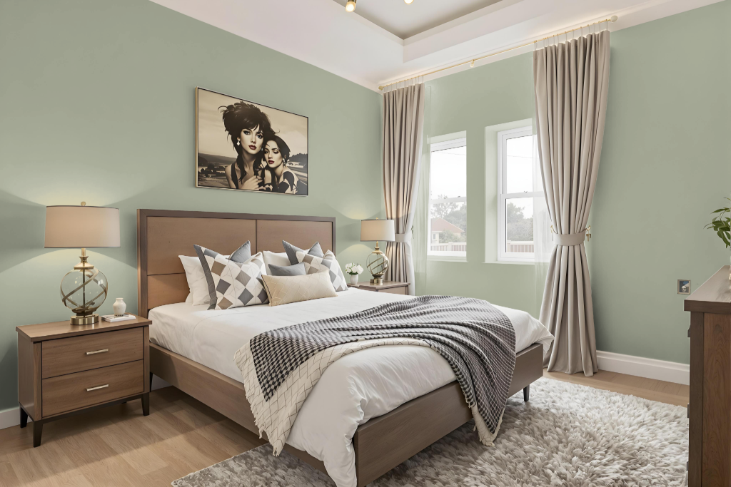
Jotun Subtle Green 7685 is an excellent choice for a bedroom color scheme, offering a calming and soothing ambiance perfect for relaxation. This gentle hue creates a serene atmosphere that can contribute to a peaceful sleeping environment, making the room feel like a tranquil retreat.
Enhancing this soft backdrop, the color pairs beautifully with lighter and darker shades of its own tone to build a layered, monochromatic look that adds depth and visual interest. It can also work well alongside neutral tones or complementary hues to further elevate the overall aesthetic and create a balanced, inviting space.
Kitchen
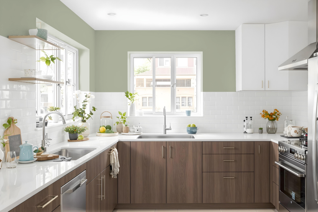
Jotun Subtle Green 7685 is an excellent choice for a kitchen, creating a serene atmosphere that feels naturally inspired. Its calming hue lends itself well to monochromatic designs, where varying intensities can be layered to build a cohesive and inviting space.
The color adapts uniquely on different surfaces, making it ideal for pairing with complementary accents to emphasize texture and depth. It brings a balanced mix of vitality and calmness to the area, ensuring that the kitchen remains both inspiring and soothing for everyday use.
Living Room
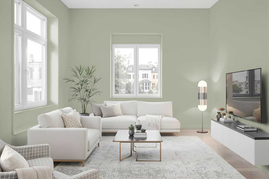
In living rooms, Jotun Subtle Green 7685 offers a sophisticated mid-tone green that creates a unique and inviting space. It works well when incorporated into a monochromatic scheme using various shades, tints, and tones of the same hue, while the addition of accent decor helps prevent a monotonous look.
This color also enhances bathrooms by infusing a warm and delightful ambiance into the space. Coordinating with lighter and darker variations of the same hue ensures a harmonious palette that unifies the overall design.
Outdoor
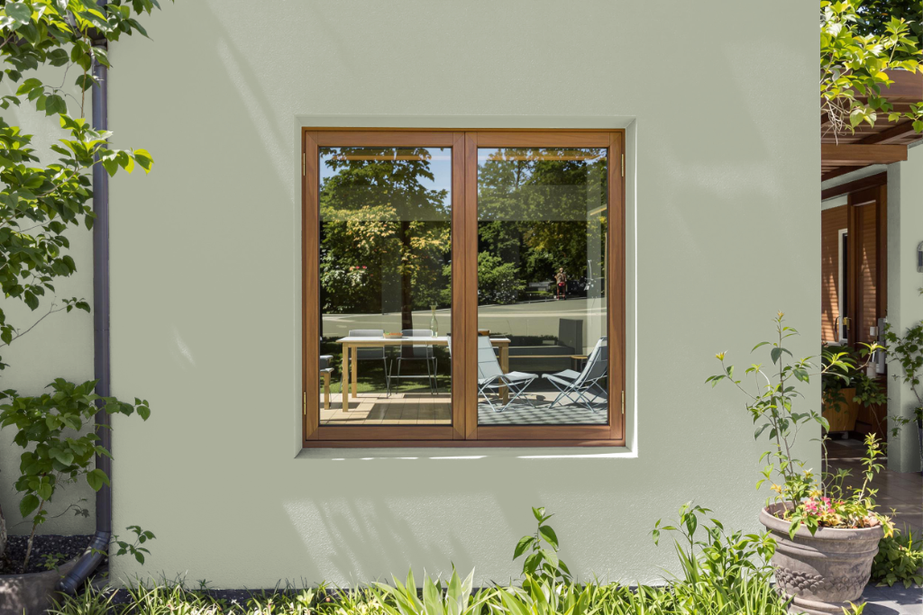
Jotun Subtle Green 7685 is a home outdoor color choice that, while appealing, is primarily formulated for interior environments. It is highlighted for its ability to imbue living rooms, kitchens, bedrooms, and yoga spaces with a calm and peaceful ambiance.
The information provided does not indicate that this shade is tailored for external applications, as outdoor painting projects require specific formulations to endure the challenges of external weather conditions. In essence, this color shines best in indoor settings where a soothing atmosphere is sought.