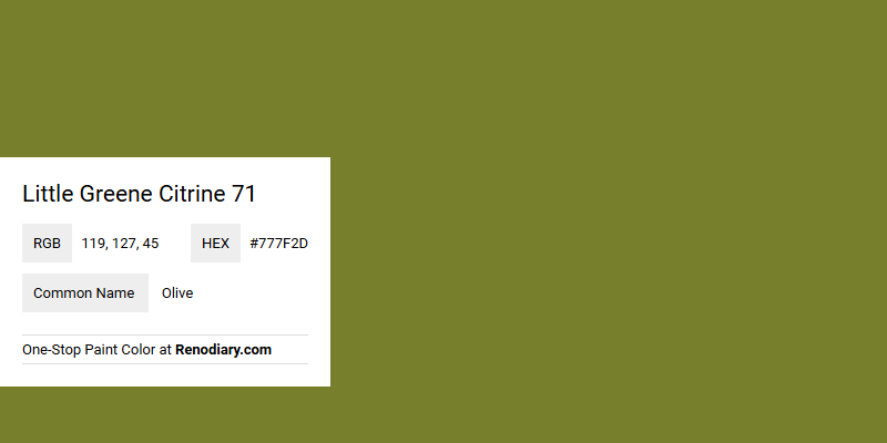
Little Greene Citrine 71 exudes a sophisticated charm with its refined hue nestled between green and yellow, akin to a vibrant olive tone. Its RGB composition of 119, 127, 45 highlights a perfect balance that allows this color to bring a touch of nature-inspired warmth and elegance to any space. Often used in contemporary and classic spaces, this olive shade is ideal for creating an inviting atmosphere that echoes subtle opulence.
Color Description
Little Greene Citrine 71 is a warm moss green paint color. It has a vibrant and dramatic accent that can enhance various color schemes, particularly when paired with pale yellow or warm brown colors.
Undertones
Citrine 71 has undertones of yellow, giving it a warm and slightly moss-like hue. This yellow undertone contributes to its vibrant and energetic appearance.
Color Values
- LRV (Light Reflectance Value): 24, indicating that it is a relatively dark color.
- L*ab and HLC values: Available on the Little Greene color chart, though specific values are not provided.
Usage
Citrine 71 is suitable for various interior applications, including walls and woodwork. It is recommended to use it in combination with pale greeny-yellow and chocolate brown colors, especially in North-facing rooms. Different finishes such as Absolute Matt Emulsion, Intelligent Matt Emulsion, and Intelligent Eggshell can be applied depending on the desired sheen level and specific area of application.
Atmosphere
This color creates a vibrant and energetic atmosphere, making it ideal for spaces where a bold and dramatic accent is desired. Its warm undertones help add coziness and natural wellbeing to living spaces.
Little Greene Citrine 71 Color Alternative
Little Greene Citrine 71 exudes warmth and sophistication, making it a popular choice for fresh, inviting spaces. For those seeking an alternative, Benjamin Moore Timson Green CW-470 provides a vibrant twist while Benjamin Moore Dark Celery 2146-10 offers a softer, earthy contrast. These color alternatives maintain the aesthetic allure of Little Greene Citrine 71 while offering unique variations suited to different design visions.
Bathroom
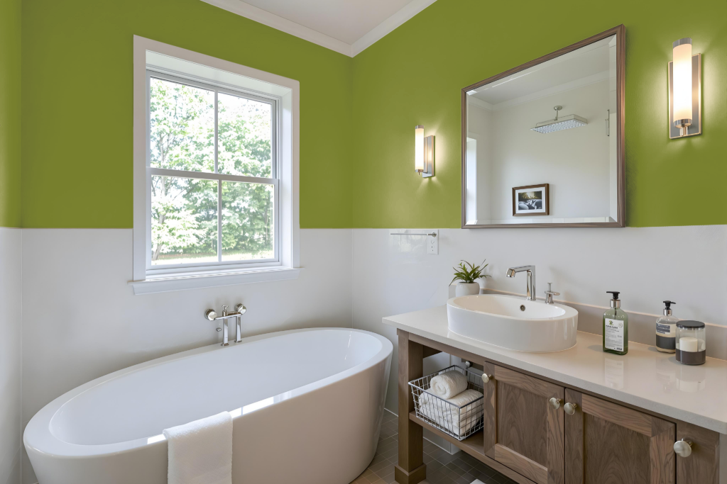
For a bathroom, Little Greene Citrine 71 offers a stylish option that works well with finishes from the Little Greene range. The Intelligent Matt Emulsion provides a 5% sheen level, making it an ideal choice for high-moisture areas due to its wipe-clean, washable, and environmentally friendly properties. Certified child-safe and water-based, this emulsion is expertly formulated for interior walls, ceilings, woodwork, and radiators.
For those seeking a more resilient finish, the Intelligent Eggshell is a robust alternative that resists moisture, staining, and general wear and tear while remaining fully washable. Both finishes are designed to deliver a long-lasting and easy-to-maintain surface, ensuring that bathroom spaces remain both attractive and practical.
Bedroom
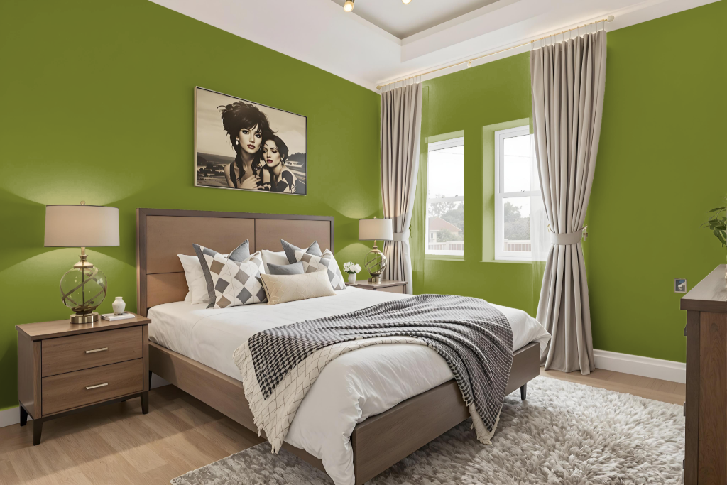
For a bedroom color scheme, Little Greene Citrine 71 brings a unique and inviting touch when paired with soft gray tones like French Gray to create a harmonious and serene environment. This pairing contributes to a balanced and tranquil setting ideal for modern bedrooms.
Enhance the space further by incorporating hues such as pale greeny-yellow with chocolate brown accents for naturally lit, North-facing rooms, and add contrasting depth with deep navy blue along with other complementary colors. Ground the vibrant character of Citrine 71 by integrating related neutrals that support a sophisticated yet welcoming atmosphere.
Kitchen
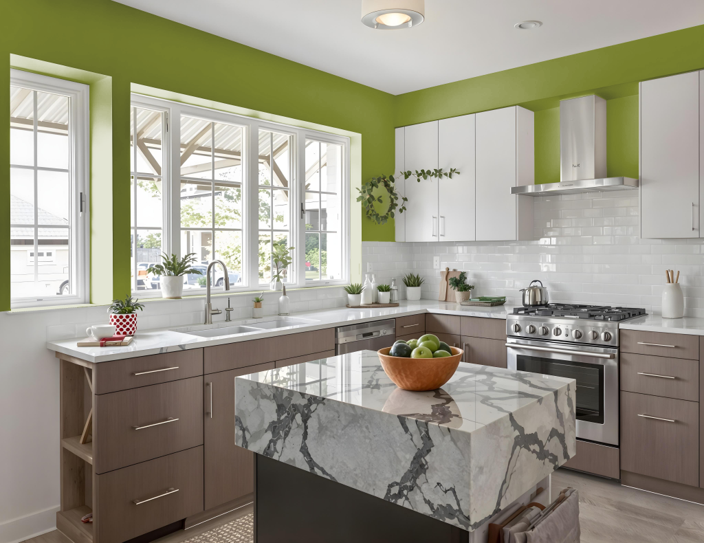
The kitchen color, Little Greene Citrine 71, brings a vibrant energy that can be adapted to suit a range of interior moods. Its lively tone pairs well with softer neutrals like French Gray or Slaked Lime to create a balanced, tranquil backdrop, while a contrasting deep navy or chocolate brown adds depth and sophistication.
For spaces with challenging light, such as North-facing kitchens, combining this hue with pale greenish-yellow and chocolate tones generates a warm, cohesive ambiance. Coordinated accents like Olive Oil and Pale Lime further enhance the overall warmth and energy of the design, resulting in a dynamic yet harmonious atmosphere.
Living Room
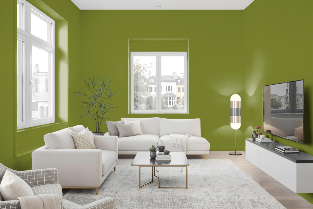
For using Little Greene Citrine 71 in a living room, it is important to consider the overall aesthetic and lighting of the space. This color creates striking contrast when paired with deep navy, adding depth and sophistication, while a combination with soft gray tones achieves a balanced sense of tranquility.
In spaces with cooler, north-facing light, integrating the color with subtle greenish hues and rich chocolate browns can enhance the room’s ambiance. Testing the shade with a small sample prior to committing to larger quantities ensures it harmonizes with your specific decor and lighting conditions.
Outdoor
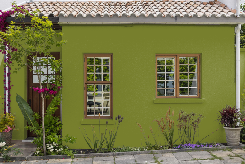
For home outdoor projects, Little Greene Citrine 71 may not be the optimal choice since it is intended for interior environments. Incorporating this color outdoors requires selecting an alternative finish from the same brand specifically formulated for exterior conditions.
For best outdoor results, consider choosing finishes that offer weather resistance, durability, and protection against mould and algae. Options such as the Intelligent Exterior Eggshell or Intelligent Masonry paints are engineered to perform on surfaces like wood, brick, and other masonry, though ensuring a precise match to the desired shade is essential.