Portland Stone - Pale 155 by Little Greene is a sophisticated shade often described as off-white, with its soft and neutral undertones. Its delicate blend of RGB(233,230,213) allows it to complement a variety of interior design schemes, providing a subtle backdrop that enhances both modern and traditional settings. This versatile hue is ideal for creating a serene and inviting atmosphere, making it a popular choice for those looking to achieve a timeless elegance in their living spaces.
Color Description
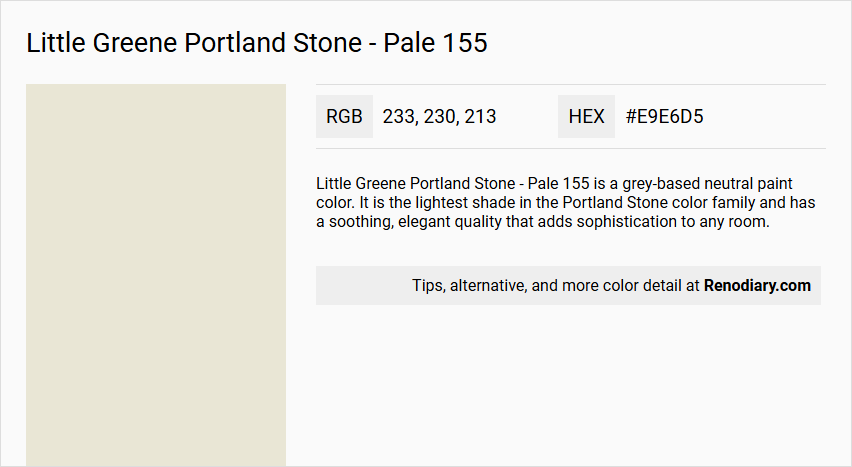
Little Greene Portland Stone - Pale 155 is a grey-based neutral paint color. It is the lightest shade in the Portland Stone color family and has a soothing, elegant quality that adds sophistication to any room.
Undertones
The undertone of Portland Stone - Pale 155 can be described as having a yellow hue, which is evident when isolating the pure hue from any tints, tones, and shades.
Color Values
- HEX value: #E9E6D5
- RGB code: 233, 230, 213
- Light Reflectance Value (LRV): 75
Usage
This color is versatile and suitable for various areas of the home, including living rooms, bedrooms, and home offices. It can be used on walls and ceilings and complements both modern and classic interiors. It is also recommended to use it in conjunction with other tones within the Portland Stone family for a cohesive look.
Atmosphere
Portland Stone - Pale 155 creates a tranquil and inviting atmosphere, bringing a sense of calm and understated luxury to the space. It helps to transform the home into a sanctuary of style and serenity.
Little Greene Portland Stone - Pale 155 Color Alternative
Little Greene Portland Stone - Pale 155 is a sophisticated color that adds a timeless charm to any space. Tikkurila Canvas G485 and Tikkurila Talcum G484 serve as excellent alternatives, offering subtle variations that still capture the original hue’s refined character. Additionally, Tikkurila Parchment F466 is another versatile option, providing a complementary twist while preserving the essence of Little Greene Portland Stone - Pale 155.
Bathroom
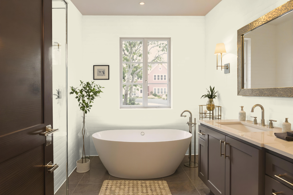
For a bathroom, Little Greene's Portland Stone - Pale 155 forms an excellent backdrop when enhanced with the right finish. The Intelligent Matt Emulsion offers a durable, scrubbable coating with a low sheen that resists steam and condensation, while the Intelligent Eggshell finish provides a slightly glossier option engineered to combat moisture, staining, and everyday wear.
Both finishes are water-based, fully washable, and child-safe, meeting the essential requirements for high-humidity environments and frequent cleaning. It is vital to let the paint fully dry and cure before using the bathroom to ensure lasting performance and appearance.
Bedroom
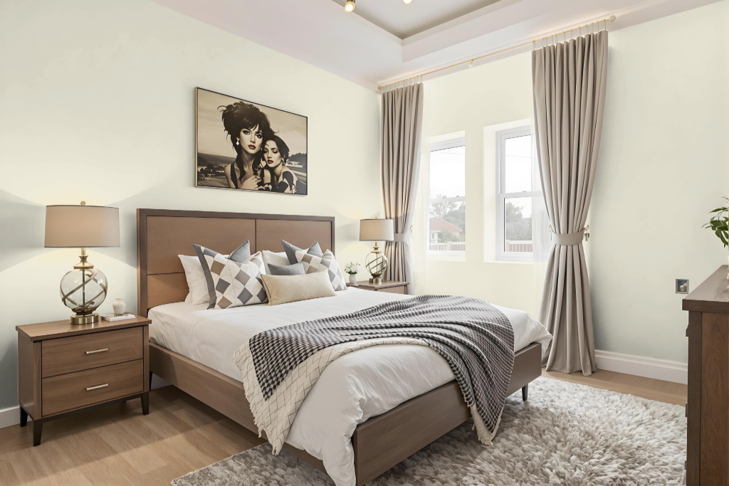
Little Greene's Portland Stone – Pale 155 is an excellent choice for a bedroom color scheme due to its calming aesthetic. It harmonizes beautifully with other members of the same family, such as the deeper hues found in its darker counterparts, and works well with complementary neutrals to create a soothing retreat.
The finish options are practical for interiors, offering water-based, low VOC formulas that dry quickly with minimal odour. These qualities, combined with its efficient coverage, make it a functional and stylish option for any bedroom setting.
Kitchen
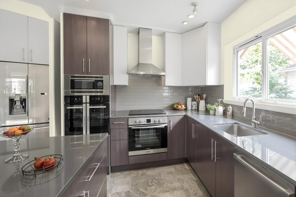
For a kitchen color scheme, Little Greene's Portland Stone – Pale 155 establishes a refined basis for an inviting space. Its durable, washable finishes and environmentally conscious options make it well-suited to high-traffic kitchens, ensuring a practical yet stylish surface throughout daily use.
The hue harmonizes with deeper, related tones that add visual depth while dynamic accents infuse the space with energy. Coordinating shades further enhance the overall aesthetic, resulting in a warm, relaxing, and sophisticated kitchen environment.
Living Room
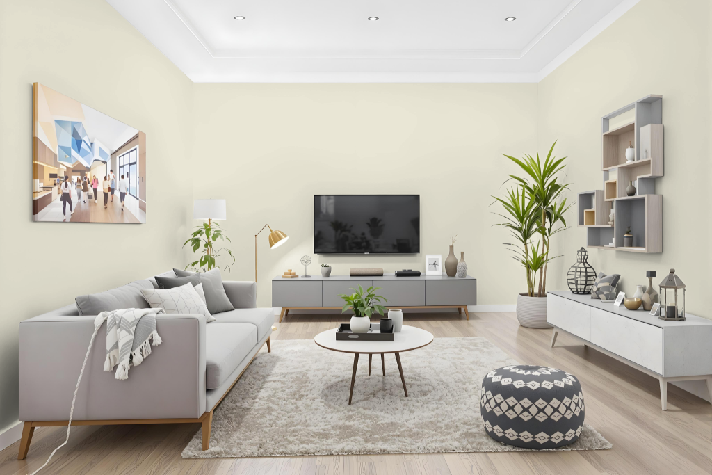
In living rooms, Little Greene Portland Stone – Pale 155 brings a gentle, airy feel that creates a refined and soothing backdrop. This color, the lightest in its family, sets the stage for a harmonious atmosphere when paired with other shades from the same collection or with complementary neutrals and contrasting accents.
Designed to suit different areas of the home including bedrooms and home offices, this paint is available in several finishes offering varied sheen levels to meet durability requirements for both high-traffic and more intimate spaces. Its environmentally friendly formulation dries quickly and provides a safe, comfortable setting ideal for modern family living.
Outdoor
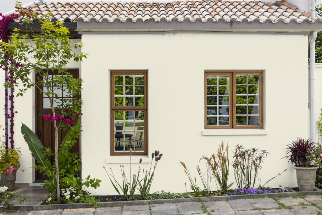
For home exteriors, Little Greene's Portland Stone - Pale 155 offers a refined outdoor color option that can be successfully adapted with the appropriate finishes. To achieve optimal performance on exterior woodwork, one option is a paint that comes self-priming on new and bare wood, inhibits mould and algae growth, and remains weather resistant with a completely washable finish.
Alternatively, a specially formulated masonry paint is available for surfaces such as brickwork, new render, cement blockwork, and previously painted exteriors, providing a durable solution that is resistant to dirt and water. This option delivers a lasting finish designed to endure up to 15 years of outdoor exposure.