RAL Classic Pearl Orange, designated as RAL 2013, offers a uniquely vibrant hue that closely resembles the warm, earthy tones of chestnut. This particular shade, represented by the RGB values (146,62,37), exudes a rich, natural warmth, making it ideal for applications that seek to evoke a sense of organic elegance. Its deep orange undertone contributes to its versatility, allowing designers to incorporate it into various contexts with striking effectiveness.
Color Description
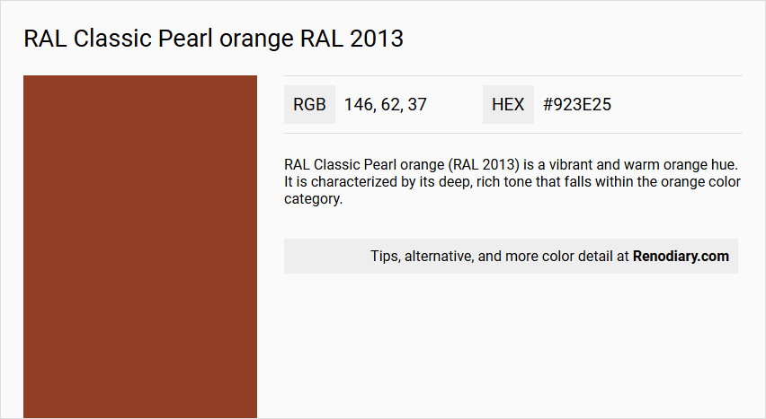
RAL Classic Pearl orange (RAL 2013) is a vibrant and warm orange hue. It is characterized by its deep, rich tone that falls within the orange color category.
Undertones
The undertone of RAL 2013 Pearl orange can be accurately described as a Red hue. This red undertone is evident when isolating the pure hue and eliminating any tints, tones, and shades.
Color Values
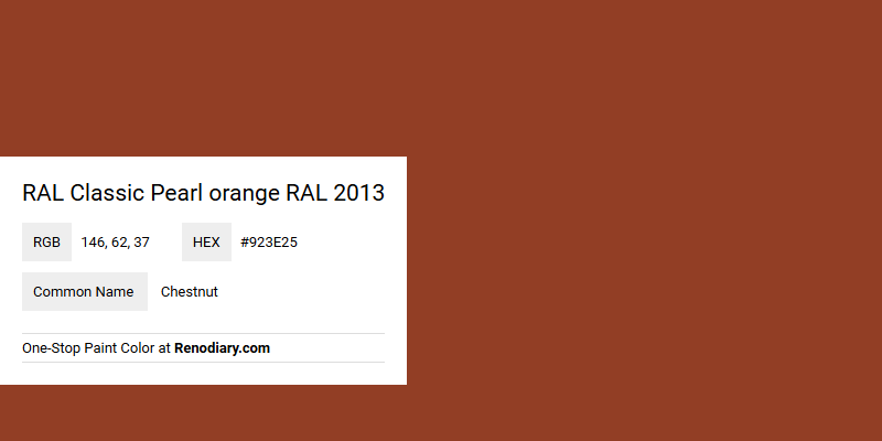
- HEX code: #923E25
- RGB code: 146, 62, 37
- CMYK values: Not explicitly provided but can be derived from the RGB values.
Usage
- Interior walls and trims
- Kitchen cabinets
- Bedroom accent walls
- Bathroom decor
- Exterior house painting
- Creative projects and temporary decor updates, especially with peel-and-stick removable and reusable paint options
Atmosphere
This color injects a cheerful and energizing atmosphere into any room. It is ideal for spaces that need a pop of color, adding a fun and playful touch. The warm, inviting tone of RAL 2013 Pearl Orange can brighten up living areas, children's rooms, or creative spaces, creating a lively and radiant environment.
RAL Classic Pearl orange RAL 2013 Color Alternative
RAL Classic Pearl orange RAL 2013 presents a vibrant and distinctive hue that offers a rich alternative for those seeking a standout element in design. Little Greene Heat 24, Sherwin Williams Fired Brick SW 6335, and Benjamin Moore Grand Canyon Red 2090-10 serve as impressive alternatives, each encapsulating unique characteristics that echo the dynamic energy of the original color. These options provide designers and homeowners alike the flexibility to create captivating spaces while maintaining the bold, brilliant spirit of RAL Classic Pearl orange RAL 2013.
Bathroom
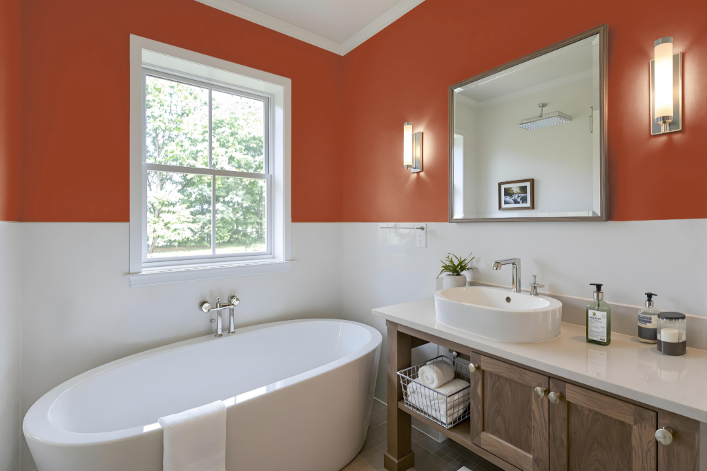
For a bathroom, Pearl orange is a bold and vibrant choice that can energize the space when used on accent walls or as a trim. The warm tone creates a cozy and inviting atmosphere without overwhelming the overall design, provided it is balanced with neutral shades.
Its energetic nature can be enhanced by pairing with complementary hues, creating a striking visual contrast that highlights fixtures and furnishings. Thoughtful consideration of the space's lighting and overall aesthetic ensures that the color remains both appealing and functional in a dynamic bathroom setting.
Bedroom
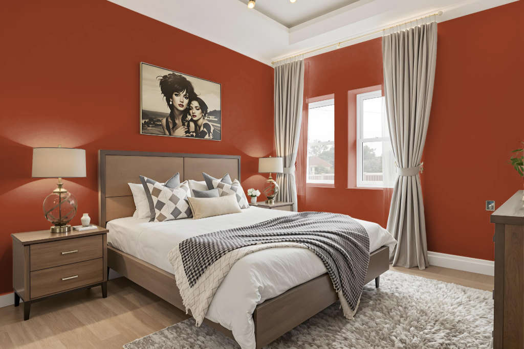
Pearl Orange is a captivating bedroom color that brings energy and warmth into the space when featured on an accent wall or incorporated into furniture. Its bold presence creates a cozy and dynamic ambiance, inviting attention while evoking a sense of vibrancy.
To ensure a balanced setting, pairing this luminous hue with softer shades such as whites, creams, or light greys helps to maintain a calm and harmonious environment. Additionally, integrating natural textures and thoughtful lighting can further enhance the inviting atmosphere, creating a bedroom that feels both lively and serene.
Kitchen
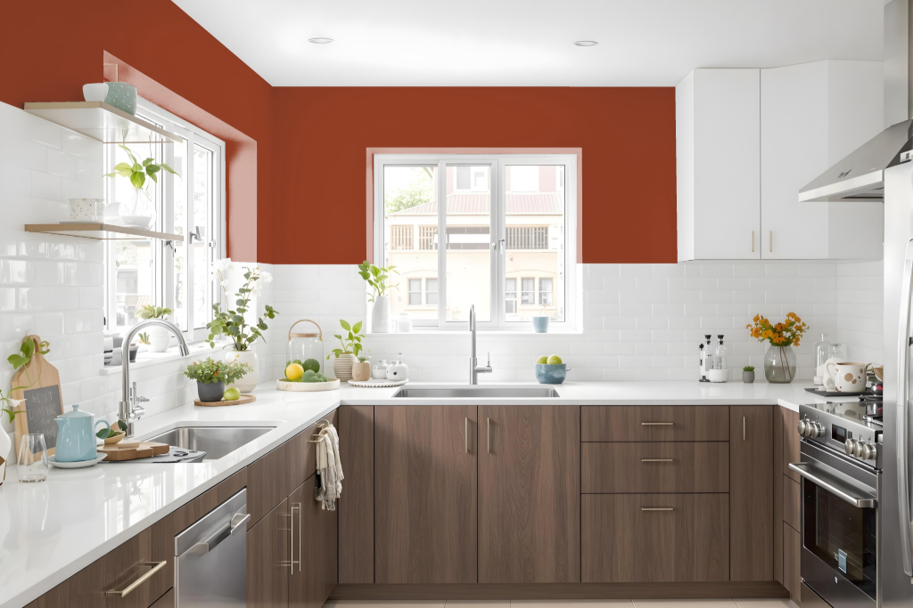
For a kitchen color scheme, RAL Classic Pearl orange offers a vibrant, energetic base that creates a lively focal point in any space. It pairs powerfully with its complementary shade, Duck Blue, which introduces a striking contrast and dynamic visual appeal, making it ideal for accentuating key elements such as cabinets or a statement wall.
To achieve a balanced look, incorporate neutrals like whites, creams, or light grays alongside earthy tones such as seal brown or light taupe. These colors harmonize with the warm undertones of Pearl orange, resulting in an inviting, cohesive atmosphere suitable for thoughtful decor updates without committing to permanent changes.
Living Room
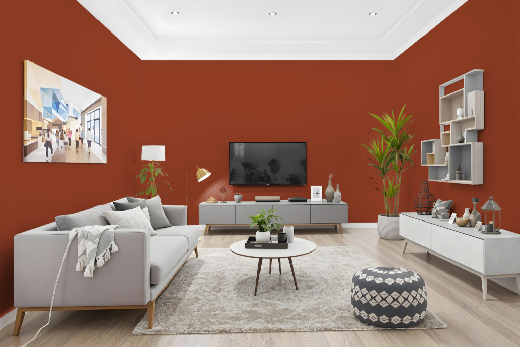
Living rooms benefit from the warm infusion of RAL Classic Pearl orange RAL 2013, creating a lively and energizing atmosphere when applied to walls or trims. Its vibrant hue brings an inviting tone that transforms the space into a focal point of creative and social gatherings.
This dynamic color also elevates other areas of the home, adding playful accents to kitchens, bedrooms, and bathrooms. It lends a unique character to cabinets, accent walls, and even exterior details, making it a fitting choice for both permanent updates and temporary decorative projects.
Outdoor
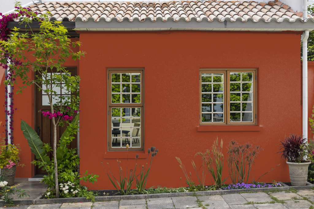
RAL 2013 Pearl Orange is a striking home and outdoor color choice designed to bring warmth and character to a variety of settings. Its high-performance options include a 2K acrylic enamel formulation ideal for high-traffic areas and harsh environments by ensuring a complete cure quickly, while a 1K alkyd DTM paint offers reliable protection against corrosion for metal surfaces in challenging outdoor conditions.
For optimal results, a primer compatible with the specific surface material—whether metal, glass, or plastic—is recommended to ensure proper adhesion and durability. Additionally, eco-friendly alternatives are available, providing a nontoxic, biodegradable option for both temporary and permanent decor updates.