Greige, a harmonious blend of gray and beige, embodies both contemporary sophistication and timeless neutrality, making it a versatile choice for modern interiors. Its subtle RGB values of 200, 198, and 190 create a calming backdrop that complements a wide range of colors, enhancing both the aesthetic and mood of a space. This balance in hue allows designers to integrate Greige seamlessly into diverse design themes, reflecting a commitment to both practicality and elegance.
Color Description
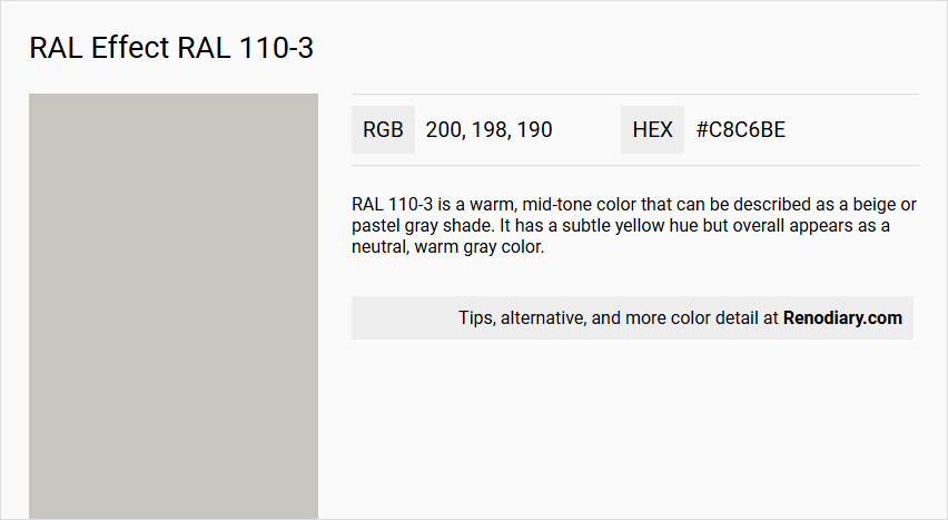
RAL 110-3 is a warm, mid-tone color that can be described as a beige or pastel gray shade. It has a subtle yellow hue but overall appears as a neutral, warm gray color.
Undertones
The undertone of RAL 110-3 is accurately described as a yellow hue. This yellow undertone is evident when the color is analyzed in its pure form, eliminating any tints, tones, or shades.
Color Values
- HEX: #C8C6BE
- RGB: 200, 198, 190
- CMYK: Not explicitly provided, but for a similar shade (RAL 110-3 from another source), it is approximately 7, 6, 20, 15.
Usage
RAL 110-3 can be used in various design contexts, including interior and exterior painting. It is suitable for living room walls, trims, kitchen cabinets, bedroom accent walls, and bathroom decor. The color can also be applied to furniture and other decorative elements.
Atmosphere
This color creates a warm and cheerful atmosphere. It can add a sense of brightness and happiness to a space, although it is recommended to use it in balance with other colors to avoid overwhelming the environment. The warm tone of RAL 110-3 can contribute to a cozy and inviting ambiance.
RAL Effect RAL 110-3 Color Alternative
RAL Effect RAL 110-3 offers a vibrant and distinctive color option that stands out in various design applications. Tikkurila H486, Tikkurila Plaster X487, and Tikkurila Pumice H487 present excellent alternatives that maintain the character and depth of the original hue while providing subtle variations suited to specific project needs. These precise color alternatives allow designers and architects to confidently match or enhance the intended aesthetic outcome without compromising on quality or consistency.
Bathroom
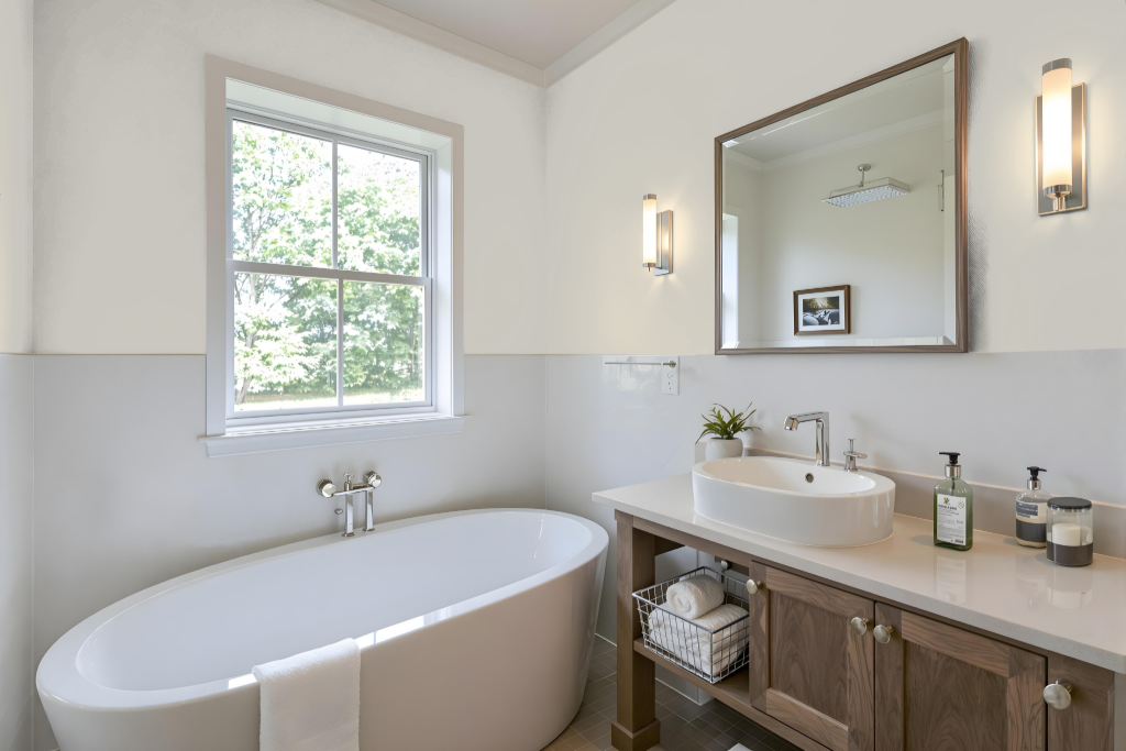
For a bathroom, RAL Effect RAL 110-3 paint provides a practical option that meets both aesthetic and durability requirements. Its availability in multiple formats—from aerosol cans to litre tins and touch-up options—accommodates distinct application needs, while the customizable finishes allow for tailored levels of shine suitable for moisture-prone areas.
Enhanced with features such as deodorizing properties, UV protection, and high-resistance additives, this paint is engineered to withstand demanding bathroom conditions. It is advisable to test the paint on a small area prior to full application, as variations in surface and lighting can influence the final appearance.
Bedroom
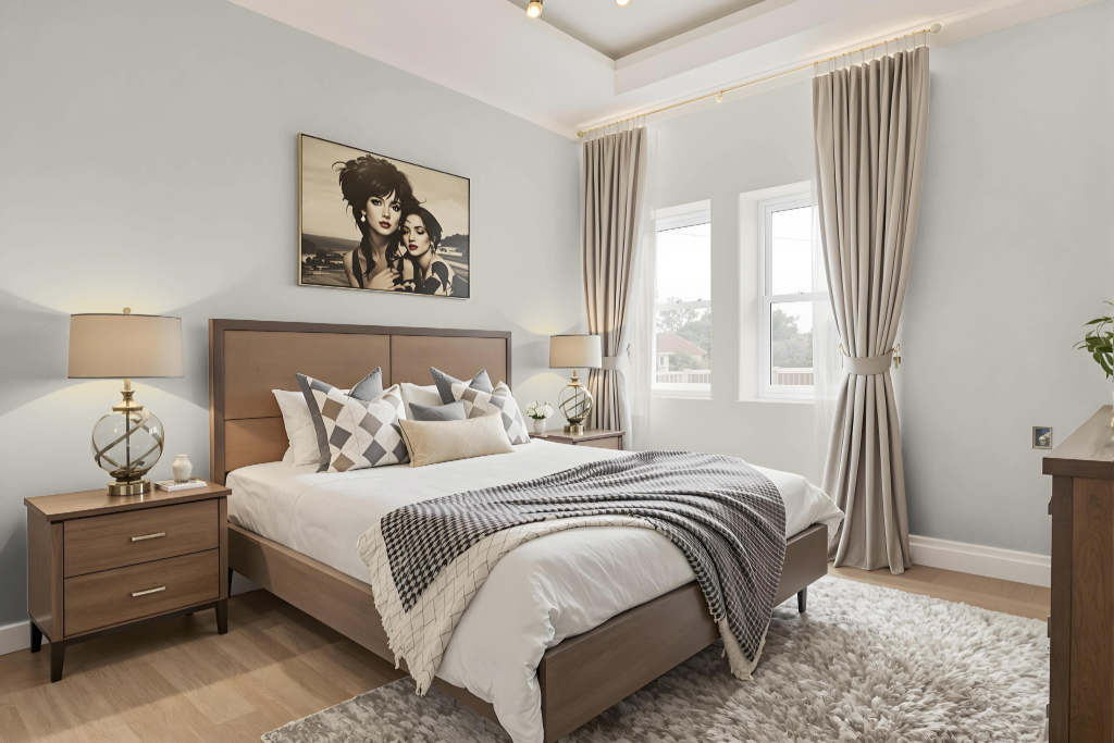
RAL 110-3 is an excellent bedroom color choice, offering a balanced neutral tone that creates a harmonious and comfortable atmosphere without overwhelming the space. Its reflective quality provides moderate light dispersion, ensuring the room remains inviting and neither too bright nor too dim.
This shade is part of a broader color system that emphasizes environmental friendliness through the use of waterborne paints free from heavy metals, thus supporting a sustainable approach. For the most accurate understanding of its true appearance, it is advised to consult a physical color fan rather than relying solely on digital displays.
Kitchen
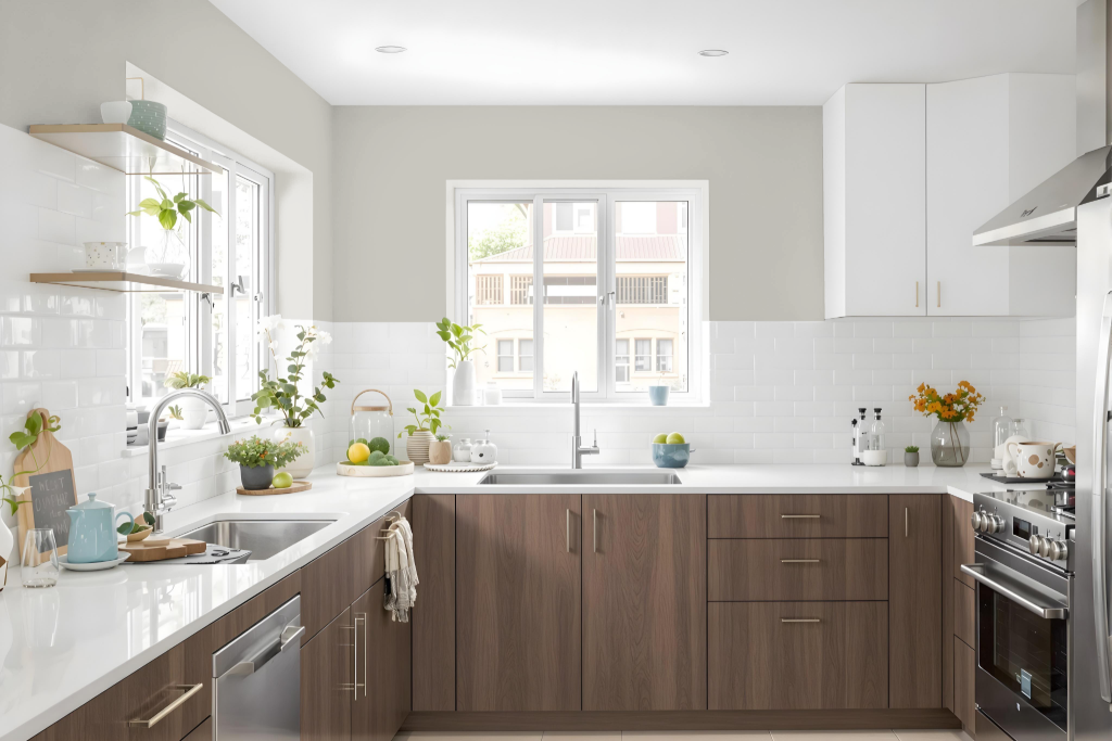
In the kitchen, RAL Effect RAL 110-3 establishes a warm and inviting atmosphere, making it a striking foundation for cabinetry and design elements. It harmonizes well with contrasting hues like medium jungle green or light taupe, and its warm undertones beautifully complement earthy shades such as desert sand or sienna when used on backsplashes or countertops.
This color also pairs effectively with neutral tones for walls and trim, ensuring a balanced and cohesive design. Enhancing the overall look with metallic accents like silver or antique brass adds a modern, sleek finish that elevates the sophistication of the space.
Living Room
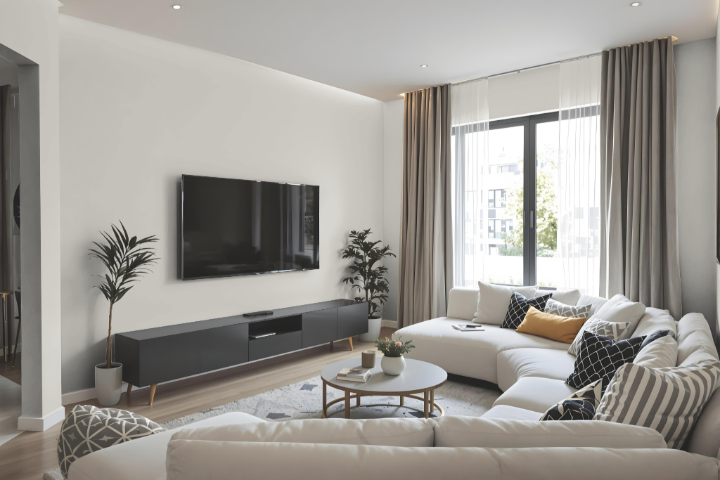
Living room color RAL Effect RAL 110-3 creates an elegant and balanced atmosphere, ideal for walls, trims, and furniture. Its neutral tone establishes a consistent appearance across various surfaces, ensuring a harmonious integration with a range of interior design elements.
For the most accurate assessment, it is recommended to view the color in person using physical samples rather than relying solely on digital displays. With a carefully calibrated light reflectance value that accommodates different lighting conditions, this hue’s subtle yellow undertone adds warmth and sophistication to spaces featuring natural wood tones and soft furnishings.
Outdoor
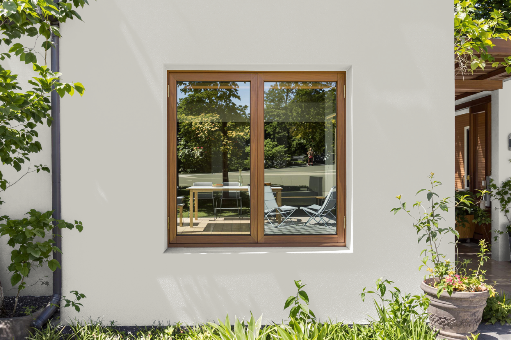
For home outdoor color, RAL Effect RAL 110-3 is an appealing choice for exterior projects. It can enhance areas such as rough walls, smooth trims, and doors, while its light reflectance value of 58.28 influences how natural light interacts with the painted surfaces.
Because the same shade may vary slightly depending on the texture and finish of the surface, it is advisable to test a physical color sample to ensure accuracy. Digital renditions may differ due to variations in device displays and browser settings, so verifying with a physical reference is recommended for the best results.