RAL Effect RAL 150-1 is a delightful, soft hue that exudes a sense of warmth and tranquility, aptly named Cream. Its RGB composition of 247, 239, 233 provides a subtle blend of light tones, perfect for creating a serene atmosphere in any interior space. This understated color is ideal for fostering a cozy environment, harmonizing well with both minimalist and eclectic design palettes.
Color Description
RAL Effect RAL 150-1 is described as a very bright pastel orange color. It has a high luminance of approximately 95% and a hue value of 26°, indicating it is a warm color.
Undertones
The undertone of RAL 150-1 can be accurately described as having a Red hue. This is evident from the color space provided and by isolating the pure hue.
Color Values
- RGB: 247, 239, 233
- HEX: #F7EFE9
- HSL: 25.7, 46.7%, 94.1%
- HSV: 25.7, 5.7%, 96.9%
- LAB: 94.9, 1.7, 3.8
- XYZ: 83.9, 87.4, 89.5
Usage
RAL 150-1 is part of the RAL Effect color system, which is commonly used in various applications such as architecture, construction, industry, and road safety. It can be used for painting interiors, exteriors, furniture, and other design elements where a bright, warm color is desired.
Atmosphere
The color RAL 150-1 creates a warm and bright atmosphere. It is suitable for creating eye-catching, modern designs and can be used to add a vibrant and cheerful feel to spaces such as living rooms, bedrooms, and kitchen areas.
RAL Effect RAL 150-1 Color Alternative
RAL Effect RAL 150-1 has excellent color alternatives that include Tikkurila Calla G503, Tikkurila Paper F497, and Tikkurila Winter V503. These options provide distinct yet complementary shades that retain the vibrancy and character of the original, ensuring consistency in design applications. By selecting any of these Tikkurila alternatives, designers can achieve high-quality finishes that honor the aesthetic integrity of RAL Effect RAL 150-1 across various projects.
Bathroom
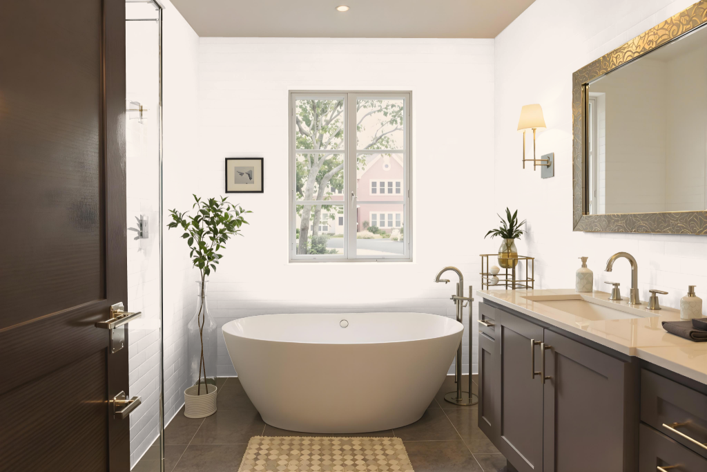
RAL Effect RAL 150-1 is an excellent bathroom choice, creating a warm, cozy, and elegant atmosphere that immediately enhances the space. Its subtle charm lends a refined backdrop to the overall design, contributing to an inviting and relaxing environment.
This hue pairs beautifully with fixtures in neutral tones and complements elements like natural stone or wooden accents seamlessly. It is well-suited for highlighting distinctive features such as trim, cabinets, or accessories, ensuring that each design element harmonizes to achieve a balanced and sophisticated aesthetic.
Bedroom
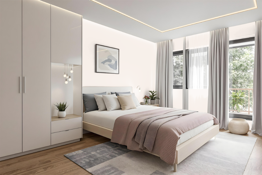
The bedroom color RAL 150-1 creates a fresh, contemporary atmosphere by modernizing the overall design. It serves as a striking backdrop that, when paired with carefully chosen complementary shades, enhances both the sense of spaciousness and the room’s depth, resulting in a harmonious balance of light and accent colors.
Used on walls alongside neutral or contrasting furnishings, this hue helps craft a cohesive and inviting setting. Incorporating varied materials and textures further elevates the visual appeal, making the space engaging and well-designed.
Kitchen
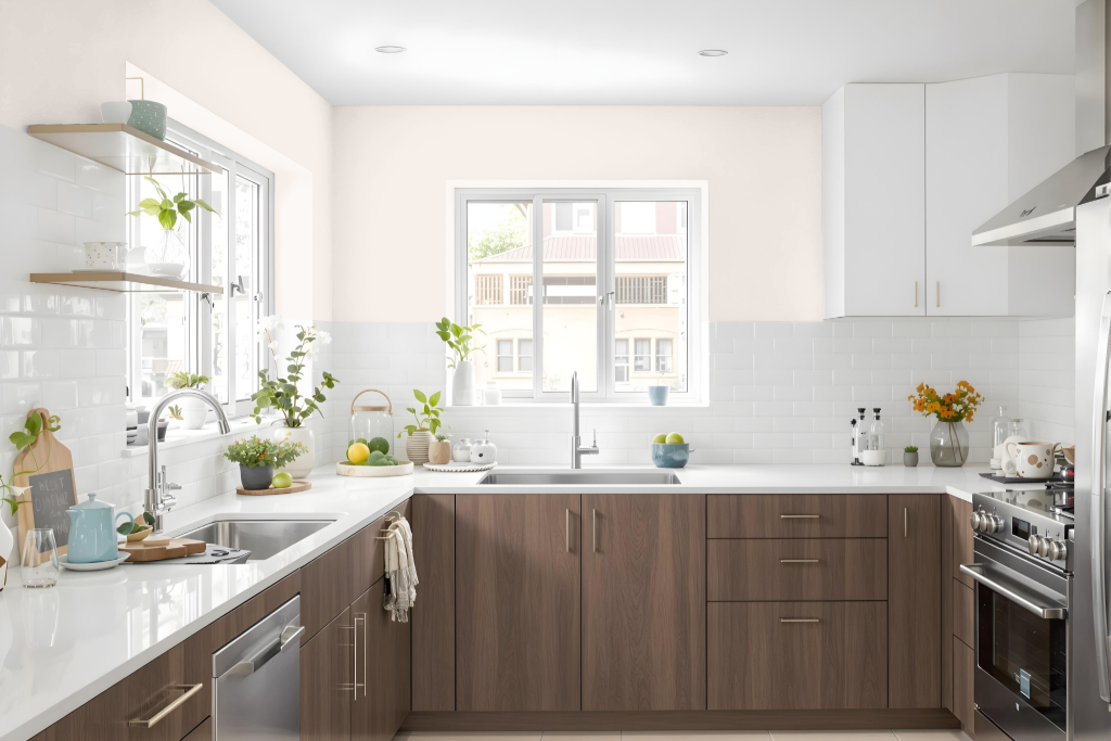
In a kitchen setting, RAL Effect RAL 150-1 introduces a warm and inviting atmosphere that elevates the overall design. This hue can be integrated through walls, cabinets, or accents to create a cozy and elegant space that pairs beautifully with neutral shades such as white, beige, and brown, resulting in a harmonious and balanced look.
Using this color on key elements like kitchen cabinets or furniture allows designers to highlight individual features and garner a sophisticated appeal, whether complemented by light countertops or stylish decorative accessories. Its ability to enhance both modern and classic kitchen environments makes it a compelling choice for creating a refined and comfortable atmosphere.
Living Room
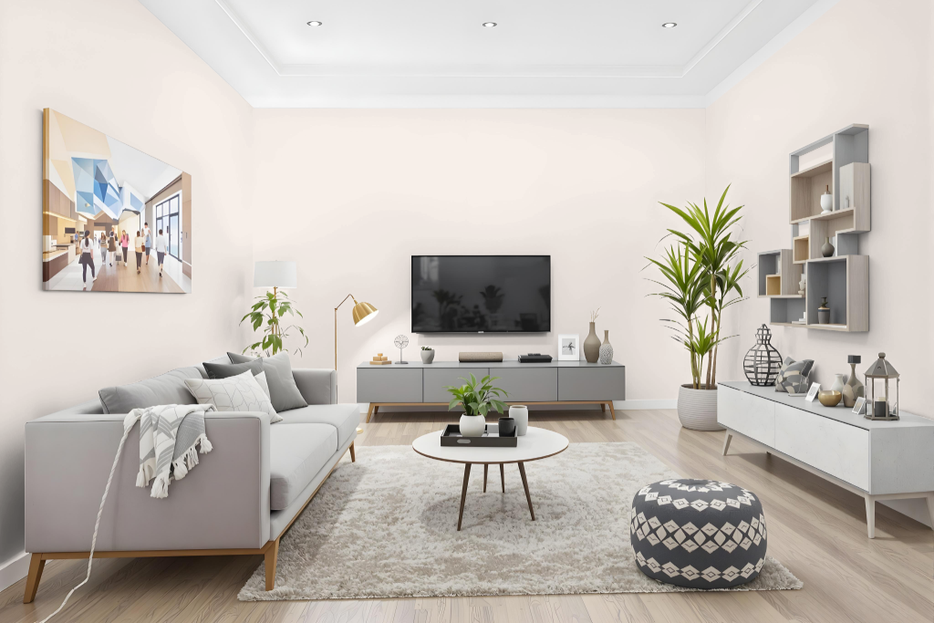
Living room color RAL 150-1 sets a warm, cozy, and elegant tone that can be applied to walls, trims, or accent areas to elevate the overall aesthetic. It works well with complementary shades like white, beige, and brown to create a balanced contrast and enhance spatial depth.
In addition to its stylish appeal, this color lends a sophisticated look to furniture and decor such as cabinets, dressers, and storage units. As part of an environmentally friendly, waterborne paint system, it also supports sustainable interior design practices.
Outdoor
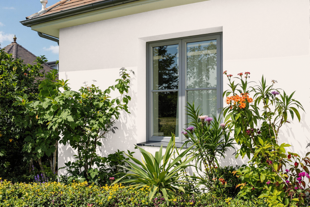
For home outdoor color, RAL Effect RAL 150-1 offers a stylish touch that elevates exterior spaces. It pairs beautifully with neutral tones such as white, beige, or brown to create an elegant and harmonious appearance on walls, trim, and outdoor furniture.
The waterborne paint base ensures an eco-friendly, non-toxic finish free from harmful heavy metals, while its high light reflectance helps the color maintain its vibrancy under various lighting conditions. This makes it an ideal solution for achieving a refined and visually appealing outdoor environment.