Mint green, which corresponds to the RAL Effect color RAL 210-6, is a refreshing shade characterized by its soft, pastel hue, often associated with tranquility and nature. Its RGB configuration of (216,233,214) blends subtle tones of green and white, creating a delicate balance that lends spaces a calm and airy atmosphere. This particular hue is frequently used in interior design and fashion to evoke a sense of freshness and renewal, seamlessly integrating modern aesthetics with timeless appeal.
Color Description
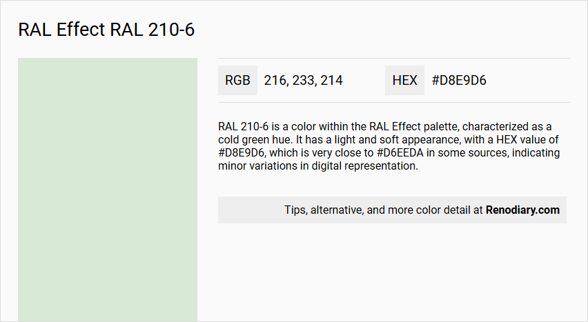
RAL 210-6 is a color within the RAL Effect palette, characterized as a cold green hue. It has a light and soft appearance, with a HEX value of #D8E9D6, which is very close to #D6EEDA in some sources, indicating minor variations in digital representation.
Undertones
The undertone of RAL 210-6 is predominantly green. This is evident from its color space and the elimination of any tints, tones, and shades, confirming its green hue.
Color Values
- HEX: #D8E9D6 (or #D6EEDA in some sources)
- RGB: 216, 233, 214 (or 214, 238, 218 in some sources)
- CMYK: 13, 0, 21, 0 (or similar values depending on the source)
- HSL: 130deg, 10%, 93% (or similar values depending on the source)
Usage
RAL 210-6 can be used in various design and architectural contexts. It is suitable for painting living room walls, trims, kitchen cabinets, bedroom accent walls, bathrooms, and house exteriors. The color is part of the RAL Effect system, which is based on waterborne paint and does not include heavy metals like lead, cadmium, and chromates.
Atmosphere
The color RAL 210-6 creates a calm and serene atmosphere due to its light and soft green hue. It can contribute to a peaceful and natural ambiance in interior and exterior spaces, making it ideal for environments where a soothing and elegant look is desired.
RAL Effect RAL 210-6 Color Alternative
The striking hue of RAL Effect RAL 210-6 has paved the way for a range of unique color alternatives that cater to diverse design needs. Notably, Tikkurila Spa X442, Little Greene Aquamarine - Light 283, and Little Greene Pearl Colour - Mid 168 offer distinctive options that echo the original tone while infusing their own subtle variations. Each alternative brings a new layer of sophistication to interiors and exteriors, ensuring that the essence of RAL Effect RAL 210-6 is preserved while expanding the creative palette available to designers and homeowners alike.
Bathroom
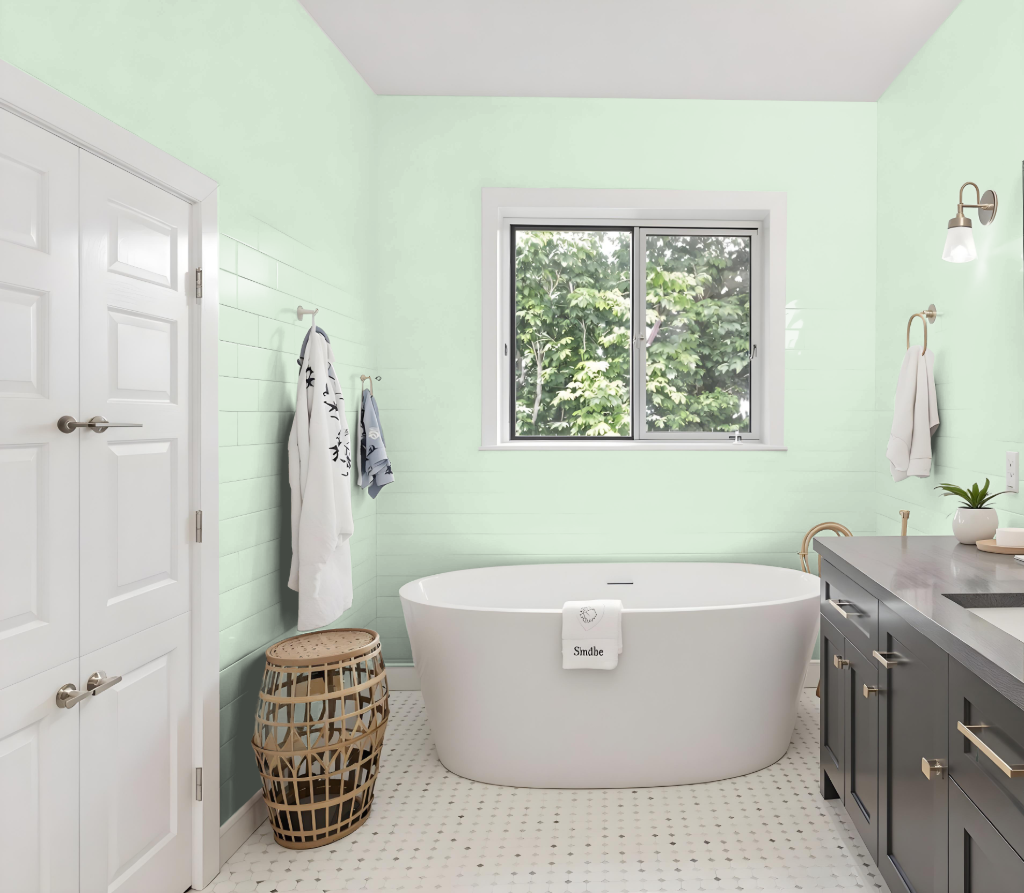
For a bathroom, consider using RAL Effect RAL 210-6 to create a light and airy atmosphere. Its high light reflectance helps brighten spaces and can make the room appear larger, though its appearance may vary depending on surface textures and lighting conditions.
It is advisable to review physical color samples to ensure accuracy, as the shade may seem different on various surfaces such as walls, trim, and cabinetry. This careful evaluation will help achieve the desired aesthetic and enhance overall visual appeal in your bathroom.
Bedroom
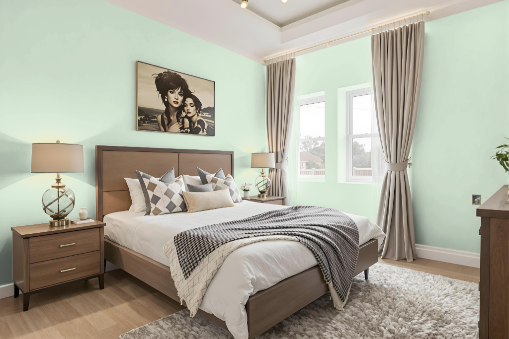
For bedroom design, the soothing RAL 210-6 is presented as an ideal color choice that creates a calming backdrop for rest and relaxation. This hue is part of a comprehensive collection developed in 2007 that emphasizes environmentally responsible production methods by using waterborne paints free of harmful heavy metals.
The collection offers an extensive range of carefully coordinated color options, featuring a broad assortment of solid and metallic finishes arranged in families with harmoniously matching shades. Each color family includes six complementary tones along with an additional metallic accent, ensuring that designers can achieve a cohesive and balanced aesthetic for any interior project.
Kitchen
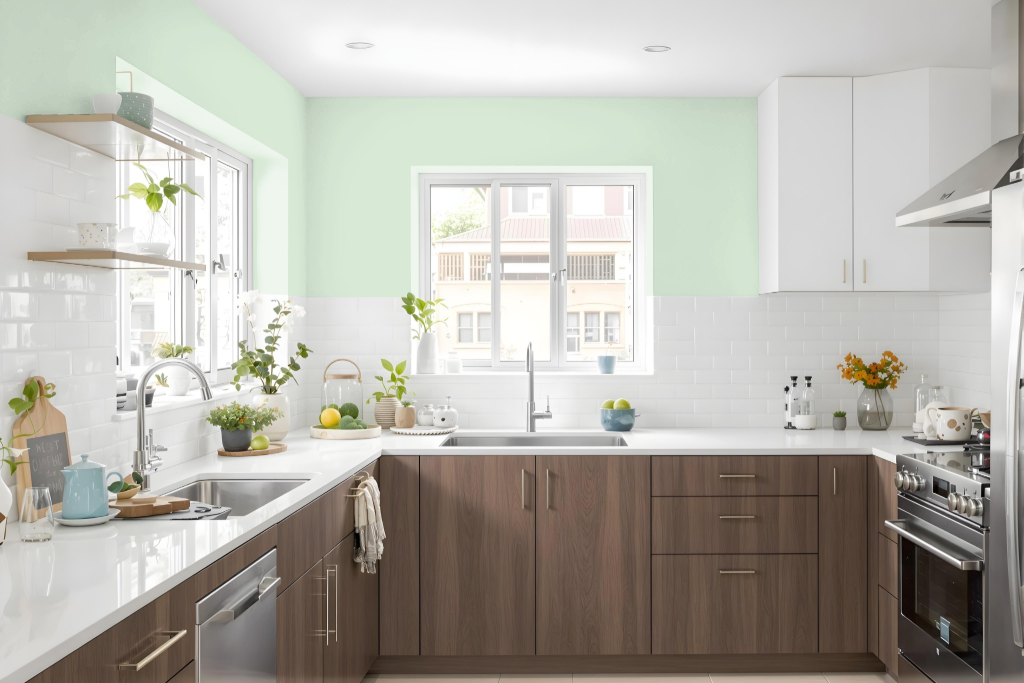
For a kitchen color scheme, RAL Effect RAL 210-6 sets a dynamic tone that can be paired with earthy tones—including medium jungle green, davvy grey, and pastel purple—to design striking cabinets, countertops, and walls. These combinations create a coordinated aesthetic that highlights the inherent warmth and appeal of the primary color.
To introduce depth and contrast, darker shades such as shadow, khaki, or seal brown work well for kitchen islands, backsplashes, or furniture, while lighter accents like pastel hues and light gray enhance brightness and spaciousness. Neutral colors, exemplified by taupe gray and manatee, help balance the overall look by complementing key surfaces such as flooring and appliances.
Living Room
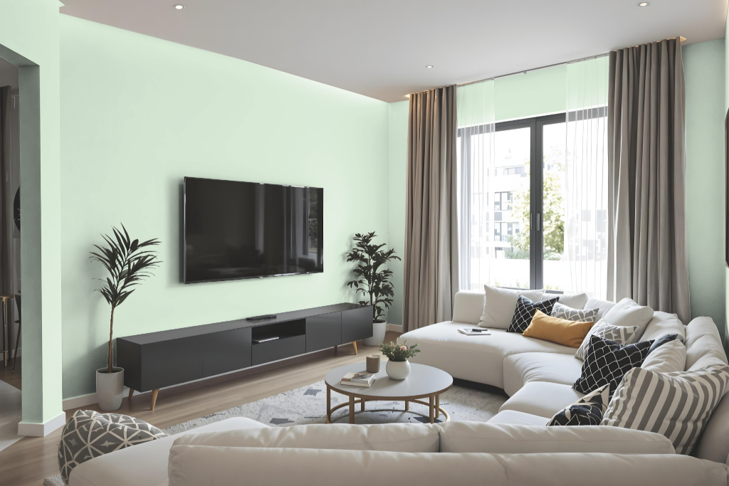
The living room color RAL Effect RAL 210-6 offers a calming ambiance, making it an excellent choice for walls, trims, and accent areas. Its light hue enhances natural brightness and contributes to a spacious feel, ensuring a serene setting.
This hue seamlessly integrates into various spaces throughout the home, including kitchens and bathrooms, promoting a cohesive overall design. When paired with complementary furniture and decor, it magnifies room light and balance, resulting in a harmonious living environment.
Outdoor
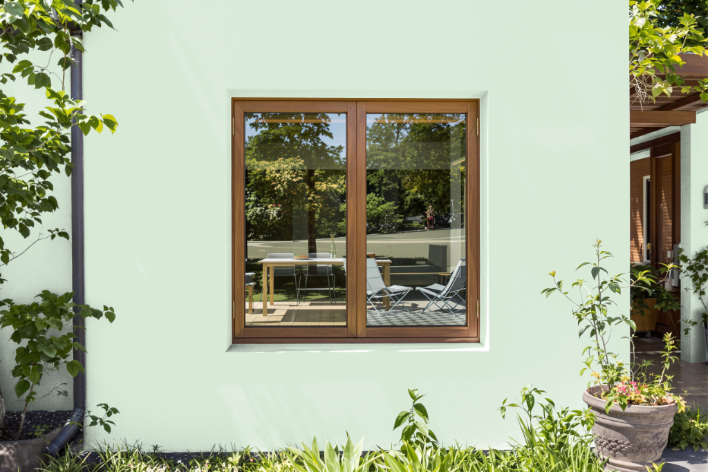
RAL Effect RAL 210-6 is an excellent choice for home outdoor painting, ideal for enhancing the look of exterior walls, trims, and outdoor furniture. This color is part of a collection based on waterborne paint that is free from heavy metals, ensuring both environmental and health benefits.
When applying this shade, it is recommended to use a physical color fan to achieve the most accurate match, as digital displays may not reflect the true hue. Testing the color in real-life conditions can help ensure it meets the desired aesthetic before finalizing any outdoor project.