Bistre is a rich, earthy hue characterized by its deep brownish tone, reminiscent of the natural tint used historically in art and illustration. Its RGB composition of 80, 49, 42 enhances its warm and muted quality, making it a versatile choice for design projects that seek to evoke a sense of sophistication and warmth. As part of the RAL Effect color palette, Bistre offers a unique blend of tradition and modernity, ideal for creating depth and contrast in both digital and print media.
Color Description
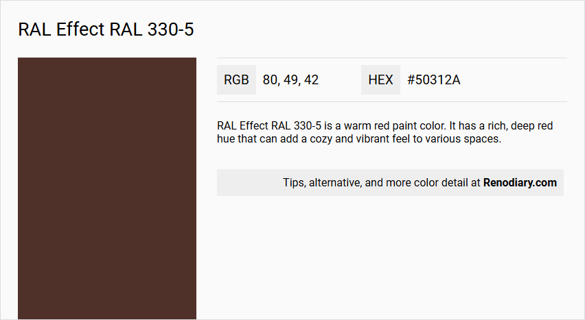
RAL Effect RAL 330-5 is a warm red paint color. It has a rich, deep red hue that can add a cozy and vibrant feel to various spaces.
Undertones
The undertone of RAL 330-5 is accurately described as a Red hue. This is determined by isolating the pure hue and eliminating any tints, tones, and shades.
Color Values
- HEX value: #50312A or #583F38 (slightly varying depending on the source).
- RGB code: 80, 49, 42 or 88, 63, 56 (slightly varying depending on the source).
- CMYK: 25, 88, 80, 83 (for the #583F38 HEX value).
Usage
RAL 330-5 can be used in various interior and exterior applications, such as living room walls, trims, kitchen cabinets, bedroom accent walls, bathrooms, and house exteriors. It is suitable for creating a bold and inviting atmosphere in different rooms and spaces.
Atmosphere
This color creates a warm and cozy atmosphere, making it ideal for spaces where a vibrant and energetic feel is desired. It can add depth and character to both interior and exterior designs, contributing to a welcoming and lively environment.
RAL Effect RAL 330-5 Color Alternative
RAL Effect RAL 330-5 stands out as a distinguished option in the realm of color alternatives provided by Sherwin Williams. Sherwin Williams Rojo Marrón SW 9182, Sherwin Williams Rookwood Dark Red SW 2801, and Sherwin Williams Marooned SW 6020 offer unique nuances that enrich any design palette while maintaining a strong alignment with the original RAL Effect RAL 330-5 tone. Each alternative brings a robust and dynamic character to projects, ensuring versatility and lasting visual appeal across various applications.
Bathroom
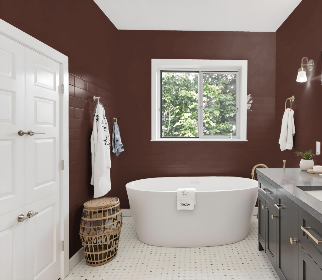
Using RAL Effect RAL 330-5 in a bathroom creates a warm, inviting environment that encourages a cozy and intimate atmosphere. Its deep, rich tone makes it an excellent choice for smaller spaces, adding a sense of luxury while subtly concealing minor imperfections when applied to walls, trim, or accent pieces.
This striking shade harmonizes beautifully with complementary neutral tones and lighter hues, enhancing the overall aesthetic without overwhelming the space. Its application can elevate the bathroom’s visual appeal while providing a sophisticated backdrop that highlights other design elements.
Bedroom
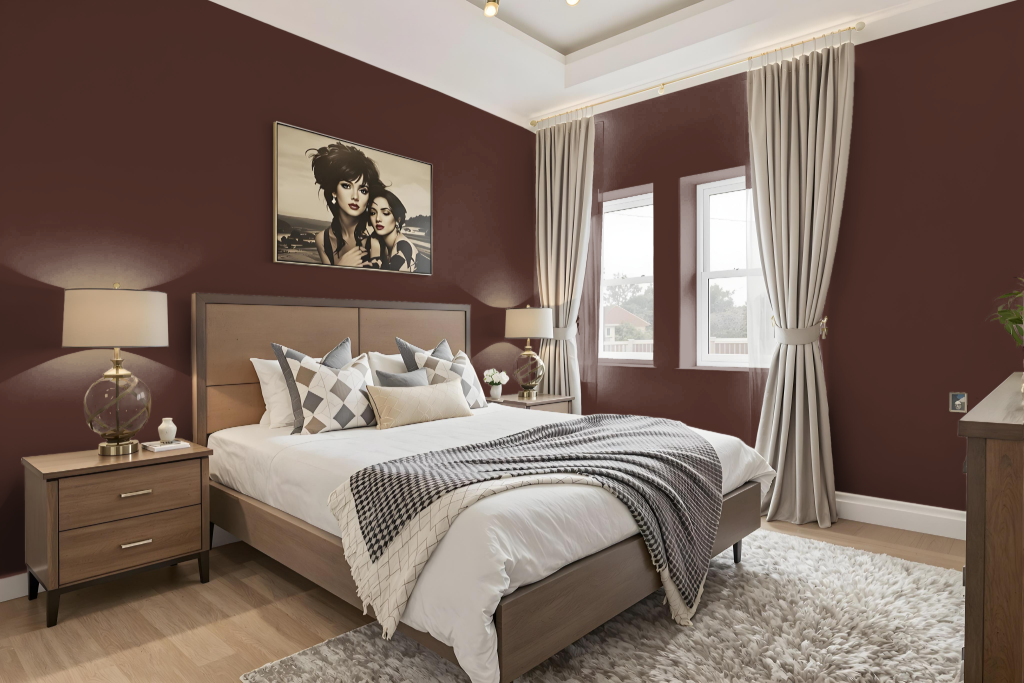
For a bedroom color scheme, RAL 330-5 creates an engaging and inviting atmosphere, ideal for accent walls or integrated into furniture and decor to infuse the room with depth and warmth. Pairing this shade with soft neutrals like light grays, creams, or subtle blues helps temper its richness and maintains a balanced ambiance.
Enhancing the space with natural elements such as wood and greenery further elevates the cozy, organic feel of the room. Additionally, incorporating deeper complementary hues like green or purple can introduce a dramatic contrast, fostering a harmonious environment that is both restful and thoughtfully composed.
Kitchen
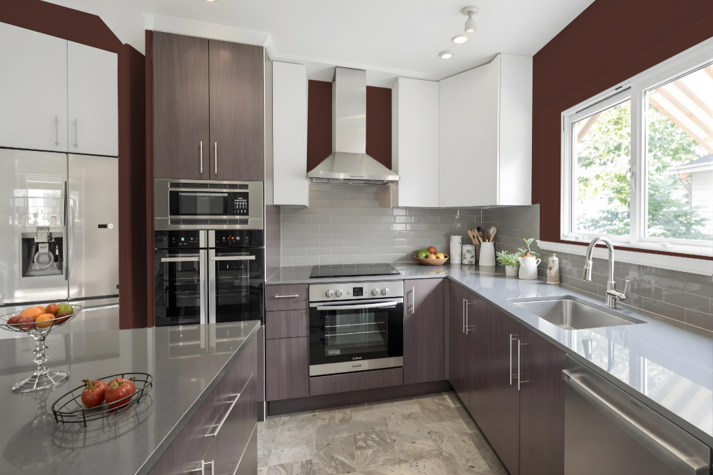
The kitchen color scheme features RAL 330-5 as a statement element, creating a rich and cohesive look when used for cabinetry and accent pieces. It pairs well with metallic finishes such as antique brass or gold, and its depth harmonizes with dark-stained woods and other deep hues like charcoals and greens.
To create a balanced and welcoming space, this bold color is best complemented by lighter countertops, mid-toned wooden flooring, and plenty of natural light. Incorporating neutral shades such as davy grey, light blue, or lavender purple further elevates the overall aesthetic, adding an elegant touch and subtle variety to the design.
Living Room
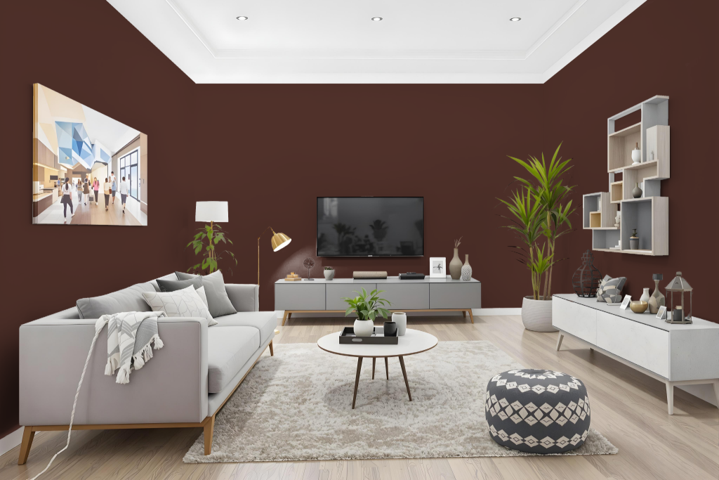
In living areas, RAL Effect RAL 330-5 brings a warm, earthy ambiance that can serve as a captivating accent. Its visual impact shifts with varying surface textures and lighting conditions, offering subtle differences between finishes on walls and smoother materials like furniture or cabinetry.
It is advisable to test the color in its intended environment before finalizing any decisions. Sampling with actual paint or referring to a physical RAL color fan ensures that the final outcome accurately reflects the desired aesthetic across different materials.
Outdoor
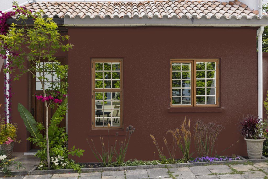
RAL Effect RAL 330-5 is a home outdoor color designed for exterior painting projects, offering a range of paint types such as cellulose, acrylic, and synthetic enamel to meet different surface needs and environmental demands. It can be applied in multiple finishes from full matt to full gloss, and special formulations with additives are available to enhance its UV protection and resistance in demanding settings.
For high-traffic or harsh conditions, a 2K version is recommended to ensure maximum durability and longevity. To optimize adhesion and performance on surfaces like glass, fiberglass, or plastic, it is advisable to use a primer and conduct a preliminary test on the specific surface, as color appearance may vary based on application conditions.