RAL Effect RAL 390-5, with its RGB composition of 216,72,15, presents a vibrant hue known as Red-orange, a blend that captures the fiery essence of both red and orange. This shade is often associated with energy, enthusiasm, and warmth, making it a popular choice for design elements that aim to attract attention and inspire action. Its vivid tone not only enlivens spaces but also adds a dynamic contrast when paired with cooler colors, enhancing overall aesthetic appeal.
Color Description
RAL Effect RAL 390-5 is a warm red paint color.
Undertones
The undertone of RAL 390-5 is accurately described as a Red hue.
Color Values
- HEX: #D8480F
- RGB: 216, 72, 15 (or 212, 72, 18 in some sources)
Usage
- Living room walls
- Trims
- Kitchen cabinets
- Bedroom accent walls
- Bathrooms
- House exteriors
Atmosphere
The warm red tone of RAL 390-5 can create a vibrant and energetic atmosphere, making it suitable for spaces where a bold and inviting ambiance is desired.
RAL Effect RAL 390-5 Color Alternative
When considering a color alternative for RAL Effect RAL 390-5, designers and architects can explore several distinctive options that maintain the intended visual impact. One viable choice is RAL Classic Pure orange RAL 2004, which presents a bright and striking option that complements modern design themes. Additionally, RAL Classic Traffic orange RAL 2009 and RAL Effect RAL 390-3 offer variations that allow for nuanced adjustments while preserving the overall aesthetic appeal.
Bathroom
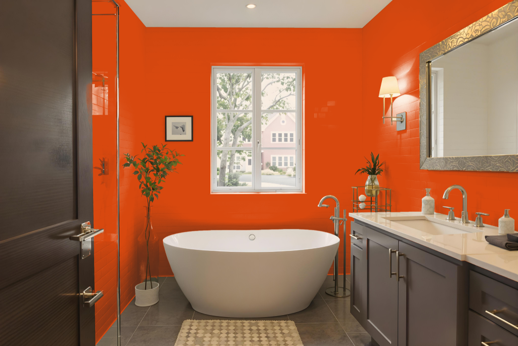
Bathroom color RAL Effect RAL 390-5 offers a vibrant and inviting touch to a bathroom by infusing a warm and cozy feel into the space. It creates an appealing ambiance when applied on walls, trims, or as an accent, ensuring that the area feels welcoming and distinctive.
Given its relatively dark nature, special attention to lighting is advised to maintain a bright and balanced environment. As digital displays may not accurately capture the true appearance of the shade, verifying the color with a physical sample is recommended to achieve the desired atmosphere.
Bedroom
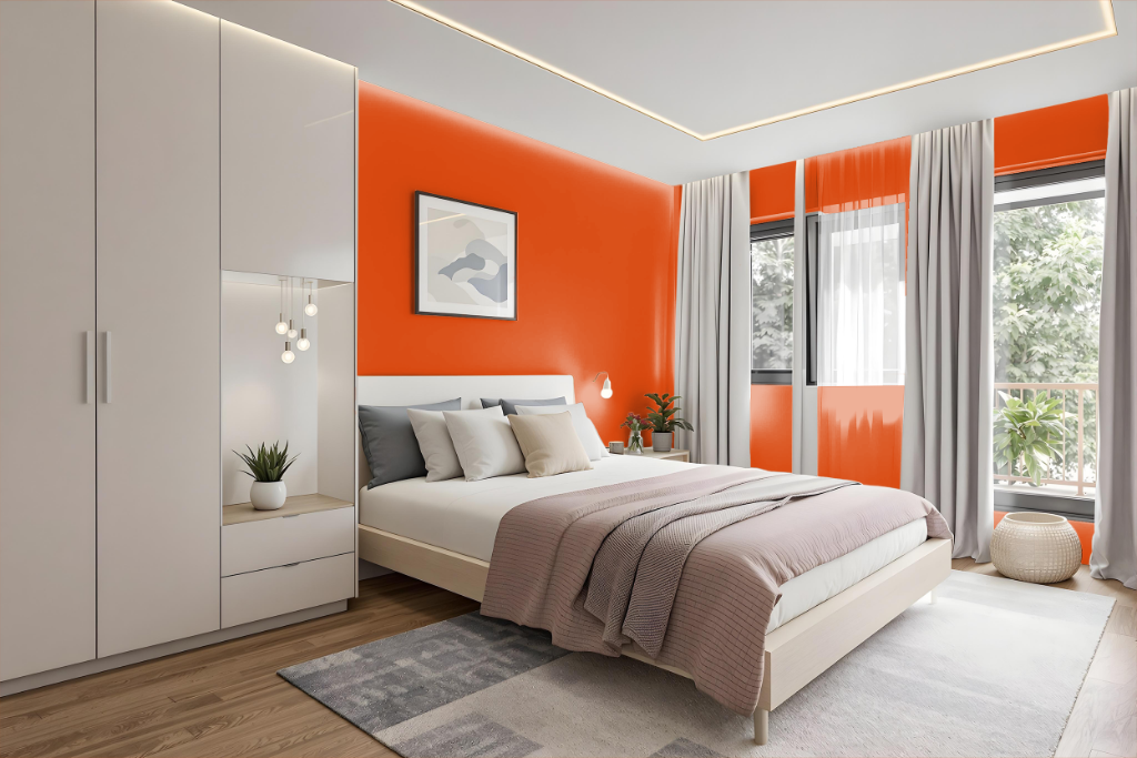
For a bedroom, RAL Effect RAL 390-M brings a bold, warm accent that elevates the overall atmosphere. The color works well as a striking accent wall, creating a focal point when balanced with neutral tones such as beige, cream, or soft grays.
Its application extends to elements like furniture and decor, offering an engaging alternative for pieces like a painted dresser or headboard. Pairing RAL 390-M with complementary shades such as dark lava, cafe au lait, or pale taupe, along with lighter bedding and curtains, helps maintain a harmonious, grounded, and relaxing room ambiance.
Kitchen
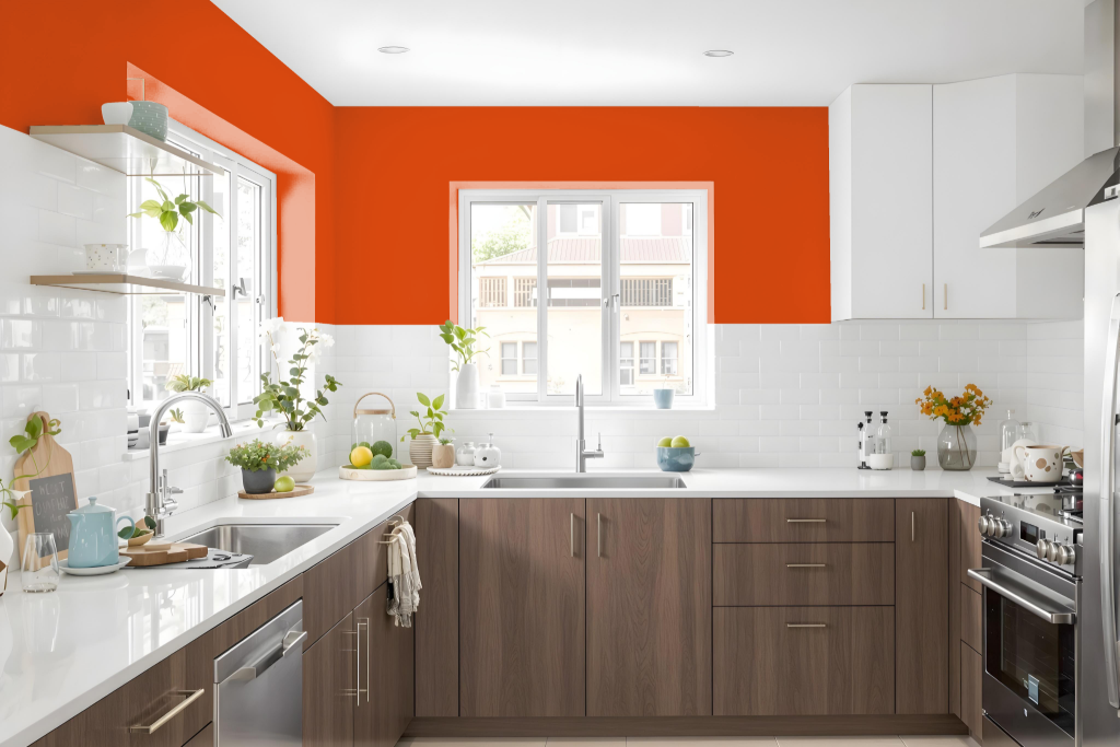
For a kitchen color scheme, RAL Effect RAL 390-5 offers a vibrant, passionate appeal that enhances the warm, inviting atmosphere of the space. This hue works well on cabinets, walls, or as an accent, creating a lively ambiance that draws the eye and brings modern energy to the design.
Complementary tones such as dark sienna, black, and wenge can deepen the overall look, while neutral shades like smoky black, battleship grey, and cadmium orange help balance the intensity. Incorporating this color in subtle accents or trim seamlessly ties together diverse design elements, resulting in a harmonious and engaging kitchen aesthetic.
Living Room
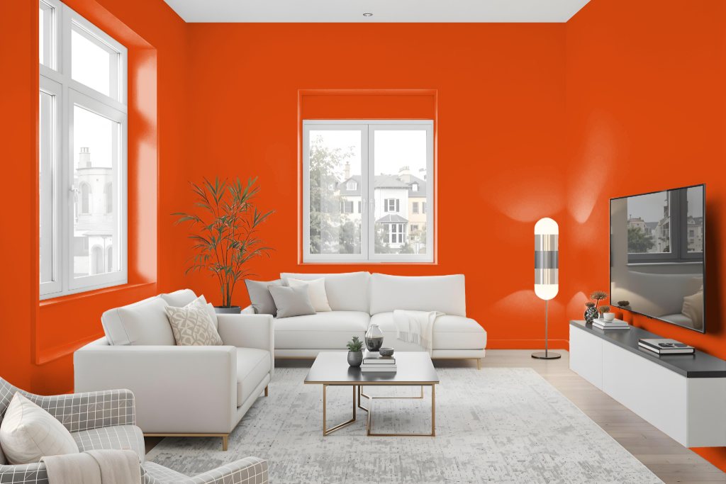
For living rooms, RAL 390-5 creates a dynamic and energetic atmosphere that infuses the space with vibrancy and passion. This bold hue also works well in dining areas by evoking a warm, inviting feel, and serves as an eye-catching accent in bedrooms and bathrooms.
Keep in mind that due to its darker tone and light-absorbing characteristics, this color may visually shrink a room if used excessively. Pairing it with lighter shades can help maintain a balanced and open aesthetic throughout the space.
Outdoor
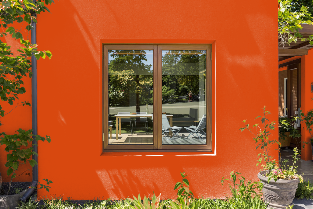
RAL Effect RAL 390-5 is an attractive home outdoor color that enhances exterior spaces with its warm, inviting tone. Its light absorbency makes it particularly effective for areas receiving direct sunlight, ensuring that the color maintains a rich and subdued appearance even under strong illumination.
When applied to house exteriors, this color harmonizes well with neutral accents such as dark hues to elevate its overall impact. For the most accurate representation, it is recommended to view a physical color sample, as on-screen depictions might not reflect the true appearance.