RAL Effect RAL 450-2, known as "Light Pink," is characterized by its subtle blend of warm and soft tones, as represented by its RGB values of 237,165,170. This delicate hue is ideal for creating a soothing and inviting atmosphere, often used in interior design to evoke feelings of calm and comfort. Its understated elegance makes it a versatile choice, harmonizing well with both modern and classic aesthetics.
Color Description
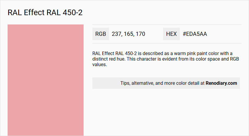
RAL Effect RAL 450-2 is described as a warm pink paint color with a distinct red hue. This character is evident from its color space and RGB values.
Undertones
The undertone of RAL 450-2 is accurately described as a red hue. This is determined by isolating the pure hue and eliminating any tints, tones, and shades.
Color Values
- HEX value: #EDA5AA
- RGB code: 237, 165, 170
Usage
RAL 450-2 can be used in various design contexts, including interior and exterior painting. It is suitable for:
- Living room walls
- Trims
- Kitchen cabinets
- Bedroom accent walls
- Bathroom decor
The color's subtlety makes it versatile but requires careful balance to avoid overshadowing other design elements.
Atmosphere
RAL 450-2 is known to evoke a sense of calm and mystery. It has the ability to transcend its visual presence and create an atmosphere that is both calming and profound. The color can influence mood and perception, making it a powerful tool for creating emotional experiences in design.
RAL Effect RAL 450-2 Color Alternative
RAL Effect RAL 450-2 is a vibrant hue that has sparked interest among designers looking for a bold, contemporary accent in their projects. Sherwin Williams Mellow Coral SW 6324, Sherwin Williams Youthful Coral SW 6604, and Sherwin Williams Hopeful SW 6597 have been identified as strong color alternatives that closely resemble the dynamic energy of RAL Effect RAL 450-2. Each option delivers its unique interpretation while preserving the overall spirited appeal and versatility of the original color, making them ideal choices for varied creative applications.
Bathroom
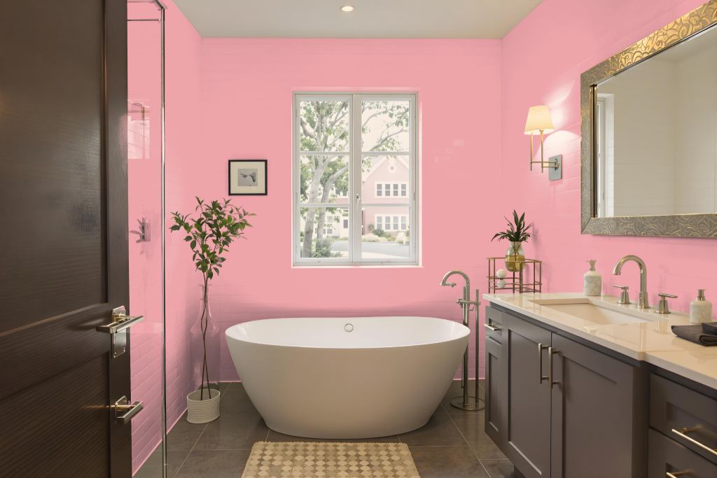
This bathroom color RAL 450-2 creates a warm and inviting atmosphere, ideal for transforming the space into a welcoming haven. It works beautifully on walls, trims, and accents, adding a cheerful touch to bathroom fixtures without overwhelming the design.
Careful attention to lighting and surface textures is essential to reveal its true potential, and using a physical color sample is recommended for an accurate view. Enhancing the design by pairing this shade with complementary colors will further amplify its harmonious appeal.
Bedroom
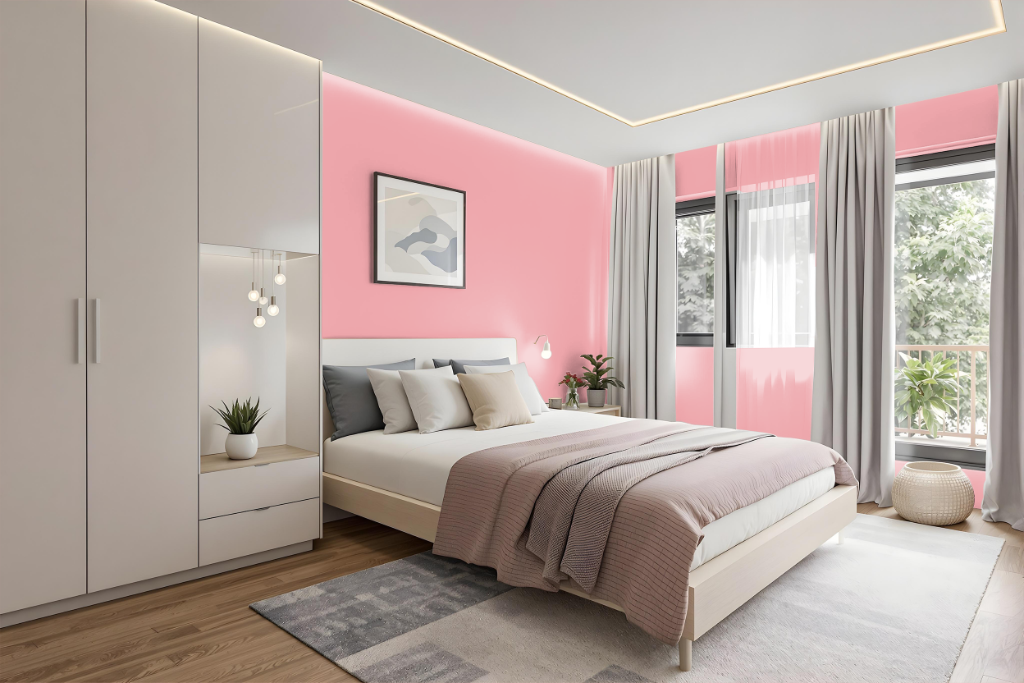
For a bedroom, RAL 450-2 offers a calming and subtle appeal that sets the stage for a tranquil retreat. Its serene quality is enhanced when paired with complementary hues such as Asparagus, Pale mauve, and Arsenic that bring natural softness to the space.
Deep tones like Onyx and Smoky black can be used for accents or furnishings to establish a gentle contrast without dominating the ambiance. Adding secondary shades such as Platinum or Pale brown further enriches the room by introducing warmth and depth, resulting in a balanced, emotionally resonant environment.
Kitchen
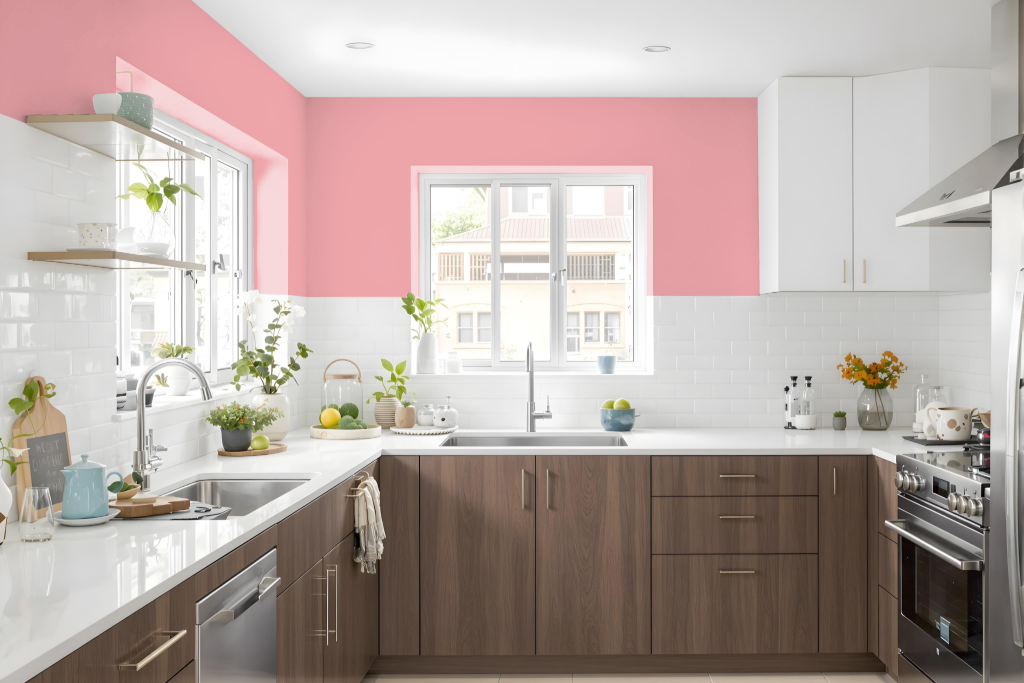
For a kitchen color scheme, RAL Effect RAL 450-2 brings a warm, inviting tone that enhances cabinetry and overall ambiance. This color works harmoniously with neutral countertops, such as white or light gray, creating a balanced and modern look while serving as a strong foundation for accent walls or trim details.
In addition, pairing this hue with complementary backsplash choices like soft gray or beige further elevates the space’s aesthetic appeal. Accents in metallic finishes add sophistication, ensuring that every element contributes to a cohesive and stylish design.
Living Room
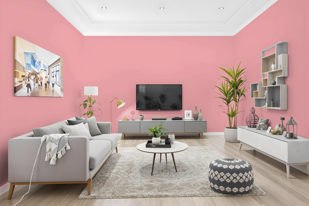
Living room walls painted in RAL Effect RAL 450-2 bring a bright and engaging atmosphere to the space. This distinct tone is also appropriate for use on trims, kitchen cabinets, bedroom accent walls, and even in bathroom decor, lending a refreshing feel throughout the home.
Keep in mind that its appearance can vary with different surface textures, showing unique characteristics on rough walls compared to smooth finishes. For the most accurate color match, it is advisable to consult a physical color fan, as digital displays can alter the perception of the hue.
Outdoor
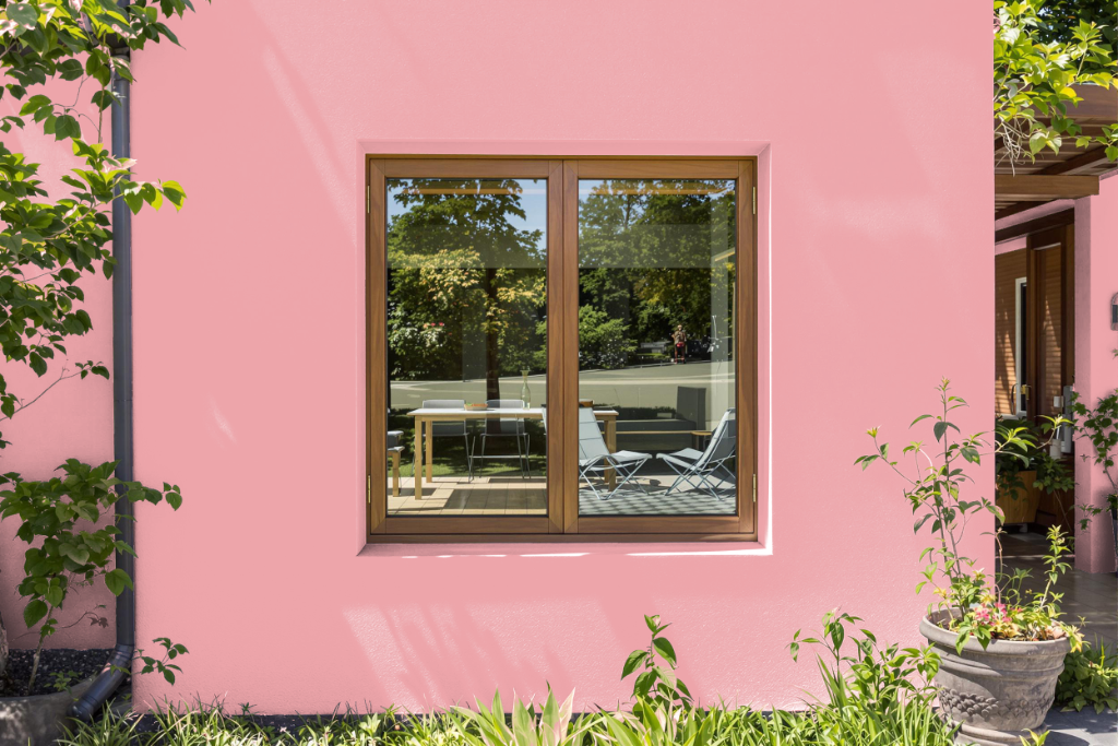
For using RAL 450-2 as a home outdoor paint color, it is essential to observe how the shade transforms under varying natural light and on different textures, from rough exterior walls to smoother surfaces like trim and doors. Testing the actual color with a physical sample is recommended to ensure the true appearance is captured, as digital representations may not fully reflect its authenticity.
When incorporating this hue into your outdoor design, careful consideration must be given to balancing it with complementary tones to enhance the overall aesthetic. Pairing it with colors such as rifle green, dim gray, or ash grey can help create a balanced ambiance and emphasize the color's capacity to evoke calm and depth, making it ideal for spaces intended to cultivate a tranquil atmosphere.