The RAL Effect color RAL 850-3, identified by its RGB values of 166,166,160, is popularly known as Warm Gray, a shade known for its subtle and soothing appeal. This particular hue is often favored in interior design for creating a neutral yet inviting ambiance, balancing both modern and classic aesthetics. Its versatility makes it an ideal choice for both residential and commercial spaces aiming for a calm and sophisticated atmosphere.
Color Description
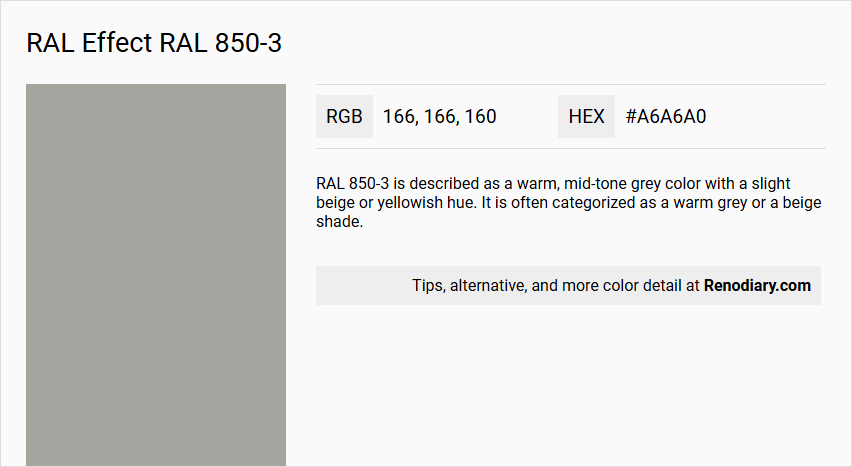
RAL 850-3 is described as a warm, mid-tone grey color with a slight beige or yellowish hue. It is often categorized as a warm grey or a beige shade.
Undertones
The undertone of RAL 850-3 is accurately described as having a yellow hue. This yellow undertone is evident when analyzing the color space and isolating the pure hue.
Color Values
- RGB: 166, 166, 160 (or slightly varying values such as 167, 172, 166 or 169, 169, 163 depending on the source).
- HEX: #A6A6A0 (or #A7ACA6 in some conversions).
- CMYK: 26, 16, 25, 25 (or similar values depending on the conversion method).
- Light Reflectance Value (LRV): Approximately 38.
Usage
RAL 850-3 is versatile and can be used in various applications, including interior and exterior design. It is suitable for painting living room walls, trims, kitchen cabinets, bedroom accent walls, bathrooms, and house exteriors. It can also be used in product design and architectural projects.
Atmosphere
The color RAL 850-3 can create a calming and sophisticated atmosphere. It is described as having a warm and neutral tone that can add a sense of balance and stability to a space. The color can also be seen as modern and intelligent, making it suitable for a wide range of design contexts.
RAL Effect RAL 850-3 Color Alternative
RAL Effect RAL 850-3 is a vibrant hue that has inspired designers to explore unique color alternatives for a variety of creative projects. Tikkurila Ash M497, Tikkurila Granite K499, and Dulux Warm Pewter 50BG 38/011 have each been identified as compelling alternatives, offering refined nuances and a distinct character that can enhance both contemporary and traditional aesthetics. These options provide designers with the flexibility to achieve a bespoke look while maintaining consistency with the original RAL Effect RAL 850-3 theme.
Bathroom
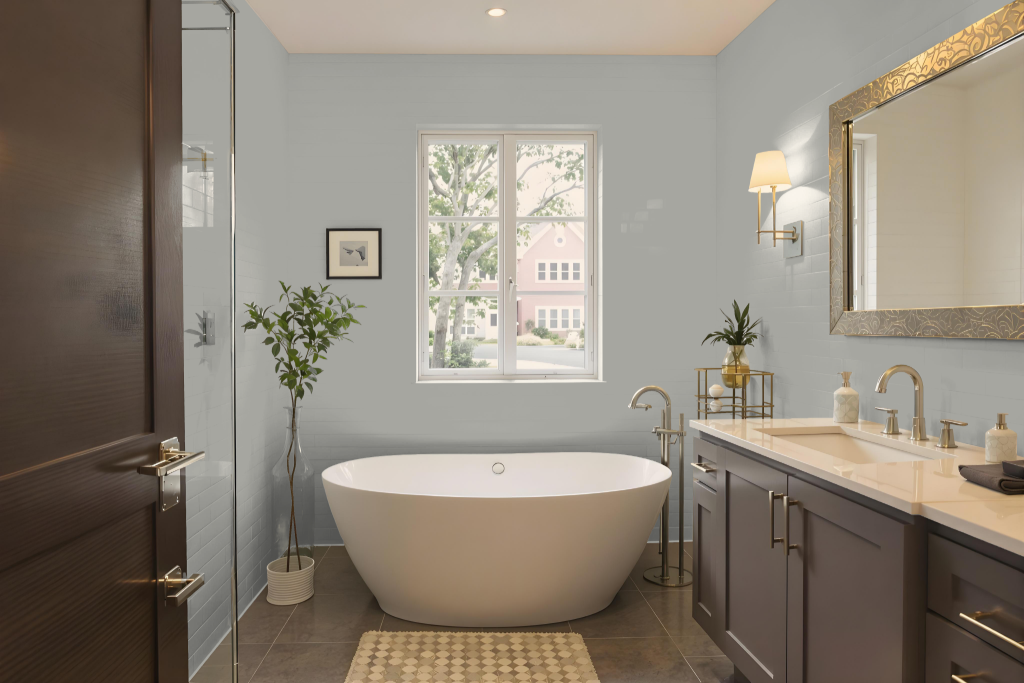
For a bathroom, RAL Effect RAL 850-3 offers a calming option, well-suited for walls, trims, and bathroom cabinets to create a harmonious ambiance. Its mild tone reflects light effectively, making the space appear larger and more inviting.
This color pairs seamlessly with fixtures and décor such as white or light-tinted tiles, chrome or silver hardware, and natural stone accents. The subtle yellow undertone also enhances warm-toned accessories, adding just the right touch of warmth without overwhelming the overall design.
Bedroom
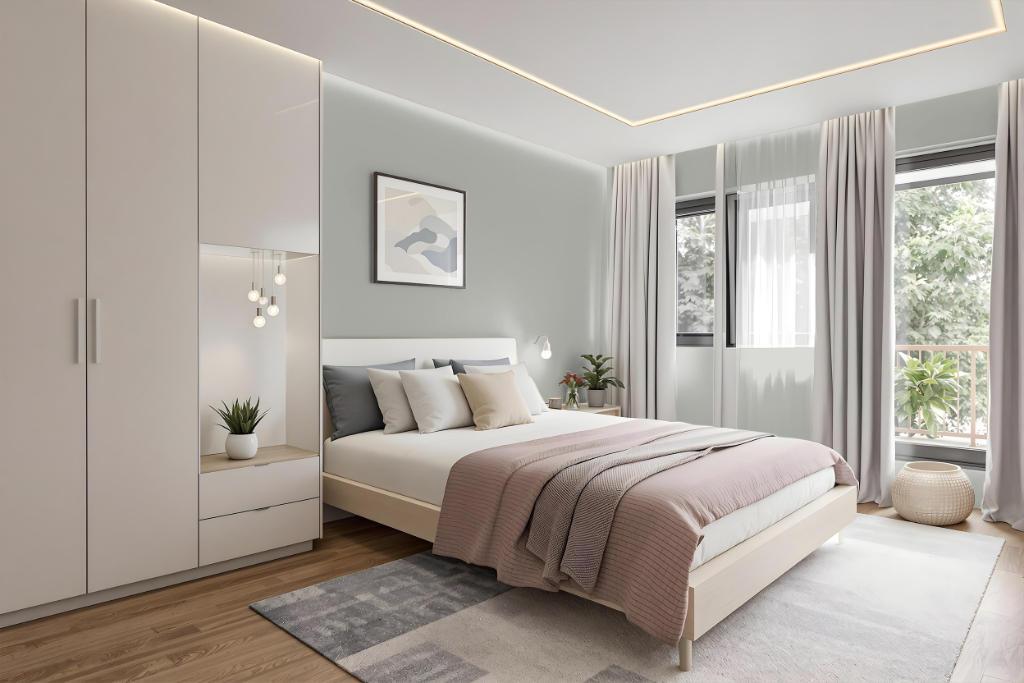
Enhance your bedroom decor with RAL 850-3, a subtle, modern shade that integrates seamlessly into interior color schemes. Introduced as part of an extensive range in 2007 featuring numerous metallic finishes, this color supports meticulous interior design efforts by offering a refined backdrop for various complementary elements.
Originally designed for industrial and product design applications, this hue has gained trust in home décor settings due to its consistent performance and precise color matching potential. Professionals rely on specialized digital tools and color swatches to blend RAL 850-3 harmoniously with surrounding hues, ensuring a balanced, sophisticated ambiance in any space.
Kitchen
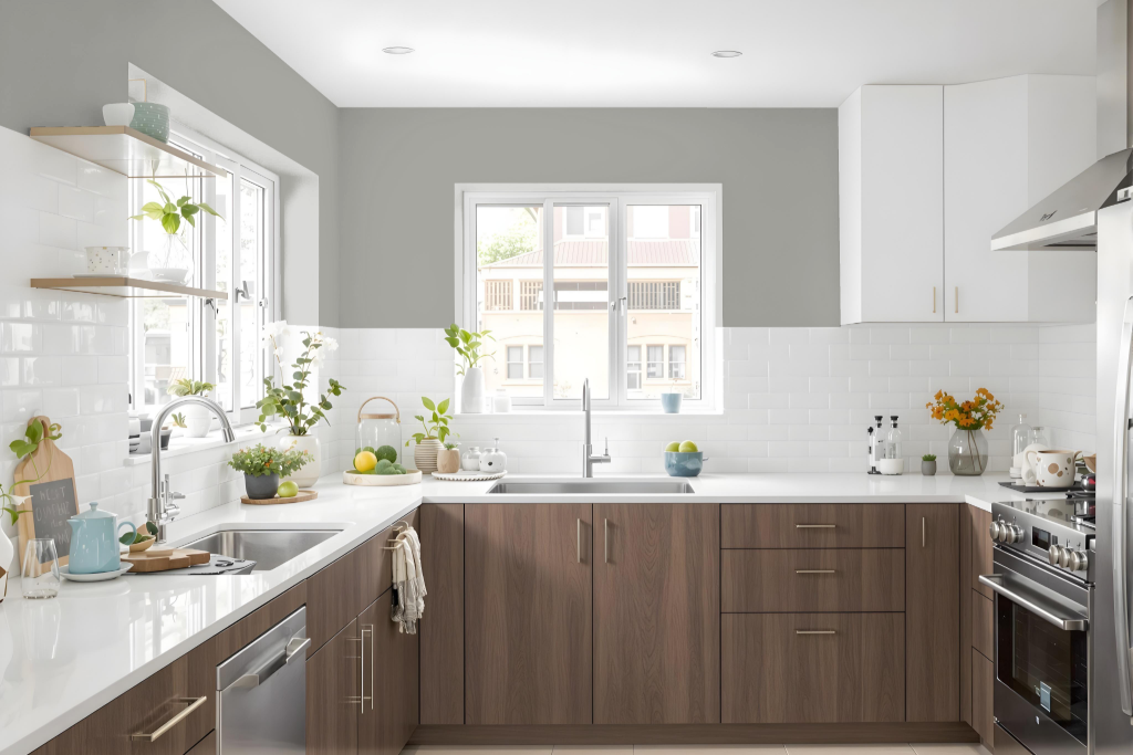
For a kitchen color scheme, RAL Effect RAL 850-3 offers an elegant design foundation that harmonizes well with wooden countertops, stainless steel appliances, and light-colored surfaces, as well as a range of hardware finishes like brass, chrome, and matte black. Its neutral tone and refined appearance make it an excellent choice for creating a stylish and sophisticated atmosphere.
In various design settings—from modern to traditional—this color can be applied to cabinets, walls, or accent elements to achieve a cohesive look. The balanced and inviting characteristic of this hue works effectively in both large and small kitchen spaces, contributing to a calm and welcoming environment.
Living Room
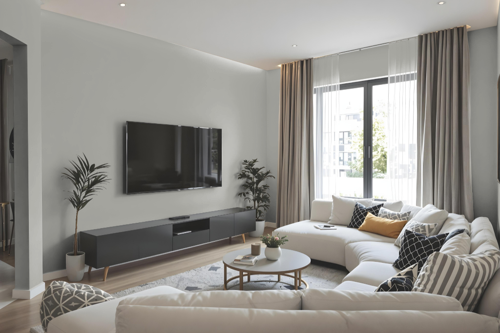
RAL Effect RAL 850-3 is an excellent choice for living room paint, providing a calming and sophisticated atmosphere when applied to walls and trims. It blends seamlessly with complementary colors like ash grey, dim gray, or onyx, creating a balanced and inviting environment.
This color also enhances decor elements, integrating well with painted furniture, storage units, and dressers to maintain a coherent look throughout the space. When accented with hues such as dark lava or gray-tea green, it adds depth and visual interest, elevating the overall design of the room.
Outdoor
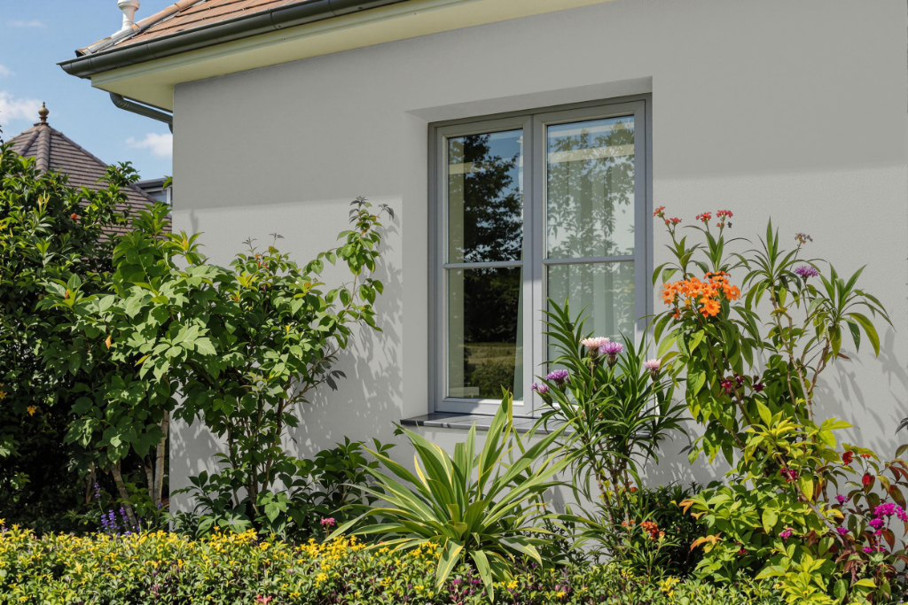
Home outdoor color RAL Effect RAL 850-3 offers a practical choice for exterior surfaces, making it an excellent option for walls, trims, and accents. Its balanced, neutral tone brings a harmonious appeal to both modern and traditional architectural styles.
This color pairs well with darker shades such as charcoal or cool grey, as well as with lighter hues like pastel brown or pale mauve, helping to create a visually appealing and cohesive exterior design that blends seamlessly with natural surroundings.