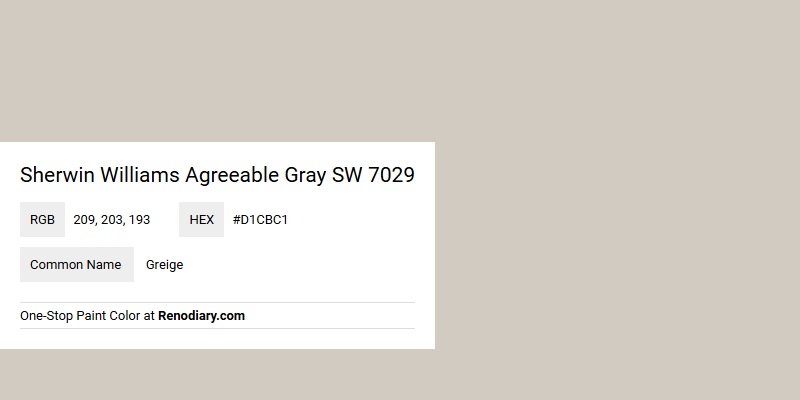
Sherwin Williams' Agreeable Gray SW 7029, a popular paint choice, is a versatile neutral known for its warm undertones that strike a balance between gray and beige, commonly referred to as "greige." With its RGB composition of (209, 203, 193), this color brings a soothing and welcoming feel to any space, making it ideal for living rooms, bedrooms, or open-concept areas. Embraced by homeowners and designers alike, Agreeable Gray effortlessly complements a wide array of color schemes, enhancing both modern and traditional interiors with its subtle sophistication.
Color Description
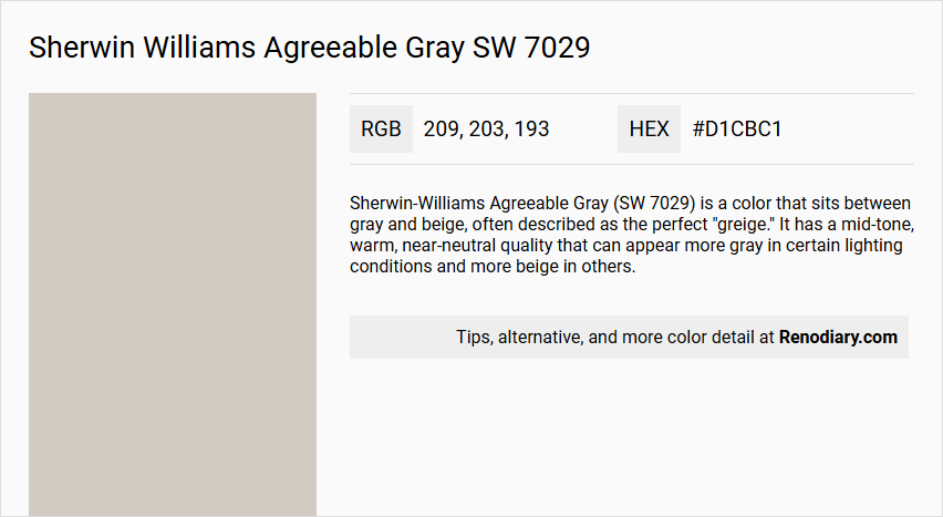
Sherwin-Williams Agreeable Gray (SW 7029) is a color that sits between gray and beige, often described as the perfect "greige." It has a mid-tone, warm, near-neutral quality that can appear more gray in certain lighting conditions and more beige in others.
Undertones
Agreeable Gray has warm undertones, primarily beige, which can sometimes cause it to look slightly purplish in unbalanced lighting conditions. However, it generally maintains a warm and neutral appearance.
Color Values
- Light Reflective Value (LRV): 60 (indicating it reflects more light than it absorbs, making the space feel lighter and brighter)
- RGB Values: 209 / 203 / 193
- Hex Code: #d1cbc1
Usage
Agreeable Gray is highly versatile and can be used in various rooms to create a welcoming atmosphere. It pairs well with crisp whites, high contrast colors like deep blues and greens, and warm neutrals such as beige and taupe. It is also a good backdrop for rich wood tones and can be complemented with trim colors like Sherwin-Williams Extra White.
Atmosphere
This color creates a welcoming and inviting atmosphere, maintaining a clean, modern look while adding a subtle warmth to any space. It is particularly effective in making rooms feel cozy and livable without being too dark or too bold.
Sherwin Williams Agreeable Gray SW 7029 Color Alternative
Sherwin Williams Agreeable Gray SW 7029 is renowned for its warm and inviting neutrality that effortlessly enhances any living space. Tikkurila Median X486, Tikkurila Shawl Y467, and Tikkurila Mirage G481 serve as excellent alternative choices that provide subtle yet distinctive variations while preserving the sophisticated essence of the original hue. Each of these alternatives offers a unique nuance that inspires creative design possibilities, ensuring a balanced and contemporary atmosphere in varied environments.
Bathroom
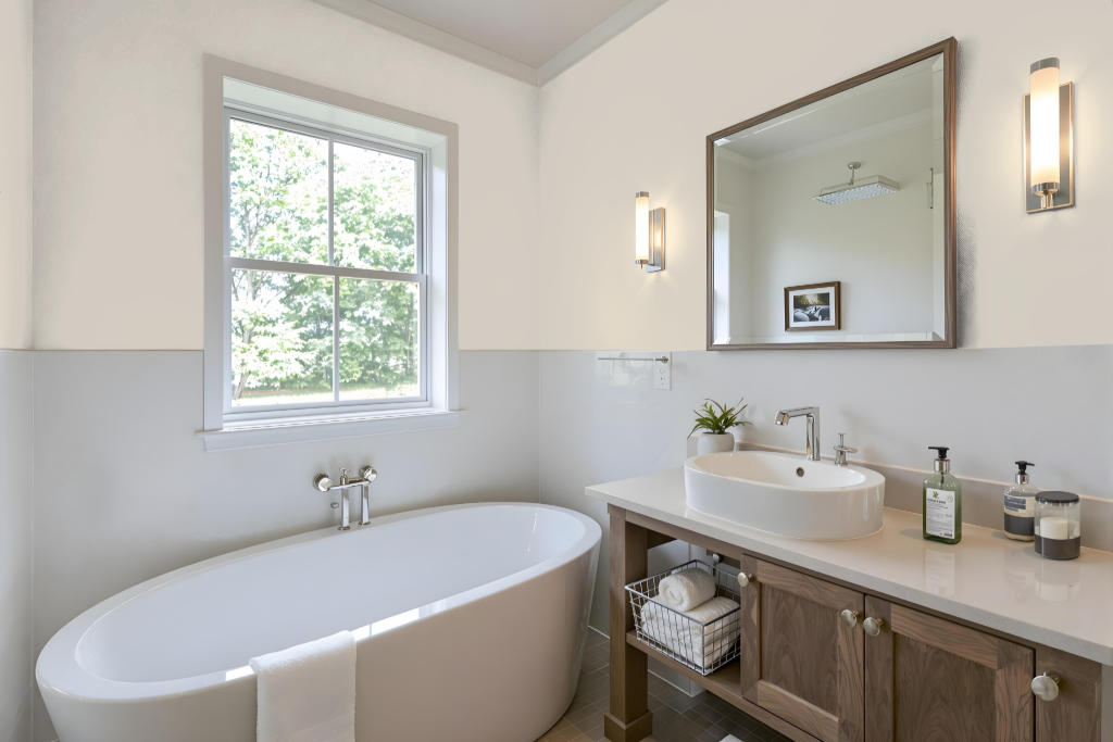
Agreeable Gray is a pristine bathroom color that adds warmth and sophistication to the space. In areas with abundant natural light, it creates a bright and inviting atmosphere that harmonizes with fixtures, backsplashes, and decorative hardware, while also complementing neutral countertops and flooring.
When applying this color, it is essential to test it in the specific lighting conditions of the room, as certain lights may reveal subtle cool undertones that can alter its appearance. With proper lighting, this shade can infuse the bathroom with a soft, welcoming ambiance that unifies different design elements seamlessly.
Bedroom
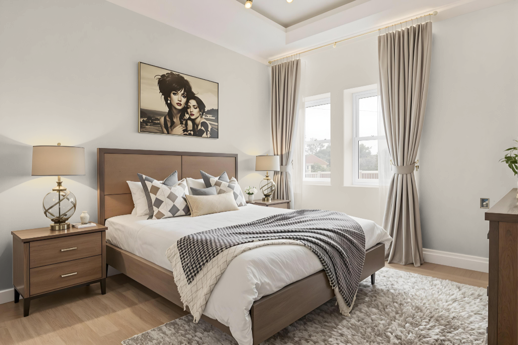
For a bedroom color scheme using Sherwin Williams Agreeable Gray SW 7029, incorporating crisp whites for trim, walls, and cabinetry creates a fresh and clean look that brightens the space. Pairing these with warm neutrals like beige, taupe, or soft blush tones adds depth and a cozy layering effect, while rich wood accents from furniture or accessories bring natural warmth and texture.
To elevate the overall design, consider adding high contrast shades such as deep blues, greens, or dark grays for a bold accent. Soft off-whites and subtle blends reflecting gray-green-blue hues further complement Agreeable Gray, establishing a balanced ambiance that mixes serene undertones with striking visual interest.
Kitchen
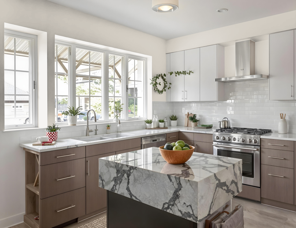
For a kitchen color scheme, Sherwin Williams Agreeable Gray SW 7029 provides a sophisticated backdrop that pairs seamlessly with soft whites such as Snowbound and Pure White to create a harmonious contrast. It also lends itself well to darker accents like Urbane Bronze and Iron Ore, which add depth when used for islands or decorative features in the space.
The subtle tone of Agreeable Gray can be expanded with accents in hues of blue, green, or even soft pink to enhance elements such as backsplashes, countertops, and decor. For a cohesive look, consider contrasting this shade with a clean white, a dark charcoal gray, or deeper tonal accents, and test the color in your specific kitchen setting to ensure it complements your lighting and overall design.
Living Room
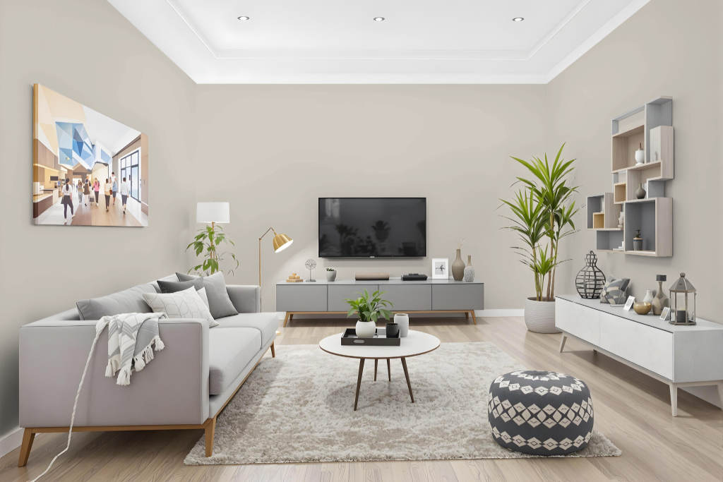
Sherwin-Williams Agreeable Gray (SW 7029) makes a striking living room color, especially in spaces filled with natural or well-artificial light where it creates a warm, inviting, and snug atmosphere. In settings with low or cooler light, the tone can appear less flattering, so testing it in your own space is key to ensuring it harmonizes with your finishes and decor.
This hue pairs well with crisp white trim and complements both bold, deep tones and warm neutrals like beige and taupe. Its ability to integrate with a range of color accents supports a cohesive interior design that adapts to different style preferences.
Outdoor
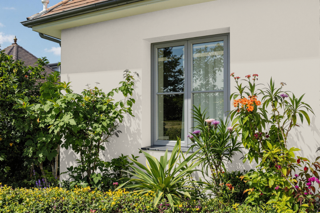
Sherwin-Williams Agreeable Gray is an excellent home outdoor color that adapts beautifully to different climates and lighting conditions. In sun-drenched settings, it lightens to a softer, cooler tone that creates a gentle contrast when paired with darker siding, earthy brickwork, or stone, imparting a warm, welcoming feeling without overwhelming brightness.
This hue performs reliably on various exterior materials, maintaining its fresh look through hot weather and prolonged rainy periods while reflecting sunlight to help keep homes cooler. Its strong adhesion on fiber cement and wood siding ensures a lasting finish, though wood surfaces might benefit from occasional touch-ups to keep the balanced aesthetic intact.
