Sherwin Williams' Balmy SW 6512 is a soothing shade known for its serene and calming qualities, aptly named Light Blue. The soft elegance of this color is highlighted in its RGB composition of (197,216,222), which blends gentle tones of blue and grey to evoke a sense of tranquility. Ideal for spaces intended for relaxation, Balmy SW 6512 creates a harmonious environment that invites peace and comfort.
Color Description
Sherwin-Williams Balmy (SW 6512) is a soft, calming purple paint color. It has a light to medium tone that is often described as serene and soothing.
Undertones
Balmy has subtle blue and grey undertones, which contribute to its cool and gentle appearance. These undertones help the color feel more balanced and less vibrant than a pure purple.
Color Values
RGB
The RGB color model values for Balmy are:
- Red: 197
- Green: 216
- Blue: 222
CMYK
Balmy is also represented in the CMYK color model by its respective cyan, magenta, yellow, and black values, though the exact values are not specified.
Usage
Balmy is suitable for both interior and exterior paint projects. It can be used on various surfaces, including walls, ceilings, and even furniture, to create a cohesive and calming environment.
Atmosphere
The color Balmy creates a serene and peaceful atmosphere, making it ideal for spaces where relaxation is key, such as bedrooms, living rooms, or meditation areas. Its soothing quality helps to reduce stress and promote a sense of calmness.
Sherwin Williams Balmy SW 6512 Color Alternative
Sherwin Williams Balmy SW 6512 offers a warm and inviting base, and its color alternatives, Tikkurila G436, Tikkurila Y436, and Dulux Mineral Mist 01BB 69/098, provide versatile options for refreshing any space. Each alternative brings a unique character while maintaining a harmonious connection to the original Balmy SW 6512, allowing designers to tailor moods without compromising on consistency. These complementary hues empower creative exploration and ensure that both traditional and modern settings achieve a balanced and expressive ambiance.
Bathroom
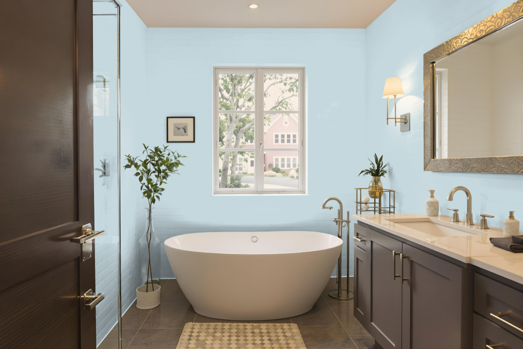
For a bathroom, Sherwin Williams Balmy SW 6512 is a calming choice that brings a refreshing ambiance to the space. It works beautifully when paired with crisp whites such as Sherwin Williams Alabaster SW 7008, resulting in a clean and timeless aesthetic.
Pairing Balmy with warm neutrals like Sherwin Williams Agreeable Gray SW 7029 or Sherwin Williams Tony Taupe SW 7038 introduces depth and sophistication into the room. Whether used as a main wall color or an accent, its cool undertones help create a serene and natural environment ideal for a tranquil bathroom retreat.
Bedroom
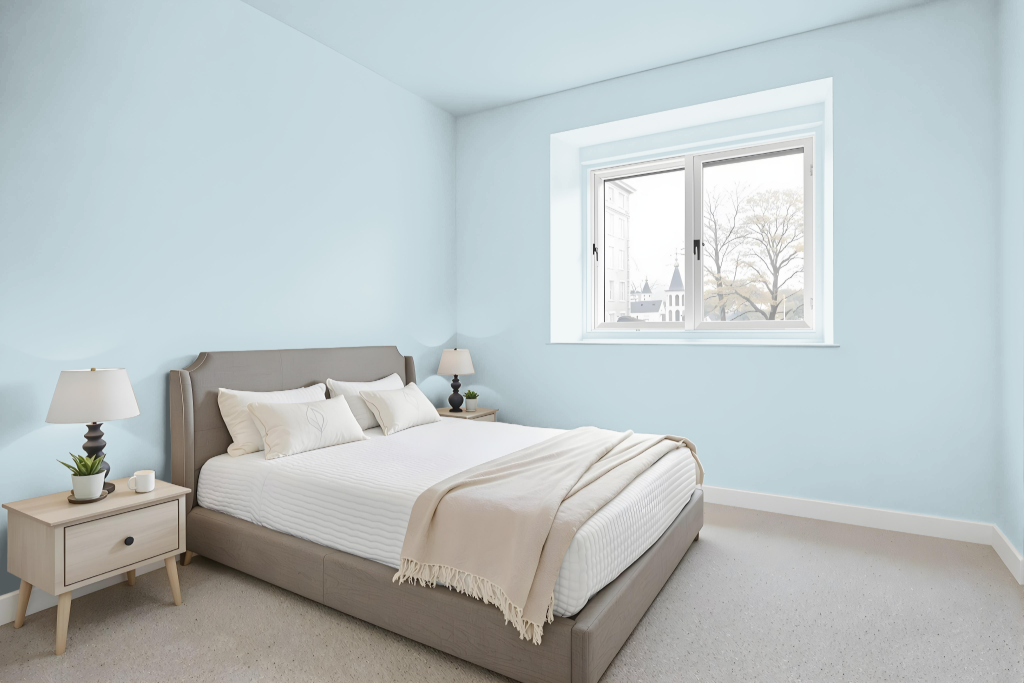
For a bedroom color scheme, Sherwin Williams Balmy SW 6512 sets a calming tone that enhances the space with a soft and inviting ambiance. Its combination with crisp whites creates a clean, timeless look, while pairing with warm neutrals like Agreeable Gray or Tony Taupe adds depth and sophistication to the overall design.
The color's high light reflectance makes the room feel open and airy, contributing to an environment ideal for rest and relaxation. Whether used as the main wall color or as an accent, it elevates the aesthetic of the bedroom, providing a balanced backdrop for various decorating elements.
Kitchen
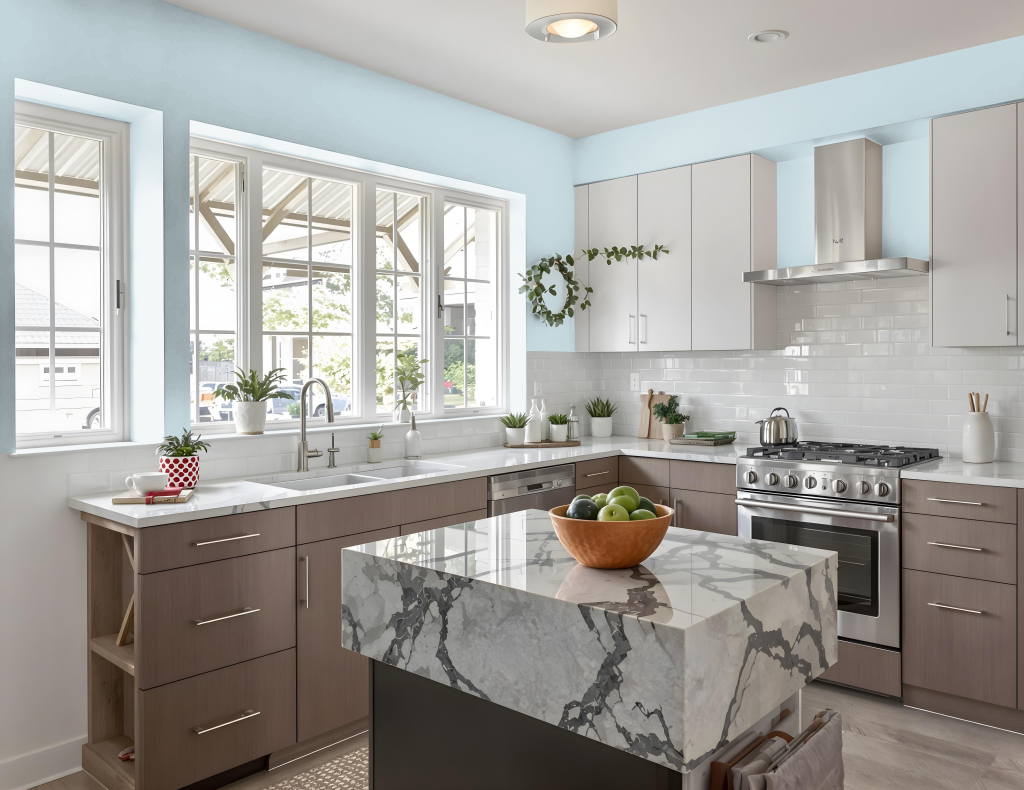
In a kitchen setting, Sherwin Williams Balmy SW 6512 delivers a refreshing and vibrant backdrop that brightens and enlarges the space. This hue, featuring a high light reflectance, creates an inviting atmosphere perfect for pairing with crisp whites like Sherwin Williams Alabaster for trim and cabinets or with warm neutrals such as Sherwin Williams Agreeable Gray and Tony Taupe to enhance depth and sophistication.
Designed to shine in both well-lit and moderately lit environments, Balmy adapts seamlessly to various lighting conditions, though additional illumination might be needed in darker areas. It works effortlessly as a primary wall color or as an accent, adding a touch of freshness to any kitchen decor.
Living Room
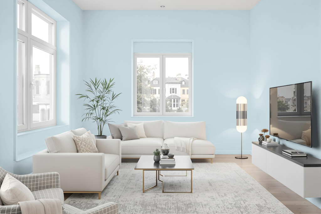
The living room color Sherwin Williams Balmy SW 6512 creates a bright, open feel by reflecting a significant amount of light, making the space appear larger and more inviting. It works well with crisp white shades like Sherwin Williams Alabaster to achieve a clean and timeless backdrop, while pairing with warm neutrals such as shades from the Agreeable Gray or Tony Taupe families adds depth and sophistication.
This color is flexible enough to blend seamlessly with complementary and analogous color schemes, enabling a range of design options that enrich the decor with subtle layers and dimension. Whether aiming for a modern aesthetic or a classic atmosphere, this hue contributes to a warm, balanced environment in any setting.
Outdoor
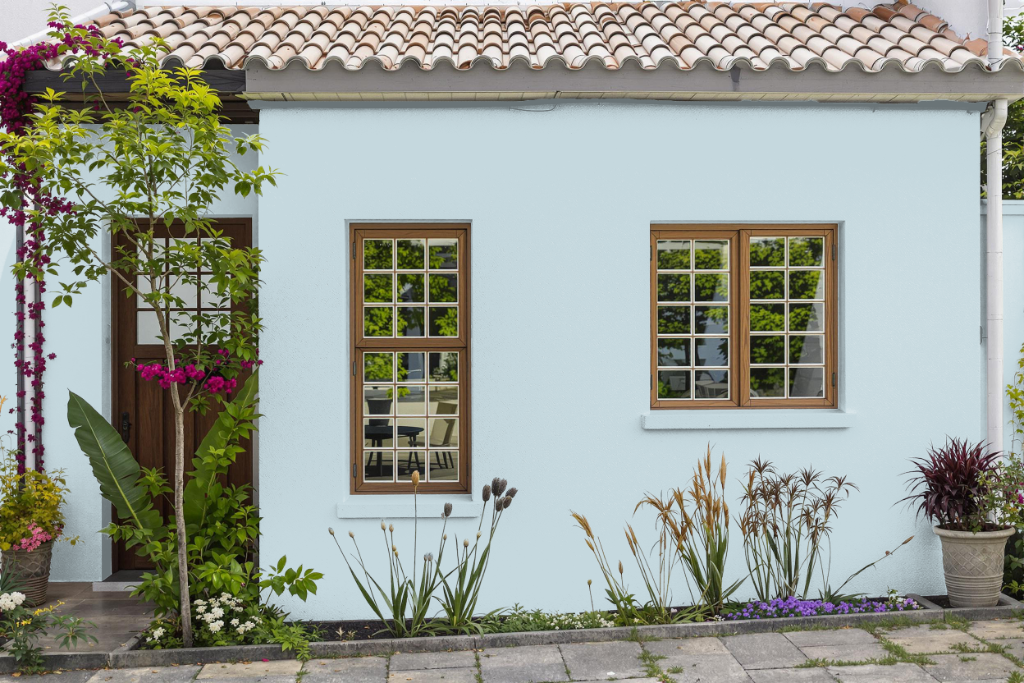
For outdoor use, Sherwin Williams Balmy SW 6512 is a home outdoor color that brings a light and cool aesthetic to exteriors, enhancing curb appeal and creating an inviting atmosphere. Its reflective qualities help maintain cooler surface temperatures, contributing to improved energy efficiency and a more comfortable outdoor environment.
It is essential to use exterior paint formulations specifically engineered to withstand weather challenges, ensuring lasting protection and durability. By choosing the appropriate finish from Sherwin Williams' range, homeowners can preserve the appealing look and performance of this refreshing hue over time.