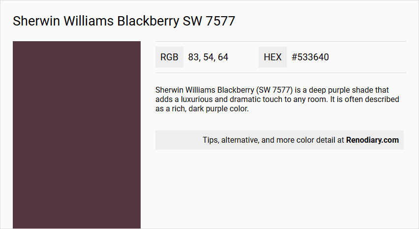
Sherwin Williams Blackberry SW 7577 is an elegantly rich shade characterized by its deep, muted tones, reminiscent of a sophisticated burgundy. With its RGB values of (83,54,64), this color exudes a perfect blend of dark berry and earthy undertones, ideal for creating a warm and inviting ambiance. Its luxurious hue makes it a versatile choice for both modern and classic interiors, adding depth and character to any space.
Sherwin Williams Blackberry (SW 7577)
Color Description
Sherwin Williams Blackberry (SW 7577) is a deep purple shade that adds a luxurious and dramatic touch to any room. It is often described as a rich, dark purple color.
Undertones
The undertones of Blackberry can be characterized by a red hue, as indicated by its RGB values. However, it also has a complex mix of undertones including brown, navy, purple, dark green, olive, dark turquoise, and grey.
Color Values
- Hex Color Code: #533640
- RGB Color Code: RGB(83, 54, 64)
- CMYK Values: 0.0%, 34.9%, 22.9%, 67.5%
Usage
Blackberry SW 7577 can be used in both interior and exterior designs. It is versatile and can be incorporated into modern and traditional design schemes. For a bold contrast, it can be paired with crisp white accents or metallic finishes. It also complements warm neutrals like SW 7012 Creamy or SW 7036 Accessible Beige.
Atmosphere
This color creates a sense of drama and intimacy in any room. It is particularly effective in bedrooms and living rooms where it can create a unique and luxurious atmosphere. When paired with complementary colors, it can produce a vibrant and dynamic visual effect.
Sherwin Williams Blackberry SW 7577 Color Alternative
Sherwin Williams Blackberry SW 7577 offers a foundation of deep, expressive color that inspires creative alternatives in any design project. Dulux Decadent Damson 21RR 07/060 introduces a warm, inviting tone, while Little Greene Adventurer 7 presents a spirited twist and Little Greene Córdoba 277 delivers an elegant vibrancy. Each color alternative provides its own unique energy, ensuring that designers and homeowners have a versatile palette to match their creative vision without altering the essence of the original color.
Bathroom
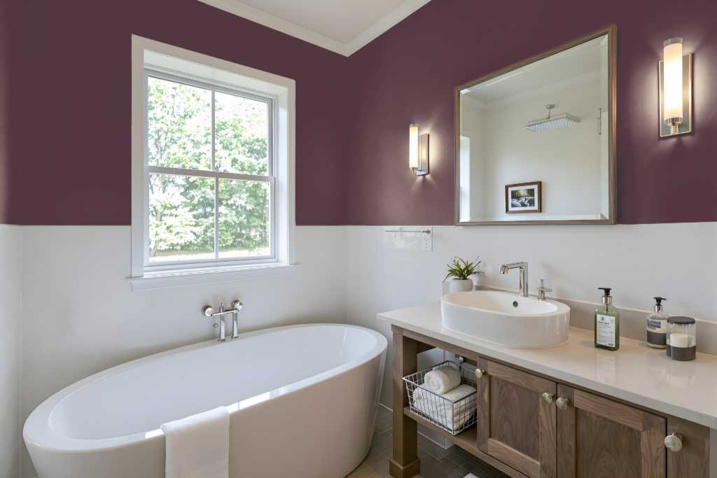
Sherwin Williams Blackberry SW 7577 is a dramatic choice for a bathroom, offering an elegant foundation that stands out with crisp white accents or metallic finishes to create bold contrasts. Its effect is further enhanced when paired with warm neutral tones like Creamy or Accessible Beige, crafting a harmonious balance that accentuates both modern and traditional design schemes.
This rich hue fosters a sense of intimacy and dramatic flair, especially when complemented by well-chosen lighting and fixtures. As finishes may interact differently with various surface textures, it’s advisable to test the color on a sample area first to ensure it meets the desired aesthetic.
Bedroom
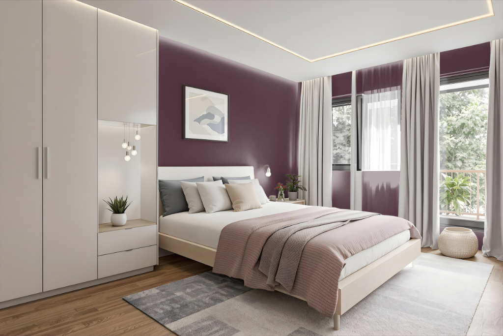
In a bedroom, Blackberry SW 7577 sets an elegant tone when combined with crisp white accents. The rich depth of this shade pairs beautifully with warm neutrals such as creamy tones and soft beiges, while natural wood finishes add a luxurious warmth to the space.
For added interest, selectively incorporating hints of green hues can subtly refresh the atmosphere without overpowering it, and layering different intensities of the base tone creates a sophisticated monochromatic look that benefits from thoughtful decor accents.
Kitchen
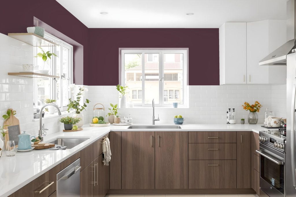
For a kitchen color scheme, Sherwin Williams Blackberry SW 7577 offers a dramatic and sophisticated option with its deep, intense hue. Pairing this bold tone with crisp white accents or metallic finishes creates striking contrasts, while warm neutrals like Creamy and Accessible Beige, along with rich walnut woods, enhance the inviting and balanced atmosphere.
Incorporating complementary green hues can add dynamic visual interest to the design, providing a vibrant counterpoint against the richness of Blackberry. This approach weaves together elegance and warmth for a cohesive and engaging kitchen environment.
Living Room
Living room color Blackberry creates a bold and dynamic atmosphere when used as a statement shade in your living space. Pairing it with crisp white accents, metallic finishes, or warm neutrals like creamy or accessible beige helps to accentuate its sophistication while providing both striking contrast and a harmonious balance.
The red undertone imbues Blackberry with a unique character, making it an excellent choice for either a monochromatic or a complementary scheme. Incorporating green hues can heighten its visual impact, while the adaptable nature of this color renders it suitable for modern as well as traditional design schemes.
Outdoor
For outdoor use, Sherwin Williams Blackberry SW 7577 can add a dramatic and elegant touch to your home's exterior. It pairs beautifully with crisp white accents and metallic finishes, while warm neutrals further enrich the overall appeal, creating a harmonious and inviting look. The look may vary depending on the surface texture and finish, so considering these factors in your design is essential.
A digital visualization tool from Sherwin-Williams allows you to see how Blackberry SW 7577 will appear on your home's exterior before the final decision is made. This helps ensure that the final result enhances your home’s architectural features while reflecting your personal style.